Fall Home Design: Take Two
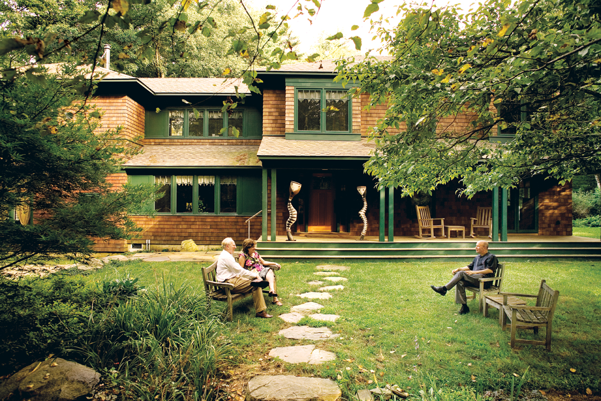
An after shot. Photograph by Jörg Meyer
Standing in stocking feet in 17-degree weather with her husband and their 14-year-old daughter, Concord resident Sara Mrachek watched as firefighters tore the roof off the family’s modest mid-1960s Cape, which was being gutted by the hottest fire that the town’s department had ever seen. The next day, the Mracheks returned to their charred, soaked home; studying the scene, they calculated that it was a total loss.
In most states, the next step would be to tear down and rebuild, or sell. The Mracheks would end up doing neither. Instead, they were about to learn a hard lesson about being homeowners in the Bay State, a surprisingly antiquated place when it comes to rules about what you can build, and where.
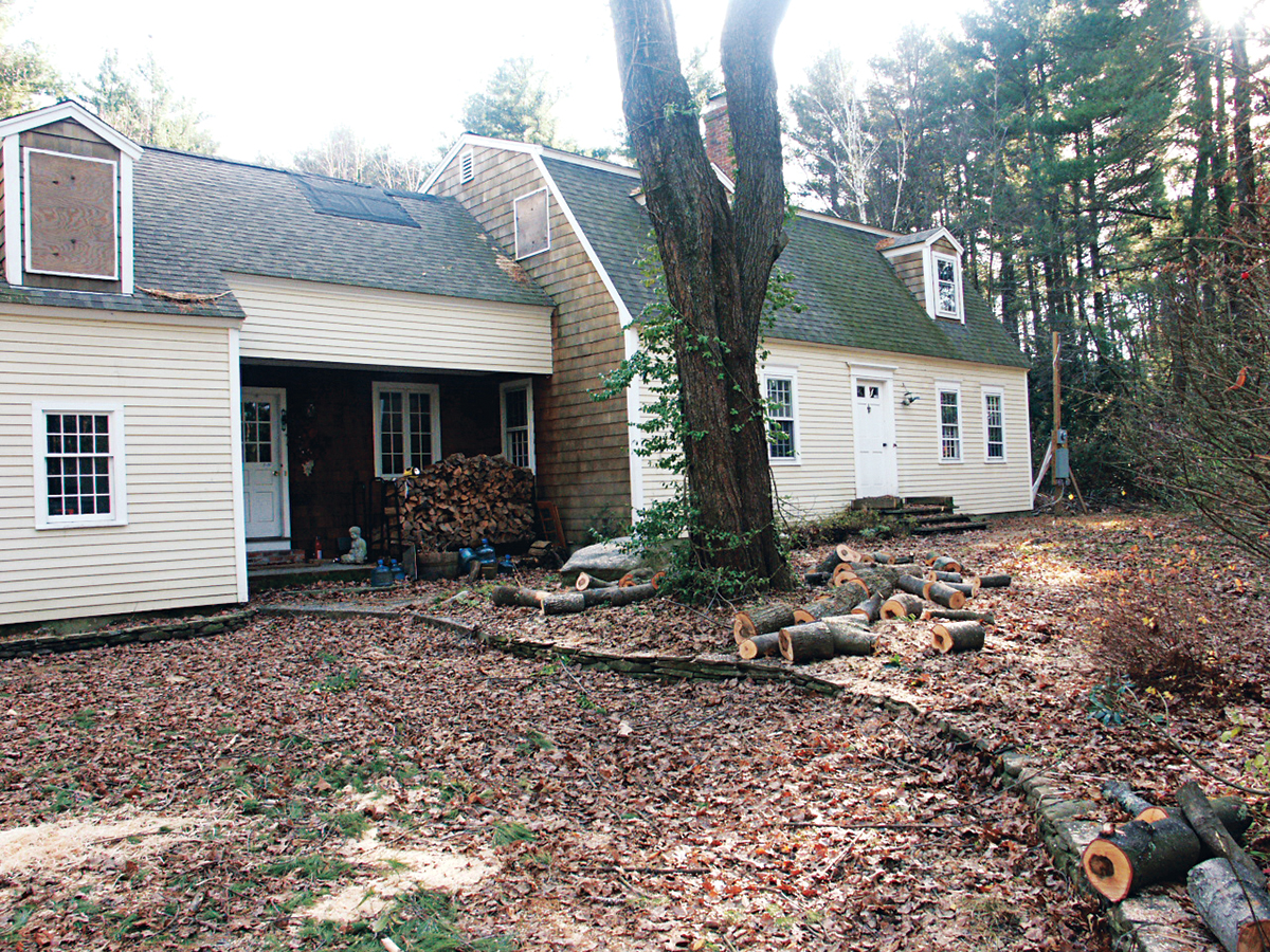
A before shot / Photo provided
It’s been almost 30 years since Massachusetts updated its planning, zoning, and subdivision control statutes; the American Planning Association has ranked the state as being among those with the weakest and most outdated land-use laws in the nation. Without clear, up-to-date statewide guidelines, towns have developed their own ad hoc, increasingly complex building codes.
While this does give each town unique power to check development, preserve its neighborhoods’ character, and protect real estate values—arguably the kinds of things that make people want to live there—it also forces homeowners like the Mracheks to navigate a complex and often confusing web of bylaws. What complies and what doesn’t, and what will get bounced to the board of appeals, often comes down to a building inspector’s interpretation. All of which means few Massachusetts residents get much flexibility when it comes to rebuilding. Instead, they must get creative.
The Miracle Comeback
Owners: Bill and Sara Mrachek, Concord
House type: 1960s Cape
Initial square footage: 3,125
Finished square footage: 3,800
Architect: Royer Architects, Cambridge
Contractor: Kennefick Builders, Harvard
Paying high rent on temporary shelter in Waltham while battling for their insurance payout, the Mracheks didn’t have time to waste. But since their house sat on “nonconforming property” (the frontage was too short), Concord’s zoning law required them to get a special permit from the planning board to tear down their damaged home—a process that would take at least six months. A real estate broker warned the Mracheks that any prospective buyer or developer would run from this special-permit condition, or bargain them down to nothing. So the family decided to opt for Plan C: Build what was allowed by law.
In their case, that required preserving at least 50 percent of the house’s original structure. It also required plenty of drop-ins by the town building inspector to approve which parts of the damaged house they would keep and which they would remove. (“I felt like I was in high school with the principal checking my skirt length,” Sara Mrachek jokes.)
For help they turned to Cambridge-based architect Chris Royer, principal of Royer Architects. Working with the existing footprint, Royer reinvented the house’s shell—replacing clapboard with shingles, moving and enlarging windows, deepening the eaves—to transform the Cape into a contemporary shingle-style home.
Still, the zoning strictures left their mark. By keeping the existing studs in order to meet the 50 percent rule, the Mracheks were unable to significantly improve on the outdated 1960s plan. “It was a huge headache for the contractor, too,” Royer notes. “Sometimes we were building new columns right next to the old columns just to meet code.” Another regulatory quirk forced the creation of an awkward four-step staircase between the second floor and the new master suite over the garage.
More than half a million dollars later, the Mracheks have their new home—and a handsome one—but Sara says it’s not quite what she would have built if she’d had free rein. She would have made sure, for instance, that the second floor was all on one level. She would have opened up the floor plan so that the whole house could be heated by a wood-burning stove. And she would have spent less money trying to save a damaged structure, and more on windows and finishes. “They made us take the hard road at every turn,” she says.
Still, with a larger kitchen, a lovely sleeping porch, and plenty of room for their art collection, the Mracheks are happy they stayed. “I know it sounds funny,” Sara says, “but I wouldn’t have traded this for anything. Working with Chris and building this house was a wonderfully healing experience.”
When facing the morass of Massachusetts zoning, a homeowner’s best ally is the locally based architect, whose grounding in a particular town’s building codes can help avoid a drawn-out review process and several redesigns (not to mention clients’ ire). That’s why when Jeff and Vicky Hadden wanted to turn their postwar Colonial in Weston into something more attractive and appropriate to the rural landscape, they called on architect John Chapman, based in nearby Wellesley.
Chapman didn’t even consider taking the house down or adding much more square footage. “Weston is cautious,” he says. “If we’d applied for a special permit, they’d review everything: light fixtures, paint colors, site engineering. Going through that process would have taken as much as a year.” Carrying a project for months without a shovel hitting the ground, and possibly hiring a lawyer to boot, wasn’t something he wanted to put his clients through. So he kept the building under 6,000 square feet and retained 50 percent of the original structure—”That kept us out of the review board,” he says.
An after shot / Photos by Single Speed Design
After plenty of research and budget crunching, the Haddens decided the New England farmhouse look would provide maximum transformation for minimum investment. So Chapman enlarged the windows, added a farmer’s porch with beefy columns, and swapped out the asphalt shingles for a standing-seam metal roof.
With the money and zoning chits they saved on the main house, the Haddens were able to refashion their two-car garage into a traditional-looking New England barn. “We looked at a lot of barn structures and saw that they frequently overwhelmed the house. It was sort of the tail wagging the dog,” Chapman says. “That’s how we could add square footage while maintaining a traditional look.” He raised the roof on the garage and doubled its footprint to create a stunning 1,000-square-foot master suite with high ceilings and a loft tucked beneath a cupola.
A before shot / Photo by single speed design
Although Chapman wishes he could have raised the roof of the main house to better balance it with the enlarged garage/master suite, he’s pleased with the results. Just as important, the new house fits in nicely with the town’s preservationist attitude. “Weston’s planning is designed to protect what’s seen from the public perspective,” Chapman says. “The town has designated scenic roadways and has developed codes to try to make houses invisible, set far back into the trees, to preserve its bucolic appearance.”
With this farmhouse upgrade, the house finally matches up with Weston’s agricultural and historic character—not to mention its owners’ vision. “Six years later, thanks to John and many others who put long hours and much creative energy into the project, we have a house we love in a great spot,” Vicky says.
The Suburban Farmhouse
Owners: Jeff and Vicky Hadden, Weston
House type: 1950s Colonial
Initial square footage: 3,625
Finished square footage: 5,100
Architect: John Chapman, Wellesley
Contractor: Eco Structures, Norfolk
Yet there are some who actually consider local towns’ restrictive zoning a godsend, because it encourages home-owners to think twice about tearing something down. “Sometimes it’s better to tear down because the house is so poorly insulated and constructed that it would cost a lot to repair and, more important, to heat and cool it,” says John Hong, coprincipal of Cambridge architecture firm Single Speed Design. “But in other cases, saving an existing structure not only makes the project more charged and interesting, it also is a good sustainable strategy.”

A before shot / Photo by single speed design
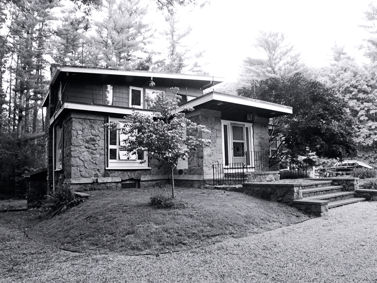
Consider, for example, Single Speed Design’s project in Medfield nicknamed the “Small Big House.” Homeowners Cuan and Lee Coulter had spent a year in their 1930s house, and were eager to be rid of its small, poorly lit rooms and severely water-damaged 1960s upper floor. But because it backed up against conservation land, a teardown would have required a special permit. So they contacted Single Speed Design, which proposed a major renovation, one that would avoid the permitting slog while also making the structure more eco-friendly.
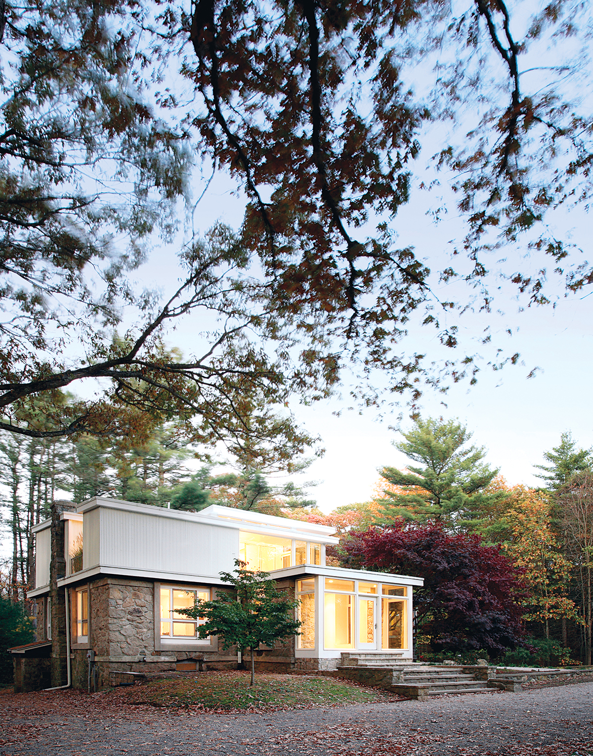
Since the ground floor was solidly built and clad in stone, the Coulters and their architects decided to keep it intact, saving those materials from the landfill and reducing construction costs. They also recognized that the stone on the house’s exterior would keep it cooler in the summer and warmer in the winter.

An after shot / Photos by Single Speed Design
Instead they poured their design energy into the second floor, breaking up what was once a single space into three “pavilions” separated by decks and a bamboo garden. The change is dramatic: The master bedroom, guest bedroom, and corridors feel light, airy, and almost Californian. Deep overhangs and plantings keep the rooms cool and work in tandem with the stone base, eliminating the need for air conditioning. “The openness of the new second floor gives the sense that the space is larger without increasing the actual square footage,” says Single Speed coprincipal Jinhee Park. “This is one of our simplest but most important attitudes toward sustainability—that spaces do not have to be bigger, just designed so that they [feel that way].”
The Coulters, for their part, were pleasantly surprised by the changes Single Speed suggested. “Changing the front entrance by removing some stone and adding the ‘glass box’ was not something we ever considered—and almost sacrificed due to budget constraints—but are so glad was included in the design,” Lee says. “It completely makes the house, both from the outside and from within.”
The Eco-Friendly Overhaul
Owners: Cuan and Lee Coulter, Medfield
House type: Mixed-era
(first floor built in 1937, second in mid-’60s)
Initial square footage: 2,263
Finished square footage: 2,461
Architect: Single Speed Design, Cambridge
Contractor: Oteri Construction, Watertown
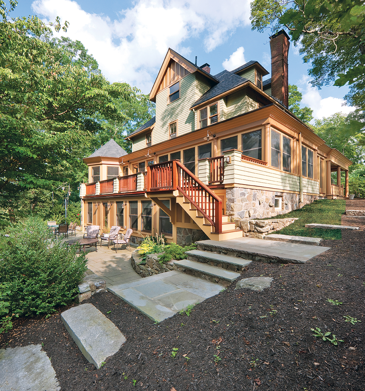
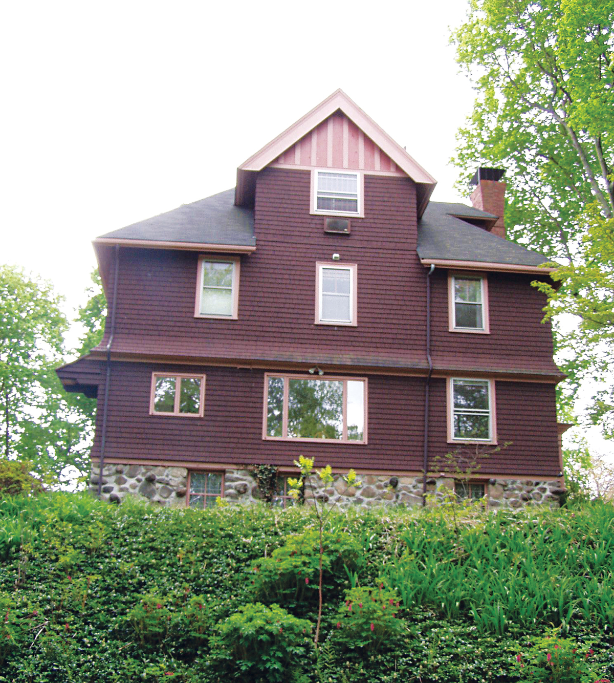
Living in Lexington, Mat and Carolyn Finch probably could have doubled the size of their Victorian when its 19th-century proportions began to feel squeezed by their three teenagers. After all, their town is informally known among building professionals as one of the Hub’s most permissive when it comes to zoning. But when they contacted contractor Peter Feinmann, president of Feinmann Inc., and described their plan—a three-story addition to the back of the house—he came up with an alternative idea, one that would have far less impact on both the house and the site.
An after shot. / Photo by John Horner
“The Finches wanted more bedrooms and more living space, but we were worried that to meet their requirements, we’d create a monstrosity back there. So we asked, ‘Do you really need to make all those spaces bigger?'” recalls Feinmann, who had done several smaller renovations for the couple over the years. “This was a case where the house told us what to do: It said, ‘Do a two-story addition instead and build out the basement.'”
Because the Finches’ house sits on a steep hill, a lower-level addition could feature large windows overlooking the backyard. It was here that Feinmann put an office, which doubles as a guest room, and a family room where the kids can spread out. He then redefined the kitchen and living room above, opening them up to each other to give a more contemporary feel.
The wraparound porch was Feinmann’s innovation, too, unifying the house’s elevations even better than the original. Once he continued the porch around the back of the house, the rest of the exterior details fell into place. “We essentially repeated what was there—the double cornice and the rhythm of the columns—but we built in more-substantial railings to fit with the scale of the house, and built a gazebo in one corner to create a unique element,” he says.
A before shot / Photo by John Horner
In the end, and at a cost of about $760,000, Feinmann added nearly 50 percent more square footage and the Finches finally had room for everyone. What’s more, for the first time the house looks welcoming and engaged with the landscape from every angle.
Ironically, Feinmann’s solution would have met the more restrictive codes of a place like Concord, which requires that additions be kept at less than 50 percent of the original square footage. In the case of this Lexington house, an architect seasoned in the Bay State’s byzantine building statutes had plenty of tricks up his sleeve for opening up a space without overbuilding—even when he could.
The Smart Expansion
Owners: Mat and Carolyn Finch, Lexington
House type: Late 19th-century Victorian
Initial square footage: 3,400
Finished square footage: 4,900
Architect: Feinmann Inc., Lexington
Contractor: Feinmann Inc.