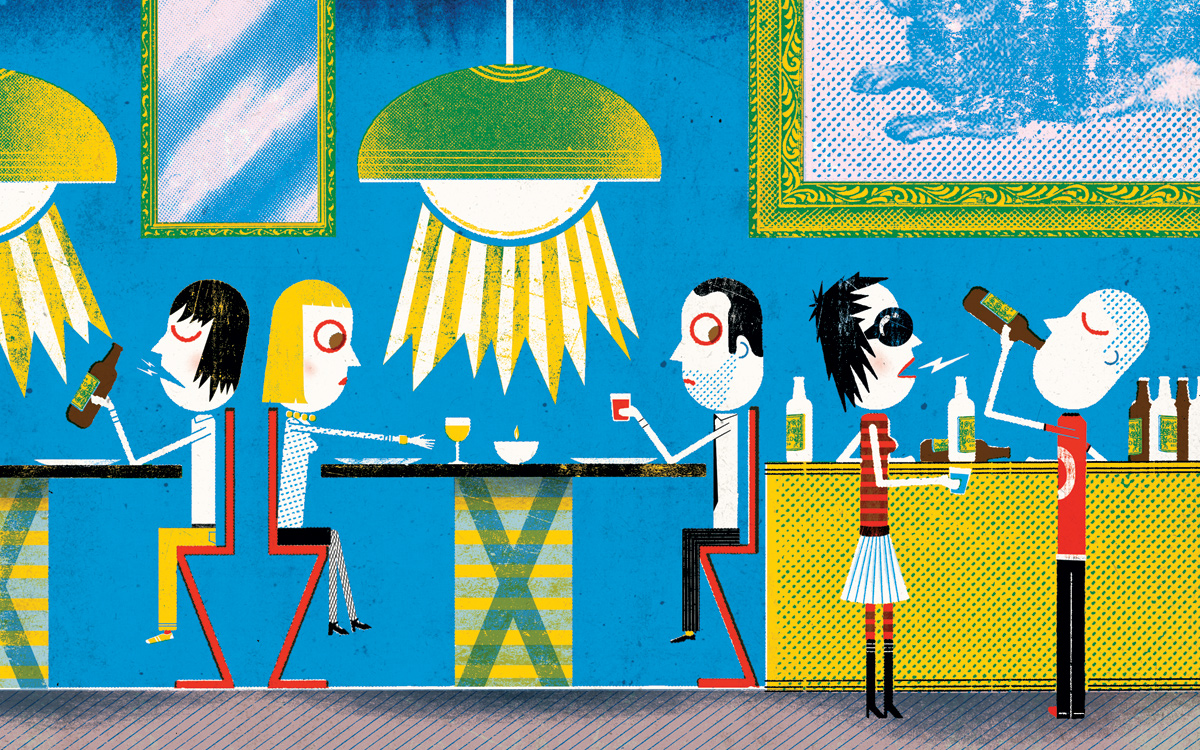
Discomfort Food

Illustration by Christian Northeast
The first time I ate at Menton — which many consider the apex of fine dining in Boston — the food was fabulous, the décor pristine, the service impeccable. So why didn’t I luuurrrve the experience? In short, I couldn’t get comfortable. For the better part of a seven-course dinner, I shifted in my seat. I set my hands on the table, moved them awkwardly to my lap, then placed them on the table again. By the time the mini macaroons arrived, my back felt permanently cricked.
The culprit? Armchairs. I hate seeing them in restaurants, and I hate sitting in them even more. The arms prevent you from scooting in close to the table, so you spend your meal either perched on the edge of the chair or settling too far back to hold a conversation. A later visit, though, was entirely different. Seated at a table with armless chairs, I was able to eat and chat with ease. It was delightful.
At so many dining spots, it’s the small design choices that have the most dramatic impact. Take the Mandarin Oriental’s Asana: If you’re unlucky enough to sit at one of the banquettes, you sink so far into the plush upholstery that you’re practically scooping food into your mouth. Elsewhere, it’s the bars and entryways that are problematic. At Towne, there’s no defined space surrounding the hostess stand, forcing guests to shuffle about until their table is ready. Across the street at Back Bay Social Club, patrons are met with a cavernous expanse between the bar and seated areas; people huddle in close to the bar not for lack of space, but because they’re otherwise floating around an empty room. Likewise, Downtown Crossing gastropub Stoddard’s is just begging for a drink rail to give standing revelers a place to set their pint.
Perhaps what’s most frustrating is that these places are all so attractive. But no matter how strong the visuals, pretty surroundings alone don’t make for happy diners. David Flanagan, co-owner of Davis Square’s new Foundry on Elm, enlisted designer Peter Niemitz to create a bar that’s supremely navigable and lively. His trick? “I’d walk around the space over and over,” Flanagan explains. “I’d imagine it on the busiest night and think, Where are people going to be? Will people standing around the bar impact people at tables? You have to anticipate high volume.”
Meanwhile, Susan Orpin, who designed Scituate restaurant Oro and the always-hopping Stella, shares my fixation on seating. “Selecting the wrong chair is one of the biggest mistakes,” she says. “[Restaurateurs] think, Oh, I can get 100 of these for this much money. But thinking that way can compromise the diner’s experience.”
Overemphasizing efficiency can also compromise the success of a design, Orpin says. “Chefs, owners, and GMs tend to focus on functionality. How far do servers have to walk to get to the bar? How large is the service area? But sometimes it’s got to be about the customer. It’s [up to] the designer to say, ‘Hey, people have to sit at that table.’”
Amen. Because for most of us, dining out isn’t just about food; it’s also about kicking back. If the restaurant you’re eating at isn’t built for comfort, you might as well be ordering in.