Going Campy
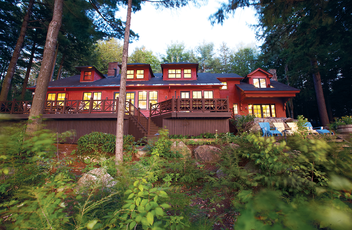
MANY REHAB JOBS REQUIRE a grand rethink, an overhaul of concept, space, and orientation. For others, all that’s needed is a subtle shift to morph from sleepy to spectacular. The latter was the case for a waterside home built in 1903 on New Hampshire’s Lake Sunapee, which the designer made suitable for its new residents by doing little more than getting it back to its roots.
The owners, a Wellesley-based couple with three children, discovered the vacation home five years ago. They weren’t exactly looking, but something about the Lodge, as it had once been called, spoke to them. The structure was originally part of a boys’ summer camp and, like most of the rustic cottages and cabins that sit at the edge of the lake, retained a camplike sensibility. Though it had undergone some work over the years — including the addition of a new wing — the building had a dated kitchen, bathroom sinks with separate hot- and cold-water faucets, and drop ceilings. But the pair
immediately saw potential.
They hired Charles R. Myer and Partners, who assigned architect Pete Lackey as project manager. To Lackey, the home’s historical relevance offered up its own set of priorities: The four-season getaway should return to — and celebrate — its homespun origins.
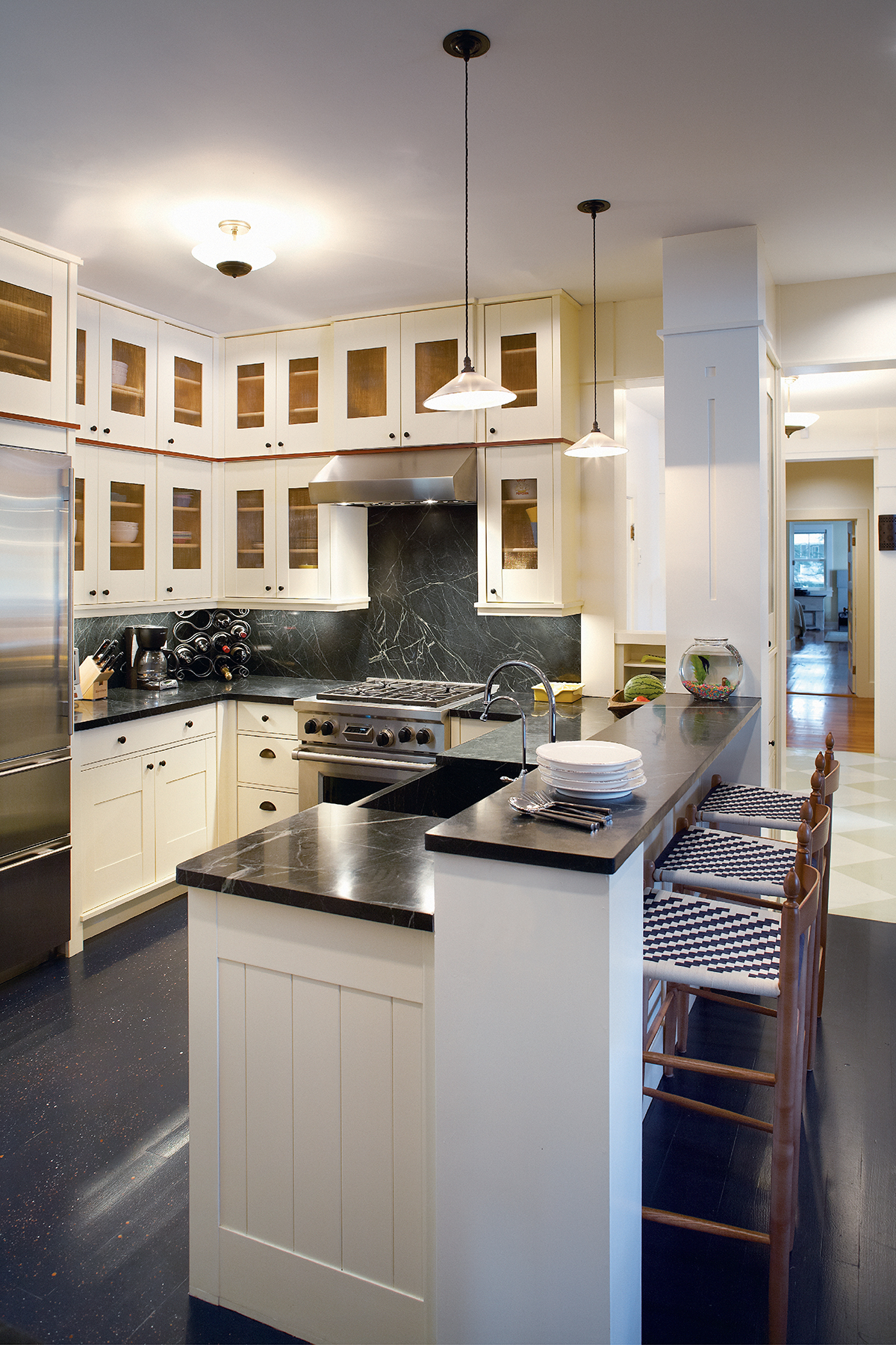
For an informal feel, copper mesh was used instead of glass in the kitchen cabinetry.
“This family wasn’t looking for any particular style. We never called it a ski house, but we never called it a lake house, either,” says Lackey, pointing out that the family uses it as both. Eventually the design team settled on an identity in keeping with the home’s history — an all-season lodge.
Another challenge was that the family wanted to be able to invite guests to stay, which meant aunts, uncles, friends, grandparents, and — most important — playmates all needed a place to sleep. And where better to stow a bunch of kids than in a bunk room?
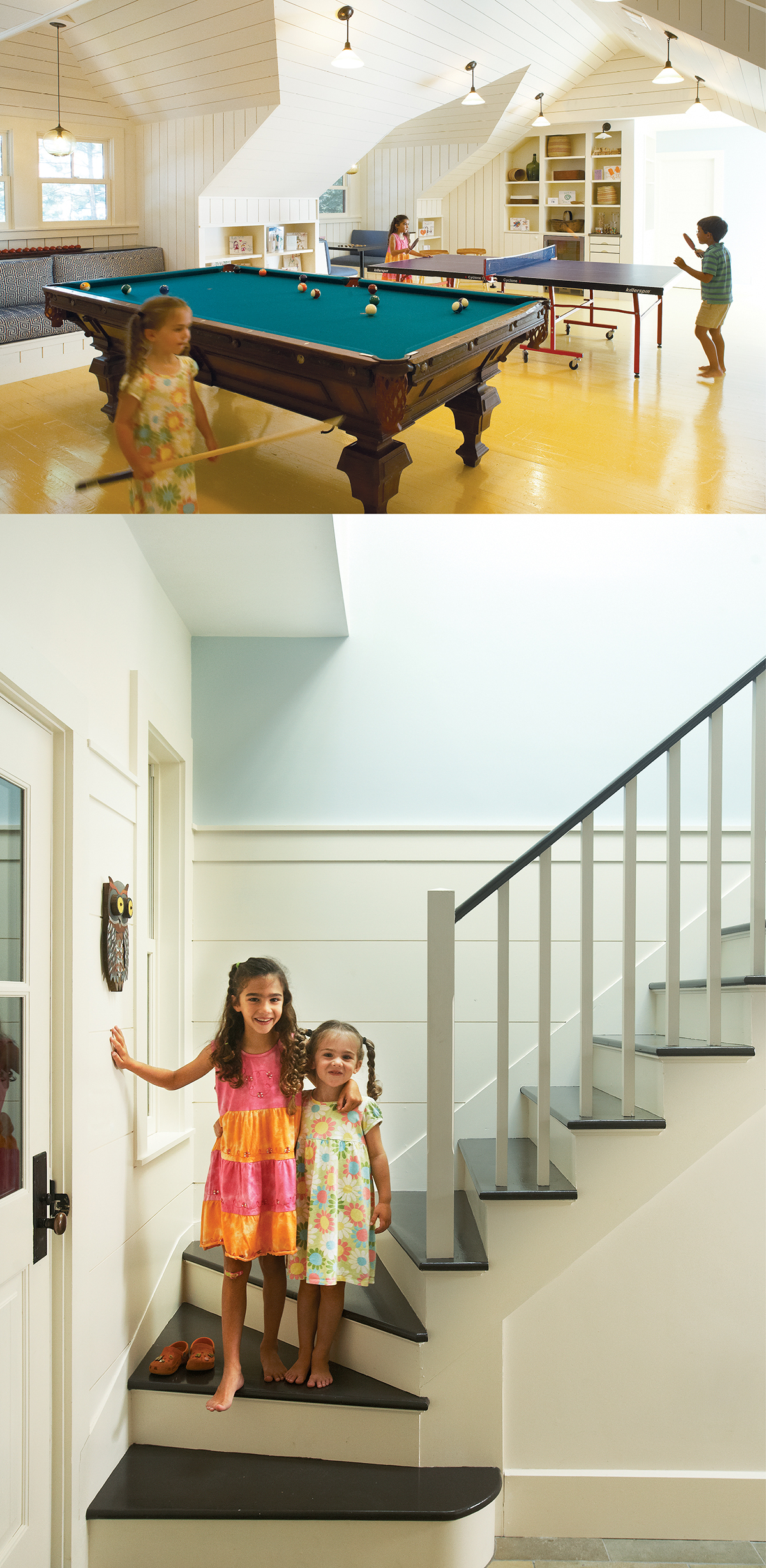
Above, the playroom contains the original pool table, making rainy days fun for everyone. Below, tearing down a wall and lifting the drop ceilings opened up the main staircase, which is now flooded with natural light.
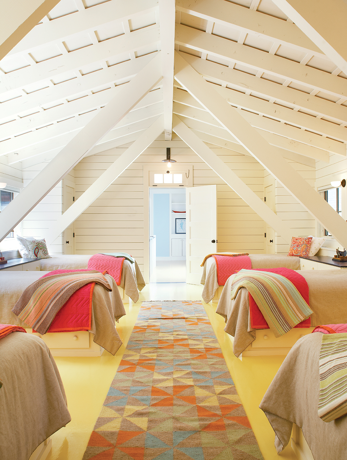
Lackey rebuilt the carport, which jutted away from the house, and topped it with a spacious dormlike bedroom, complete with six built-in beds crafted by general contractor George Constantopoulos. The structure’s A-frame beams cut through the room to dramatic effect, offering both spatial organization and stability. Propped-up dormers provided additional head room, while individual nooks and accompanying bureaus for each bed were illuminated by strategically placed lights, including a pair of “platter” lamps by O’Lampia Studio. Now, the family says, their kids can all pile in — making it feel exactly like, well, camp.
Interior designer Kate Maloney enhanced the concept by adding Dash & Albert woven cotton throws to the foot of each bed. “It looks like everyone brought their own sleeping bags,” she says. Yellow-painted wood floors and a pinwheel runner make the ground much easier to tolerate than an actual cabin.
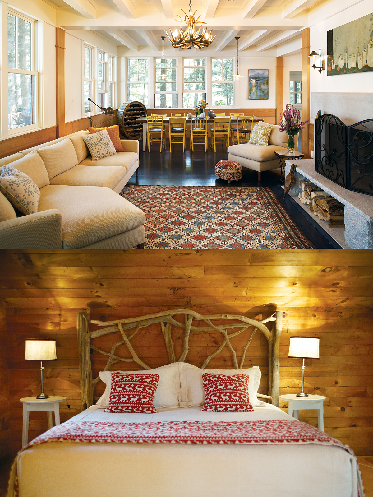
Above, an antler chandelier, modern sofa, and tribal rug lend an eclectic yet lodgelike look to the living room. Below, interior designer Kate Maloney incorporated camp-chic accents like this tree-branch headboard.
Lackey paid special attention to the finishing touches, looking for ways to add unusual elements. “The owner really liked a lot of variation in shapes and patterns,” he says. “And so we were looking for opportunities to do that throughout the house.” He applied a copper screen to the upper kitchen cabinets, which lends an interesting texture and — as an extra benefit — allows air flow so that dishes can be put away while still wet. He also added rustic, punched-tin fronts, created by Pennsylvania-based Country Accents, to the hallway cabinets. More punched tin was used in some downstairs lighting fixtures to create stunning sunburst light patterns on the walls.
For the game room, the owners wanted a place where everyone could hang out. The architects constructed a built-in booth around a table, custom-painted by Neil Clapp of Masterwork Painting and Restoration with a checkerboard for the kids; the adults, meanwhile, got their own hidden bar. Lackey and his team also lifted the dormers here, and added windows to help brighten the previously dreary space.
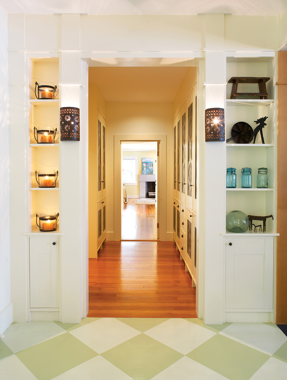
Punched-tin light fixtures and cabinetry in the adjacent hall give the home an Arts and Crafts feel.
In the main house, where dropped ceilings and dark-wood accents also weighed things down, Lackey opened up the main staircase and removed the drop ceilings. The addition of a skylight in that hallway, along with a few new windows overlooking the lake, makes a breathtaking difference.
“Before, you couldn’t see the water” from the main entrance, says Lackey. “Whenever we can create some feature to connect you to where you are, we try to do it.”
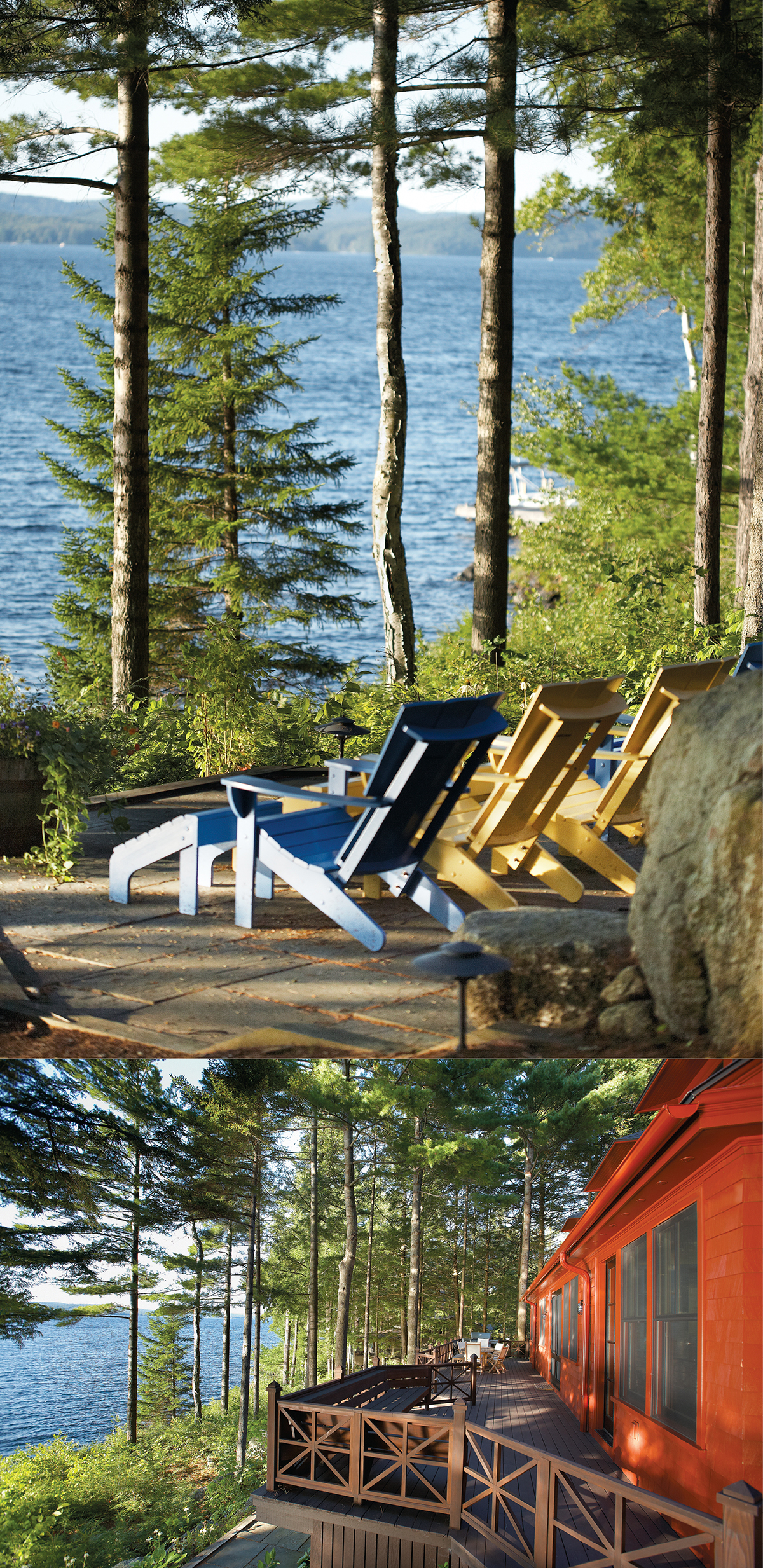
Above, guests are treated to gorgeous lake views both outside and in. Below, thanks to the architects’ choice of a red exterior, the getaway stands out in winter and summer alike.
While very little was done to the physical layout of the great room, it became one of Maloney’s favorite parts of the project. The all-season elements shine here: A built-in reading chair is covered with lush, whisper-blue chenille; navy-painted floors are intentionally worn in certain spots to reveal the freshly painted orange layer beneath; and a new doorway gives access to an existing sunroom.
“There was an eclectic nature to this project, which the owners let us take all the way,” says Maloney. One example is the living room, where a modern, casual couch is set against a patterned kilim area rug and topped with a very lodgelike accent: a deer-antler chandelier.
“It’s not what you normally see around Lake Sunapee,” she says of the more-rustic cottages that sit nearby. “But it fits.”
Architect Charles R. Myer and Partners, Cambridge Interiors Kate Maloney Interior Design, Cambridge.
Photographs by Kent Dayton
