Double Take
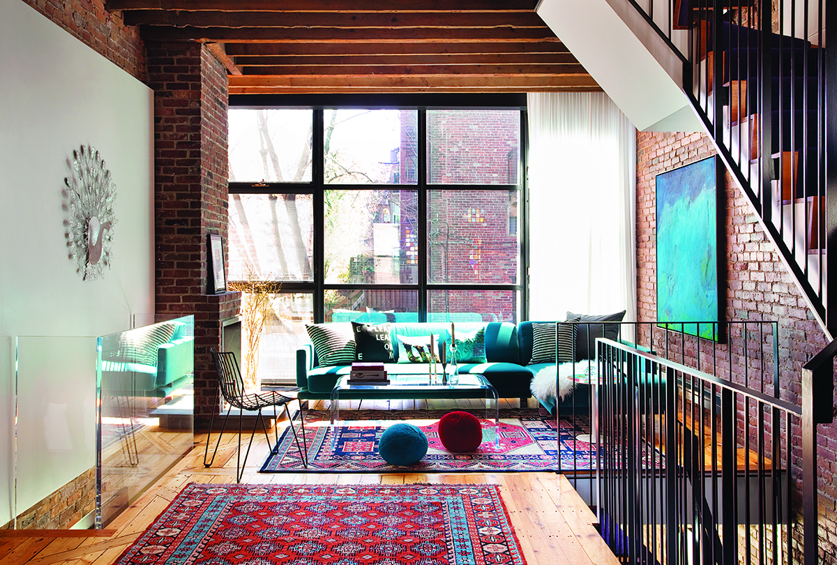
To fuse the homes, architecture-design team Stern McCafferty started by extending the first floor’s grid of windows; the rugs are from Yayla Tribal Rugs.
AMY AND ETHAN D’ABLEMONT BURNES HAVE a giant peace sign drawn on their dining room wall. It carries signatures, doodles, and well wishes from everyone who has visited the house in the past two years. The sign was created by an artist with the local nonprofit Artists for Humanity for a wine-and-peace-themed dinner party hosted by Amy, who sits on the board of advisers, and Ethan. The event was the first to be held in the couple’s newly stitched-together South End row houses.
Ethan, a native Bostonian, and Amy, who grew up in New York and Delaware, met while they were both working at the Boston Renaissance Charter School. The two are deeply immersed in the city’s educational system — he’s a principal at the Manning School in J.P.; she does pro bono programming and community-partnership development at the South End’s Joseph J. Hurley School. She also supports several arts-education groups, including AileyCamp Boston, a dance-focused day camp for middle schoolers.
Amy and Ethan share the home with their two children, Orly and Jasper, and are in the process of adopting a third, Ruth, from Ethiopia. So the dwelling must accommodate the many community events, school meetings, and kids’ parties they host, as well as offer a comfortable, uncluttered place for hanging out on weekends.
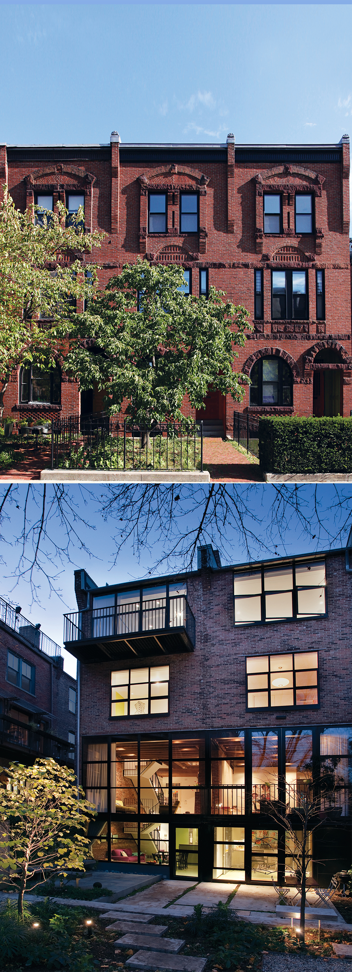
Above, the building’s original 1880s exterior conceals the homeowners’ contemporary flair. But from the back (below), this revitalized building looks like it could have been shipped over from Amsterdam.
When architect David Stern and interior designer Diane McCafferty, principals of Boston’s Stern McCafferty, started the renovation, their instructions from the homeowners were to make it feel “open and simple yet bright and joyful.”
The house, originally built in 1888, had already been through one major remodel; 11 years ago architect Andrew Guidry (who has since left Boston) opened up walls and added floor-to-ceiling windows overlooking the garden. But due to a construction problem, the back wall of the top two floors eventually cracked and collapsed, forcing the d’Ablemont Burneses to relocate for two years while the work was redone by the contractor Pomeroy & Co.
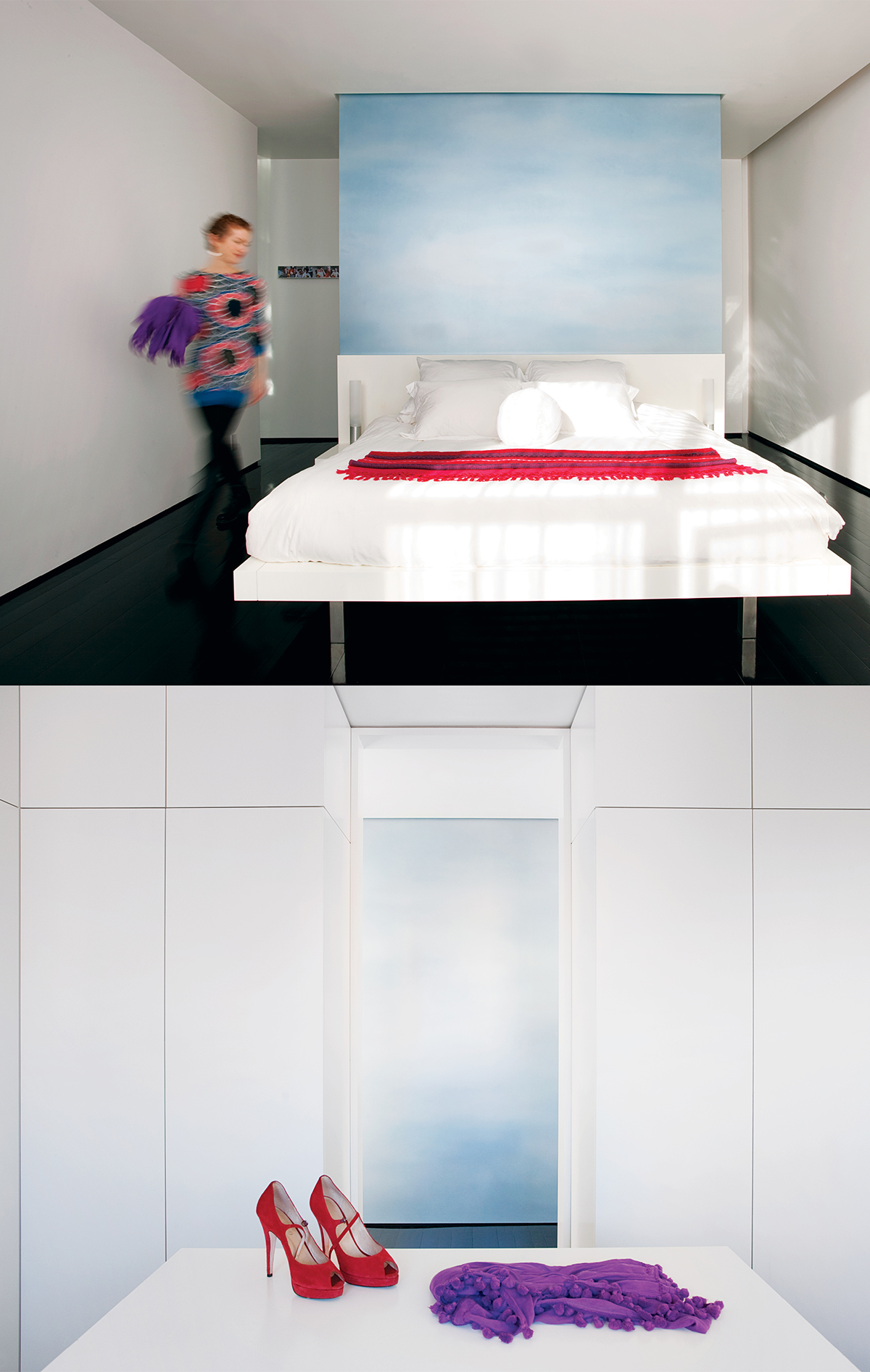
Above, Gedas Paskauskas Studios painted the wall behind the Diane McCafferty–designed bed in hazy blues. Below, architect David Stern’s design for the dressing room in the master suite hides everything with touch-spring doors.
Despite the drama, the homeowners got precisely the aesthetic they wanted: open and modern. So when the townhouse next door became available, they called on Stern McCafferty, which had done similar work in the neighborhood, to combine the two homes.
Stern gutted the second house and rebuilt it to match the original, adding a craft room to the garden level, a living and dining room to the first floor, an extra bedroom and a family room to the second, and a master suite to the top. “They were coming in on the heels of someone who had just created something beautiful, and they took it even further,” Amy says of the new design team.
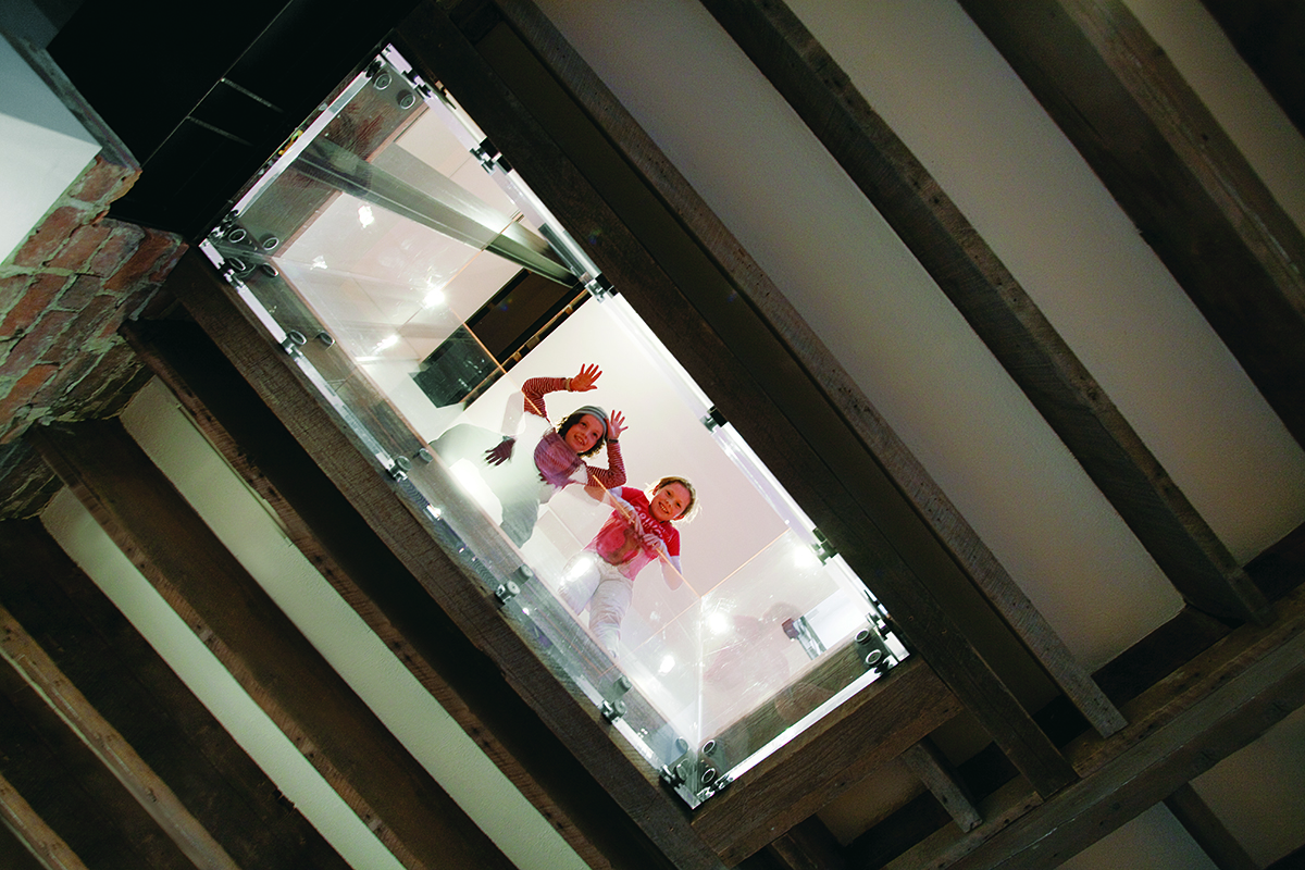
“We wanted to respect and celebrate the places where the two spaces meet,” says Stern. To do that, he set steel beams at every wall and ceiling intersection, and created spaces where portions of the original brick walls peek through. He also cut through the floors and surrounded the holes with acrylic railings to achieve exciting new sightlines from the garden level all the way to the third floor.
McCafferty, meanwhile, worked with Amy and Ethan to place furniture, fabrics, and colors throughout the home. She installed a lipstick-pink steel bench on the wall where the peace sign would eventually go, splashing the opposite wall with a grassy yellow. In the master suite, the painted wood floors got a high-lacquer sheen that reflects the hazy sky-blue wall behind the bed, also designed by McCafferty.
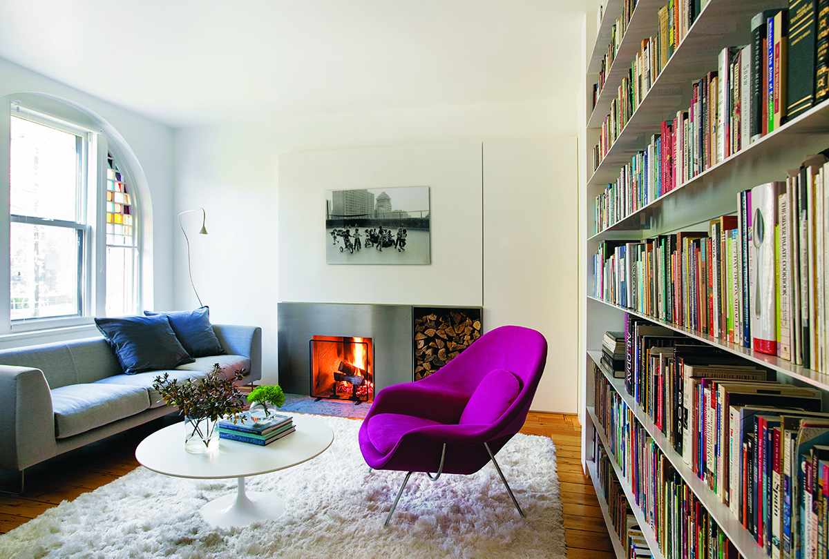
Sturdy custom metal bookshelves and a hidden wall of white cabinets with concealed hardware provide plenty of storage for the family.
“We wanted materials that were very simple, so that the people, art, and colors could stand out,” says Amy. Her own wardrobe reflects that sensibility (a whip of a green scarf against a vintage black athletic dress one day; a knee-length embroidered purple coat on another).
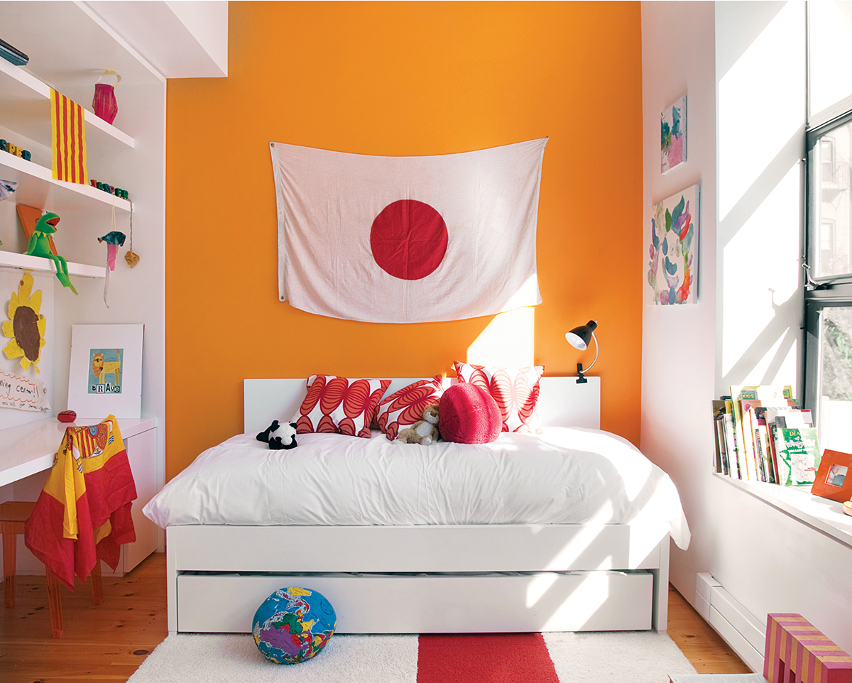
All three kids’ bedrooms boast one bold wall of color, a built-in desk and shelves, a custom trundle bed, and homemade artwork.
For the master suite, Stern says, the couple wanted a sanctuary with “empty spaces that were just about nothing.” To that end, Stern and McCafferty created a stark white dressing room full of cabinets that hide clothing and everyday items. The tub in the children’s bathroom, made of a thick glass sheet wedged between two tile walls, was inspired by a photo Amy found years ago. “Some people buy shoes and handbags; I buy international home magazines,” she says.
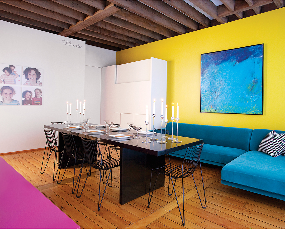
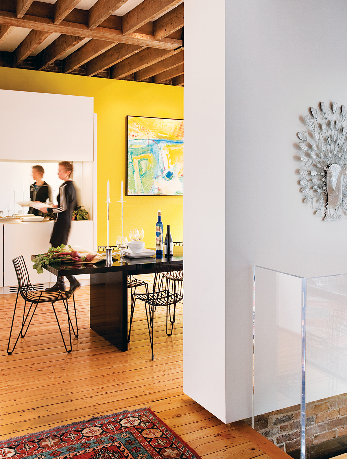
A vivid cantilevered-steel bench and brightly hued wall create a dynamic dining room; the table (which converts into a large console) was custom-designed by Diane McCafferty.
Now, after two years in their new space, Amy and Ethan are grateful for the opportunities their expanded home has afforded them — from hosting the perfect parties to giving their new daughter plenty of room to grow.
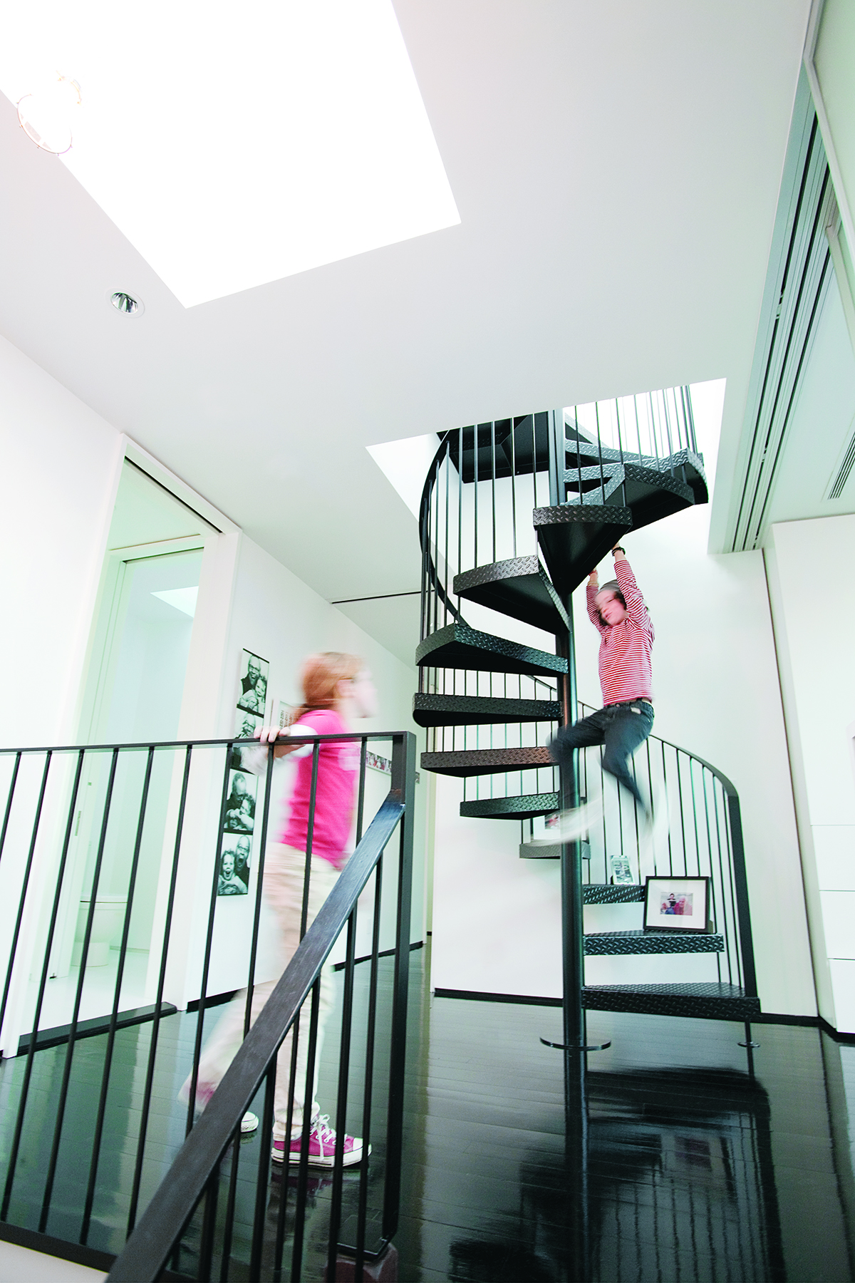
With its ebony stain and semigloss finish, the master suite’s wood floor reflects light beautifully. The roof is accessible by an industrial spiral staircase.
“We never, ever, ever intended to buy a place, do something to it, and then move out of the city. We’re in the South End as long as we can walk up these steps,” says Amy. “And even then, we’ll move our bedroom to the gardenlevel.”
Architecture and interiors: Stern McCafferty, Boston
Landscape Architecture: Jonathan Keep, Lincoln
Construction: Pomeroy & Co., Charlestown
All photographs by Eric Roth
