Wedding Invitations 101
 (Images courtesy of Hartford Prints)
Selecting and designing wedding invitations can be overwhelming for brides and grooms-to-be. Luckily, the sisters of Connecticut paper goods shop and studio Hartford Prints — Addy, Callie, and Rory Gale — agreed to demystify the process.
What is the ideal time to start planning your invitations?
We recommend reaching out to a stationer 10 months before your wedding date. This will give [everyone] plenty of wiggle room for revisions and additions during the design and printing process. Customarily, save the dates are mailed six to eight months out, with formal invitations to follow four to eight weeks before the big day.
Describe the invitation selection and design process.
The first step is an initial consultation, over coffee or wine — we’ll ask you about your style, tastes, and stories. If you aren’t local, and we cannot reach you by car, subway, train, bus, or Delorean, this consultation will be done via phone or video chat. After the meeting, we will send over an estimate that, upon its approval, will be followed by an invoice for a 50 percent non-refundable deposit, a contract, and a wedding timeline. This timeline is extremely helpful for our clients (and for us!), since we schedule everything from three built-in design revisions to the final delivery of your paper goods.
All throughout the design and printing process, we encourage our clients to come by our studio or drop us a line. Whether it’s to watch, learn, laugh, chat, snap some photos, or just to have an awesome time, our door and phone lines are always open. We’re three sisters, so our goal is to be like family by the end of the process.
What details can couples share to aid the creative process?
The most instrumental things a couple can share with us during the initial consultation are stories, from “how we met” to the engagement and beyond. We also love hearing about any and all details of the wedding that you have already decided on. Finally, we definitely need to know what your deal breakers are when it comes to design — what makes you wrinkle your nose. Pinterest is an indispensable tool for this, allowing us to build collaborative inspiration boards with our clients, who aren’t afraid to say, “Ugh, no!” or, “Ooh, yes!”

Should invitations match the theme and color scheme of the wedding?
Most couples pick 3-5 colors for their wedding palette, which gives us plenty of options for incorporating those colors into the invitation design. But, the invitation design does not have to match your wedding colors. A custom drawn map or decorative element might require colors that are not repeated in your flowers or “day of” details, which is totally fine.
What information is necessary to include on the invitations?
Some clients like to give us free range with their invitation wording, while others like a very traditional layout and content. It’s best to start thinking about this early, as it is going to shape the look and feel of the invitation suite. Beyond wording, essential invitation information includes:
- Who is inviting the guests
- The couple’s names
- The time, date, and location of the ceremony
- The expected attire (if any)
- The reception information
Additional details, like meal choices, RSVP dates, maps, and weekend events should be printed on separate cards (unless your stationer comes up with an awesome design for incorporating the information elsewhere).
What’s hot in invitation design?
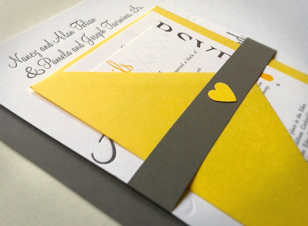
Vertical layout, belly bands, small tags, twine, hand-drawn calligraphy, vintage stamps, and decorative envelope liners are pretty ubiquitous in the world of paper right now. There are some under-the-radar trends popping up here and there, however, that we feel add a compelling twist. We’ve seen fabric used in invitation suites as a decorative element and to add texture. From wrapping invitations in scraps of geometric textiles to printing directly on fabric for a save the date, fabric incorporates a different medium into an invitation suite and adds a layer of intrigue.
Since we are a letterpress studio we also love the use of blind embossing in invitation design. This is when the paper is run through the press with no ink on the rollers, leaving a blind impression in the paper. Since letterpress, by nature, invokes a romantic nostalgia for an analog age, we like trends and color that add a contemporary feel. Techniques like edge painting and foil stamping, combined with bright color palettes, such as neons, and unexpected mediums, like black or kraft paper, work to create designs that are pretty cool.
Hartford Prints, 860-690-9108, hartfordprints.com.
Getting married? Start and end your wedding planning journey with Boston Weddings' guide to the best wedding vendors in the city.


