Before and After: A Somerville Kitchen Gets a Bright and Modern Update

Photos by Max Holiver Photography
Home is where the heart is. But the heart of the home? That’d be the kitchen—the place where everyone ends up gathering.
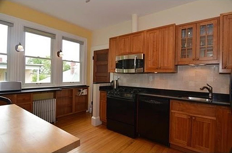
This never used to be the case for a Queen Anne Victorian in Somerville, until a recent renovation transformed its cramped kitchen into a breezy one. Built in 1894, with the last home improvements wrapping up in the ’70s and ’80s, the home in Spring Hill boasted gorgeous original details. The stained glass windows, high ceilings, and detailed wood floors gave a sense of grandeur—but then there was the kitchen.
According to Refined Renovations owner Jim Buhrer, the kitchen seemed to be the only part of the house that didn’t quite belong.
“[The home] was made back when the kitchen was really just for service and it was very tight,” Buhrer explains. “It was such a beautiful, grand home in Somerville—the area is just exploding—so we really wanted to make the kitchen work with the rest of the home.”
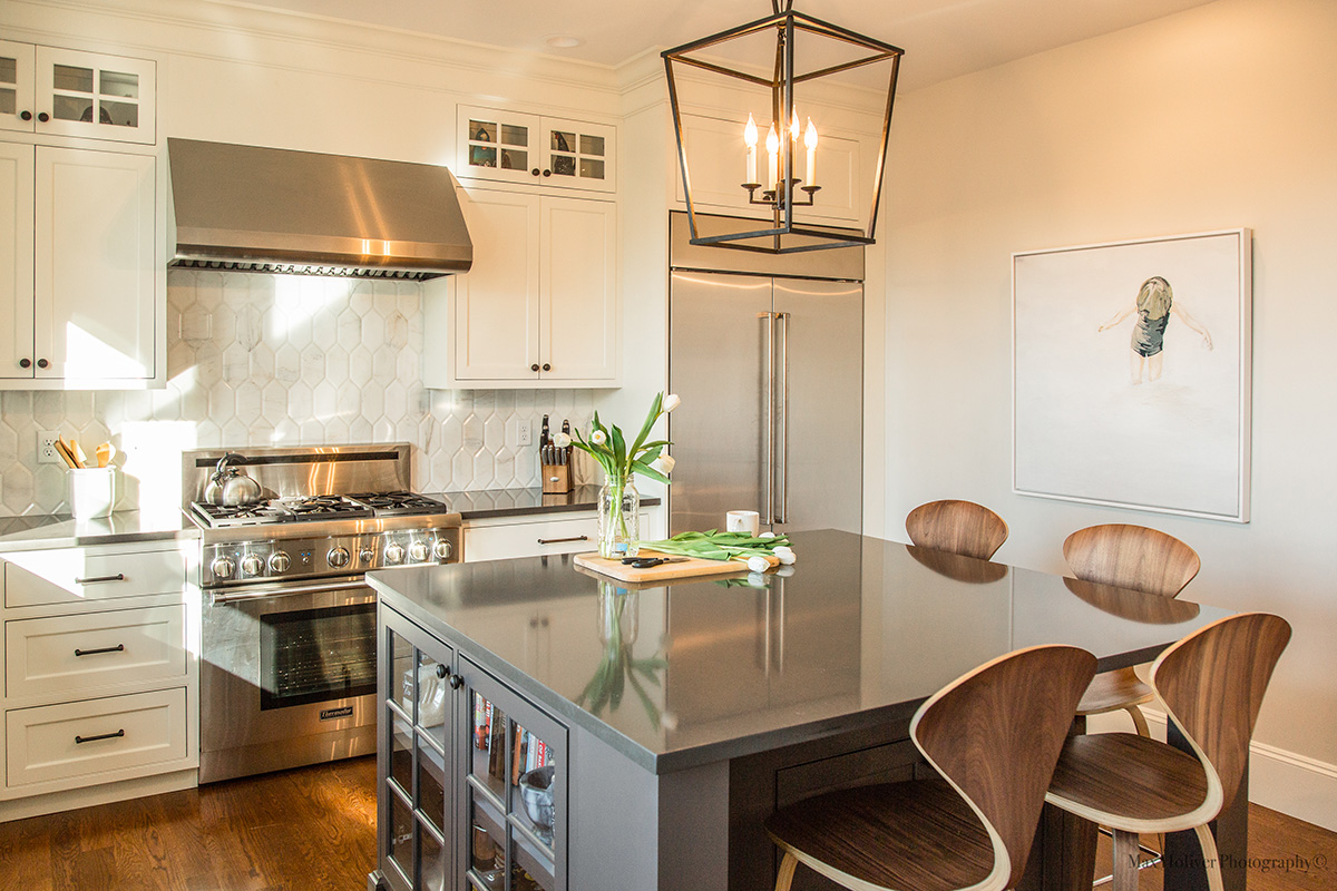
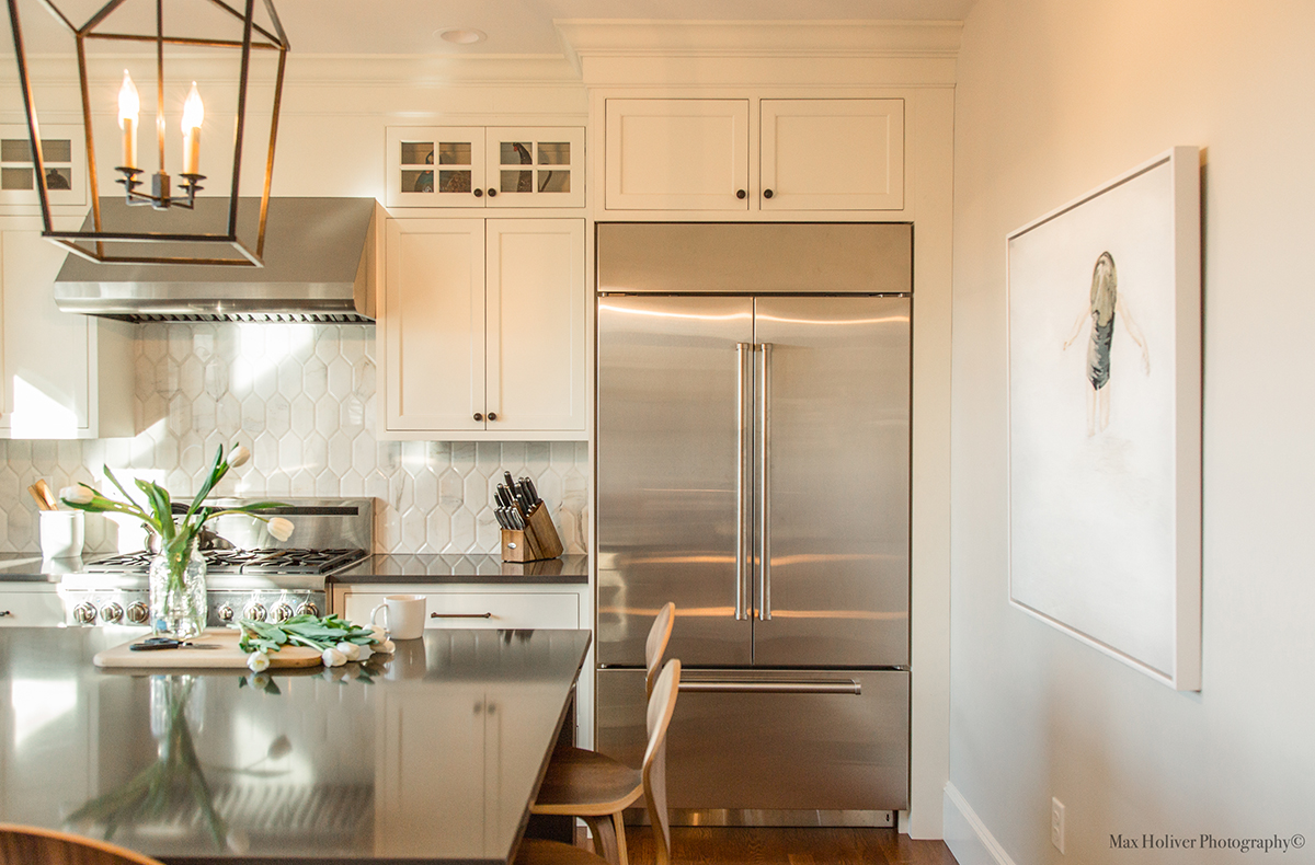
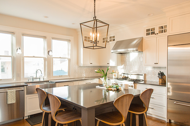
Buhrer and his team got to work on making the kitchen functional by repositioning the back wall. It gave the kitchen more space and transformed the room into a perfect square shape. He put in all new appliances and accented them with a modern lantern-style chandelier.
Soaring ceilings gave Buhrer the chance to work upward. “The ceiling heights were so tall that we really wanted to emphasize and take advantage of that, which is why we could use that big hood and the cabinets on the wall, and the large lantern to anchor the space,” he says.
He put in bright double-stack glass cabinets with a wrap-around crown, plus a stainless steel hood over the stove. According to Buhrer, the only true original design of the kitchen that remains is the trio of windows, which overlook the side yard. To balance the space, he centered a stainless steel farmhouse sink under the windows.
Buhrer also found it important to add an island in the kitchen to create more counter space. “We came in with a really large square island so people can come in and congregate into the kitchen, because everyone knows that that is where the parties go to,” Buhrer says.

The island measures nearly 7 feet by 7 feet, and creates a new flow of movement in the room. Because the space didn’t offer much square footage to begin with, Buhrer emphasizes it was important to utilize the space at hand. He explains the more counter space within a kitchen, the larger and more open it looks. Case in point: the island creates enough counter space so the host can entertain and cook there at the same time.
A few years ago, a party may never have made its way into the kitchen. But now, the former service kitchen is a dreamy cooking space that flows seamlessly with the rest of the house.
“When you walk in there now you have no idea where the kitchen is now,” Buhrer says. “It blends in.”


