These Three Recently Approved Seaport Towers Don’t Suck

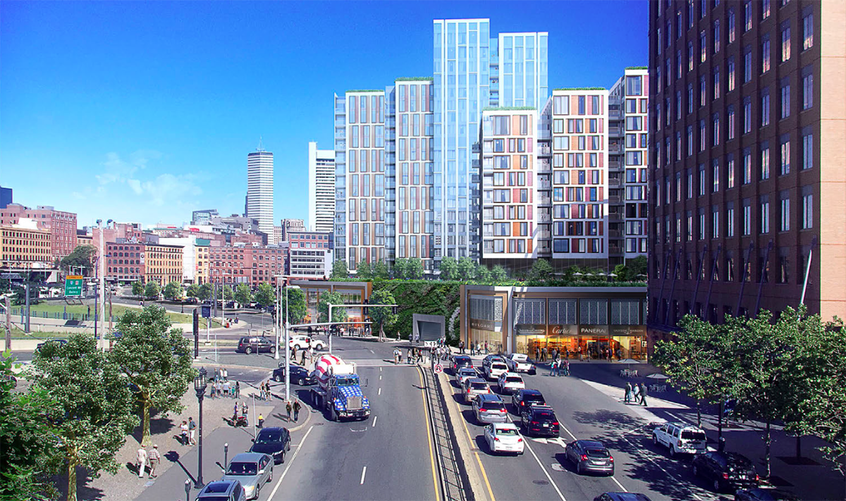
View of M1 & M2 parcells of Seaport Square project. Via Boston Redevelopment Authority
The designs for three 22-story residential buildings that comprise a $700 milllion chunk of the 22 acre, 6.3 million square foot Seaport Square development were approved by the Boston Civic Design Commission this week.
The three structures differ greatly from nearly all of the devlopment in the South Boston Seaport to date as they’re more than just glass cubes that resemble cargo crates unfit for human habitation. These structures are creative with their fenestration as well as their relation to the street and the public space they create. They are staggered in their height and inventive with their shape and most importantly, they do not resemble buildings one would find in an anti-septic suburban office park .
These new buildings are spread across a 3.5 acre space over two blocks between Seaport Bouelvard, Congress Street, B Street, and the East Service Road. In total, the new development will include 1.1 million square feet of new space with 750 residential units. In addition to the residential components, the project includes two below ground parking garages anad 125,000 square feet of street level retail.
The larger Seaport Square development is an ongoing project under the direction of Boston Global Investors.
Boston Global Investors CEO John B. Hynes III told The Boston Business Journal, that they’re looking at price point of $1,000-to-$2,000 per foot for the 400 for sale condos in the buildings. The other 350 will be market rate rental units.
“You’re paying a premium for quality of life and location, the design of the buildings and the quality of the construction. At the end of the day, unfortunately, these buildings are very expensive to build, and you’ve got to clear $1,000 a foot across the board to make these new projects work,” said Hynes.
When the Seaport district started receiving heavy criticism for its architecture, Hynes went back to the drawing board with the designs for the project.
The design of the three buildings is based on the Back Bay row houses.
“Their massing is the same, they’re the same height, they could in effect all be one building. Yet they all have nuances on the face that make that streetscape varied. There’s a richness to the exteriors and the individuality of these addresses. That was the premise that we embarked on,” said Hynes.


