The Interior Design of Shepard in Cambridge

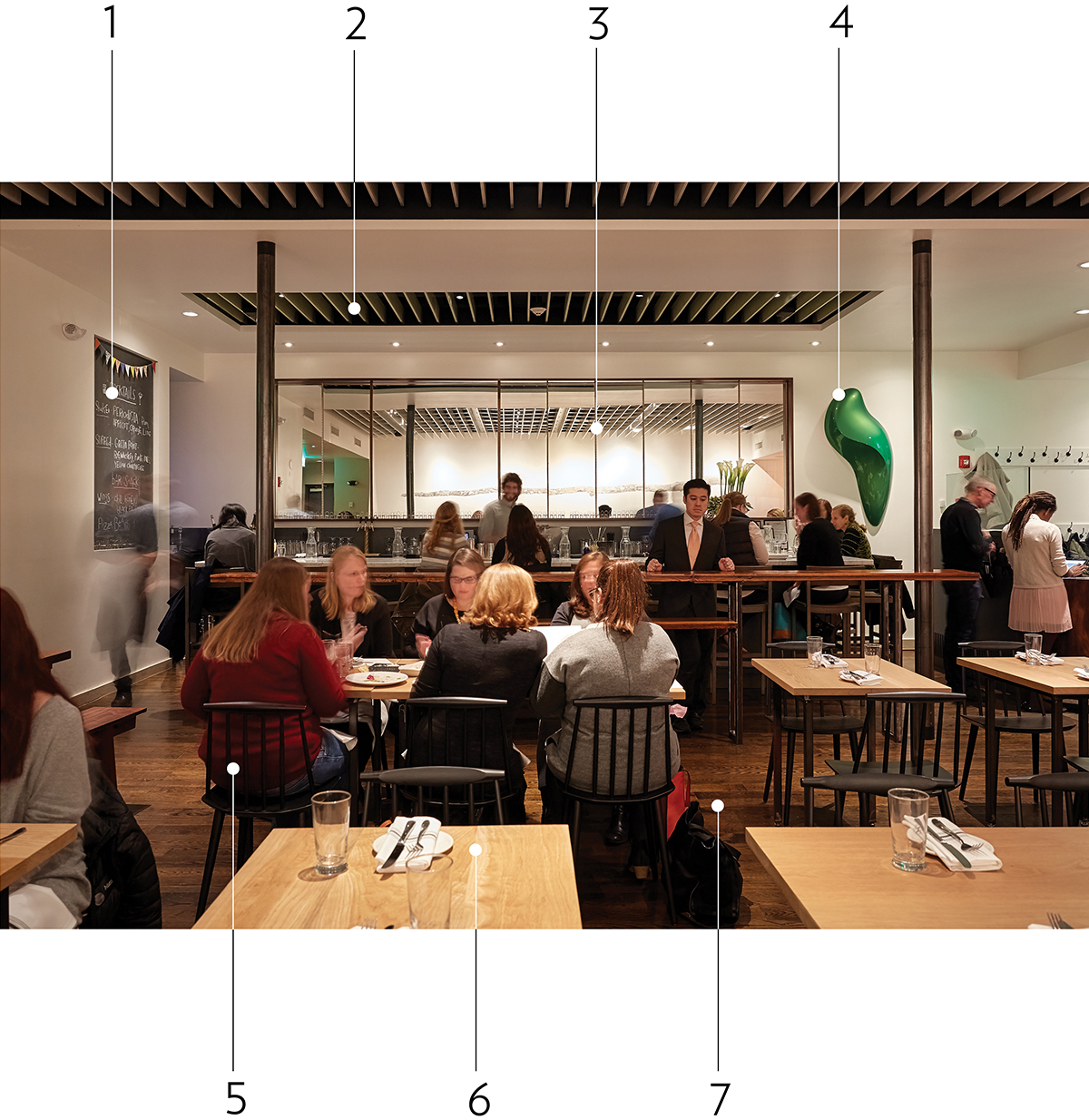
Photograph by Jim Brueckner
1. A chalkboard offers a wonderful way to communicate without saying a word.
2. Changing ceiling planes create distinct areas within larger spaces.
3. Mirrors can double the apparent size of the room and bounce in light.
4. Smaller spaces benefit from large accent art, like this bright green sculpture.
5. Windsor-esque chairs are all the rage in current Boston restaurant design.
6. Light, clear-coated wood tabletops make a fresh, clean impression.
7. Floors are lightening up, too. We haven’t seen hues like these in a while.
Read a review of Shepard by Corby Kummer from our January 2016 issue.


