Kelly Rogers Took the Kitchen in This 1930s Kit House from Drab to Delightful
Complete with a wallpapered dry bar and a wood-topped island.

Photo by Michael J Lee
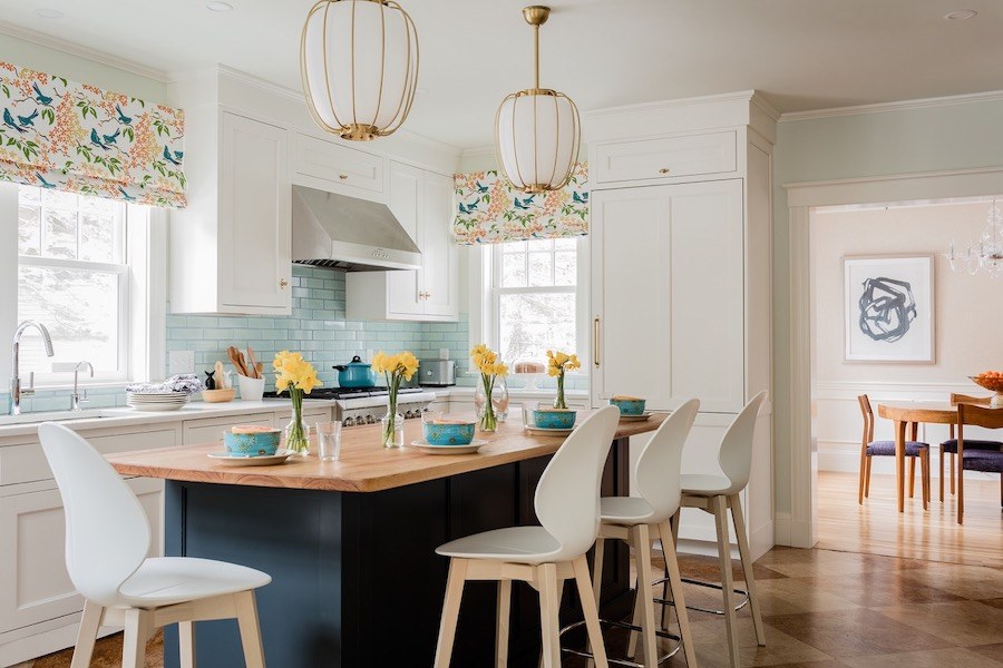
When a husband and wife with three kids began to feel like they were outgrowing their 1930s kit home in the northwest suburbs of Boston, it came time to decide whether to move to a new property or stay put and overhaul their space. They agreed on the latter option and reached out to Waban-based interior designer Kelly Rogers for help with the facelift. The ’70s-era kitchen was of particular concern. The meager 153-square-foot space featured laminate countertops, no backsplash, insufficient cabinetry, and no room for the family to eat together. “It was more separate from the rest of the house, like a service kitchen with the kind of footprint where you didn’t really want to be in there,” the designer explains. “But that’s not the way we live in our kitchens today—we do a lot of things in there.”
The couple’s main goal was to transform their kitchen into a more functional space, complete with an island and a bar area. To accomplish their vision, architect David Whitney designed a new floor plan that would expand the kitchen to 267 square feet. Their second objective was to add more color and personality to the space. “They’re a very energetic and fun family and they wanted the house to better reflect them,” Rogers says. “They wanted it to be less cookie cutter because [as a kit house] it was cookie cutter by definition.”

Photo by Michael J Lee

Photo by Michael J Lee
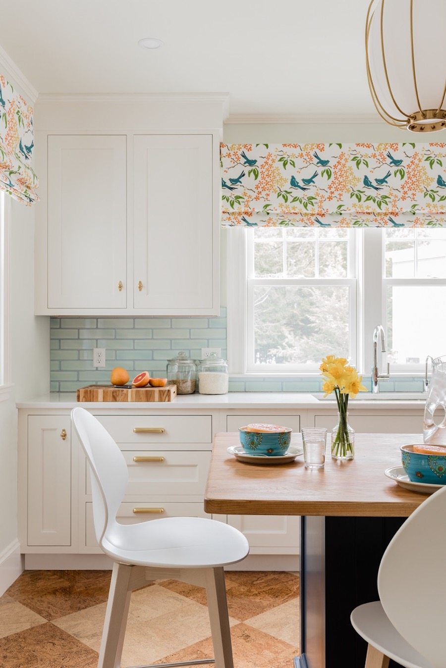
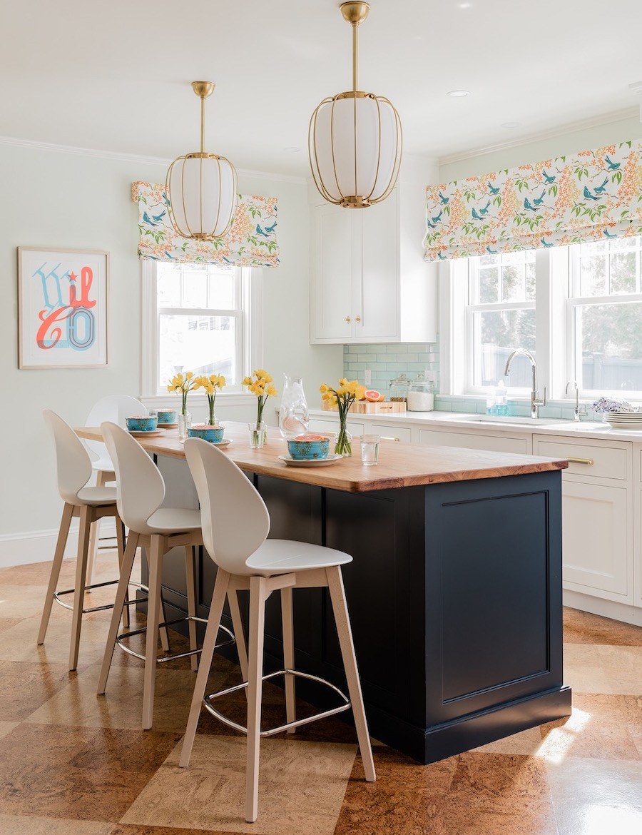
To achieve the distinctive style they craved, Rogers focused on filling the space with unexpected materials and intentional details. Rather than extending the hardwood featured in the rest of the house into the kitchen, the designer opted for cork flooring, which requires a similar amount of maintenance as hardwood at a comparable cost but adds a “high degree of design value,” she says. Rogers then chose a “Perla White” quartz countertop to pair with the Cabico cabinetry on the perimeter of the room, where the family would prep food; in the center of the room, she topped the cyan-hued island with an edge-grain hickory to add warmth to the space and make the island feel more like a dining table. Inspired by the light turquoise-blue paint color in the couple’s original kitchen, Rogers added other splashes of blue throughout the space, too. For the backsplash, for example, she used a pale blue-green handmade ceramic tile with an antiqued edge alongside Benjamin Moore’s “Dewdrop” paint on the walls. From seeing other rooms in the home, the designer also learned that the couple was fond of small doses of bright multicolored patterns and nature motifs, so she wanted to bring those elements into the kitchen as well. “The window treatments were the perfect opportunity,” Rogers says of the colorful roman shades she picked out from Galbraith & Paul. “[They] bring energy and cheer to the space without a jarring contrast.”

Photo by Michael J Lee
When it came to the bar area, the couple wanted the feature to be located within a recessed nook. “It’s part of the kitchen, but it has its own identity. So [I thought] ‘What can we do to make it more fun and interesting?’” Rogers explains. To visually connect the dry bar to the rest of the room, Rogers incorporated cabinets and hardware that matched that of the island. She also framed the bar with a patterned Anna French wallcovering that the designer says adds an element of texture to the space without overwhelming it. “This is where they’re going to gather with their friends,” Rogers says. “It’s a fun little destination for them to have.”
THE FACT FILE
Architect David Whitney Architect
Contractor Leo Arria Contracting
Interior Designer Kelly Rogers Interiors
Kitchen Designer Packard’s Kitchens
Backsplash TileBar
Bar Stools Calligaris
Cabinets Cabico
Countertops MSI
Faucet Newport Brass
Flooring DuroDesign
Hardware Rejuvenation
Paint Benjamin Moore
Pendants Hudson Valley Lighting
Shades Galbraith & Paul
Wallcovering Anna French


