This Home Builder Transformed Her 19th Century Cabin into a Dreamy Summer Retreat

Photo Credit: Shanna Snow
People are putting a premium on open space right now. But more space doesn’t have to mean bigger houses in cookie-cutter exurbs. With the right renovation, even a petite country home can offer room to live, work and spread out in luxury and natural beauty.
Case in point: home builder Sarah Lawson’s 19th century cabin in Plymouth was a mess when she found it, that cramped, murky and outdated kind of fixer-upper that exists in every small town or rural hideaway. But with the right care (across ten years), Lawson has created a bona fide lakeside stunner, with space to work and play, indoors and out. We sat down with Lawson to discuss how she managed to find the big, beautiful home under the humble little roof.
Seeing the Diamond in the Rough
Lawson first encountered the house as a child summering in Plymouth. When she would walk by the house, its pressure-treated front mostly obscured by leaning trees, a Doberman Pinscher would run out at her, barking.
“It was the kind of house that you tried to avoid walking by,” says Lawson. “But I’m always attracted to orphan houses that I can see could be, you know, made into something great. And this definitely had that.”
Lawson loved Plymouth, and eventually revisited the house as an adult when exploring properties in the area. She recognized, instantly, that the house was made with care.

“It was built by a carpenter for himself, and I could tell, because the casings are a little more ornate than you would expect for a house like this. He made a decision about that, and about having the floorboards go all the way across rooms. I can’t imagine that cost too much more back then, but it was still a more expensive choice,” says Lawson. “He put care into it and I could actually see it, which is pretty neat. It’s sort of the way carpenters and crafts people speak across the ages.”
The floors Lawson is referring to go the full length of the room, while the original doors featured casings carved by hand with a custom knife. She also noted the house’s beautiful granite foundation. With those features in mind, Lawson purchased the home and got started on the renovation.

Modernizing the Structure
The house was built in the late 19th century and still had the design quirks of that period. The first floor had three small parlors, one of which had been made into a massive bathroom after the popularization of indoor plumbing. An extra front door on the side of the house further disrupted and confused the first floor’s flow. The small kitchen was dominated by a large chimney.
“When you first walked in you had an impression of a very small, dark, rabbit-warren-like collection of rooms,” says Lawson. “Put a few walls in the wrong place, and it’s just disastrous. But you could see how nice it could be.”

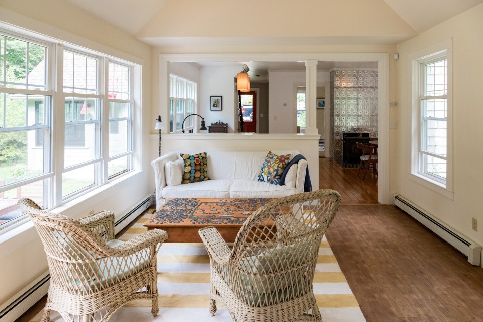
Slowly but surely, they got to work. To maximize space, they knocked down all the unnecessary walls, creating an open floor plan with room to breathe. They even converted the bathroom, which had been taking up about a third of the floor space, into more living space, moving the bathroom to a small addition on the side of the house. The wall between the kitchen and living room was then cut in half.
“We use all of the space now, with really beautiful sightlines,” says Lawson. “It’s a perfect downstairs living space.”

Nailing the Details
With the right flow, Lawson could emphasize the best assets of the house, something she describes as a cathartic moment.
“When I’m working on houses where I have design control, I don’t feel like I’m applying something to a house,” says Lawson. “I feel like I’m releasing the house to be what it should be.”
That meant going back to what Lawson originally loved about the house. They restored the original front door, cleared away the trees in front of the house, and put in a driveway and walkway leading up to the door. They filled in the second front door and replaced it with a window, to correct the flow into the house. They then replicated the original window and door casings throughout, using a custom-ordered knife.

“A house should have a face, and it should have one front door,” says Lawson. “We made it unambiguous. Here’s where you park, here’s the walkway, and here’s this great front door where you can look in and see all the way through the house. It’s giving people signals through design.”
From there, a clean color template for the walls and furnishings was chosen to emphasize the floor’s golden color, the star of the house according to Lawson. She also thought the fireplace and chimney were a great asset, but for the mantle to be up to code it would’ve been too high for the space. So, she created her own pressed tin wrap that made the fireplace a quaint, craft-inspired focal point.

Living It Up
While Lawson has another home in Boston, with social distancing measures in place, she’s found herself living and working at the Plymouth home more regularly, finding it a calming escape.
“When the design is good, it’s just a pleasure to be in, and a lot different than the experience of being in someplace that’s restrictive or problematic in some way,” Lawson says. “It’s relaxing, because it’s simple. I hope to have more of that in my life going forward, because it feels really great.”
This is a paid partnership between S+H Construction and Boston Magazine


