This Chestnut Hill Kitchen was Once a Living Room
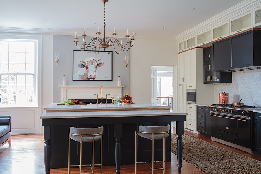
Overseen by architect Sam Kachmar, the renovation made use of the historical home's 10-foot-tall windows.

Original to the home, the brass chandelier above the new kitchen island was replated and rewired to accommodate LED bulbs. Photo by Michael J. Lee
It’s likely the original owners of this early-1900s estate in Chestnut Hill rarely stepped foot in the kitchen. After all, in homes like this, kitchens were the place where food was made—and later served in a formal dining room—by a staff behind closed doors. Not so for the current owners, who “wanted the kitchen [to be] part of the action,” says architect Sam Kachmar, whose firm was tasked with the revamp. Relocating it to the rear of the house in what was once a living room allowed them to take advantage of 10-foot-tall windows overlooking the grounds, while leaning into classic elements such as a working fireplace helped blend the new 460-square-foot space into the rest of the home—a priority for the team. “Dance with the girl who brung ya,” the architect jokes. “Otherwise you’re doing an abomination to the house itself.”

Photo by Michael J. Lee
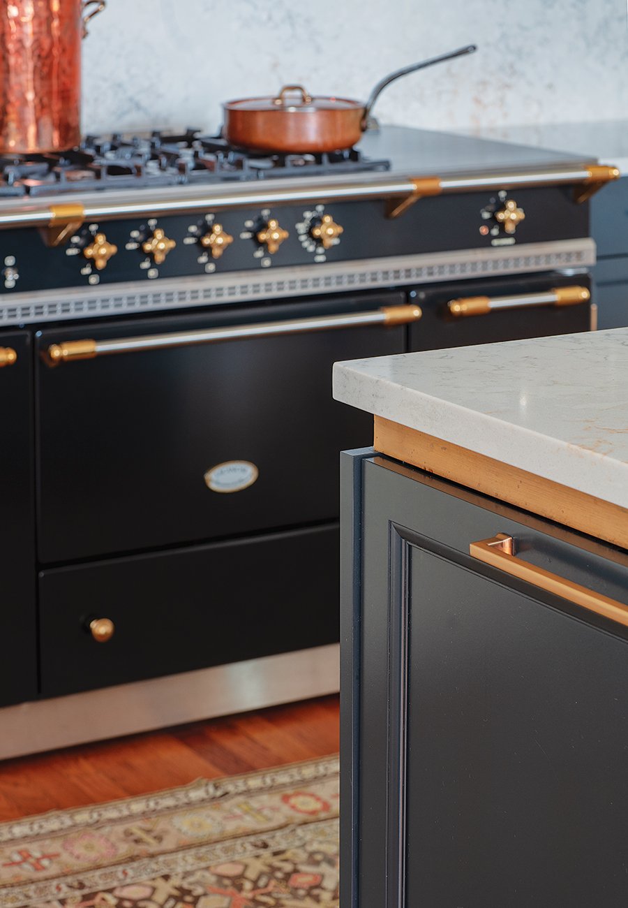
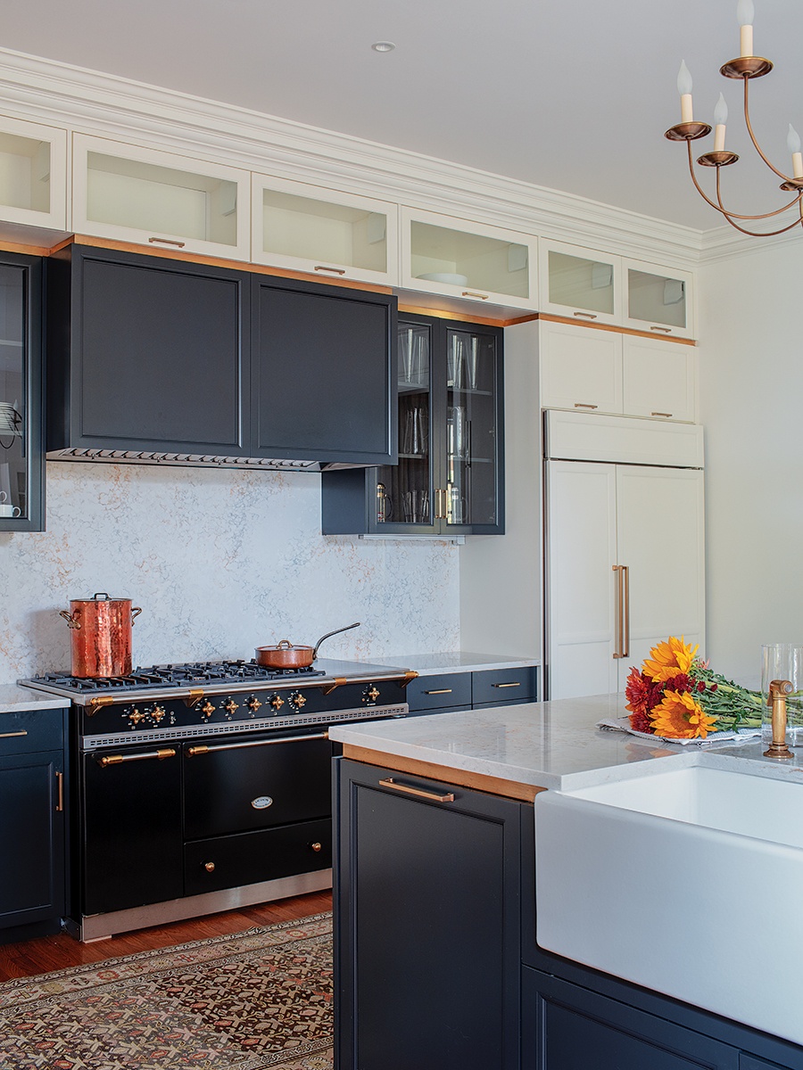
A strip of brass running along the top of the custom cabinets and around the island provides a sense of cohesion to the space.

Photo by Michael J. Lee
The stain-prone quartzite countertops and backsplash may have been a risky move, but that didn’t deter the owners. “It reminds me of Italian counters that have absorbed so much red wine over the course of 200 years,” Kachmar says. “It gives it character.”
Architect
Sam Kachmar Architects
Cabinetmaker
Crown Point Cabinetry
Contractor
FBN Construction
Designer Tricks
Access For All
Make your kitchen work for users of all ages and abilities with pointers from accessible-design specialist Josh Safdie, principal architect at Newton-based KMA.
LEVEL UP—AND DOWN
“Kitchen counters at different levels can accommodate a wider range of users,” Safdie says. “Install most of your kitchen counters at a standard 36-inch height, but include at least one section at 34 inches with knee space underneath for a seated chef, or even a portion at 30 inches that can double as a dining surface.”
GET IN SHAPE
You’ve heard the theory that the kitchen sink, oven, and fridge should be arranged to form a triangle? Make it a circle, Safdie advises. “A 60-inch-diameter circle of clear space provides sufficient room for anyone to turn around inside the working space of the kitchen,” he explains.
GO FOR CONTRAST
“Develop a color and material palette that allows work and dining surfaces to contrast distinctly from your floor finishes,” the architect says. “This will help ensure nobody misses the countertop when setting down the lasagna tray for a candlelit dinner.”
SHOP WISELY
“Select appliances and fixtures that are simple and intuitive to use,” Safdie suggests. “Opt for control panels with icons as well as text, and look for dials and levers that are operable with a closed fist.”
LIGHT IT UP
When it comes to lighting, more is definitely more. “[Include] task-specific lighting at each work area. Additionally, [increase] your general lighting and put it on one or more dimmer switches,” Safdie says. “This will ensure there is adequate light for any set of eyes.”
See the rest of this year’s featured kitchens here.


