This Charlestown Family Fixed up a Brittle 1840s Townhouse
With help from interior designer Jessica Stambaugh.
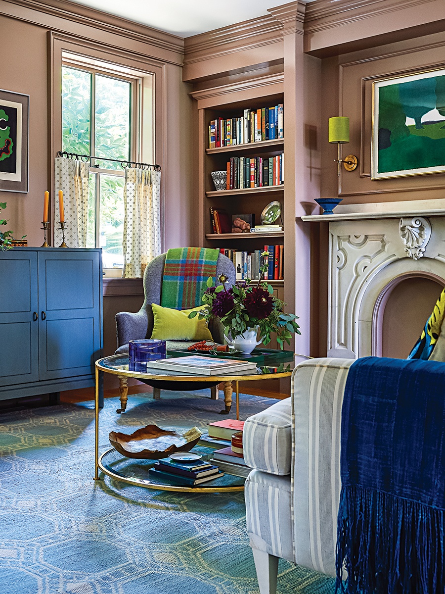
Photo by Sian Richards / Styling by Benjamin Reynaert
Johanna Hynes and her husband moved into their circa 1840s Charlestown townhouse in 2007, but they waited a decade to tackle the bulk of its issues. “A golden ray of western light penetrates the house; however, the bones felt brittle,” Hynes says, describing a cherished selling point and alluding to fixes the old home required. In the ensuing decade, the family grew from three to five, causing them to rethink the bedroom layouts. Furthermore, Hynes craved décor that reflected her lively household. So she called Jessica Stambaugh, of JS Interiors, whose former design partner had done the family’s first renovation a few years prior. Stambaugh—who also designed Hynes’s neighborhood wellness studio, Asana Charlestown, and the family’s Martha’s Vineyard beach house—has a sophisticated yet playful sensibility that meshed brilliantly with Hynes’s inclination for both order and originality. “Her use of color and pattern is cohesive yet unpredictable,” the homeowner says. “I would follow her to the end of the Earth.”
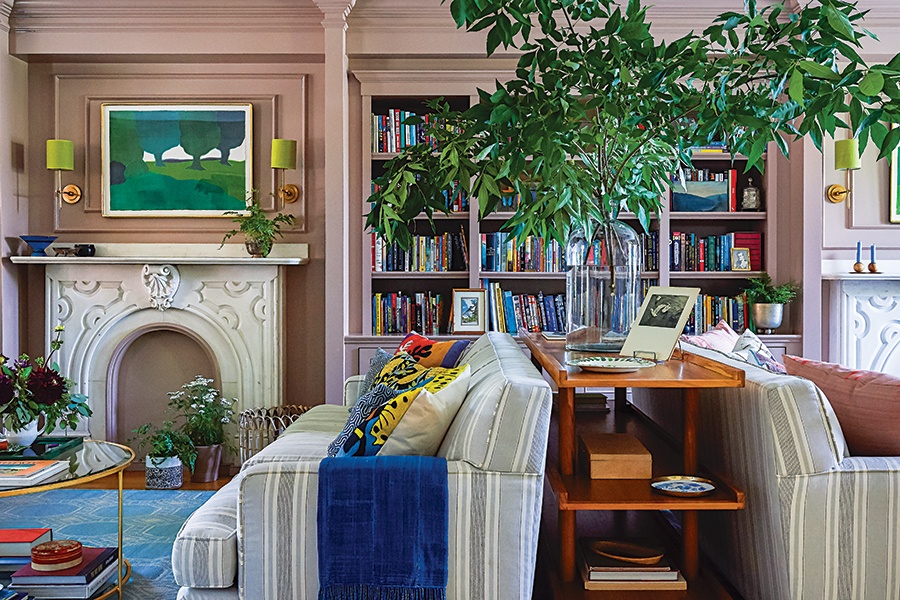
Photo by Sian Richards / Styling by Benjamin Reynaert
Split the Difference
In the combined living room and parlor, built-in bookshelves emphasize the expansive space and make it feel cohesive. “The enlarged bookcase highlights the room’s size and helps establish separate reading and entertainment areas,” says architect Brian Alim, who collaborated on the millwork around the twin marble mantels. Stambaugh reinforced the concept: Painting everything one color ties the rooms together, while back-to-back sofas allow each zone to function independently. “The symmetry along that wall inspired the furniture plan,” she says.
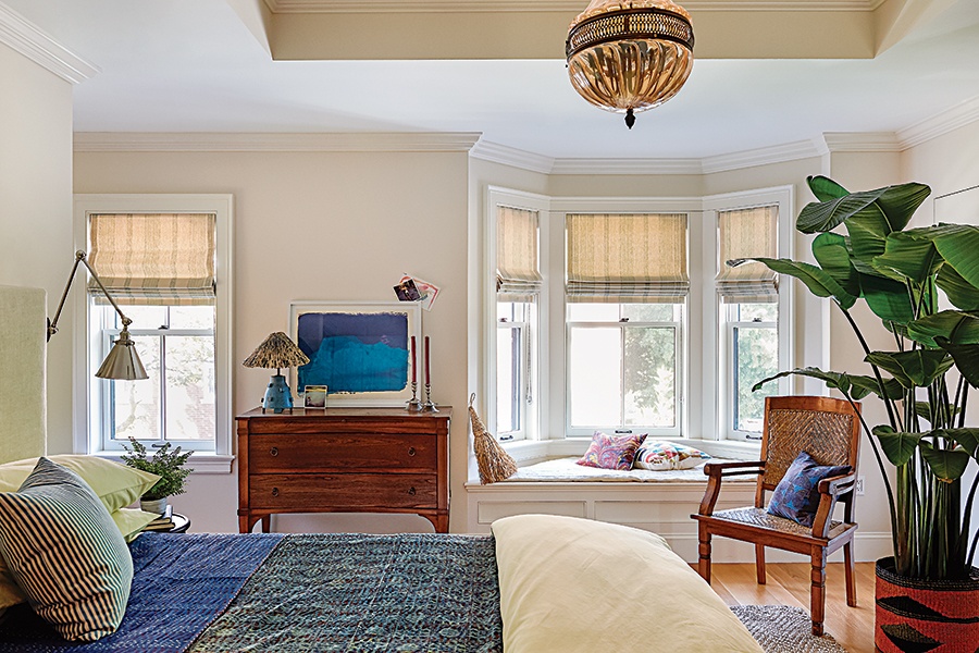
Photo by Sian Richards / Styling by Benjamin Reynaert
Retreat to the Suite
At Stambaugh’s suggestion, the couple created an expanded primary suite that feels like a sanctuary. Square footage gained by relocating the boys’ bedroom went into a new bath with a freestanding slipper tub and casement windows meant to mimic the feel of dreamy French doors in the Tuscan countryside. They also allocated space for a new dressing/meditation space with concealed closets. “Jib doors provide a clean canvas for the Pierre Frey wallpaper,” Stambaugh says. “The tropical motif makes it into a jewel box escape.”

Photo by Sian Richards / Styling by Benjamin Reynaert
Rekindle an Old Flame
Hynes had her heart set on lighting a fire in her bedroom. “Carrying wood up the stairs and getting lost in the glow of the flames appeals to me,” the homeowner says. The crew repaired the firebox, for which Stambaugh specified red brick in a herringbone pattern that extends to the hearth.
She also designed a simple mantel that disappears into the wall and offers a perch for displaying personal items. The wood stove—code dictated its small size—lets Hynes connect with nature and “nods to the romance of Old World New England,” Stambaugh says.
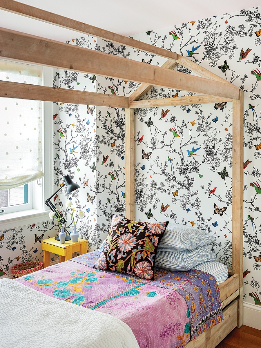
Photo by Sian Richards / Styling by Benjamin Reynaert
Reach for the Sky
“Filling a small space with something large conjures up an environment,” Stambaugh says, referring to the treehouse-like bed in the daughter’s room. Paired with Schumacher’s “Birds & Butterflies” wallcovering, the little room resembles an aviary. Hynes, who imagined an enchanting hideaway with a canopy bed, points out that the wall’s sprawling pattern accentuates the storybook situation. “It seems like I could wander in between the branches and butterflies and just keep going,” she says. “It’s like a portal to another place.”
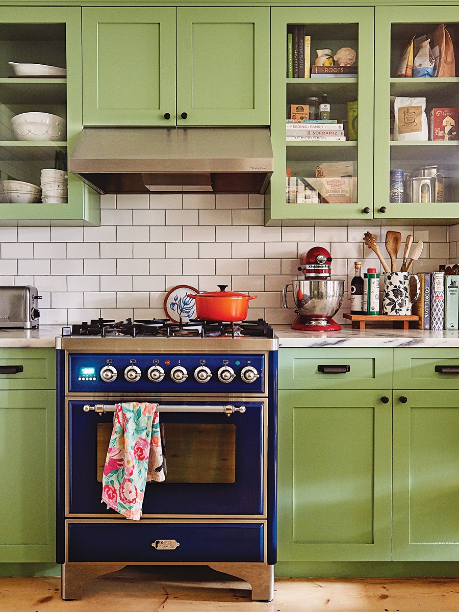
Photo by Sian Richards / Styling by Benjamin Reynaert

Photo by Sian Richards / Styling by Benjamin Reynaert
Captivate With Color
Five years after its initial renovation, the kitchen was ripe for a refresh. Since Hynes still adored the Cole & Son “Hummingbirds” wallcovering that reminded her of her stylish great-aunt, Stambaugh suggested painting the cabinets Farrow & Ball’s “Breakfast Room Green” to punch up the palette. “It’s a Kermit-the-Frog green that’s a surprise as you go down the stairs,” Hynes says. Stambaugh explains that saturated shades work well in rooms that don’t get a lot of natural light. “You can go brighter when a space is dark for a more vivid effect,” she says.
Architect
Brian Charles Alim
Contractor
C2MG Builders
Interior Designer
JS Interiors


