This Renovation Resulted in a Light and Function-Filled Home
A North Shore residence is revamped to include more usable space and ample opportunity to enjoy the views.

Photo by Greg Premru
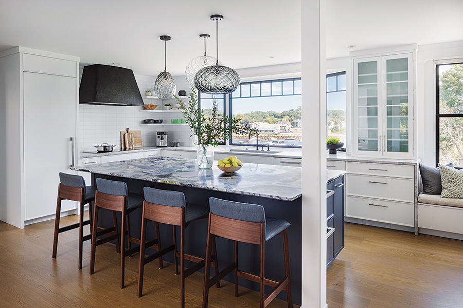
“Karen always wanted to get her hands on our kitchen,” laughs kitchen designer Karen Swanson’s client and longtime friend. She and her husband, now empty nesters, lived in their circa 1870s Manchester-by-the-Sea home for two decades before seriously considering Swanson’s ideas for reworking its disjointed plan. “They have the most beautiful views of the harbor, but there were literally no usable rooms that faced it,” Swanson says.
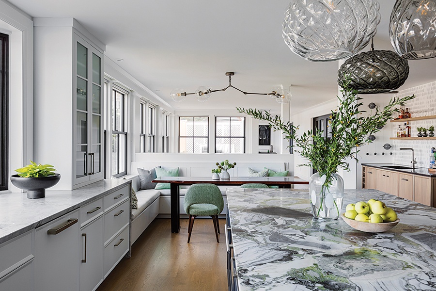
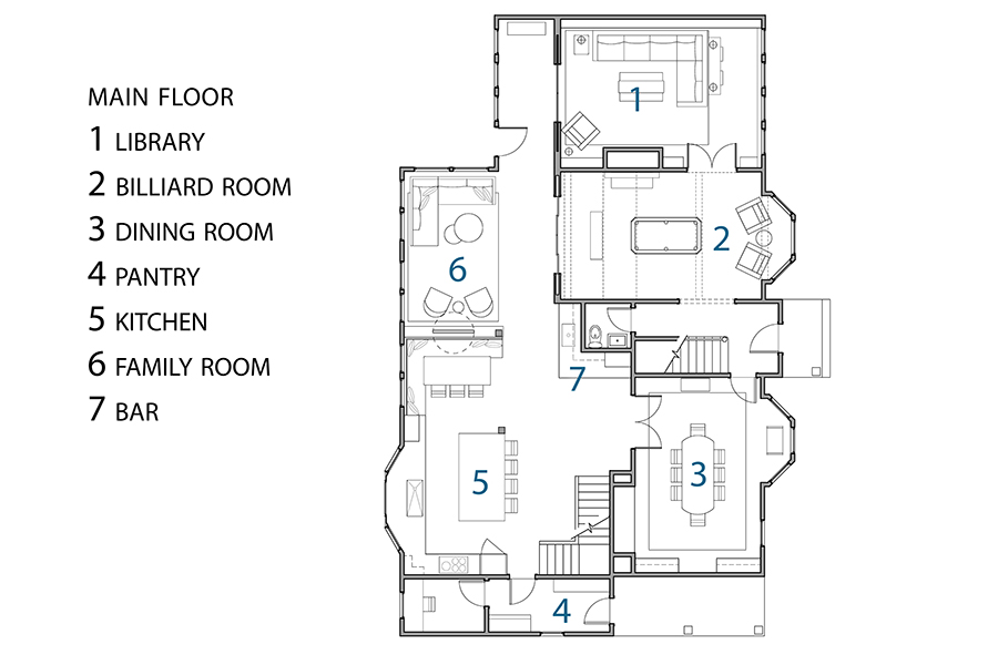
By removing walls between the kitchen, butler’s pantry, and extremely narrow sun porch, Swanson created a series of light- and function-filled spaces that sweep across the back of the house. Some fine-tuning improved the flow to surrounding rooms as well. Swanson introduced the couple to designers Jayme Kennerknecht and Courtney Dana to flesh out the finishes, fixtures, and furnishings. “We infused the interiors with a modern aesthetic that merges new and old elements in a cool, fun way,” Kennerknecht says.

Photo by Greg Premru
Build in a Bar
Seizing the central location of the old butler’s pantry, Swanson wrapped it in cabinetry packed with purpose. Eighteen-inch-wide doors hide a dishwasher and an ice machine on one side, where a Grohe faucet dispenses filtered water with bubbles or without. There’s traditional storage and a beverage fridge on the other side, along with a glass-fronted tower cabinet that rests upon the blackened steel countertop. “The bar keeps people out of the kitchen but keeps the person in the kitchen connected to their guests,” Swanson explains.
Let the Architecture Lead
Rather than regard the structural column between the breakfast nook and family room as an impediment, the team integrated it seamlessly into the plan—using it as a guide to divide the space with a half wall. “It was a natural placement for the room divider,” Kennerknecht says. With the push of a button, a 65-inch television rises out of the paneled divider. The screen can face the sectional in the family room or pivot 180 degrees to face the kitchen, where the homeowner often finds herself preparing meals solo.

Photo by Greg Premru
Embrace Entertainment
With the new floor plan established, the couple realized that their living room had become irrelevant. The solution? Turn it into a billiard room. The crisp lines of the California House pool table echo those of the black soapstone fireplace surround that Kennerknecht designed. “It flows right off the family room, banquette, and bar, so people can hang out or get a drink while others play pool,” the homeowner says.

Photo by Greg Premru
Meld Modern and Cherished Elements
To connect the airy spaces in the back with the more traditional rooms up front—particularly the formal dining room—the designers introduced furniture with clean lines, statement lighting, and unexpected pattern and color. The original carved door with leaded glass and the couple’s Old World dining table remain; the smoky tone of the room’s millwork enhances the European sensibility. “Where we broke the rules for blending new and old made for the special moments,” Dana observes.

Architect
Breuker Design
Builder
Filias Construction
Interior Designer
Kennerknecht Design Group
Kitchen Designer
New England Design Works


