How Wolf in Sheep Design Brought Cambridge Restaurant Moëca to Life
To create an inviting vibe for the Shepard Street spot, the interior architecture firm paid subtle homage to the sea.

Photo by Jared Kuzia
When the owners of Cambridge’s new seafood spot, Moëca, enlisted designers Alina Wolhardt and Jaz Bonnin of Wolf in Sheep Design to bring their vision for a cozy, neighborhood-y restaurant to life, the name (inspired by the Venetian-dialect word for green crab) hadn’t yet been decided. What they did know, however, was that they wanted the space to have the same warm, inviting vibe of its sister restaurant, Giulia—with an ocean-inspired twist.
It was a tall order. Before Wolhardt and Bonnin worked their magic, the space was stark, white, and entirely minimalist—a holdover from the previous restaurant that inhabited the Shepard Street spot. There was one upside, though. “It was an operational restaurant before, so it was more about putting their own flair on it and changing up the floor plan,” Wolhardt says. “We talked about doing an homage to the sea.”
With the shell of a restaurant as their template, they got to work. The light color palette was the first to go, replacing the white walls with a deep, moody blue from Portola Paints, which has a plaster-like finish that adds depth to the walls. Other existing elements were amplified, highlighted, and used as a starting ground. Case in point: The once-simple marble-topped bar is now a showstopper, clad in dark metal and backdropped by three wooden arches crafted by millworker Thom Scott. The mirrored back and uplit shelves make for a museum-worthy display. “We wanted to create a sort of focal point and make sure that the bar itself was celebrated,” Wolhardt says.

Photo by Jared Kuzia
Wolhardt and Bonnin then used the pair of steel poles in the middle of the space to their advantage, dividing the bar and the dining room with a wall of shelving anchored by storage on two ends and a blue leather-clad banquette. They matched the marble tabletops to the marble of the bar and retained the industrial, exposed-bulb lighting throughout.
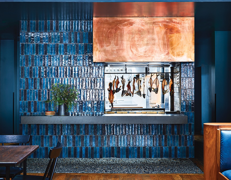
Opposite the front windows, the designers highlighted the copper-hooded fireplace with cool-hued tiles and embellished one large wall with an abstract vinyl wallcovering. “It has a lot of blues and greens, and it reminded me of the top of the ocean with the waves and seaweed,” Wolhardt says. “The restaurant is nautical, but in a very subtle way.”
First published in the print edition of Boston Home’s Summer 2023 issue, with the headline, “Into the Deep.”
Previously:
- Review: Moëca Largely Succeeds With Wildly Clever Seafood
- At Moëca, a Talented Cambridge Restaurant Team Takes on Seafood
- 15 New Full-Service Boston Restaurants We Loved in 2022


