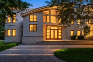
This Wellesley Tudor Is a Home Entertaining Dream
Married dentists Adela and Michael Tarshi tap architect Jacob Lilley to turn their stately brick family home into a fun-but-traditional social hub.
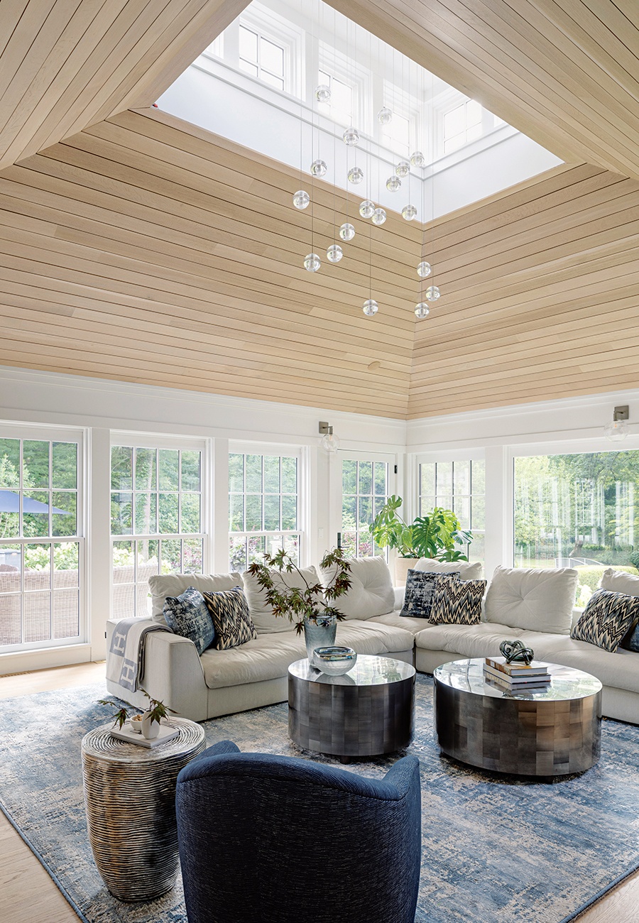
Photo by Greg Premru
When the time came for Adela and Michael Tarshi to renovate their stately brick Tudor home in Wellesley, the choice of professionals to work with seemed almost effortless.
- Inside Gretta Luxe’s Chic New Wellesley Location
- How Designer Amanda Reid Balanced Style and Family Function in a Wellesley Craftsman
- A Wellesley Cape Cod Home Transforms From Traditional to Modern
- Need Last-Minute Gifts? Five Greater Boston Shops with Same-Day Delivery
- Real Estate Showdown: A Back Bay Brownstone vs. a Suburban Tudor
Architect Jacob Lilley was already a family friend, and in fact, he and Michael had once discussed the need for a redo during a party on the premises. “Adela and I love to cook and entertain,” Tarshi says, but the house, as it then existed, “just didn’t have the functionality. It seemed very cut up; there wasn’t a grand space where everybody could congregate.”
So they embarked on what eventually became a total refresh of the residence. And right at the heart of the house now sits a triple-threat entertaining ensemble that jibes perfectly with the family’s penchant for socializing. Lilley devised a copper-topped family room pavilion that juts out into the backyard, with a reconfigured kitchen acting as a connector. The ell between the house and addition forms a two-sided court, which shelters an expansive double patio for outdoor dining and lounging.
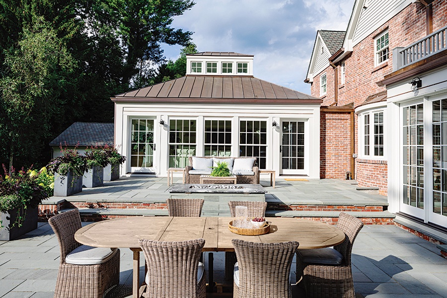
A two-level patio of bluestone pavers nestles into the back of the house, extending the stage of family life out into a sweeping backyard landscape by Tom Lee of TL Studio. / Photo by Greg Premru
Interior designer Rachel Reider was the next partner invited to join the collaboration. Her firm had recently done another home on the same street, and Adela had encountered more of her aesthetic magic during the previous year’s Wellesley Kitchen and Home Tour. “Jake helped them envision how they could redesign the space to work more for their lifestyle,” Reider says. “Where we really came in was from our hospitality experience: We have a very strong understanding of materials and finishes.”
The couple wanted their new spaces to feel “contemporary, upbeat, fun,” according to Tarshi, but not “super-modern and edgy,” especially in the context of an otherwise fairly traditional house. “Rachel helped us find the sweet spot,” Lilley says.
All the same, the Tarshis were definitely in favor of strong design statements. That much is immediately clear in the kitchen, whose dark-versus-pale vibe coalesced around the sexy black Lacanche stove that anchors one wall. Reider integrated its inky presence into a web of equally bold visual accents, including a custom range hood of blackened steel and brass and an over-island light fixture that resembles the massed crystals of some exotic mineral.
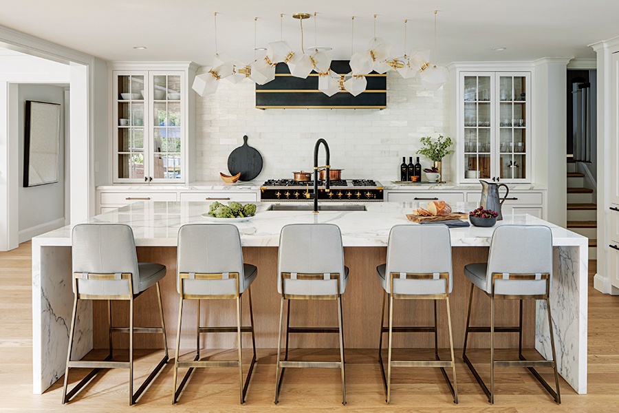
Notes of light and dark, traditional and modern, unite seamlessly in the party-ready kitchen. “We wanted to do something memorable, interesting, and unique,” says architect Jacob Lilley. / Photo by Greg Premru
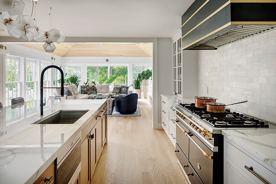
The homeowners are committed cooks, so the kitchen—in addition to serving as a link to the new family room—was exhaustively fine-tuned to maximize both beauty and usefulness. / Photo by Greg Premru
The family room pavilion, Tarshi says, “is the one part of the house where people come in and go, ‘Wow!’” Rightly so, given Lilley’s decision to sheathe the four angles of its hipped roof in white-oak paneling, forming a sumptuous frame around the elongated rectangular cupola that crowns the structure. “There is something wonderful about the light that cascades through and then the warm wood,” Lilley notes happily.
One more attention-getter is the TV wall. Washed in radiance from the facing banks of windows, a lower band of Zebrino marble comprises a low-key surround for the contemporary fireplace, while above it, a mother-of-pearl wallcovering from Innovations shimmers as a backdrop to open shelves. “It feels very dynamic,” Reider observes, “and it makes the wall feel very luxurious.”
On the outside, the new architecture pairs perfectly with the Tudor aspects of the home, recalling classic garden pavilions that grace many a British country manor. On the inside, the team’s work resulted in an improved flow, superior functionality, and several dashes of drama.
Michael Tarshi professes himself to be “extremely happy” with the outcome. Lilley says simply, “We’re quite proud of it.”
Architect
Jacob Lilley Architects
Interior Designer
Rachel Reider Interiors
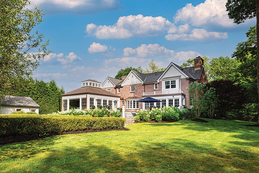
Matched rows of windows on the backyard additions, plus the pavilion’s stately proportions, lend the home a renewed feeling of harmony. / Photo by Greg Premru
First published in the print edition of Boston Home’s Summer 2023 issue, with the headline, “Geared for Gathering.”


