Joint Effort
Two savvy design firms strive to transform an 1840s Greek Revival into a 21st-century abode.
Photograph by Jared Kuzia
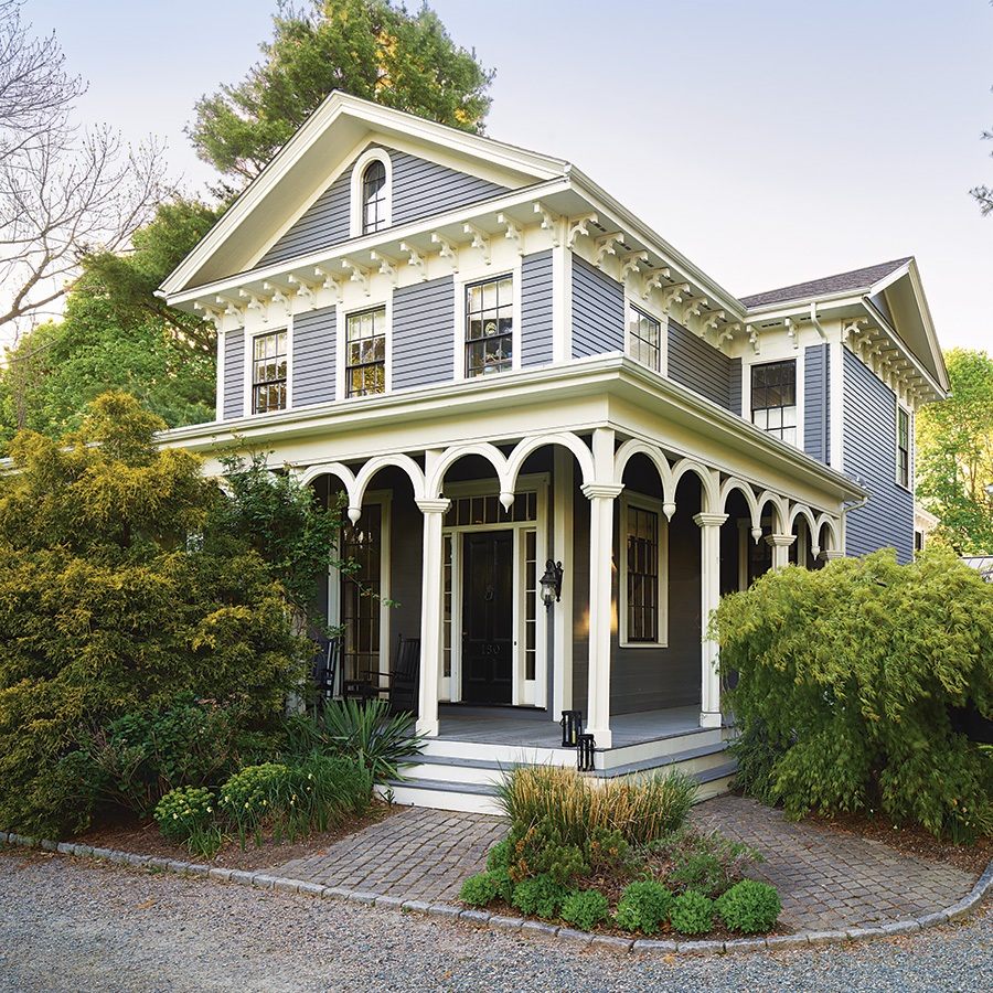
Bringing a historic home into the modern era is no easy endeavor, especially when you want all the design elements to have a seamless flow that doesn’t feel forced. But for the evolution of an 1840s Greek Revival in Milton, the owners enlisted two Boston-area firms—Helios Design Group (HDG) and Twelve Chairs Interiors—which were up to the task. Through a blend of artwork, finishes, furnishings, and modern space planning, a contemporary style was achieved that simultaneously honors the house’s history.
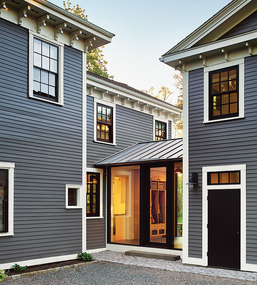
Helios Design Group conceived a new barn and a connection to the residence (including a mudroom) and renovated the kitchen and bathrooms. “Our firm had done some extensive interior renovations for the previous owners of this house, and that was a lot of fun,” Carol Marsh, AIA, principal at HDG, reveals. “Then that couple moved, and the new owners—a young family with two kids—were connected to us by a Realtor.”
Meanwhile, for the dining room, entry, family room, and front parlor, Twelve Chairs Interiors took the lead. “This couple bought the home with the intention of restoring and updating it. That was something important to them when they were house hunting,” Miggy Mason, lead designer at Twelve Chairs Interiors, says. “They wanted to bring it back to its glory—but put their own stamp on it.”
Photograph by Jared Kuzia
OUT WITH THE OLD…
“The clients’ first inclination was to keep the barn, but it had decayed beyond that point. So we rebuilt it and made it a little bit larger, but very much in keeping with the original,” Marsh says. “We pulled it a little closer to the house and then added that mudroom connector. It was always meant to be an enclosed space, but originally, in our early designs, we had it as a bit of a colonnade. Then we all got really excited about having it be dematerialized, and what we could design there that would be as minimal as possible.” The result is a glass-enclosed connection that houses the mudroom with custom cubbies and links the renovated barn to the new kitchen.
Photograph by Joyelle West
PARLOR TRICK
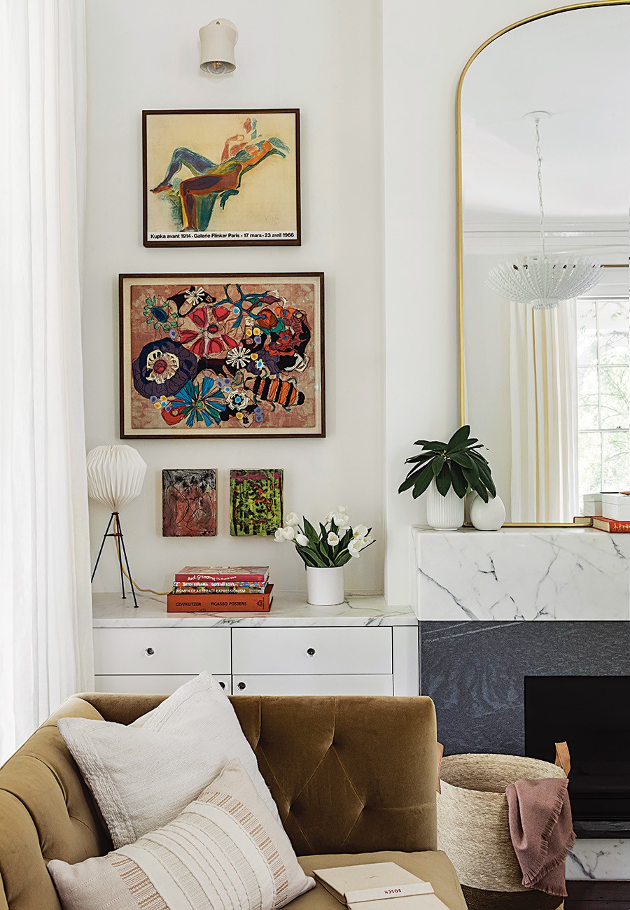
The wife has a fine arts background, and her mother is an artist, so there were several beautiful pieces—along with cool antiques from the husband’s family—to incorporate throughout the home. “We took an inventory of what she had and were very calculated about grouping where things could live together, what rooms would work best, and the scale,” Mason says. “I think that it makes it feel more collected and authentic to the client and adds a layer that’s hard to achieve otherwise. It gave us a leg up having a great collection to pull from.” The parlor is a prime example where vintage art seamlessly combines with a range of colors and textures to evoke a layered and collected feel throughout the space. Fabrics and finishes define the room as both formal and family-friendly, including an Élitis jute rug, stain-resistant sofas from Cisco Brothers (mustard velvet) and Lawson Fenning (white), and the concrete coffee table.
Photograph by Jared Kuzia
KITCHEN POSSIBLE
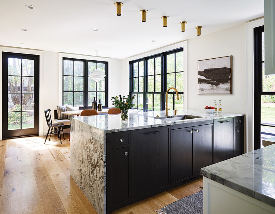
Some of the most remarkable qualities of the house include its high ceilings. “I think the windows in the front part of the house are taller than eight feet. The clients wanted the space to reflect that—particularly from the outside,” Marsh explains. “We weren’t really looking at it in a modernist direction, but their own aesthetic included loving some modern, clean lines and a lot of openness.” Because the kitchen is built in what had been an addition to the house, the team gutted that space and put in eight-foot-high floor-to-ceiling windows. Also featured are contrasting elements such as a wall of white cabinets surrounding the range, black cabinetry on the island, a built-in banquette anchoring one end of the room, unlacquered brass light fixtures to complement the brass faucet, and crystal and black hardware for visual appeal with the help of HDG’s interior design lead Ariel Roth.
Photograph by Joyelle West
ALL IN THE FAMILY
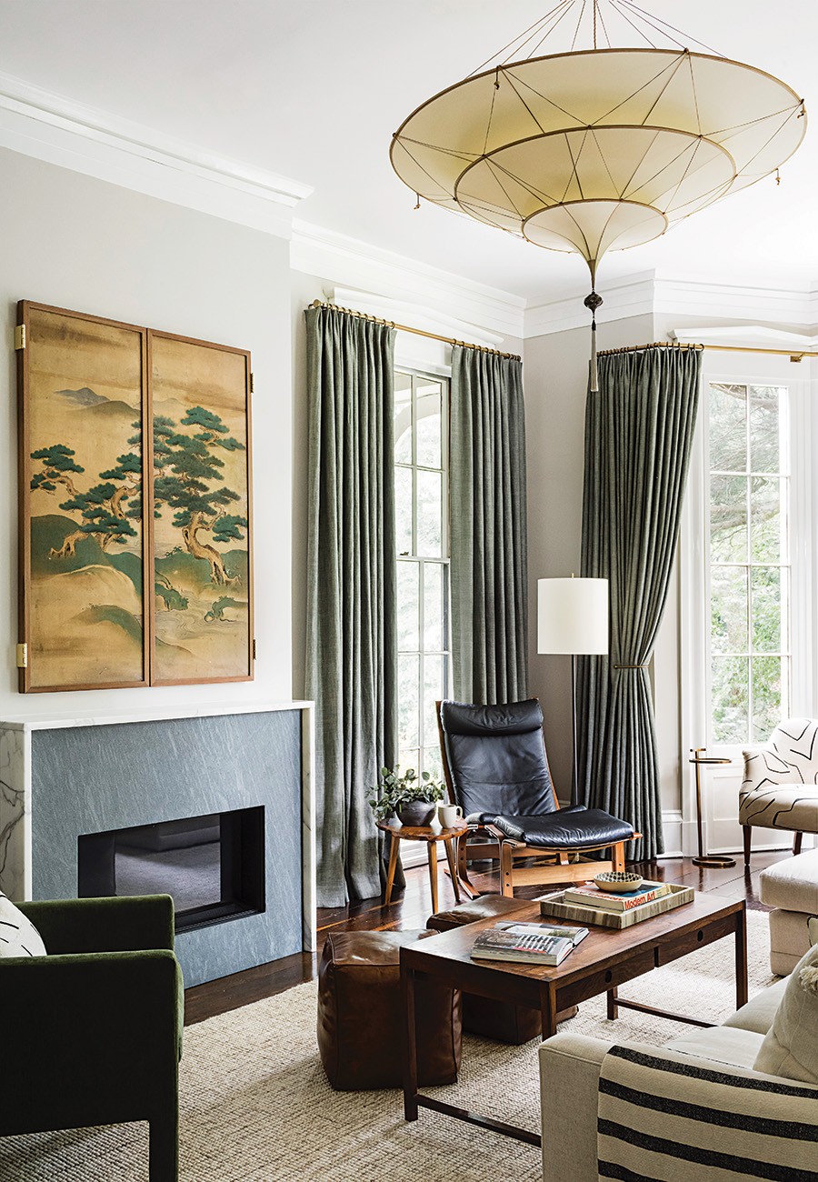
The space at the front of the home was originally the family room, and the parlor was further back, but Mason suggested swapping the areas. “We felt having the more formal room in the front of the house to receive guests felt right,” she says. “Then, as you move back into the heart of the home, it’s a bit more private, and the room is larger. The majority of the time, it’s going to be this family of four, so we wanted them to be able to spread out.” The enhanced space now includes a small nook with a custom Cisco Brothers settee in Kelly Wearstler fabric and furnishings from various eras, including a live-edge tripod table from Reside. It also features an 18th-century Japanese Kano School screen used to cover up the television, which came from an antique shop in California. It was shipped here, taken apart, and reassembled by the team at Jameson and Thompson Picture Framers.
Architect
Helios Design Group
Builder
Scorpion Builders
Interior Designer
Twelve Chairs Interiors

Photograph by Joyelle West
First published in the print edition of Boston Home’s Fall 2023 issue.

