Behind the Design: Oat's Inspiration Boards for Island Creek Oyster Bar, Saloon
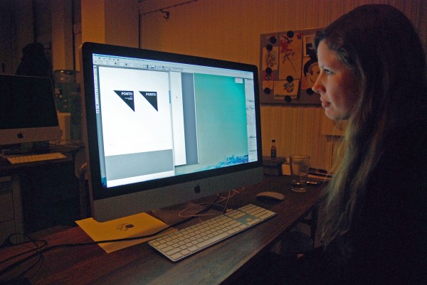 Jennifer Lucey-Brzoza, Oat’s Creative Director, at work at her Somerville office — on her computer are unused logos for pizza haven Posto, one of her clients. All photos by Charlotte Wilder.
The offices of Oat, the design firm that Jennifer Lucey-Brzoza and Rory Keohane own together, resembles a fine piece of unused stationary: the space, which was once a barber shop, is mostly white, and the only furniture is a window seat and evenly placed desks. It’s the blank slate in which Lucey-Brzoza and her team brand many of the top restaurants in Boston.
Some of Oat’s many clients include Island Creek Oyster Bar, Posto, Saloon, Trina’s Starlight Lounge, and Bondir. The design process begins with a meeting between the restaurant owners and Lucey-Brzoza, where they discuss the overall concept. “Most restaurants have a strong sense of the food that they’re going to be serving, and of the aesthetic they want. It’s about drawing all of that out of them so we’ve got something to go on,” Lucey-Brzoza says. She also has restaurateurs fill out a five-page questionnaire, in which they relay what they love and hate in restaurant design, and tell her their specific ideas they have for their space.
From the initial meeting and questionnaire, Lucey-Brzoza often creates inspiration boards, which are collections of images that she thinks reflects the aesthetic the owner wants. “I make the boards to be sure we’re all on the same page about the vibe. The inspiration can be anything,” she says. She sources images and objects at flea markets and vintage shops, and then scans them and lays them out in Adobe InDesign. “It just gives people something to react to visually,” she says.
Ahead, check out the detailed inspiration boards for Island Creek and Davis Square newcomer Saloon. Check back next week for drafts of logos that didn’t end up getting making the final cut for some of the hottest restaurants in Boston.
Island Creek Oyster Bar:
 “The inspiration can be anything,” Lucey-Brzoza says. “Here’s tent canvas.”
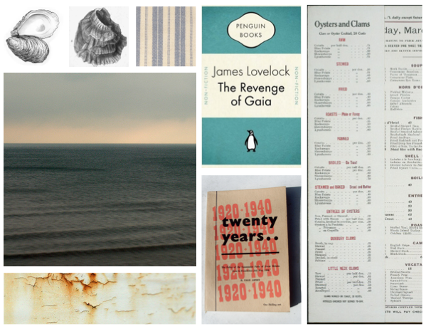 “The Island Creek inspirations were all about nautical New England history; the aesthetic of fishing and shipping,” Lucey-Brzoza says.
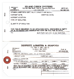 Oyster Tickets served as inspiration for ICOB’s business cards.
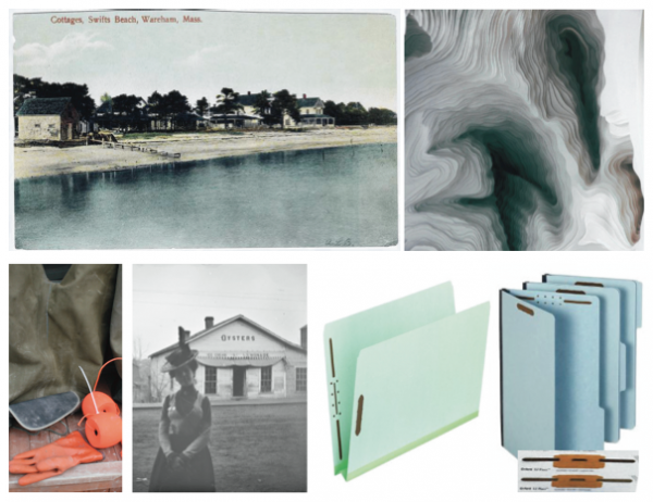 Since the Island Creek Oyster Bar owners also own Island Creek Oysters, all of the objects were informed by the seaside Duxbury farm’s aesthetic.
The final products: stationary, business cards, and menus. Lucey-Brzoza was excited to work with the bright orange color, which she says was inspired by orange twine.
Saloon:
 Saloon, a new pre-Prohibition-style tavern, got an inspiration board as well. “I wasn’t sure where those guys were in terms of design,” Lucey-Brzoza says. “The word ‘saloon’ comes with a whole set of connotations; the Wild West and all of that. The owners wanted it to be more New York City, more like a men’s club.”
 Lucey-Brzoza said that she went with the idea of “bowties and watch fobs, a more sophisticated kind of thing. It was important to steer clear of the cowboy look.” She says she makes the boards to be sure she and the owners are “on the same page and they know where I’m headed.”
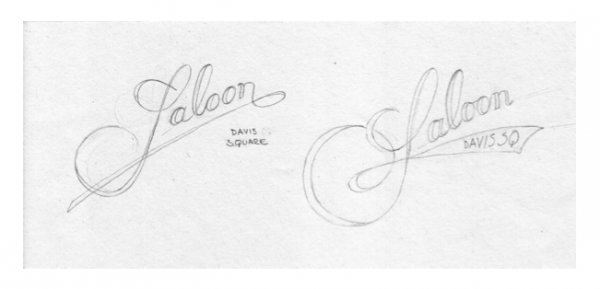 Lucey-Brzoza hand-sketched several logos, scanned them in, and then refined them on the computer. The owners went with a cursive script, which was Lucey-Brzoza’s favorite. “The owners really trusted us,” she says.
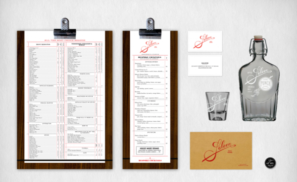
Here’s the final logo:
“It feels like a men’s clothing line label,” Lucey-Brzoza says. “It’s very gentlemanly, which I think was appropriate for the aesthetic they were going for.”
Above, renderings of the finished products at Saloon. While you’ll find the menus at the tavern, the glasses and bottles have yet to go into production.
Read more Behind the Design posts here.
For more online food coverage, follow us on Twitter at @ChowderBoston.


