Follow Friday: Design Museum Boston

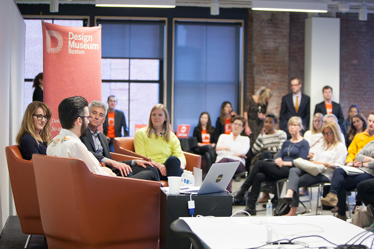
Photo via Design Museum Boston
Design Museum Boston is a foundation that identifies as a “nomadic museum,” where its exhibits and events pop up all over the city. Instead of a centralized brick and mortar gallery or event space (the closest thing they have is the Design Museum store), blink and you’ll miss its interactive, pop-up exhibits. The museum capitalizes on making the city its gallery, educating the public on the design elements and opportunities present all around us in our daily lives.
Here, Brooke Scibelli, the events and content producer who manages the museum’s several social media profiles, talks about keeping topics accessible to everyone, why a map is the centerpiece of their new website, and embracing Instagram.
Follow Friday, At a Glance
Connect with the Design Museum Boston on social media:
Can you give me a brief overview of the Design Museum Boston, and its identity as a “distributed museum?” What does that mean?
Design Museum Boston is a local non-profit working to educate the greater Boston area—but larger than that, to educate the world—about design and how it affects our lives in good and bad ways every day. We have a unique approach to what a museum means. We have integrated the city to be our space. As opposed to having a brick and mortar space, we are a nomadic museum. We pop up in all different kinds of spaces and places in the greater Boston area.
As I said, we’ve been doing this idea in the Boston area for about five years, but we’ve taken our idea to other cities in the U.S. We have a similar pop-up museum called Design Museum Portland in Portland, Oregon, and a baby, very new design museum in San Francisco, California.
How many social media profiles are there for Design Museum Boston? Can you give us a rundown?
I would say our strongest is Twitter, and we also have an Instagram. We have a Facebook community page, and we have a LinkedIn. We also have a Vine community account.
Which would you say is the “must follow?”
Definitely Twitter.
Who manages the social media sites?
I’m the point person for social media. With our new website we’ve kind of just begun having multiple authors for the website, and multiple authors on social media. So, for example, our executive assistant who also manages the store, has been writing a lot of interviews on social media about our design competition. Our exhibition and development people are both beginning to market their programs as well. We’ve gone from two marketing authors to about six.
We obviously have a Board of Directors, and we also have a Boston Advisory Council, and there are always people coming in and out of our Design Museum circle. We’re starting to ask some of our Advisory Council members, and people who come to our events a lot, to write blog posts and recaps for our website as well. We’re starting to push the boundaries a little bit on who’s writing our content.
One of the primary goals of the Design Museum is to make design accessible to everyone. At times, do you ever feel like you’re speaking too much to design experts on social media? How do you handle that?
It’s definitely something we think about and talk about a lot. We try to be as aware as possible that not everyone that’s following us is a design expert. For example, I have a Bachelor of Fine Arts, so design, when I started at the museum, was kind of foreign to me. I think the museum does its job keeping in mind that we have people listening to what we’re preaching, reading our content, and coming to our events that maybe are in [other industries]. We have some people from pharmaceutical companies show up or educators in the sciences. It can really vary, so we’re constantly reminded that not everyone is a design expert.
I think a really good example of this is that at one of our talks in March, we featured Grace Teo, who’s the founder of Open Style Lab. The mission of her organization is to create fashionable apparel that is accessible to people of all abilities, as opposed to limited abilities. Of course they’re focusing on people that aren’t as physically able as the majority of the world, but they discovered in making a rain jacket for this man who uses a wheelchair that this rain jacket could apply to anyone, sitting or standing in the rain. It was a really interesting story to be a part of because it focuses on people who are not necessarily thinking about the design of apparel or thinking about being in a wheelchair. It was definitely eye-opening. That’s the kind of content that we’re really looking to share.

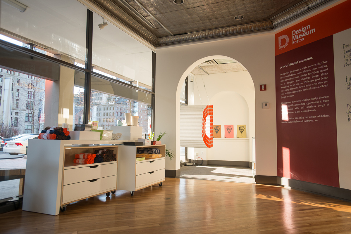
The Design Museum Boston store, located in downtown Boston. | Photo Via Design Museum Boston
What goes into choosing what content and programming you advertise or post on the museum’s online profiles?
As all museums are, we are a super busy cultural organization. We try to produce about one event, on average, a week, and we do one to two exhibitions per year. Accompanying our programming we have so many events and exhibitions that you can go physically see or attend, and we’re obviously promoting those on our social media and web outlets.
We also try to do some content marketing, and look at other organizations that we admire, like AIGA [a design industry professional organization] or some design programs that are in the area like at MassArt or Wentworth Institute of Technology. For example, MassArt just had an open call for designers to submit work for a gallery show so we helped promote that because we would think that our audience is interested in what they’re doing. So we try to bring other partner organizations into our marketing content.
We’ve also been doing a lot of interviewing. We have presenters and panelists speaking at our events all the time, so we’ve been doing a lot of interviewing of those thought leaders in the Boston area. We write up these short little interviews and post them on our new website, and then tweet about it.
Have you ever started a profile on a platform that you later abandoned? Are there any accounts you’ve done away with, or ones that have been difficult to get off the ground?
I would say for a while we were struggling with Instagram, which is kind of ironic because design can often be so visual. We’re really strong on Twitter and we have the most followers on our Twitter, but we struggled for a little while with keeping up on Instagram because there’s just so much to post all the time that we weren’t sure if we were really being successful. This also kind of applies to Vine. I think once we got more staff people on Instagram and we were more actively using and discussing how we can push thoughtful content on Instagram, it became more successful. But I think it was a challenge for a little while.
The new website is really beautiful, and it’s something that you’ve mentioned quite a bit. Can you tell me a little more about its inspiration?
We’re so thrilled to have a brand new website that we just launched in early February. Our old website was really nice but we started to grow out of it, and it wasn’t as clear to users that we’re nomadic, and that we don’t have a brick and mortar space, but that we use space around the city to produce our programs. The map on our website is so important to the user to understand immediately when you go to our homepage that that’s what we’re doing.


