Shakespeare Meets Urban Art In This Year’s Production on the Common

Courtesy Photo by Melissa Williamson
Shakespeare is coming back to Boston Common this summer, but this time with a bit of a twist.
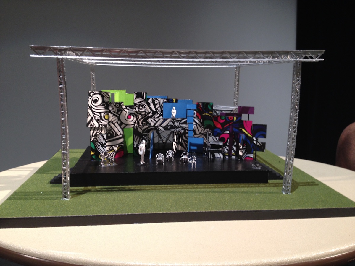
Taking a cue and deriving her inspiration from outdoor urban street art, Cristina Todesco, set designer for this year’s production of Twelfth Night, part of the Commonwealth Shakespeare Company’s “Free Shakespeare On The Common” series, created an eye-popping mural marked by colored swirls and black-and-white twisting shapes to serve as the play’s backdrop.
The free, outdoor shows begin on July 23 and run through August 10, and will have a modern take on the Bard’s classic love comedy thanks to Todesco’s touch. “I think it feels like a piece of art, and it feels a little street, if you will,” said Todesco of the final product.
But the set design didn’t come together without some challenges. Capturing the essence of the play, about Viola and Sebastian, twins separated by a shipwreck and cast into a mythical land, was one thing; making sure the scenery was bold enough to grab the audience’s attention and hold it, while the distractions of the city’s skyline is all around them, was another. “You really want to attract people to it,” she said.
We chatted with the creative eye behind the set design to find out why she chose to take this particular approach, and create a backdrop that pays tribute to the graffiti that marks many city walls.
Are you ready for opening night?
The set isn’t all done, but my work as a designer is almost done. Opening night it will be done. We have to load it in onto the Common, make sure everything is going to work as we planned—which is always tough when the venue is outside—make changes when we need to—informed changes—and make sure we are still on the path that we planned.
What makes it tough to have the set outside?
It has to be weather-proof, it has to be wind-proof, and it also has to be bold enough to speak for itself. That’s the thing about having it outside, you don’t have an informed audience paying to come, you have people wandering around the park, taking in the scenery—these are people who are stumbling on it. This is part of this public art idea. We wanted it to be something that perhaps people don’t recognize as a stage set, and potentially it is public art. We wanted it to be attractive in lots of different ways, to lots of different people.
It really pops out at you.
We definitely wanted there to be a tension between the natural environment that is the park, and this giant object. Also, something that is somewhat recognizable. It looks a bit like street art, its definitely inspired by [a mural] in Miami, from the Wynwood Walls in particular. It has an urban feel, but there’s also a sort of elegance to it.
How was it meshing the old-timey feel of the play with a new urban space?
Old timey!? Shakespeare isn’t old-timey, it’s timeless. It’s something that can appeal to many different kinds of people in many different ways. But it can be daunting, because it is an open arena for interpretation. It can be daunting, a little bit dangerous, because it can be easy to misstep. Because Shakespeare allows for so much freedom, there is a lot of good and bad interpretation. Never does he tell you what anything is supposed to look like, and I think because that wasn’t important to him—it was more about the humanity, and how similar we are to these characters— it can be challenging.
What’s the process for putting something like this together?
The first step in creating a production is collaborating with everyone involved, and coming up with an idea about what’s important by telling this story right now and how it relates to our city. It’s about creating models of the space, and elements of the physical space, and us staging the play on it and how action works in the space and the growth of the characters. Basically there is a wall, and I wanted to have something that felt very permanent and monumental. That’s what I like about murals that are done in the city, they are just there all the time, and depending on the mood when you approach it, it says something different to you. So to have this large monolithic sculpture or wall right there was appealing to me.
What else in the set helps tell the story?
We also have lots of fabric in the show that sort of hints at the premise of the play, which is that Viola winds up on this island because of this shipwreck, so all of the chaos sort of ensues after she has gone through this disaster when she is separated from her brother on this boat. The whole idea of the fabric is that it also creates a lot of interesting elements for the actors to deal with and to play with. It also hints at the sails, and the other nautical element in the show.
Was this a lot different from other productions you’ve done?
Two years ago I did Coriolanus, which was a much darker Shakespeare play, and this one is a comedy—it’s a great comedy—much lighter. It was fun to be exuberant about life, whereas the other one was a lot darker.
What’s this set made out of to make it so vibrant?
It’s not painted, we had it printed on vinyl which makes it waterproof, but it also allows us to manufacture and fabricate the set quickly. Usually I love things that are hand-painted, so I could employ my painter friends doing it, but this piece would have been a challenge for the shop space at the Huntington Theatre Company, who is building this for us. It’s a limited space for such a large piece. To have it painted would have been beyond our means.
How’d you come up with it?
We brainstormed together. I presented some of my ideas in a visual form, and then the director is able to respond to those. As well as the lighting designer, and costume designer—they are in the room as well. It opens it up for discussion. They are able to take part in what we come up with. I love to have their feedback. The only way to do it is that way, because then it feels like one voice, which is the way it should be.
You said you wanted this to speak to art in Boston now. Where do you think it stands in the city?
I think there is certainly a buzz now that Marty Walsh is the new mayor. It has changed the conversation a bit about the arts. He is talking about it, and has other people talking about it. It sounds like he has decided to—what’s the word—he’s inviting this conversation about how important the arts are to this city. He is starting it up again. I feel like we haven’t really broken ground on any large movement in art for a while.
So is your mural a good place to start?
Sure! Of course.


