
Who Does a Better Job on the Economy in Six Easy Charts
One of the most earnestly pursued “branding” efforts by the Republican talking heads is that the Republicans most consistently create conditions for the greatest economic expansion and job growth. And if that were true, it would indeed be a good reason to vote for them. But the metrics say otherwise, as evidenced by the following series of charts and graphs.
Look at this chart from the Joint Economic Committee, and compare it to Republican claims that Obama has made the job situation even worse (the red bars indicate Bush’s term; the blue, Obama’s):

Source: U.S. Congress Joint Economic Committee.
Take a look at this chart, also from the Joint Economic Committee, and compare it to former Governor Romney’s frequent claim that Obama has made the Great Recession even worse (again, the red bars indicate Bush; the blue, Obama):

Source: U.S. Congress Joint Economic Committee.
Take a look at this chart and compare it to claims by Republicans that they are the party of economic growth and job creation:

Source: economyinperspective.com.
Compare the reality of this chart with Republican claims that giving big tax breaks to the wealthy will magically create job growth :

Source: Bureau of Labor Statistics and Tax Policy Center via ThinkProgress.org.
The top line on this next chart represents the actual distribution of wealth, the second line represents what respondents guessed the distribution was; and the third line represents what respondents said would be an ideal distribution:

Source: Who Rules America: Wealth, Income, and Power.
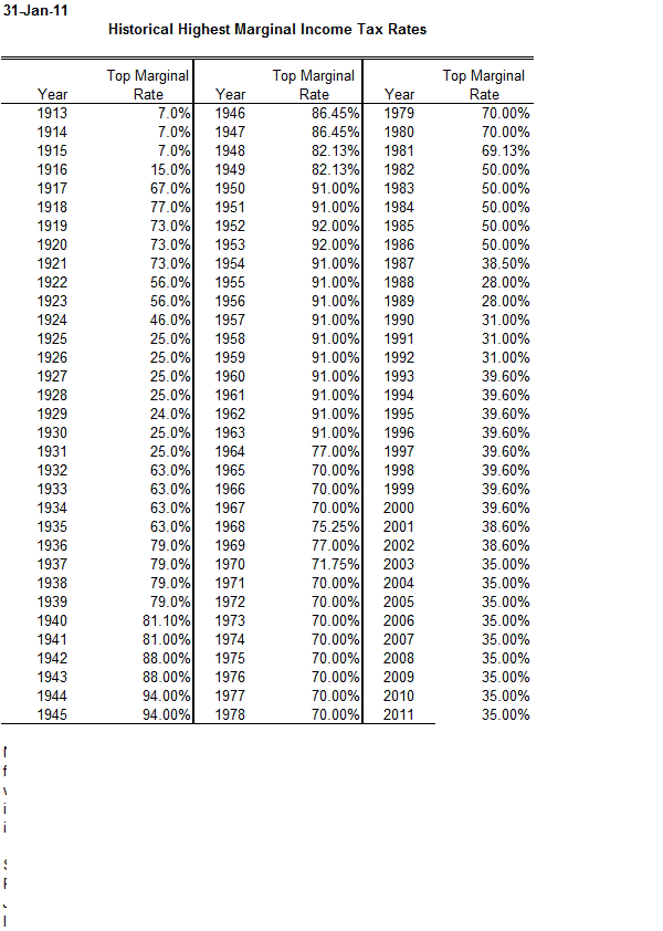
And finally: a historical chart showing the top marginal tax rates. They are now — not as Republicans would have you believe — at the highest rates in the history of earth – but actually at historic lows:

Source: Taxpolicycenter.org.


