How the MBTA Map Misleads Us

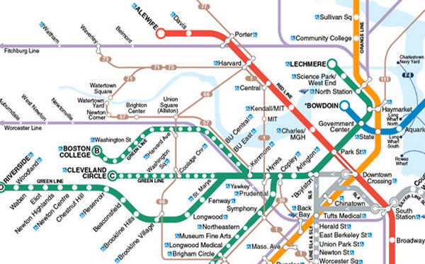
Commuters see that familiar MBTA transit map so often that most probably don’t consider that the way it was designed might impact how we make travel plans. We were reminded of this today by Jessica Gross, writing in The Atlantic Cities, who delves into the ever-fascinating (nerd alert…) subject of subway map design.
Among the many map design difficulties Gross highlighted was the issue of “enlarged-center syndrome.” Most major cities’ subway maps—Boston’s included—exaggerate the distance between geographically cramped stops in a city’s center and shorten the space between geographically distant stops on the map’s outskirts. That sometimes leads us to make irrational commuting decisions.We’ll choose short-looking transit routes even if they actually take longer. It’s a problem everywhere, but she offers a Boston-based example:
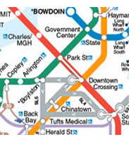
“In Boston, the distance from Park St. to Downtown Crossing looks at least a mile long on the MBTA map (at left) but in reality, it’s easily walkable. If we blindly rely on the map, we’ll probably waste time.”
This is quite obviously true. It’s about a tenth of a mile between Park St. and Downtown Crossing, but the distance between them on the map is comparable to the one between Park St. and Charles/MGH—which is more like a mile.
Noah Bierman of the Globe pointed out this quirk too back in 2009 when the map redesign was launched. He offered up another example: those trying to get from the Aquarium to the Red Line.
“If you look at the MBTA map, you might be tempted to hop on the Blue Line, switch trains at State Street to the Orange Line, and then switch lines again at Downtown Crossing. Or you could take the Blue Line to Government Center, switch to the Green Line, and then switch again to the Red Line at Park Street.
This would be, of course, a waste of time. It takes more time to type these instructions than to walk from the aquarium to Downtown Crossing.”
 People who know the city well, you’d think, would just intuitively understand these things after a while and plan accordingly. But often they don’t, Gross says, citing researcher Zhan Guo’s 2011 study of the London map, which has similar issues.
“Passengers who knew the system well were less likely to be duped than first-time riders, but even they still regularly fell under the Tube map’s spell.”
These miscalculations have system-wide effects:
“If passengers got out at Park St. and walked instead of transferring for one stop, it would clear out a ton of human traffic underground. The flip side: the apparently short distance from the outskirts to downtown areas could make city hubs seem much more accessible to many people who live far away.”
Add this to the list of complaints with Boston’s increasingly cluttered map design, some of which we highlighted last March. Guo suggests ways a redesign could fix some of these adverse effects, but we’d add that this problem (like so many) can be partially addressed with a smartphone. Plug in a trip into the iPhone’s Maps app, for instance, and select public transit. It will usually offer you the shortest route by calculating train times and walking distance—not by looking at the pretty map. Commuters used to choosing their route based on visuals might be pleasantly surprised.

