Maps: The Mayoral Preliminary Election Results
You’ve probably read everything you need to know about the Boston mayoral preliminary last week, right? Wrong. Here, we present a guest post featuring maps created by Andy Woodruff, a cartographer for Axis Maps and co-author of the Bostonography blog.
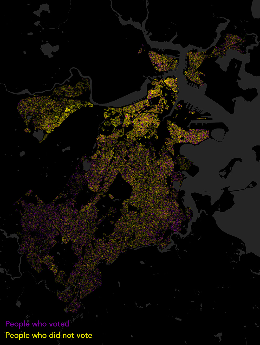
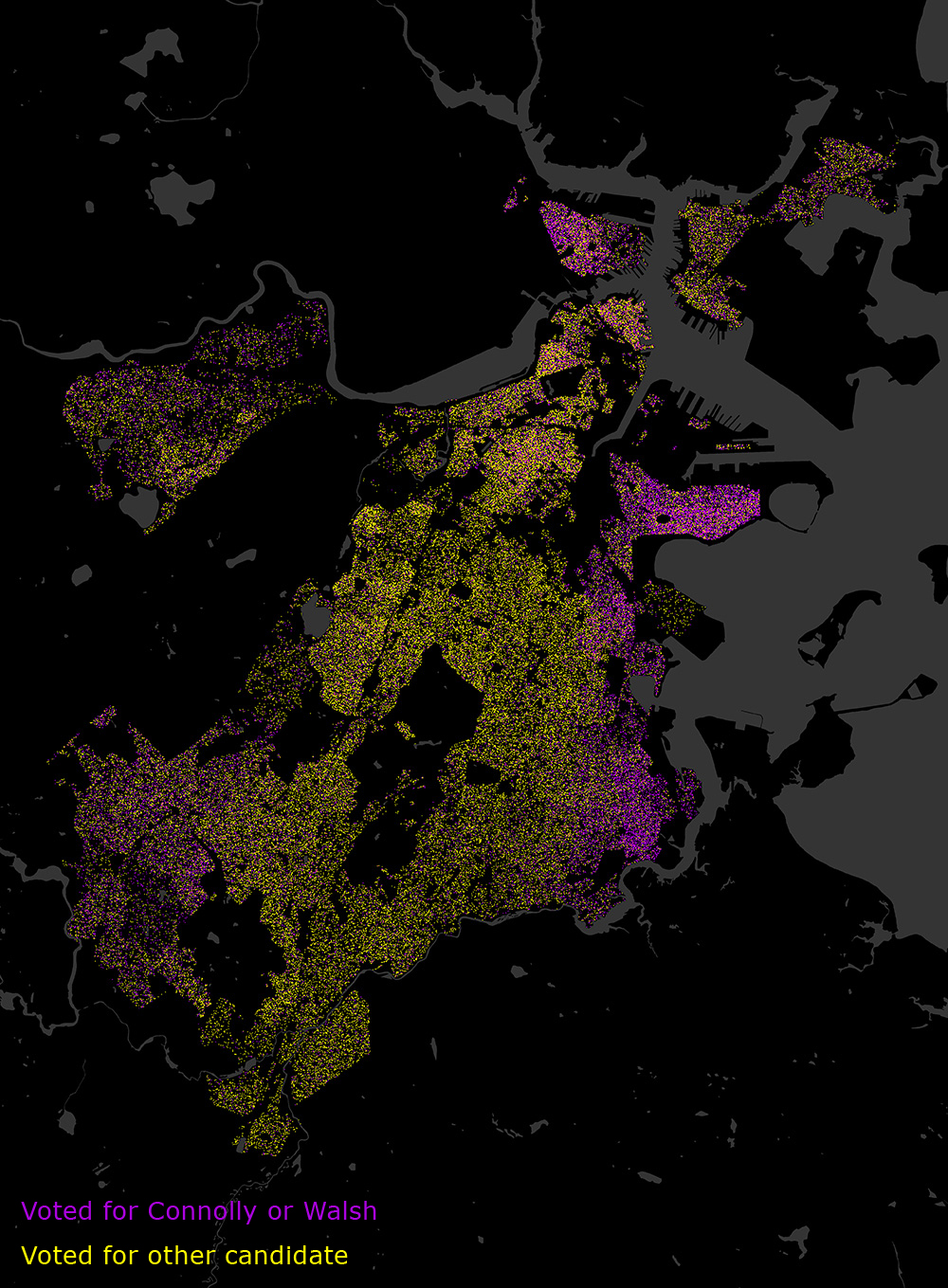
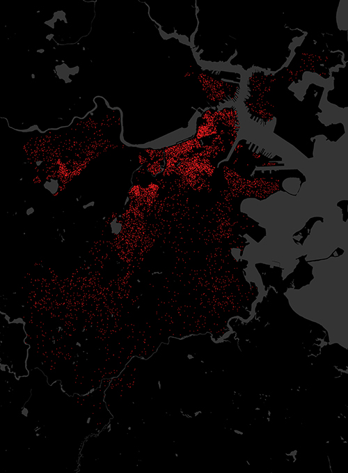
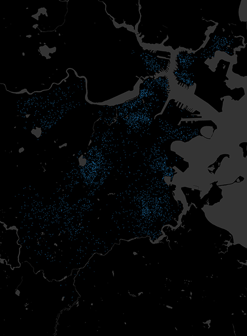
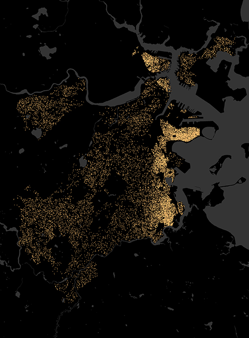
Based on data from the City of Boston Election Department, the following maps show a dot representing each vote recorded for the 12 mayoral candidates in the preliminary election, aggregated by precinct. The dots are distributed randomly within populated portions of each precinct based on the census. Together, the maps give an overall picture of the geographic distribution of votes and voters in the election.
Voter Turnout:
This map shows the neighborhood variation in voter turnout. A purple dot denotes each vote, and a yellow dot represents every registered voter who did not cast a ballot.
Winners vs. Others:
This map shows votes for the two advancing candidates, John Connolly and Marty Walsh, alongside the votes for the other 10 candidates. Votes for either Connolly or Walsh are purple; votes for any other candidate are yellow.
All Candidates:
This series of 12 maps shows the votes for each candidate individually, allowing a comparison of the geography and intensity of support between the different candidates. Click the version below for a larger view, or scroll down to view each map on its own.
Here are the above maps presented one by one:
Felix Arroyo:
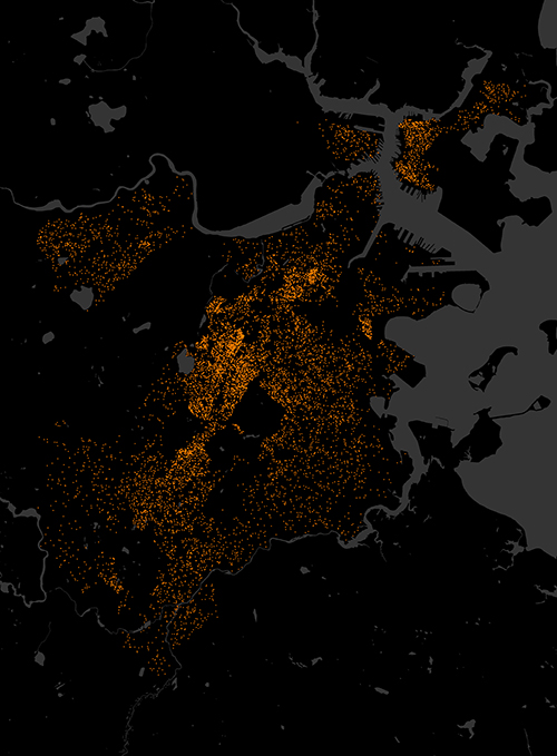
John Barros:

Charles Clemons:

Dan Conley:

John Connolly:

Rob Consalvo:

Charlotte Golar Richie:
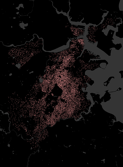
Mike Ross:
Bill Walczak:
Marty Walsh:
David James Wyatt:

Charles Yancey:

