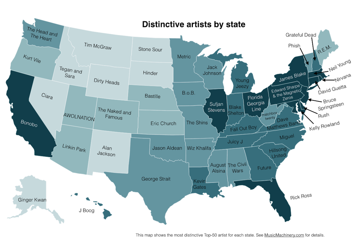
Mapping the Country’s ‘Favorite’ Music by State, and What It Tells Us

Images Via Echo Nest
There’s a difference between the word “distinctive” and “favorite” when it comes to how the U.S. breaks down in terms of music preference, and the folks at The Echo Nest want to set the record straight.
The Somerville-based music intelligence company, which specializes in data tracking, recently put out a couple of maps that show various aspects of how artists are listened to in a particular state compared with other parts of the country. The “distinctive” map, pictured above, came first, and you’ve probably seen it plastered across your News Feed this week—most likely accompanying some sort of commentary (and a lot of Facebook hemming and hawing) that misinterprets its true meaning based on confusion of the terms “distinctive” and “favorite.”
Paul Lamere, the company’s director of developer platform, explains: “I have an analogy I have been using around food. If you’re up here in New England, we eat the same hamburgers and pizza as everyone else,” he said, adding that that would be a “favorite” food. “But ‘distinctive’ foods for us are going to be things like clam chowder, which is a more frequently consumed food than it would be in Texas or New Mexico [by comparison].”
Lamere said the goal of the “distinctive” map—which caused the ruckus—was to find the musical equivalent of clam chowder for every state, or, in terms of music and not noshing, “the artist more critically defined for a state than from the rest of the country.”
To do that, he made a list of the top most-played artists in the state, then he matched the ranks of those artists as compared to where they fell on the playlists in other spots in the U.S. “Popularity is very different,” he said. “Everyone listens to Jay-Z, Daft Punk, and Macklemore, so if someone says they listen to Jay-Z, it doesn’t tell you much about where they are from.”
But if they say they listen to Neil Young, as is noted for Massachusetts on the “distinctive” map, it does.
With that bit of information clarified, Lamere went ahead and created the second map based on public interest, which shows the actual “favorite” bands—as of the past year—for each individual state.
The findings aren’t that surprising. Across the country, similar patterns prevailed, and the findings for Massachusetts are no different (we seem to be bumping a lot of Daft Punk these days). But it did pique Lamere’s interest in terms of how favorite artists were mapped by region and clusters. “Just a handful of artists dominates the listening of wide areas of the country,” Lamere said. “I was expecting to see mostly unstructured artists, but you can see some good patterns. Jay-Z captures the whole East, Drake captures the Southwest, Macklemore is just about everywhere else.”
He said he was expecting to see fewer artists on the “favorite” list, scattered haphazardly around the country. “I’m not really sure what to make of it still, to tell you the truth,” he said.
Both maps, Lamere said, are an aggregation of data across a wide range of online music services powered by The Echo Nest, and are based on the real listening behavior of a quarter-million online music listeners. When it comes to how they calculate their math and add up their totals, The Echo Nest is tight-lipped on the method, but they assure us that the company works in tandem with some of the leading streaming music services including Clear Channel’s iHeartradio, Rdio, Rhapsody, SiriusXM, and others.
In the end, the maps prove that when it comes to data collection and interpretation, the Drake is in the details—and understanding the correct definition of the words.


