Throwback Thursday: When the T Was Color-Coded

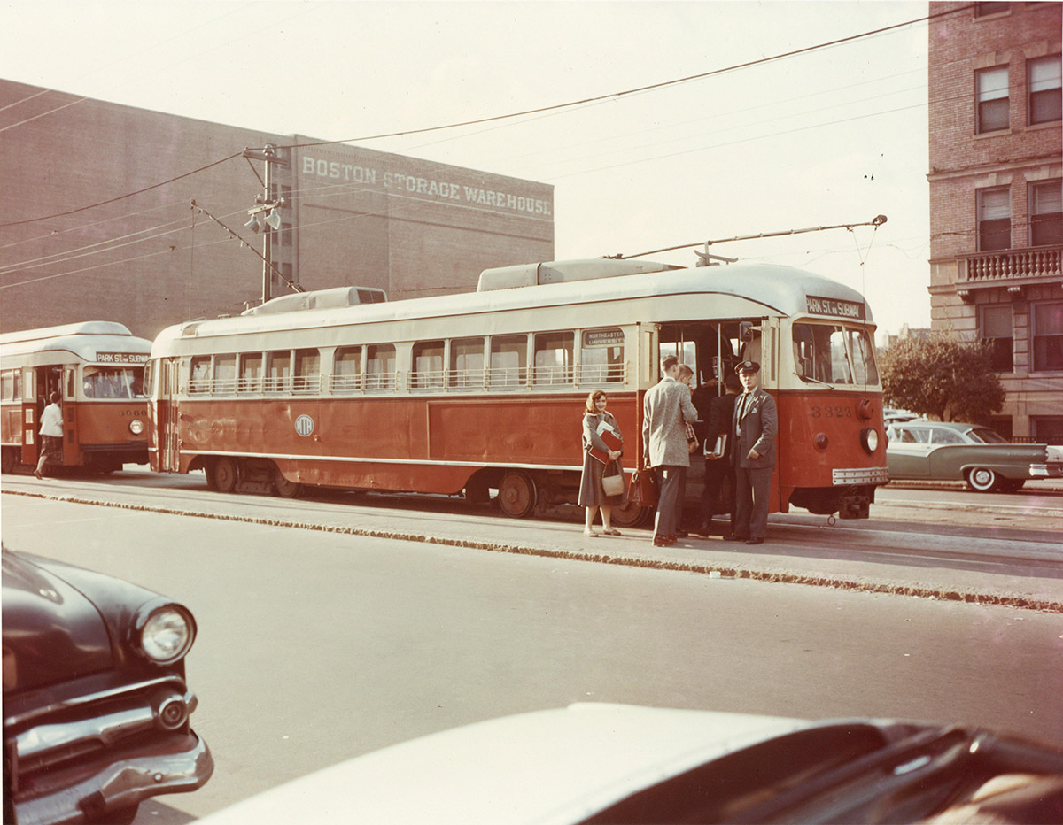
The T on Huntington Ave., pre-color assignments / Photo via City of Boston Archives on Flickr/Creative Commons
Fifty-one years ago this week, the Green Line became green, the Blue Line adopted its cobalt hue, and so on. The four branches of the MBTA’s rapid transit lines, better known as the T, were officially assigned colors on August 26, 1965.
The Massachusetts Bay Transit Authority was only inaugurated about a year earlier on August 3, 1964. In the months before the T was color-coded, the trains were painted in either two schemes: blue, gold, and white to honor the Massachusetts state flag, or a dull shade of olive. (The Boston Globe points out that this brownish color was thought to hide dirt and grime.)
In an effort to become a more modern transportation system—the T is, after all, the oldest subway in the country—the MBTA opted to brighten up each of the four branches in different shades. This way, they’d be easier to identify and navigate. Officials didn’t just choose any old colors, though. There’s specific reasoning behind each one.
The Green Line is green because it runs along Frederick Law Olmsted’s Emerald Necklace parks.
The Red Line is red because it winds through Harvard, home of the Crimson.
The Blue Line is blue because it travels under the watery depths of Boston Harbor.
The Orange Line is orange because it runs beneath a part of Washington Street originally called Orange Street.
Here’s a fun fact: the Orange Line was planned to be yellow, but the design firm in charge of the rebranding, Cambridge Seven Associates, rejected the sunny color after testing. Two years later, the Green Line branches were lettered A through E, though the A Line was nixed in 1969. And it wasn’t until October 1974 that the MBTA dubbed the commuter rail’s color scheme as deep purple.
We see your true colors, MBTA. After more than 50 years, they’re still shining through.

