Boston’s Income Inequality, Visualized

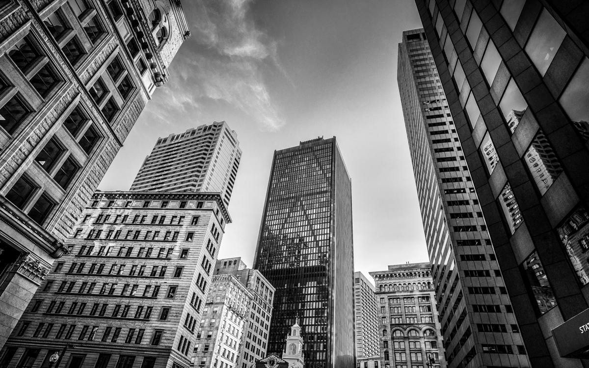
Photo by Nicholas Erwin on Flickr/Creative Commons
Boston suffers from the worst income inequality of any major U.S. city, according to the Brookings Institution. In no other major metropolitan area does the gap between the haves and have-nots yawn so wide as it does in the Hub, where those in top five percent of earners make $266,224 a year, compared to the $14,925 earned by those in the bottom 20 percent.
The problem of wealth inequality is hardly unique to Boston. Nine of the top 10 cities saw their middle class population—that is, households with an annual income between $42,000 and $125,000—shrink between 2000 and 2014, according to the Pew Research Center.
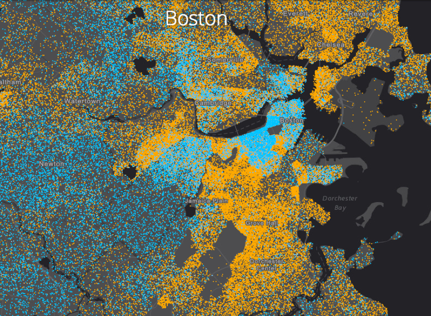
To illustrate this shift, geographic information systems provider Esri devised a story map, titled “Wealth Divides,” highlighting five cities with severe inequality: New York City, Atlanta, Washington D.C., San Francisco, and Boston.

Map via Esri
Esri calls Boston “a study in income divides,” noting how the median household income in Jamaica Plain is $169,291, while on the other side of the Arnold Arboretum in Forest Hills, the median household income of $34,366. In the above map, each blue dot represents two households with an annual income greater than $200,000, while each yellow dot represents two households with an annual income less than $25,000.
You can check out Esri’s “Wealth Divides” in its entirety below.


