Cape Escape

photograph by brian vanden brink
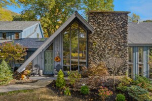
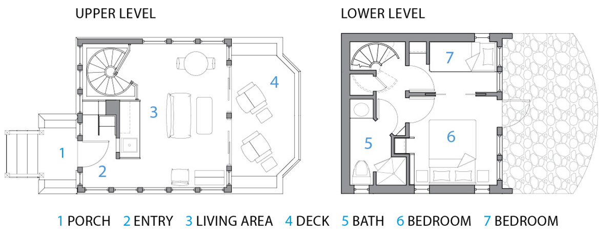
Few places feel more serene than this tree-shrouded abode, perched on the edge of a marsh overlooking the Cape’s majestic Pleasant Bay. Of course, it took some very inspired design choices to get it that way. Built on an ailing building’s modest footprint, the 512-square-foot guest cottage—dubbed the “Hen House” by the homeowners for the original structure’s subtle resemblance to a chicken coop—was the brainchild of the team at Polhemus Savery DaSilva Architects Builders, who tricked out the space with a kitchenette, sleeping quarters for four, and plenty of room to enjoy the views. Here, principal architect John DaSilva offers his insights on maximizing a compact floor plan.
photograph by brian vanden brink
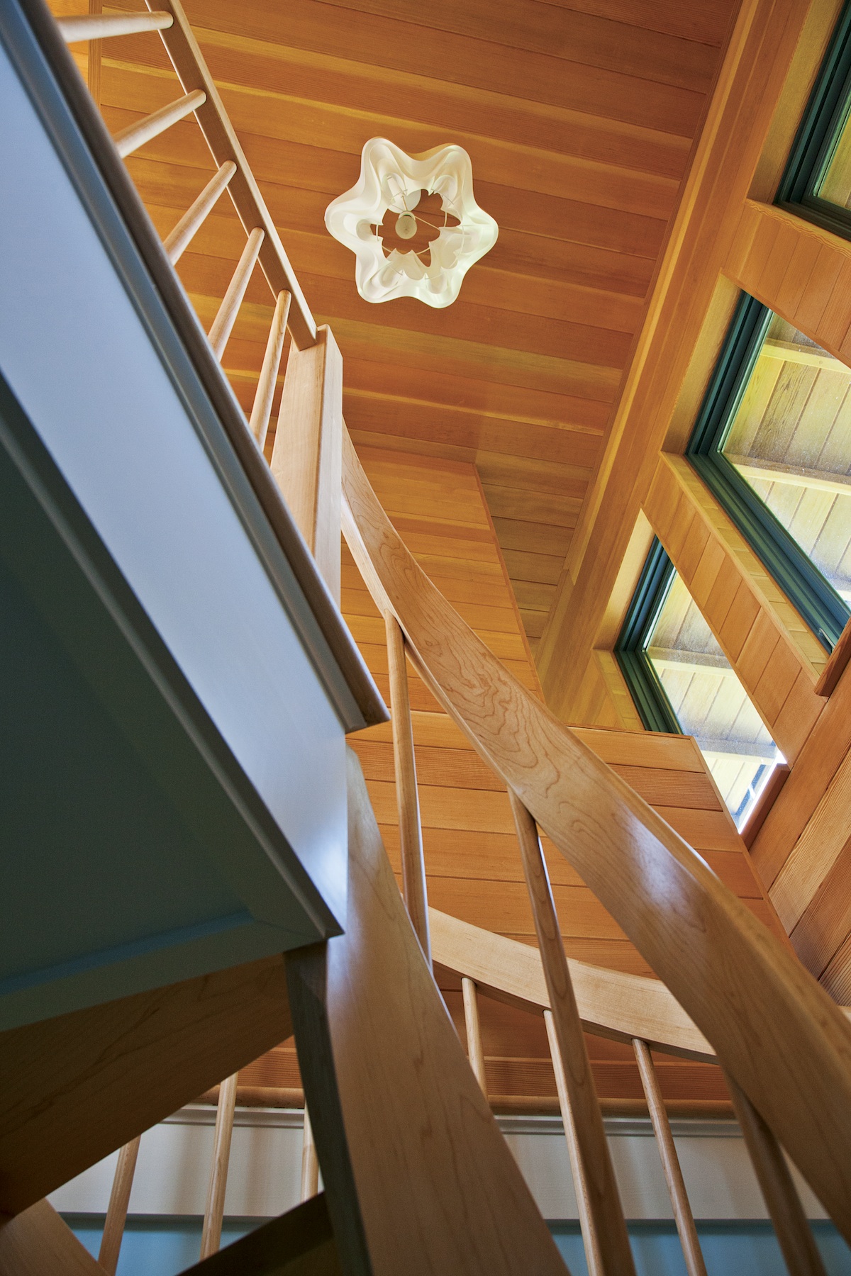
Go Spiral
The home’s double-helix spiral staircase is beautiful, but it also serves an important purpose: With no landing required, it has a much smaller footprint. “Wedge-shaped treads with no risers take up considerably less floor space than a traditional staircase,” DaSilva says.
photograph by brian vanden brink
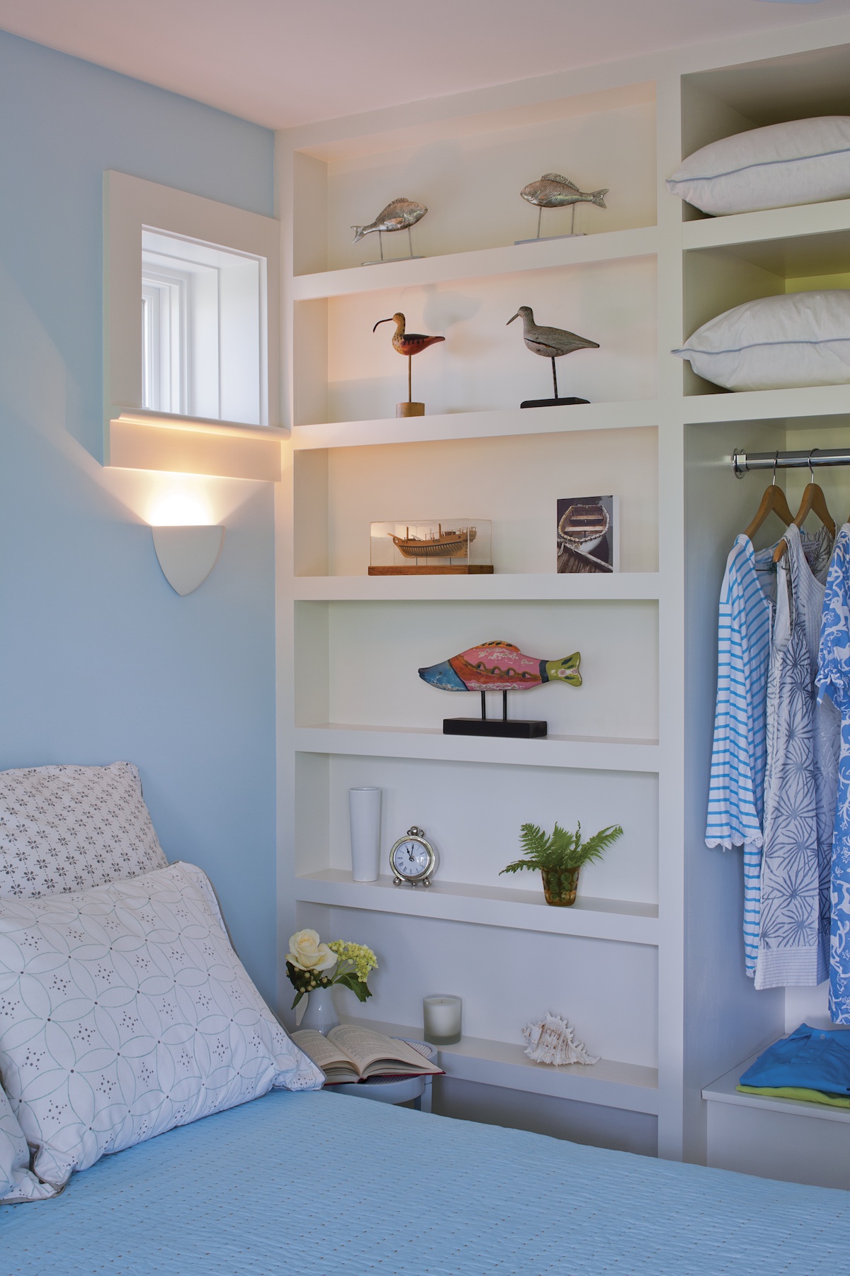
Think Nautically
To create two bedrooms in the walkout basement, DaSilva took cues from the way spaces are arranged on boats: Since standard closets wouldn’t fit, the architect added open shelving and space for hanging clothing on one wall, and installed small inset light fixtures on the wall above the bed.
Warm With Wood
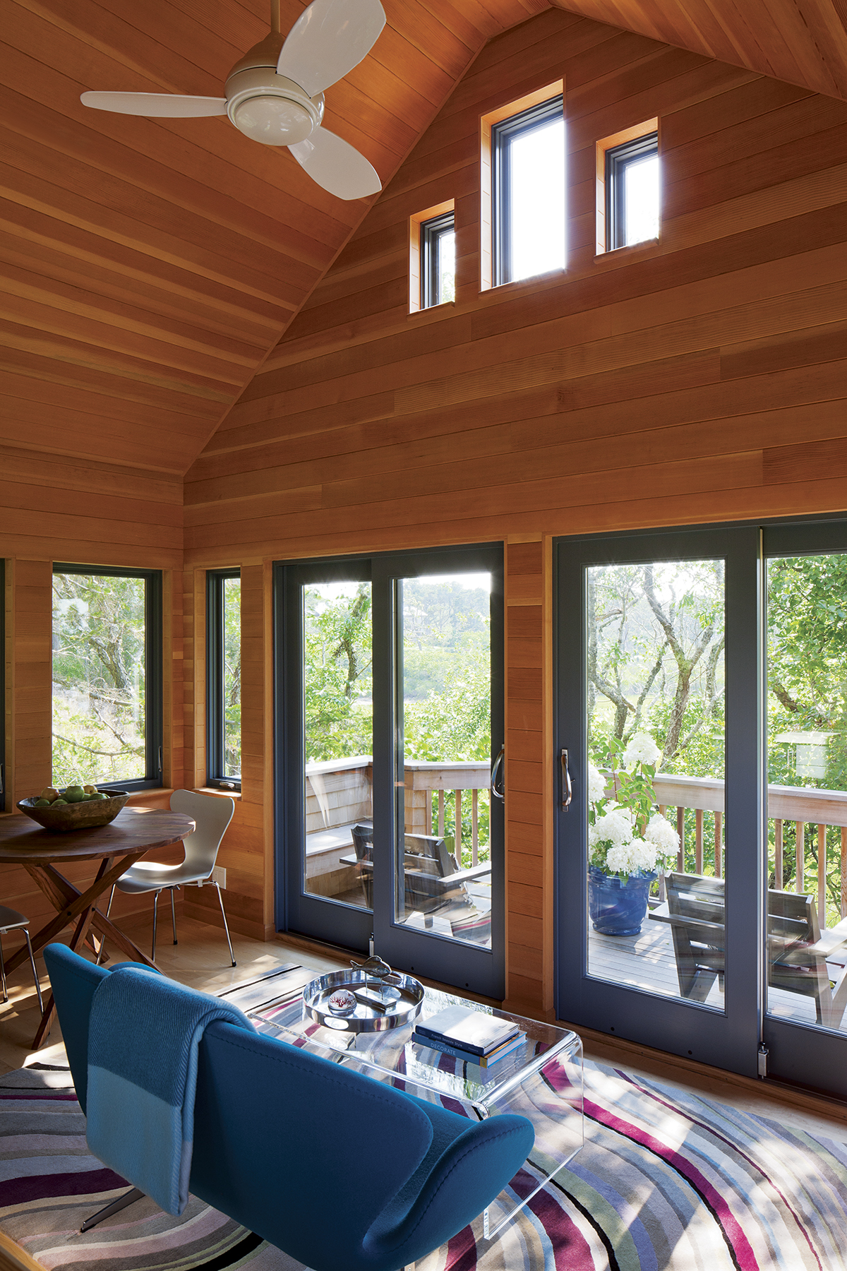
To enhance the home’s cozy ambiance, DaSilva clad the walls and ceiling in unfinished vertical-grain fir, a common flooring material in 19th-century coastal New England homes. “The experience is something like being inside a grand cocoon, or in the cabin of a boat,” he says.
photograph by brian vanden brink
Isolate the Entrance
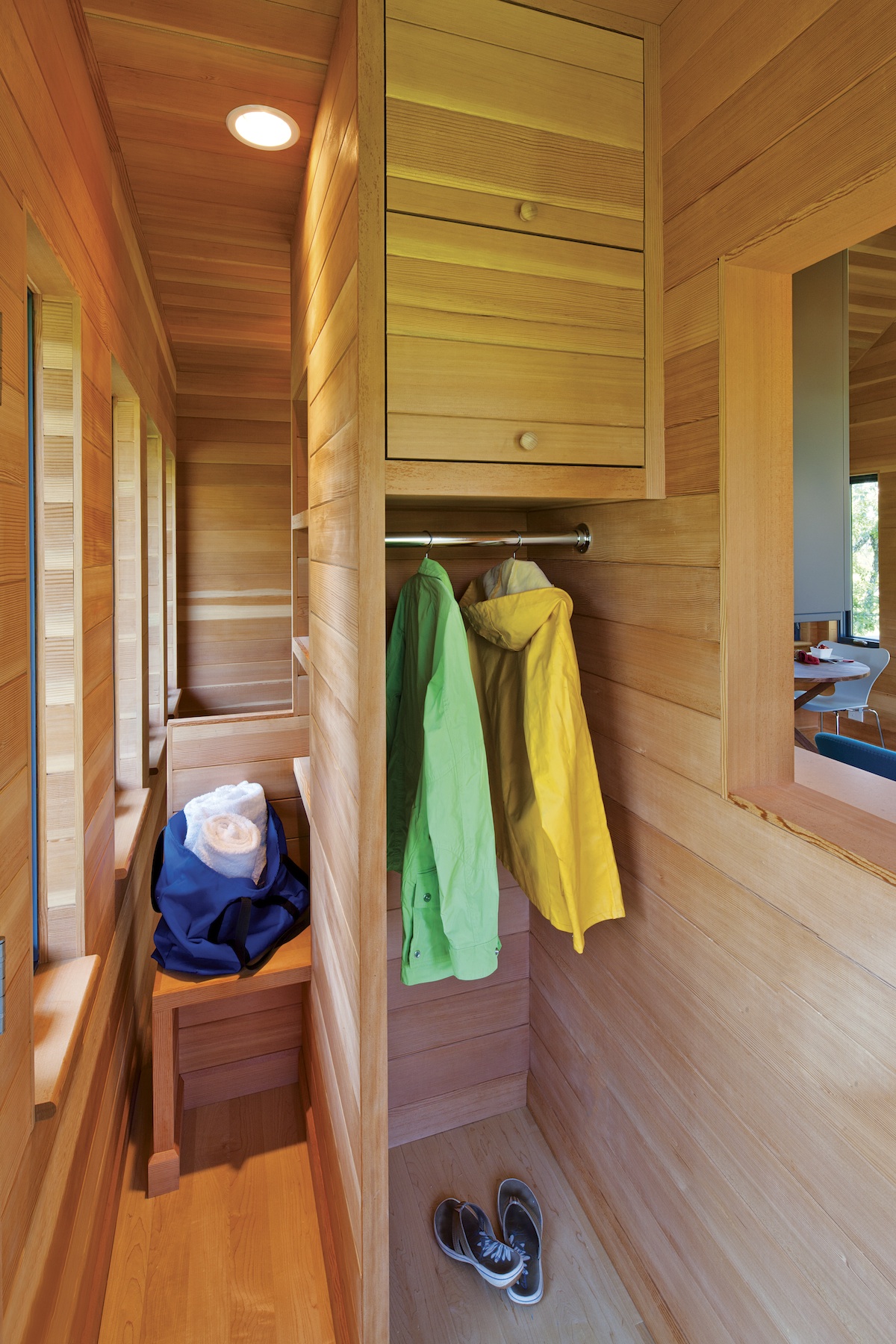
It may seem counterintuitive, but creating a separate foyer is an absolute must, even in a tiny space. “It makes the living space feel more private and comfortable and allows you to let the entry be messy,” DaSilva says. Just inside the guest house’s main door, a small bench sits next to an open closet designed for shoes and coats, with upper compartments providing concealed storage
photograph by brian vanden brink
Pair Form and Function
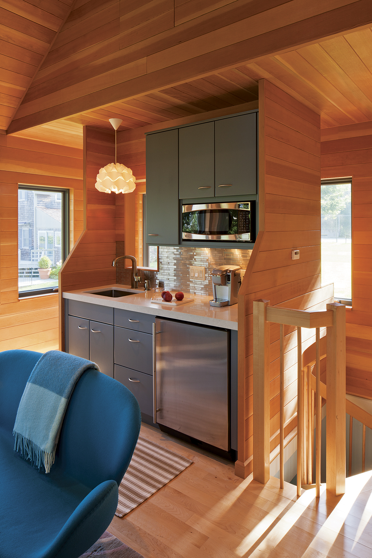
Layouts that cleverly divide the living quarters can create the illusion of space. The kitchenette in this home, for example, stands like a piece of furniture between thin fir walls, offering a view to the front door through a window-like interior opening in front of the sink. “Since the kitchenette doesn’t touch an exterior wall, it’s self-contained and feels like its own entity,” DaSilva says.
photograph by brian vanden brink
Furnish Modestly
Rather than obstruct the coastal view with a typical media stand, DaSilva designed a narrow fir cabinet with a door at the top, out of which the television rises via a motorized lift. With the initials HH (Hen House) inlaid on the front doors, the piece complements the spare, clean-lined furniture and blends effortlessly into the petite living area.


