10 Questions With Interior Designer Stephanie Rossi

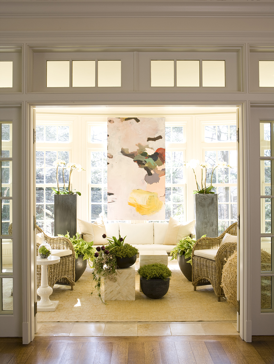
Abstract art punctuates a solarium at a Winchester home. Photo by Keller & Keller.
After earning a business degree, Stephanie Rossi returned to school and enrolled in an interior-design program at Suffolk University. Since then, she’s quickly earned praise as a young up-and-comer through her company, Spazio Rosso. With an eye on design that is aesthetically and financially pragmatic yet still incorporates the best of both classic and modern styles, it’s no surprise that H&M asked her to curate a table for the new H&M Home shop-within-a-shop on Newbury Street.
Rossi’s personality is just as warm and approachable as the spaces she transformes. She made time to chat with us about how technology has changed her field, her favorite home stores, and why she never wants to lay eyes on zigzag patterns again.
1. H&M found you through your social media presence—how has social media changed your career and creative process?
I like seeing lots of interesting, beautiful things that are out there that I wouldn’t normally see in my day to day existence, so it’s a constant visual scroll of objects and items and what other people are doing all over the world. I love Instagram.
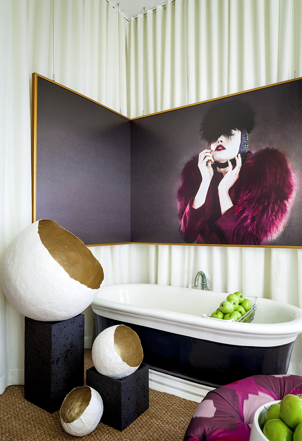
What the Internet does in a very interesting way is make design incredibly personal despite the fact that you have no idea who you’re approaching or who’s approaching you. For my Junior League project I used these huge portraits of women. I had a conversation, ‘Should I email the photographer? I don’t know if they’d even answer.’ She (Paulina Otylie Surys, below) answered almost immediately. In our minds, everybody seems huge and successful, but in reality we’re all the same. It’s as simple as introducing yourself and opening the door. Conversely, we forget about that because we walk up and down the street looking at our phones and nobody looks up.
2. You’ve said your client base tends to skew younger—how does that affect the bottom line?
We’d all love a client that has an unlimited budget but nobody does. It’s all relative to that. I think people, even if they have all the money in the world, appreciate you showing them things that are reasonable because it works and it fits.
3. What are your budget design tips? Your projects use both both higher-end and mass-retailer pieces. Is there a better season to shop?
It’s the ‘finds’ that you are so not even looking for that pop out at you and you’re like, ohmigod. It’s like there’s a karma that’s popping out at you that’s going to make it work.
Fall always brings in a lot of sales, fashion-wise. I notice that a lot of companies are having warehouse sales. Design Within Reach has a warehouse online sale site you can check out all the time.
4. What’s a hidden gem for you in Boston?
I really like Garage Sale in the South End, I’m constantly on their website. I bought a sectional sofa. Ohmigod, I love it—it’s in pristine condition. They’re the best.
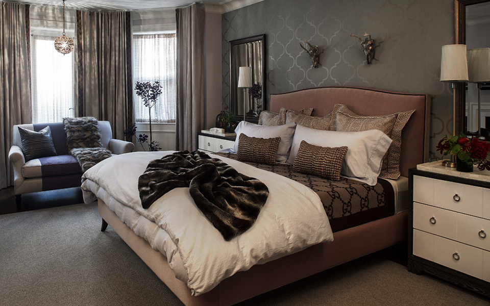
5. You used to own a clothing boutique, can you speak to the connection between fashion and home design? You’ve referenced Alexander McQueen (below), but who else on the fashion scene inspires you?
You see a color palette in 30 seconds on a single person on a runway show. There’s four or five patterns on a catwalk and it’s like your Pantone colors for interior designers. I love it because it’s compartmentalized. You don’t need more than three models basically that can design or inspire an entire house. If you’re looking for something elegant, it’s Jason Wu, or if you want something more elaborate, Mary Katrantzou.
6. Are there any fashion and/or home trends you think should see the light at the end of the tunnel?
Ikat and zigzag patterns. Enough is enough is enough.
7. You’ve mentioned photography but your home-design portfolio also includes a lot of modern art (below). Is that something your clients like, or something you gravitate toward?
As a designer, you get over-stimulated with a lot of things, the business side of things, and fabrics, and everything you have to see for a client. There’s something about modern art and abstract art that’s soothing because your eye doesn’t focus on one part of it. But making a commitment to that for a lot of people is scary. If your art is a cityscape, in my head you have to look at every single car and thing. I look at those things during the day—I don’t want to look at anything specific.
8. You don’t have a lot of cars or a skyline where you live—what sold you on Metro West?
It was built in the ’70s by an architect named Robert Whitton. He designs jewelry and furniture and houses like mine. When you see my house nestled in the neighborhood it obviously sticks out, it’s a series of white boxes. It’s visually organized with really tall ceilings and an open concept with few doors. It’s the opposite of what my clients request of me. I think I gravitate towards this kind of thing. My residential projects aren’t like this. I wish they were, but I think that’s a New England thing.
9. Is a house like yours a dream project?
I have two, maybe three dream projects! From a residential standpoint, one is very sparse, very neutral, very ‘European.’ It’s for a client who appreciates the simplicity of objects and doesn’t want a lot of them. The other residential project would be almost the opposite, somebody willing to take such outrageous, cool, sexy risks, where there’s movement and drama and power in that space, and then, of course I would love to design a restaurant. (Her husband, Jerome, is a chef.)
10. What are your design priorities?
I think light is probably more important, and then sound comes next. It’s how you walk through a room—literally. You walk around something, do you walk through something, how does the light bounce off those objects, and then how does that translate as sound for you. I think there’s a feng shui to it—it’s the part of a designer that keeps them up at night over an inch or three quarters of an inch.
Connect with Stephanie Rossi via Spazio Rosso at spaziorosso.com. Info: 978-263-5870.

This Back Bay townhouse includes features inspired by Alexander McQueen. Photo by Sean Litchfield.
Stephanie Rossi styled this Beacon Hill townhouse, renovated and designed by Ruhl Walker Architects. Photo by Eric Roth.

Contemporary photography like Paulina Otylie Surys’ factors into Stephanie Rossi’s work regularly. Photo by Greg Premru.
This interview has been edited and condensed for clarity.


