10 Questions with Landscape Architect John Copley

JOHN COPLEY HELPED DESIGN THIS DECK AT INTERNATIONAL PLACE USING NON-COMBUSTIBLE IPE WOOD. PHOTO BY COPLEY WOLFF DESIGN GROUP.
From the Frog Pond at Boston Common to the fountain at the Christian Science Plaza, the footprint of landscape architect John Copley can be seen throughout the city. Now, with the increase in luxury condos and apartments, his latest efforts can be found many stories in the air, and Copley Wolff Design Group’s current portfolio includes green spaces from atop high-end housing complexes, like the Kensington.
Copley spoke with us about the challenge of designing for mixed-use spaces, why simple designs can be best, and how being outdoors is like being in a cathedral.
1. Boston’s luxury condo market is booming—what has that meant for your business?
Nowadays, every developer and architect generally puts in a roof deck because they’re so popular and there’s usually space for that. Roof decks have become amenities and sales tools. When you walk into a space and look outside and see a continuation—a 30-foot space turns into 100-foot space. On top of that, you’ve got these great views of the city, and they’re a place where you can get away or hang out with people.
Something interesting we’re working on is adding multiple roof decks to a building—some are on top of a podium, which are usually retail spaces or garages. Say you spent $4 million on a condo, how comfortable are you going to be hanging out during the day with an office worker across the way? You need to provide enough individual spaces and enough space to intermingle.
2. You’ve worked on the outdoor space at the new Ink Block Residences in the South End—is this kind of project indicative of the future?
That space is designed for interaction with the condo, apartment, and office. It’s based on conjecture and based on our feeling, and our clients’ feeling of living in a democratic society. We think it’s a good thing. Most of the Ink Block deck is a big pool.
3. I’m sure people ask you about the practicality of a pool in an outdoor space in New England. What are your thoughts?
Outdoor spaces with pools are used beyond the summer months. We’re coming up to one of the best seasons, fall, and people love to be outside. We try to work in fire pits and heat lamps, and then you can extend the use of these spaces. We’re also doing some different things, like including narrower lap-pools. You can hang out there with a drink. It’s usually right next to a club space so you can sit inside and watch that as well.
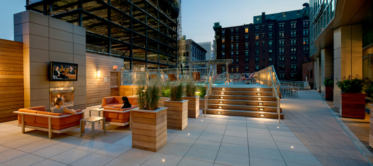
4. Was this the concept you were trying to create at the Kensington (below)?
That pool deck is basically like an outdoor room with fireplaces and outdoor TVs. During the World Cup, people were outside hanging out, even though it was blazing hot, and enjoying drinks when the Americans were playing. We like to do shade structures for the summer. Some of the new things are vegetable gardens, flower gardens, and bocce courts. We’re doing a project down by Boston Medical Center—an urban farm where kids can harvest their own vegetables, and some restaurants use it as well.
5. That sounds fun. What are some other memorable creative projects you’ve been involved with?
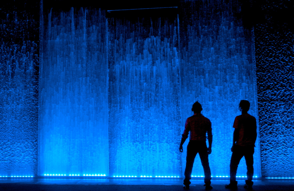
The water wall at Liberty Mutual was really fun (below). It was designed mostly to mask a garage, but also to provide some audio masking of the sounds of the city. We looked at how water could move at different rates over the wall by using different volumes and different gradations of stone.
At International Place, we redesigned a deck of the lower tower. The space below was a trading floor of stockbrokers. We couldn’t use any combustible materials, but they still wanted a roof deck, so we designed it with ipe, a dense wood. We used scaffolding to support this deck which was very, very unusual. It’s got an interesting look to it because all the ipe walls and the surfaces of the floor are oiled every year, so it kind of looks like the deck of a ship that’s overlooking the harbor and the greenway. People eat their lunch out there with little shade trees.
6. What drew you to landscape architecture? It’s part artistic and part scientific…
I took a few landscape courses out at the University of Colorado, so I got interested enough to pursue it along with my degree in architecture. My dad owned a construction company and building things was familiar for me.
On the Common, people just enjoy immensely the little hill by where the Soldiers and Sailors Monument is. That hill has got hundreds and hundreds of students on it when the weather’s nice. And it’s “just” a green wall and it slopes to the southwest.
Think about Comm Ave.—60 feet wide with grass, a walk down the middle, and trees on the sides. How hard is that to design? But it’s one of the most beloved spaces in the world. It’s just so special.
7. You also graduated from the University of Michigan—how has the experience of living in different regions impacted your aesthetic?
In Colorado, the spaces are huge because the sky is so big. You’re always trying to reduce the scale, thinking about overhead structures or dividers.
In the Midwest, it’s different in that it’s kind of like New England—you’re trying to make space bigger. There are trees everywhere. Climate is also a big difference. Shade is getting to be a bigger concern, because it’s getting hotter. We’re always trying to find shade and plant materials. Growing zones are changing slightly, too. Some of the materials we used to use a lot, we can’t use anymore.
8. You design spaces with user-habits in mind—what do you do for fun?
I’m renovating a house, painting, and I play golf—not in that order.
9. Has designing outdoor spaces led you to love golf?
Being outdoors is like being in a cathedral. You’re there, and it’s your own space. It’s really cathartic. I walk to work everyday. It’s really the same thing—it’s really a cleansing of the spirit.
10. What was it like redesigning a spiritual space, like the First Church of Christ fountain, which is also such an iconic piece in Boston?
That was really cool. It was all about decoration versus interaction. It was designed as a focal point at the end of the reflecting pool, and you weren’t supposed to run around in it, but then it became an “urban beach.” People would come down with their towels. It’s gone from a decorative element to an interactive one. I know they’re thinking about how to make the reflecting pools more interactive—maybe cutting through with a glass wall, so it’s almost like you’re walking on water, or it could become skating rink in the winter. This is one of the things I’ve been thinking about as a citizen—how to make spaces more usable without destroying their original intent.
See more of John Copley’s work at copley-wolff.com.

THE DECK AT THE KENSINGTON FEATURES A TIERED SPACE WITH OUTDOOR TVs AND A POOL. PHOTO BY ANTHONY CRISAFULLI.

A “WATER WALL” AT LIBERTY MUTUAL HELPS MASK THE SOUNDS OF THE CITY. PHOTO BY LUKE O’NEILL.


