10 Questions with Interior Designer Rachel Reider

SINCE ITS RECENT OPENING, INTERIOR DESIGNER RACHEL REIDER HAS BEEN GETTING RAVE REVIEWS FOR HER WORK AT 76 MAIN HOTEL IN NANTUCKET. PHOTO PROVIDED BY RARE BRICK.
Known for unabashed use of color and texture, interior designer Rachel Reider isn’t afraid to take chances with vibrant, patterned wallpaper and snakeskin chairs.
With the recent opening of 76 Main, a boutique Nantucket hotel, many have admired her hospitality work, which also includes such seaside locales as Newport, Rhode Island and Kennebunkport, Maine.
After a busy year, she recently returned from a family vacation at the beach. Here’s what she had to say about finding the inspiration for projects, and segueing seamlessly from summer to fall.
1. How can homeowners take their seaside or lakeside homes from summer to fall?
Changing out accessories is a great way to change up the look and feel of your house. Try switching out accent pillows or throw blankets. For cool temperatures, I like to play with jewel tones and heavier fabrics. I feel that both can add a layer of softness and warmth.
2. Many people consider the coastal vibe a trademark of yours—is that what inspires you?
There’s inspiration in the mundane, little things. After two weeks in Dennisport with my family, I can’t tell you how many times I stopped collecting shells on the beach with my daughters and said, “This makes a really good color palette.” Things somebody might not think twice about always inspires me. Every time I travel, I discover something new.
3. Was there a place that changed you?
I love traveling internationally. I graduated from college and went into advertising, but it was on a trip to Bali where I was really inspired to become an interior designer. I was so taken by the colors and the silks. I was just mesmerized by it. That inspired me to start taking classes in interior design and get a graduate degree. Travel can be inspiring—and career changing!
4. With two young daughters at home, how has your aesthetic changed, and what advice do you give clients with kids?
I think clients always feel they have to choose between form and function, and that isn’t so. It’s more about choosing right materials with durable fabrics. For example, for kitchen chairs and banquettes that get a lot of wear and tear, I love using faux leather. It comes in really great colors and textures that are easy to wipe down. If there’s a delicate fabric that you fall in love with, you can use it as a pillow or drapery—something that doesn’t get as much everyday use.
5. What is your own house like?
We renovated a Victorian farmhouse a couple of years ago. We maintained a lot of the original architectural details, but my style tends to be more modern, so the interiors are really a mix of styles. There are elements that are modern and some that are vintage. I have a couple of great pieces from my grandmother and a couple of pieces to connect with architecture of the house. I think the most successful interiors are ones that aren’t stuck in any one period, but really are a combination of different styles.
6. If a couple has different design preferences, how do you advise they decorate?
I always meet with both members of a couple to kick off a project. I say knowing what you dislike is as important as what you like. All that gathering of information helps me create a look and feel unique to them. Like everything, it’s like compromise figuring out different ways to represent both people so they’re happy with the end result.
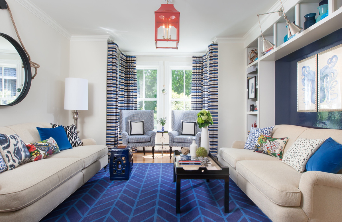
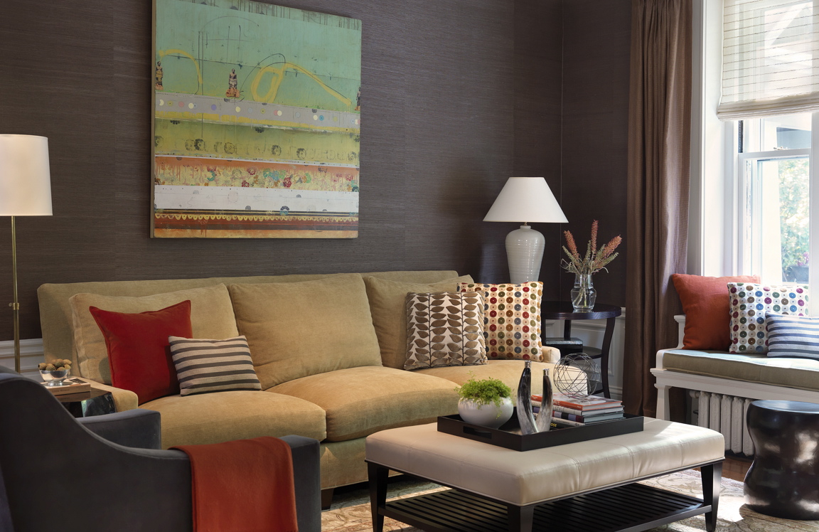
A couple of years ago I worked with a couple, and the woman said, “I love cream. I love neutrals and off-white. I love the beach.” Then, her husband said, “I love colors—the stronger the better.” If you look at the end result (in Brookline, below), the foundation is neutral, but layered with strong accents of color. I feel like they were both represented and happy.
7. What’s your advice for establishing a creative process?
I advise to pick one starting point—art is great. There’s been times where I work with clients who have art collection to begin with, and we pull the palette from the paintings. The same can be true with rugs, where you often have an established color palate and you can pull your fabrics and other patterns from there.
8. What is the best way to design on a budget?
I tell my clients that it’s important to invest in quality pieces. They’ll come to me and say that they want to do the whole house. If I don’t feel that realistically the budget covers the house, I’ll say, “Which three spaces do you spend most of your time in?” I’d rather have them do that and get good quality pieces than try to spread it out through the whole house and never be happy with end result. It’s better to start out with a smaller scope rather than try to do an entire space.
9. What are your favorite local places to shop?
Landry & Arcari has a great variety of broadloom, Tibetan, and custom rugs. It’s a great resource for a variety of different styles and price points.
10. You also use custom wallpaper a lot—what is the reaction of your clientele?
I think people have a love/hate relationship with wallpaper. Part of that is generational, but it’s making a comeback. I’m always excited when clients want to explore that option. If you’re hesitant, start out with a small space. Powder rooms are a great place to experiment. I also love using wallpaper in dining rooms—it’s a special place and it creates a lot of warmth.
I’m working on a great residential project in Cambridge right now. We’re using Fromental custom wallpaper from Studio 534 at Boston Design Center. I’m having a lot of fun—it’s even pushing me beyond my level of comfort, which is exciting.
Admire more of Rachel Reider’s portfolio at rachelreider.com. Info: 617-942-2460.

A WALLPAPER POWDER ROOM BY REIDER. PHOTO BY MICHAEL PARTENIO.

RACHEL REIDER DESIGNED THIS BROOKLINE HOME TO BALANCE A HUSBAND’S LOVE OF COLOR AND A WIFE’S LOVE OF NEUTRALS. PHOTO BY NAT REA.


