South End Sophisticate

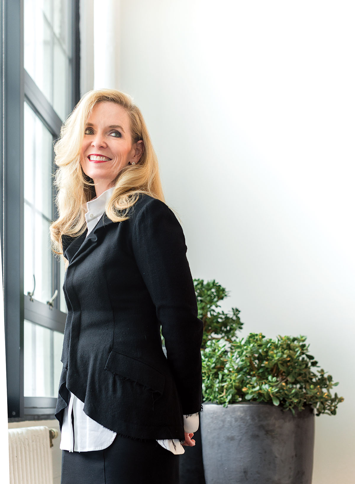
Elizabeth Lowrey in Elkus Manfredi’s Boston office. photograph by toan trinh.
Elkus Manfredi principal Elizabeth Lowrey’s whole life could be summed up as a study of interiors. “I have a camera in my hand at all times,” she says. “I drive people crazy with, ‘Did you see this? Look at this!’ I take pictures of indoor spaces, or exceptional lighting or light fixtures, table settings, silverware, the room number on the hotel room.”
Her interiors work can be found across the country and locally at new urban developments like Ink Block—a 6-acre South End apartment complex in the former home of the Boston Herald—and Boston Landing, a mixed-use project that will house New Balance’s headquarters and a sports complex where the Bruins will practice, plus a 175-room hotel, residential space, and a new MBTA commuter-rail station that’s slated to open in fall 2016.
Here, the Georgia native dishes on her favorite fashion tycoons, contemporary art, and why redevelopment is important to our neighborhoods.
In a word, how would you describe your style?
Elegant. I love fashion, and I’m very inspired by how it can inform my ideas and color palettes. Fashion is always ahead of interior architecture—it’s brave, and I love studying the materials, fabrics, colors, patterns, and politics that drive designers’ creations. I just got back from Belgium this past week, so I’ve also been flipping through [the work of] the Antwerp Six. Those designers were about minimalism, quality of texture. I think fashion is great at bringing the arts together. It’s faster than my field: Every season it has to reinvent itself. It’s where I continually go for inspiration, because it doesn’t stop evolving.
Who are your favorite fashion designers?
Dries Van Noten is one of the best colorists out there. I wear him; I’m inspired by him. And Charles James, the ballgown designer who has a show at the Metropolitan Museum of Art. I can’t stop looking at the show catalog because it’s glamour, it’s architecture. The pieces—the way they’re constructed is like building a building, and the color palettes are so simple and beautiful.
Where else do you draw inspiration?
Contemporary art. Donald Judd is an all-time favorite. He was an unbelievable minimalist master who is with me all the time. My father was a Donald Judd fellow and lived and worked in his studios in Marfa, Texas. That whole experience has really stayed with me: Being there, seeing it through my father’s eyes—there was this feeling, that ambiance, an immersion of what Judd was trying to do with the light quality and the texture of Texas.
Travel also influences my design. What is the quality of light in the region? I look at the landscape in a painterly way and ask, What is the experience and state of mind you are trying to paint?
What’s your favorite thing about your own home?
Both of my parents and my sister are fine artists and I treasure their work, along with the things I’ve collected. My ceilings are high, so I’ve been able to install big artwork. I’m sentimental; I love the history mixed with the new pieces. My dad painted a portrait of my mother in Paris when he was serving in the Army there after they’d become engaged, and it’s sitting next to a contemporary photograph.
So you live in the South End?
Yes. I love that it’s a neighborhood that has everything: people of all walks of life and socioeconomic groups living together. We have the best restaurants, great galleries, and you can walk anywhere.
Ink Block is in the old Herald space in the South End. How did you acknowledge the site’s illustrious past?
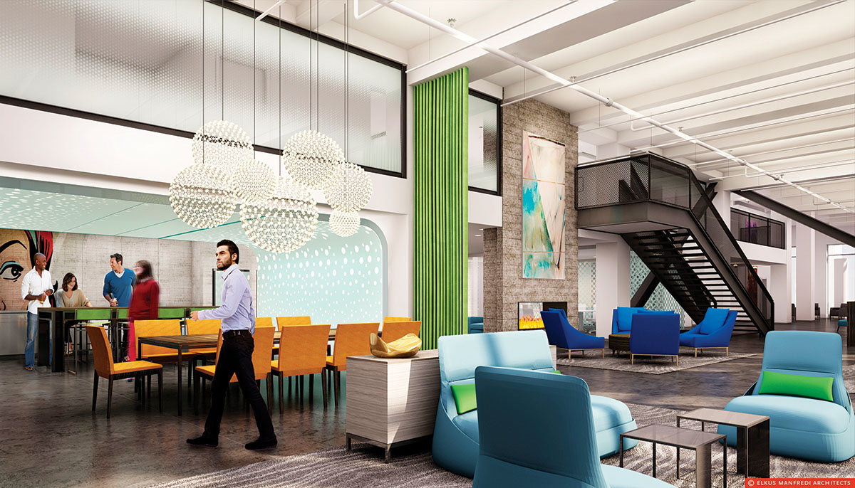
There are lots of nods in the design to the industrial, loftlike aesthetic. We have big, open volumes of space, and murals and artwork that reference the equipment used throughout the history of printing.
Who do you imagine living in Ink Block?
It’s very eclectic within the block. In general, we think that it will appeal to the international, globally sophisticated people who are currently flocking to Boston—a mix of academics, Big Pharma, Big Data. All of these industries are moving their headquarters here, which makes now an exciting time to be in the city. Multi family housing projects like this one target that clientele, as well as those returning to the city from the suburbs. You can eat out all the time, you don’t need a car, and everything’s right next door.
How did you distinguish the three buildings in such a large project?
We developed several prototypical tenants to create three distinct lifestyle stories. Each of the three buildings is meant to serve a slightly different tenant. In Ink 1, we imagined the international couple with a huge contemporary art collection that’s looking for a clean, simple, elegant backdrop for their lifestyle. Ink 2 was designed with the younger, hip, urban somebody in mind who works at Google and rides their bike to and from work. The materials are exterior-like. We like to say it’s black lacquer meets Lichtenstein: artsy and a little bit gritty. And Ink 3 was designed for mature individuals who are downsizing. It’s warm, moody, and refined.
Tell us about some of the ways you folded art into your design.
Ink 2 has a sense of humor, but people live here all the time, so we had to be very appropriate; these are not boutique hotels. Floor-to-ceiling graphics hang at the ends of each hallway: At one end of the corridor we have a female comic strip winking and the male counterpart smiles back at the other end.
Let’s talk about Boston Landing. Is this the beginning of a new Allston-Brighton?
We believe Boston Landing will be a transformative, one-of-a-kind project that will create a distinctive and dynamic identity for visitors and residents, and serve as a new, western gateway to Boston. We think it will strengthen the surrounding urban fabric by creating new green spaces, instituting an updated street grid, and vastly improving the pedestrian experience. There was a real focus on truly enhancing how people live, work, and play.

A rendering of the Ink 1 lobby. Photo by Toan Trinh.


