A Lakeside Beauty in Newton
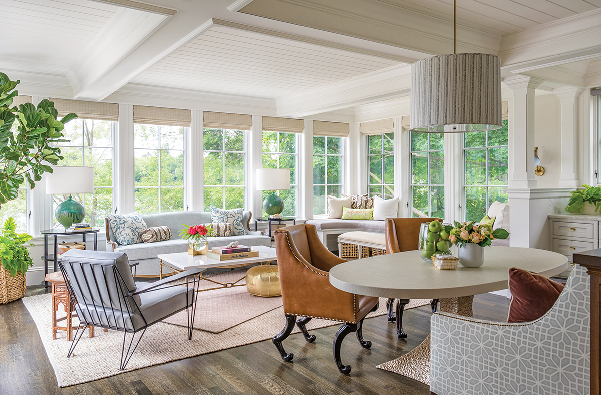
In the living room, a neutral palette echoes the landscape outside. / Photograph by Eric Roth
The owner of this lakefront Colonial Revival in Newton first glimpsed her future home in 1997, when she was a student at Boston College. “I used to walk from campus down to this neighborhood and imagine living on the lake,” she says. “This was the house I always loved to look at. But I never expected to own it.”
As the budding professional built a career in software development, she kept an eye on the lake. When her favorite home landed on the market in August 2014, she made an immediate offer—followed by a prompt retreat to its third-floor attic apartment, where she lived for two years during reconstruction. “I started gutting the house as soon as I moved in,” she says. “It probably would have been faster if I knocked the place down and started from scratch. But I didn’t want to live in a brand-new house. I’m an old soul.”
The same description easily applies to the grand white building hugging the water’s edge. With its wraparound verandas and profusion of windows, the 5,400-square-foot abode has a dreamy, suspended-in-time quality that the homeowner was anxious to preserve.
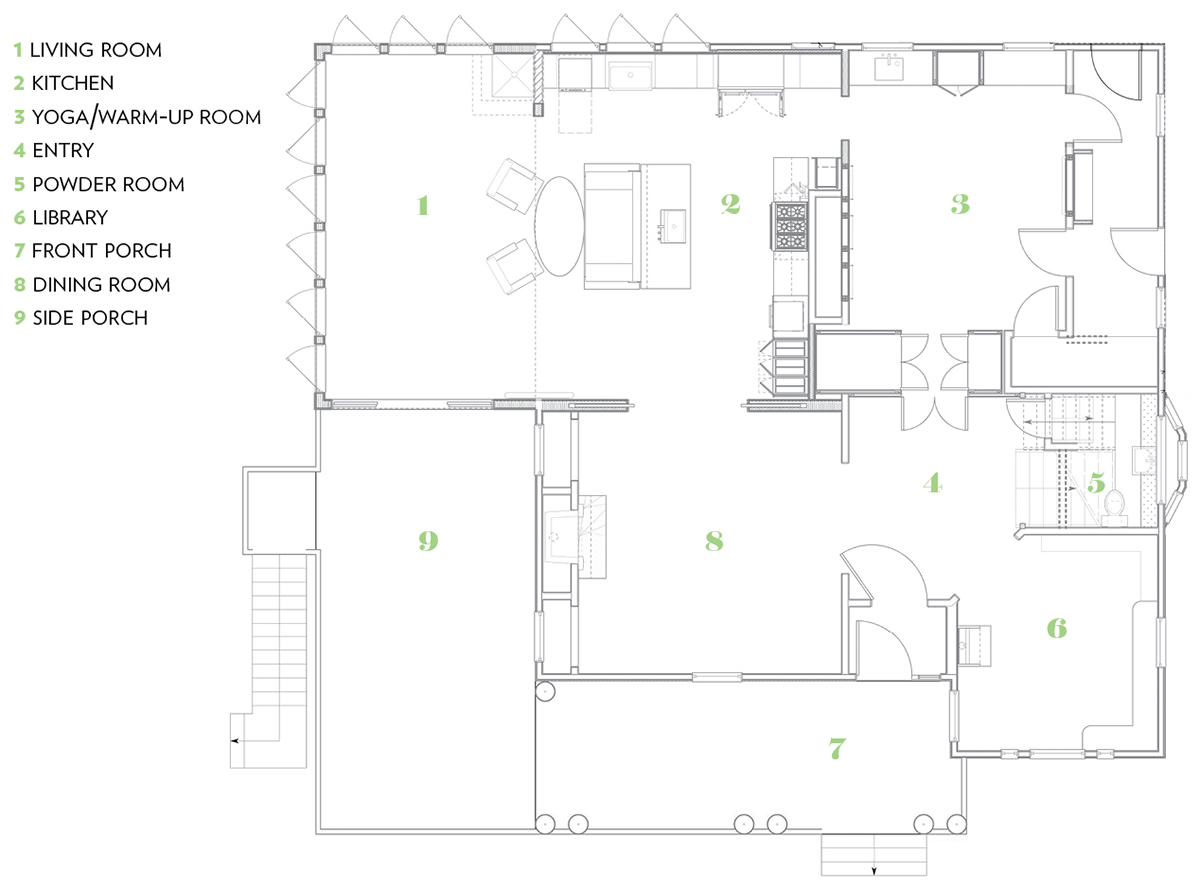
The interior, however, needed some work. Built in 1899, the original structure was unsound in some areas, incongruous in others. The floors on the main level sloped, while an enclosed kitchen faced an interior wall. And a “kind of cruddy” three-season porch obstructed views of the lake. The homeowner enlisted Fallon Custom Homes & Renovations, of Needham, to reframe the sagging lower levels and reorganize the cramped layout. Her one request—to be able to gaze out at the water while standing at her kitchen sink—required some serious demo. The team razed the attached porch and shored it up from the basement, building an airy family room bordered by windows. Now, a glass door swings open onto a new porch overlooking the water. The interior wall also came down, allowing for a spacious kitchen with marble countertops and maple cabinets, designed and executed by Fallon. An island with a sink and a banquette for both dining and admiring the scenery underscore the fluid layout; the kitchen segues into the living area with ease.
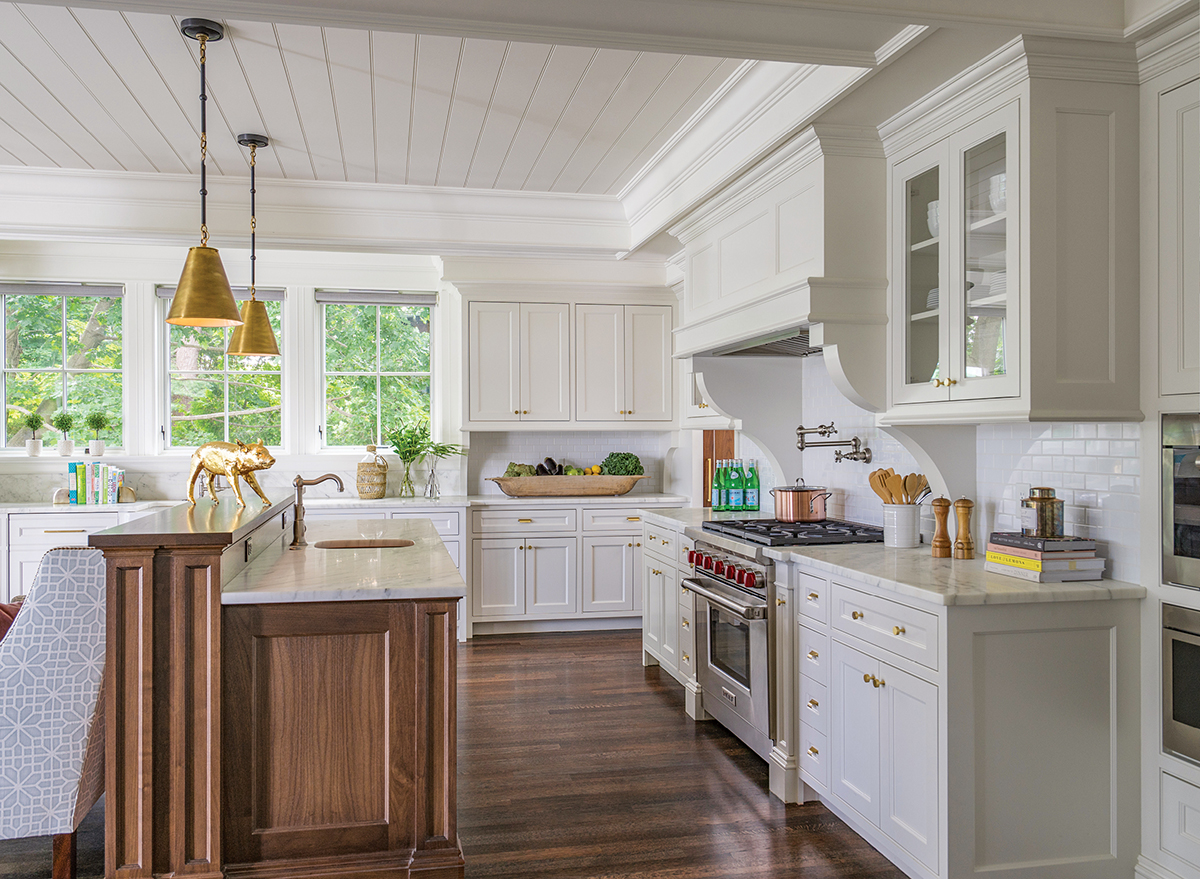
The custom walnut island allows the homeowner to appreciate the view while standing at her kitchen sink. / Photograph by Eric Roth
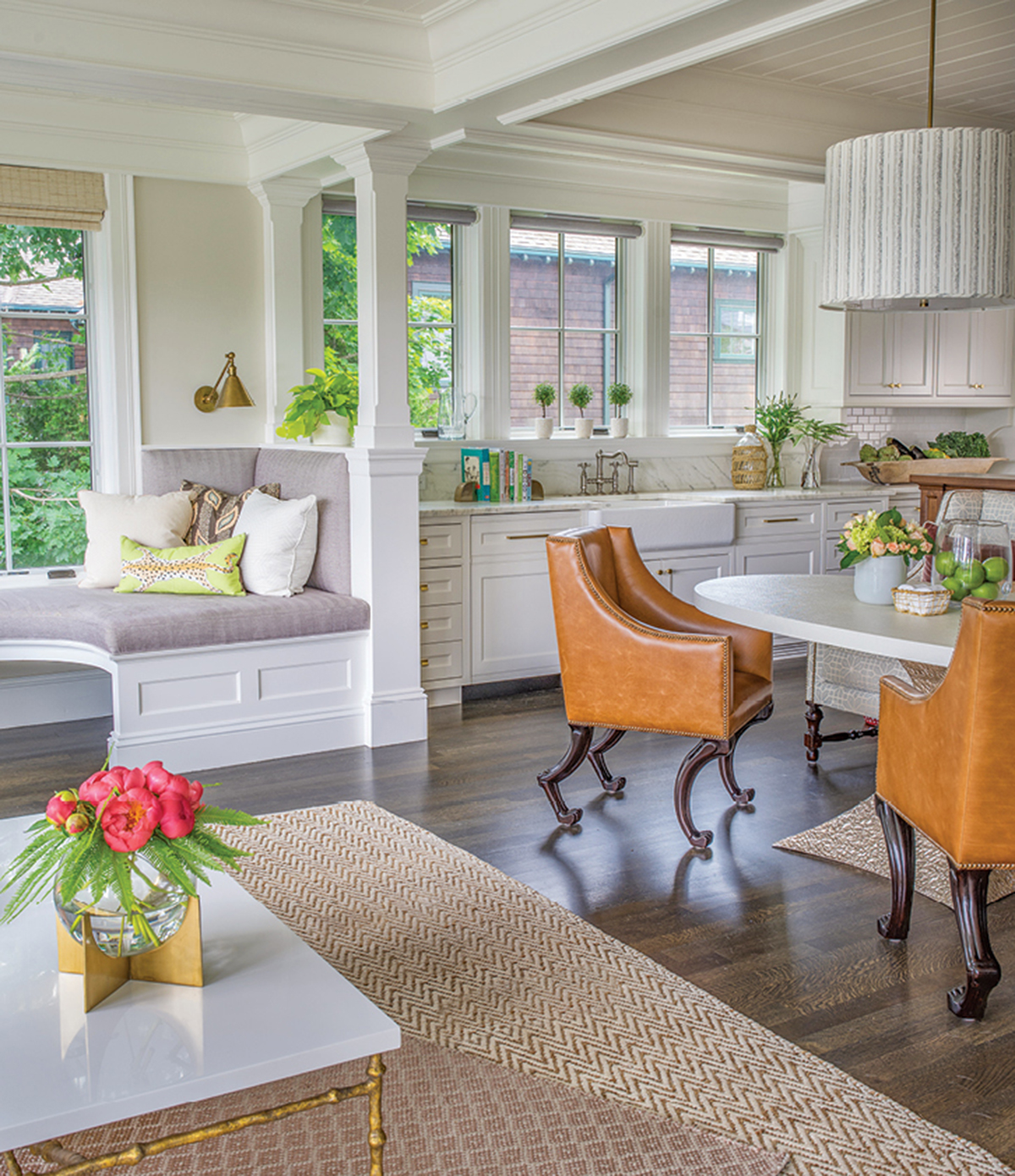
Custom woodwork in the family room and kitchen leads the eye throughout the shared space. / Photograph by Eric Roth
As the plan for the structural elements came together, there was just one problem left to solve: the décor. “I was losing sleep over the renovation,” the homeowner says. “The thought of decorating gave me an anxiety attack.” On a recommendation, she recruited Newton-based interior designer Liz Caan to cultivate a complete vision for the house.
Caan arrived on site and remained for three years, overseeing the project from beginning to end. “It was actually a luxury to have such a drawn-out process,” the designer says. “I had time to let my ideas percolate and really understand the client and the space.”
Caan’s goal was to create a casual atmosphere for her client to relax and entertain in, while honoring the home’s roots. In the family room, she installed a mix of vintage and contemporary pieces from Oly Studio; a curvy light-brown sofa and an angular dusty-blue chair form an unexpected symmetry. On the side tables, dark-green lamps echo the foliage outside, while two brown leather armchairs add an earthy note. The meditative palette reflects the natural landscape glinting through the windows. “I wanted to capture the essence of the lake while avoiding obvious clichés, like oars on the walls and horn chandeliers,” Caan says.
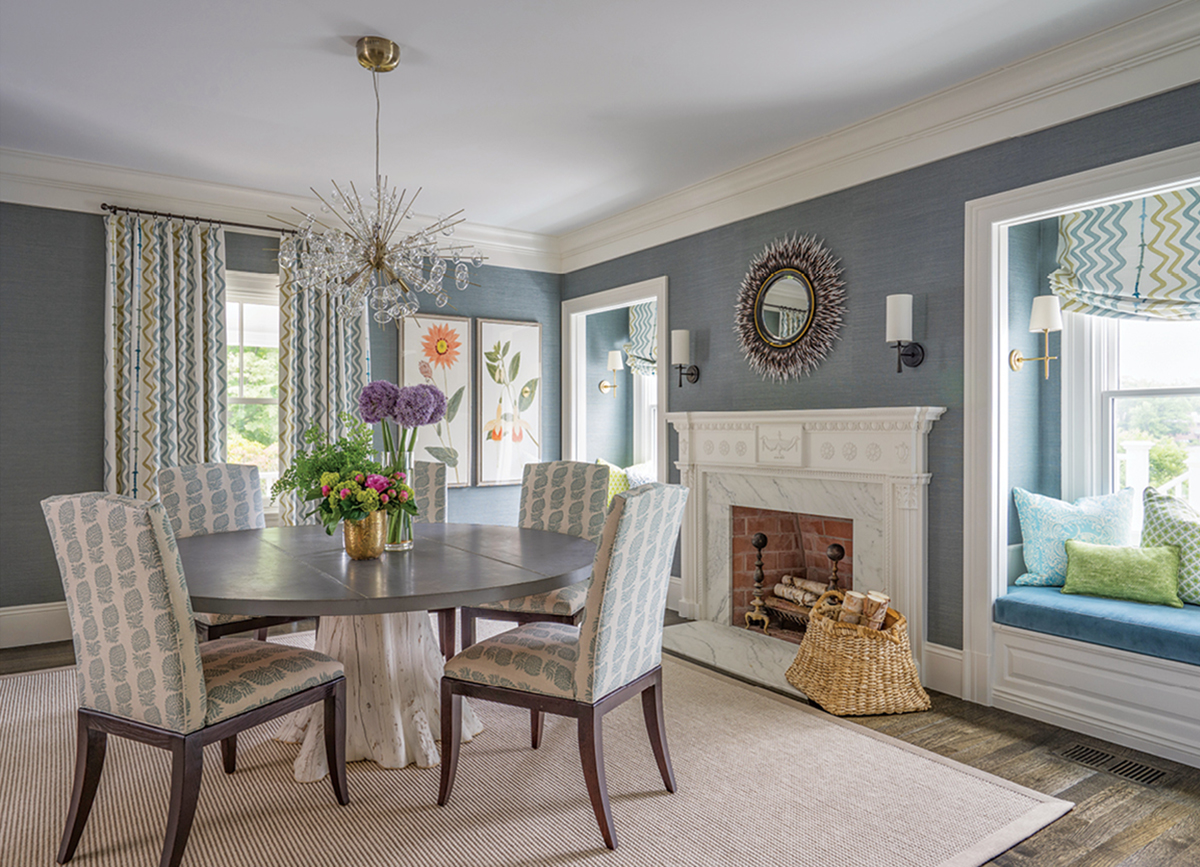
Brett Larson of Fallon Fine Cabinetry restored the original trim in the dining room to preserve the home’s charm and character. / Photograph by Eric Roth
The elemental theme flows into the dining room, where a zinc tabletop sits on a gnarled-tree-stump base, and a mirror wreathed in porcupine quills playfully contrasts with the stately marble fireplace and ornamental trim. Caan took a more traditional approach in the library, emphasizing the original wood paneling, bookshelves, and window seat with formal details: a winged armchair, a long-limbed floor lamp, and an upright desk (the homeowner prefers to work standing on her feet).
One of the designer’s biggest challenges was figuring out how to repurpose an empty room attached to the back of the kitchen. Inspired by her client’s passion for running, Caan converted the space into a yoga studio and warm-up area. It’s also the preferred hangout of the owner’s mixed-breed dog, Regis.
After decorating the main level, the designer tackled the three bedrooms on the second floor, where her client had a cozy, old-fashioned aesthetic in mind. “She used the word ‘doily,’” says Caan, who layered richly patterned fabrics to give each room a soulful, artisanal beauty. For the finishing touches, Caan installed a clawfoot tub in the guest bath, and surprised her client with a special rug for the hallway. “Believe it or not,” the homeowner says, “it looks like a doily.” With its intricate weave, the marigold-hued rug also bears a certain resemblance to a fingerprint—and that’s the point. “This house is so obviously built for the owner,” Caan says. “It’s her.”
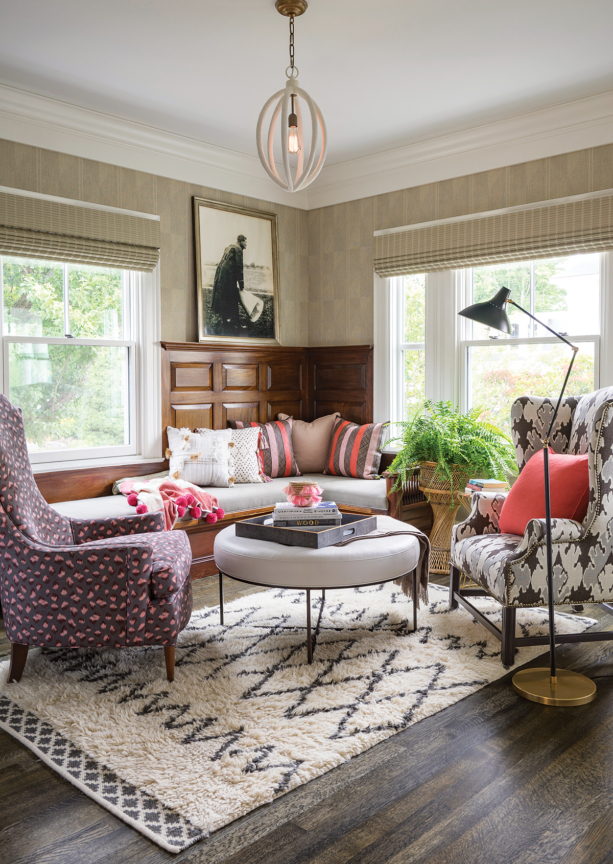
The library’s stately wood paneling remained untouched during the renovation. / Photograph by Eric Roth
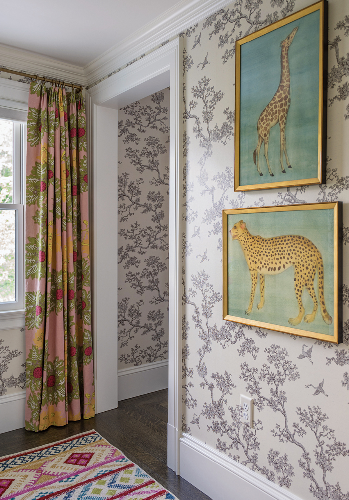
Paintings by Connecticut-based artist Mary Maguire and linen curtains create an acquired, lived-in effect. / Photograph by Eric Roth
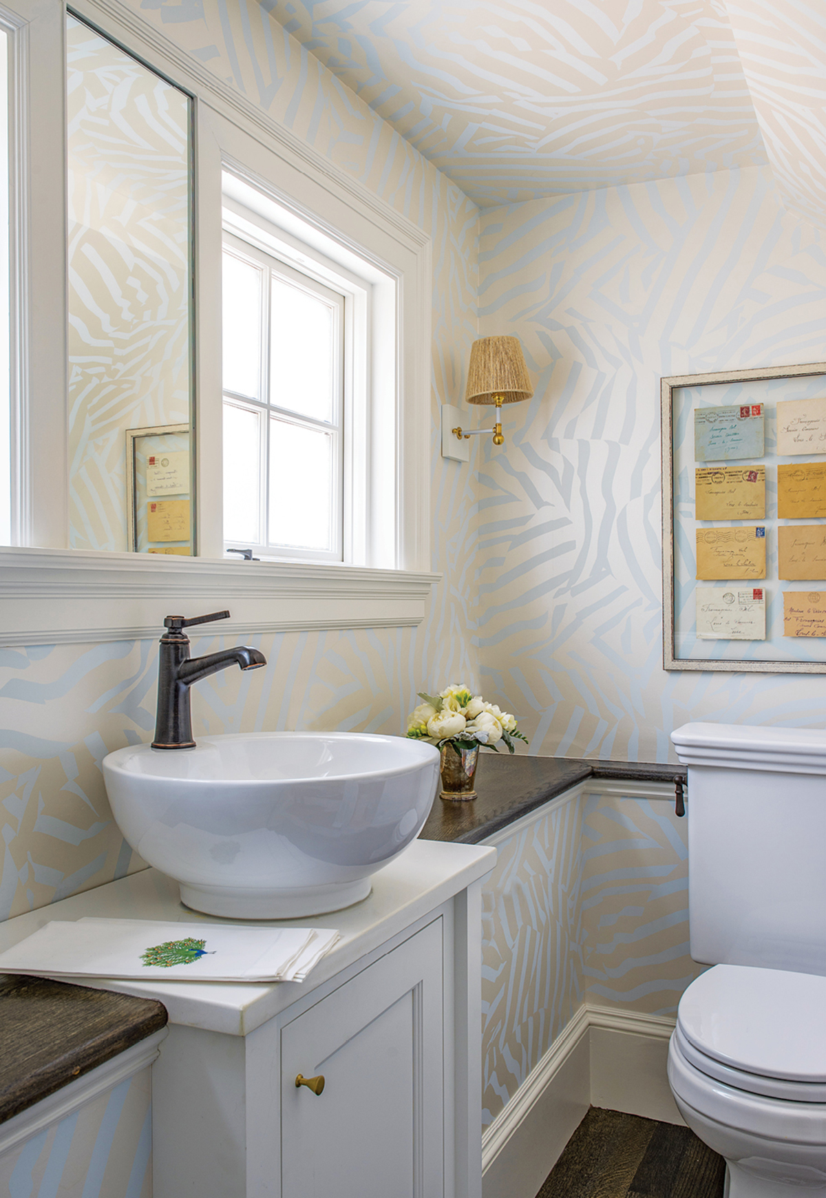
Printed wallpaper by Flat Vernacular updates the “cute and funky” powder room under the stairwell. / Photograph by Eric Roth
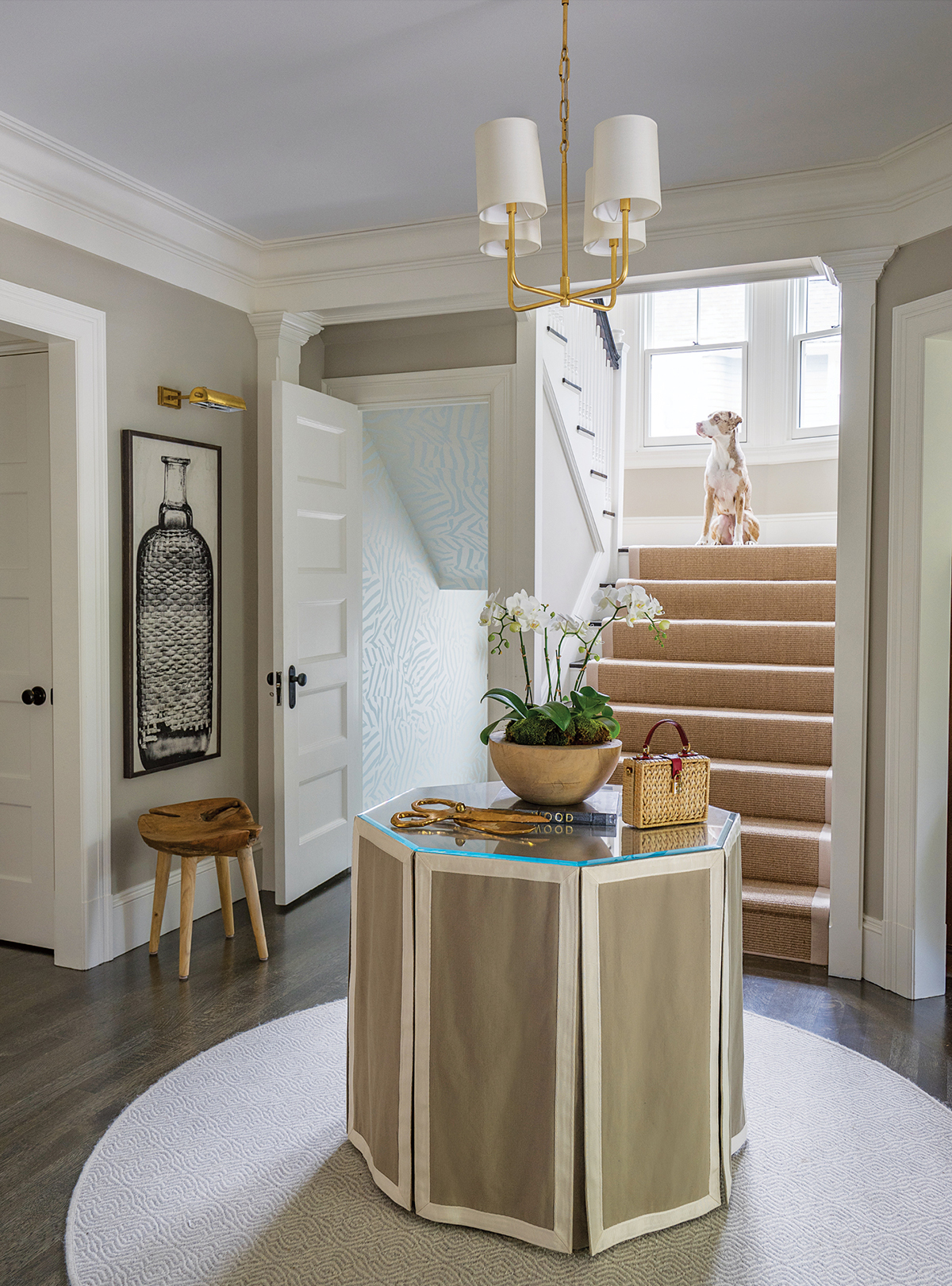
The resident canine, Regis, greets guests in the foyer. / Photograph by Eric Roth
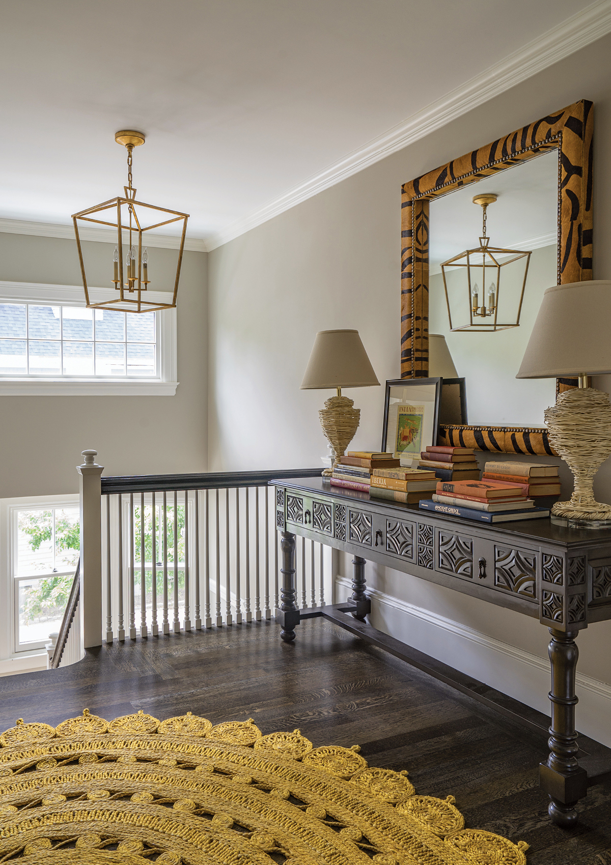
A Lulu & Georgia rug recalls a doily. / Photograph by Eric Roth
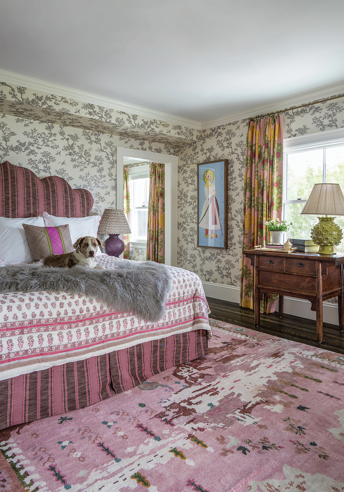
An upholstered, arabesque-shaped headboard and a riot of prints give the master bedroom an exotic, antique appeal. / Photograph by Eric Roth

In the master bath, undulating green-and-blue tiles mirror the movement of the lake outside. / Photograph by Eric Roth
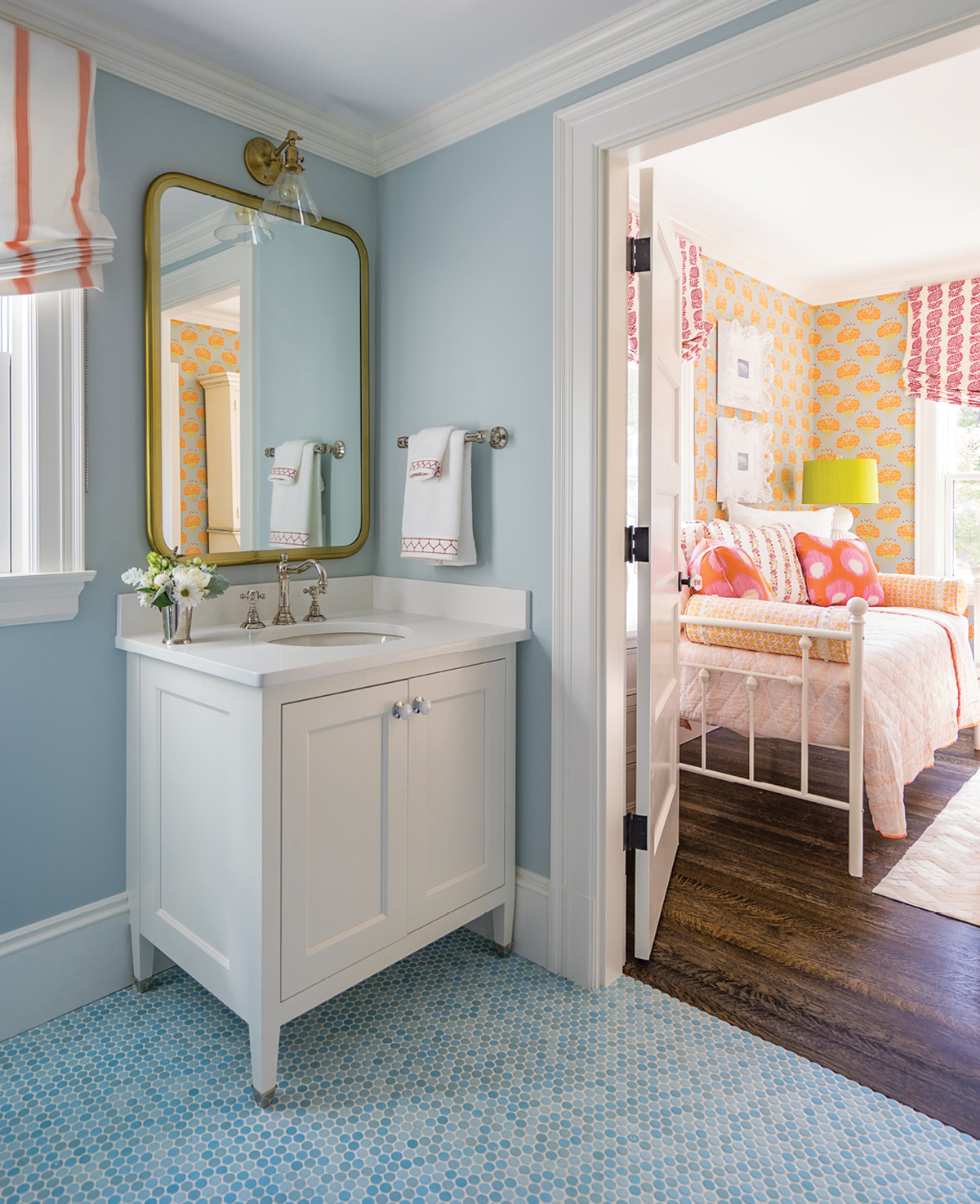
A shared bath adjoins the two guest rooms on the second floor. / Photograph by Eric Roth
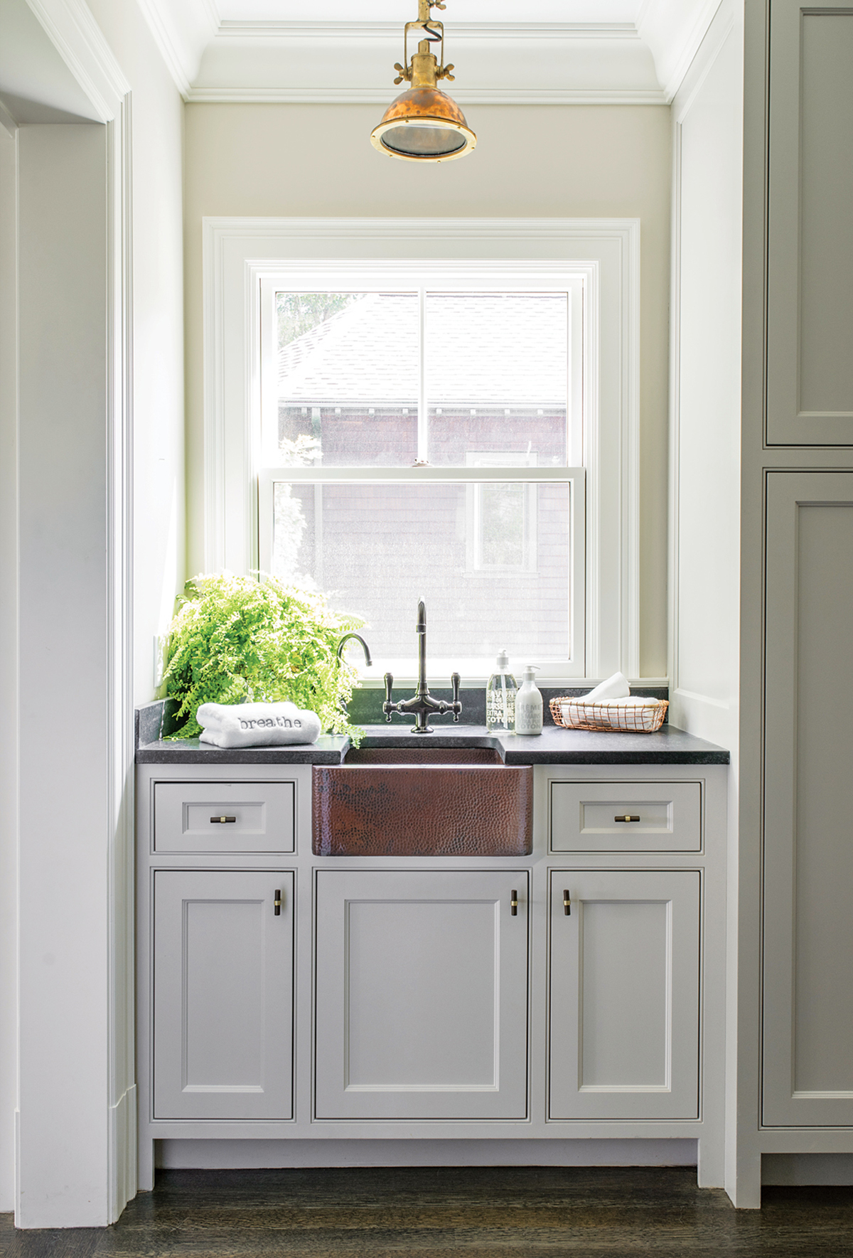
A copper ship’s lamp in the yoga studio adds a light nautical touch. / Photograph by Eric Roth
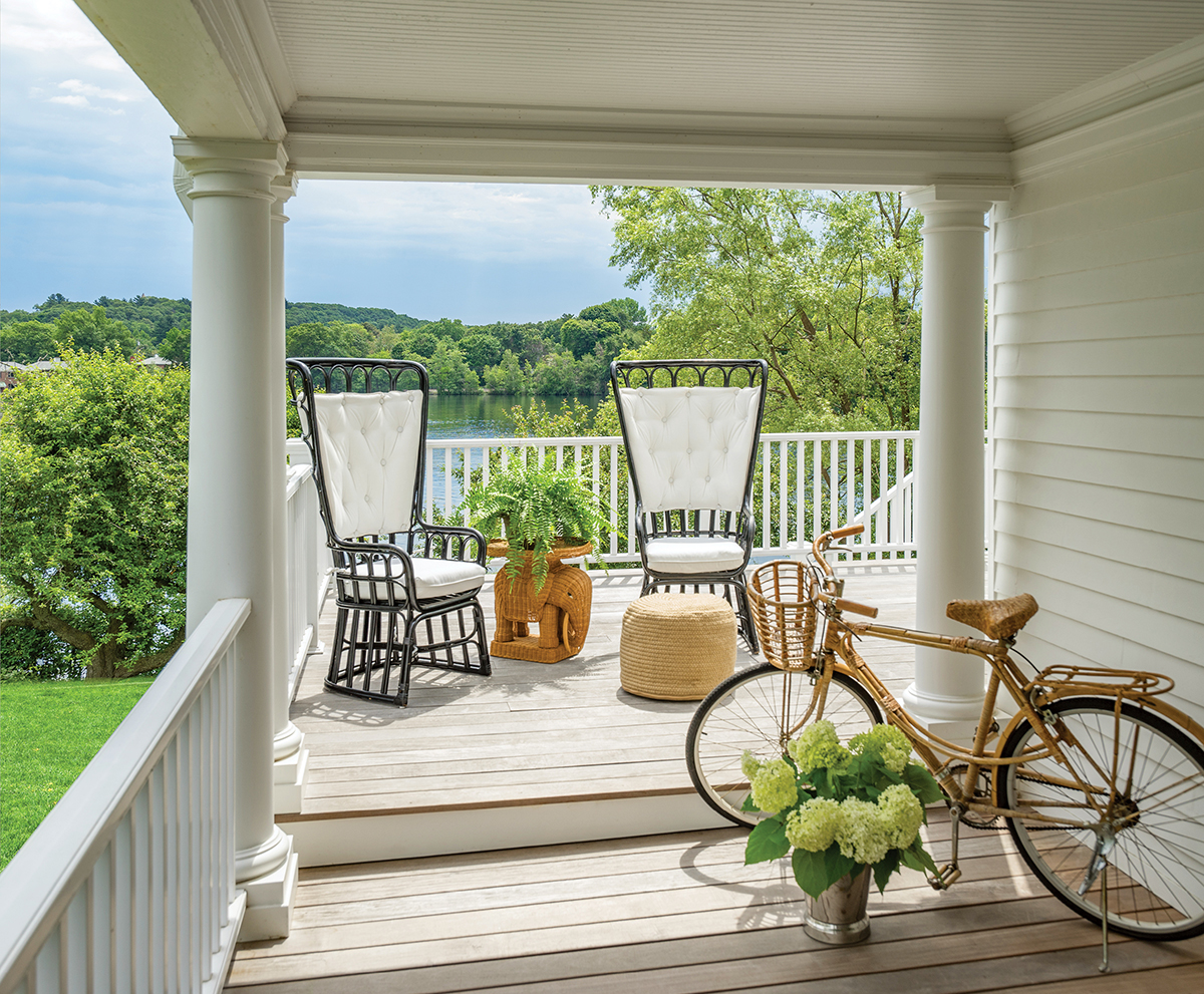
The home’s wrap-around veranda, outfitted with vintage chairs from Circa Who, is a sundrenched retreat. / Photograph by Eric Roth
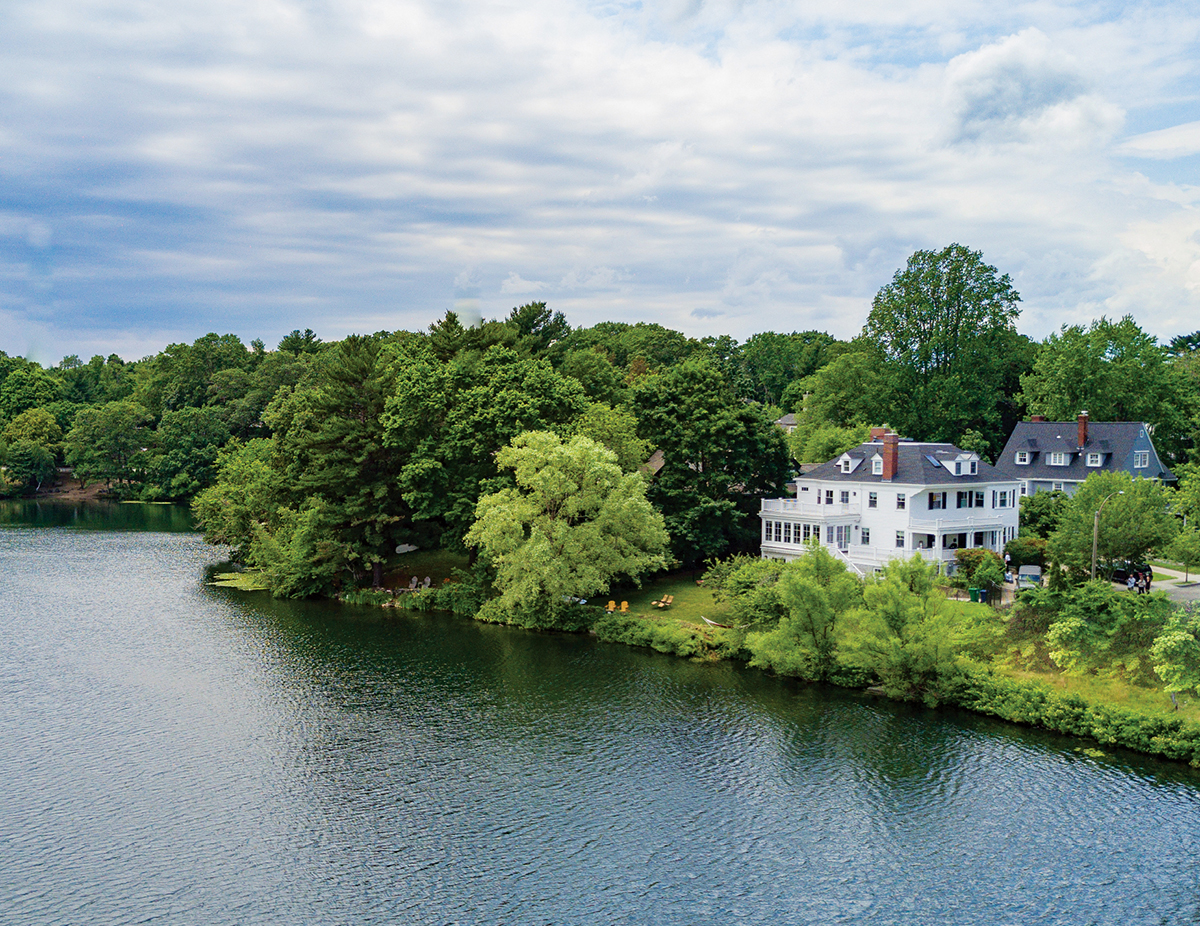
Proud and private: the 5,400-square-foot-home sits near the lake, sheltered by trees. / Photograph by Eric Roth
