Past Is Present: Loosening Up a Formal Estate in New York
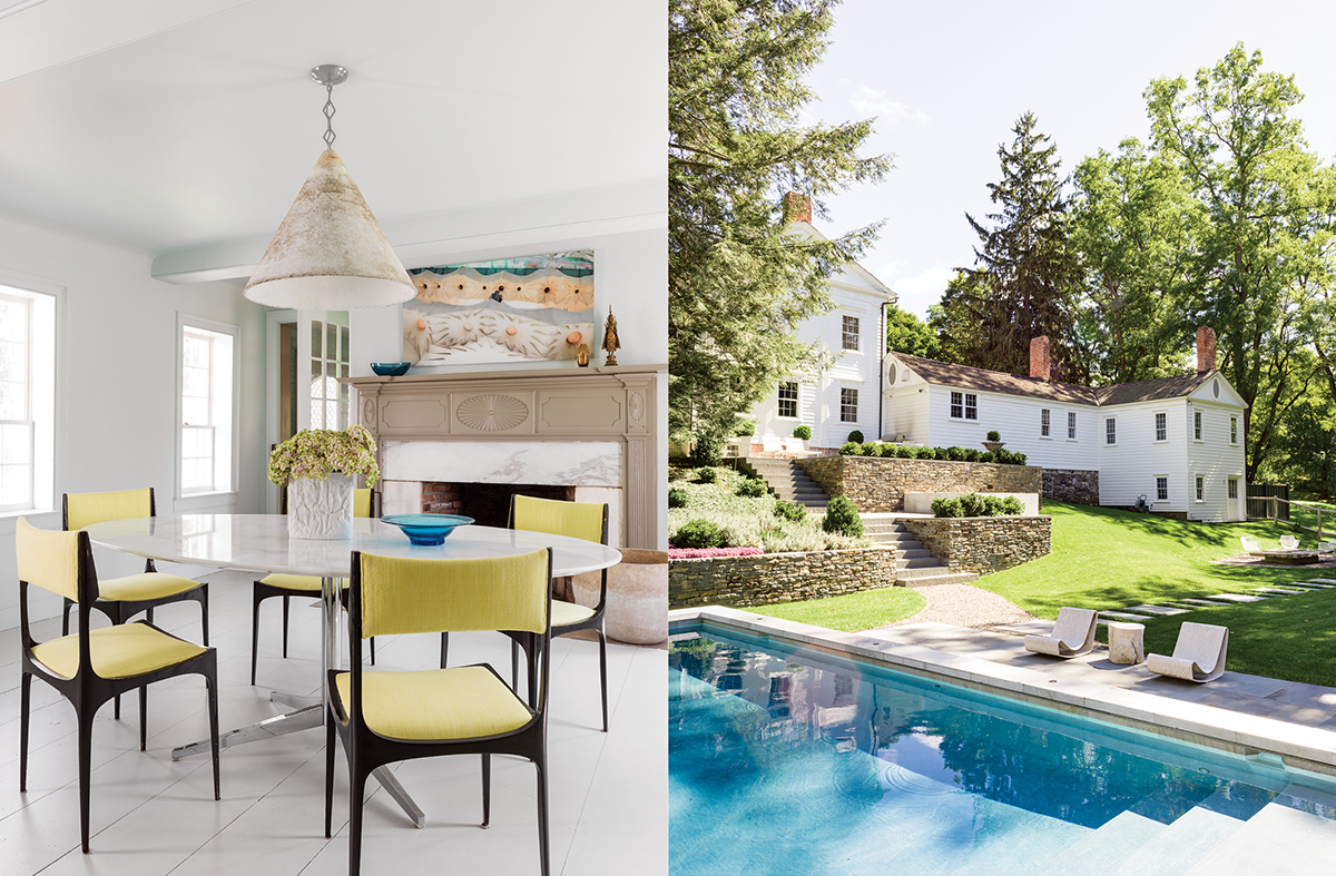
Left: Upholstered in chartreuse, midcentury modern chairs from Italy create a casual vibe in the breakfast room. Right: A pool can look out of place among traditional gardens. Roop avoided that by elevating it: “It’s not flush with the patio, so it feels like a fountain,” he says. / Photograph by Stephan Julliard
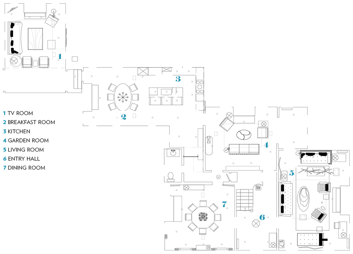
How do you turn a buttoned-up, formal estate into a weekend-friendly, barefoot-casual escape? That’s the challenge Boston-based interior designer Frank Roop faced with an upstate New York home, built by Mormon farmer Anson Pratt in 1796. The 4,200-square-foot house exemplifies the Adam style, an 18th-century neoclassical design known for ornate, neo-Gothic flourishes—and not for a laid-back vibe. “It was a little intimidating,” Roop confesses. “It’s a house that needed to be reinvented for modern living.”
Fortunately, designing for modern living is Roop’s specialty; so he went to work, choosing to preserve important architectural elements, like mantels and millwork, and refraining from major structural changes. “We respected the history,” Roop says. As such, the designer focused on cosmetic improvements, limiting any substantial overhaul to bathroom and kitchen fixtures, lighting, painting and papering, and floor work. To his surprise, an update to the flooring made the most visual impact. Prior to the renovation, the wood styles had been mismatched and some polished with classic caramel color. Roop stripped and bleached the floors, and then used matte poly finish to make them look like raw wood, taking the color scheme in a distinctly Scandinavian direction. The effect is rustic and relaxed, but still highly polished.
Next, Roop focused on the toile wallpaper and formal wall treatments, which “made the walls feel like they were closing in on you,” he says. “Even as a designer it was hard to see through them—they were so stylized.” Adding unexpected elements, such as the lime-green pressed-grid effect in the garden room, helped loosen things up. “The house has such a classic architecture,” Roop says. “I wanted to contrast it with things that were more creative and challenging—things you wouldn’t expect.” A sparkly pendant light resembling a disco ball, for example, hangs in front of an original fireplace with antique brass andirons.
But challenging the home’s existing aesthetic didn’t mean fighting it. Instead, Roop worked with what the house already had in abundance: hand-detail work. None of the home’s original millwork or trim was made by machine. Here Roop, as a designer who prefers designed or found objects over mass-market furnishings and textiles, was well within his comfort zone. Playing off the home’s “handcrafted vibe,” he offset the kitchen’s centerpiece—an artful periwinkle range—with a wall of one-of-a-kind Moroccan tiles. Unique details like these add a cheerful air to the home, especially when juxtaposed with the cool and calming white-marble elements, such as the oval dining table, that are peppered throughout the living space. “I want each piece to have its own identity, its own visual space,” Roop says. Even though the home is formal, “the handcrafted elements give it a relaxedness.”
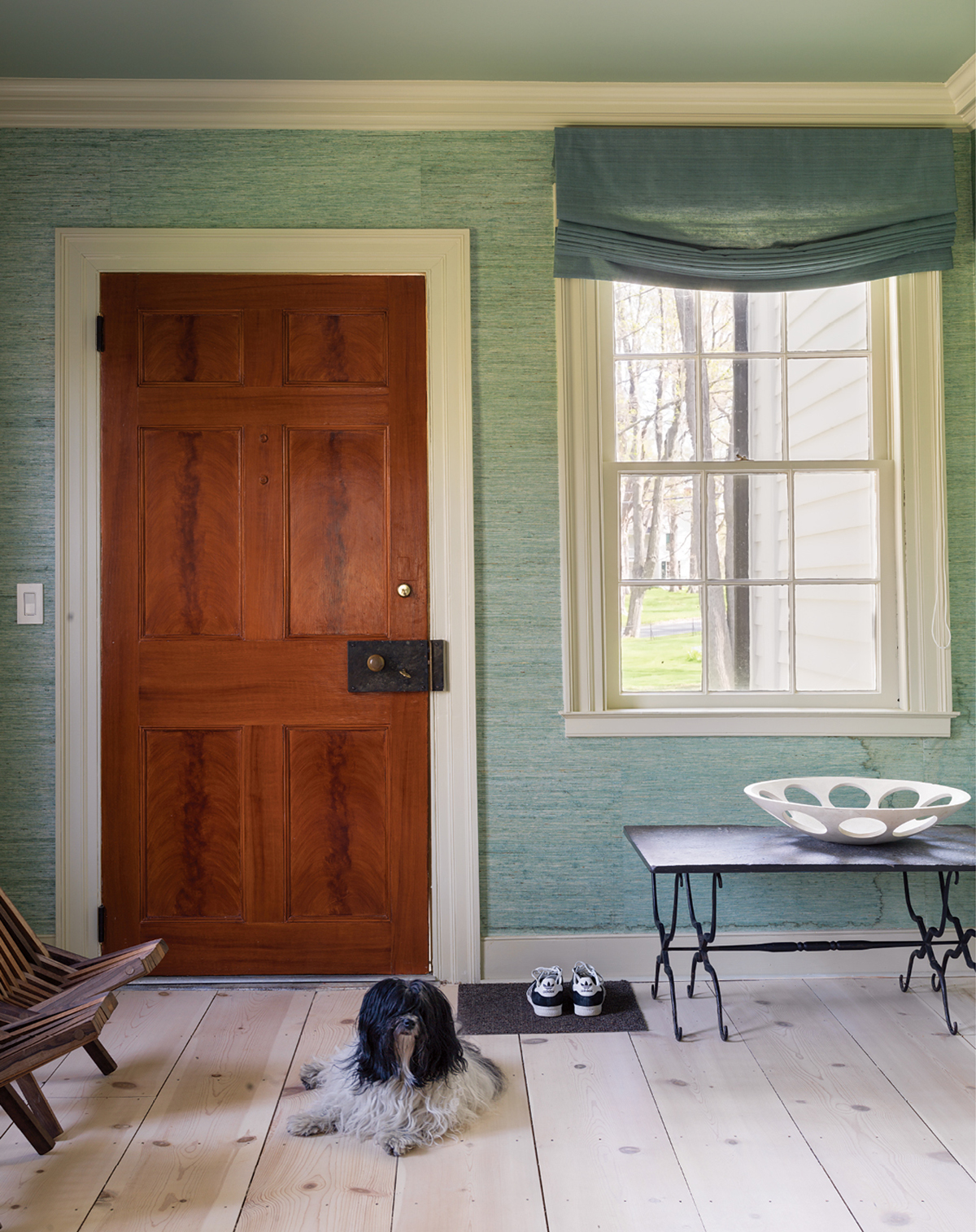
Roop brightened the dark and formal interiors by stripping and bleaching the floorboards, some of which are original to the house. “I wanted a more Scandinavian look, which makes them feel more rustic and relaxed,” he says. / Photograph by Stephan Julliard
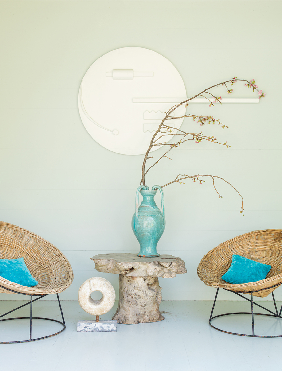
To create cohesion with the surrounding landscape, the designer chose a palette of greens, blues, and teals. / Photograph by Stephan Julliard
The lush grounds of the estate, meanwhile, inspired the serene landscape indoors. Roop’s cool, organic color scheme (think: ocean turquoise, cloud gray, grass green) provides additional contrast to such heavy architectural elements as the ornate fireplace mantels and the striking flying staircase, the focal point of the house. “The cooler palette makes it more open, makes it breathe more,” Roop explains.
Outside, Roop once again reimagined the existing details. The barn, for example, had spent decades in derelict condition but had been recently shored up. Roop strategically positioned a pool in front of it, treating the barn like an enormous pool house. The effect is that of a reflecting pond—one you can swim in. And just as he did indoors, Roop experimented with unexpected colors. Once a classic red, the barn now bears a sophisticated gray veneer with blue doors. “It’s subtle, actually—more than a red barn,” he points out. “The gray disappears more in the greenery.”
The house will always be a showpiece, but now it’s one where you can put your feet up. “The architecture is the strength and the backdrop to the design,” Roop says. “It has a three-dimensional textured depth that you can’t create in a new house.”
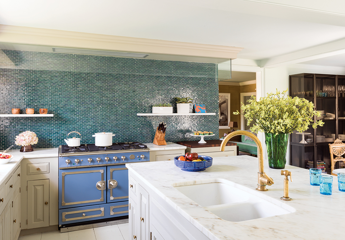
Roop ripped out the upper cabinets and left the kitchen with base cabinets only, providing ample space for a backsplash of ceramic Moroccan tile. / Photograph by Stephan Julliard
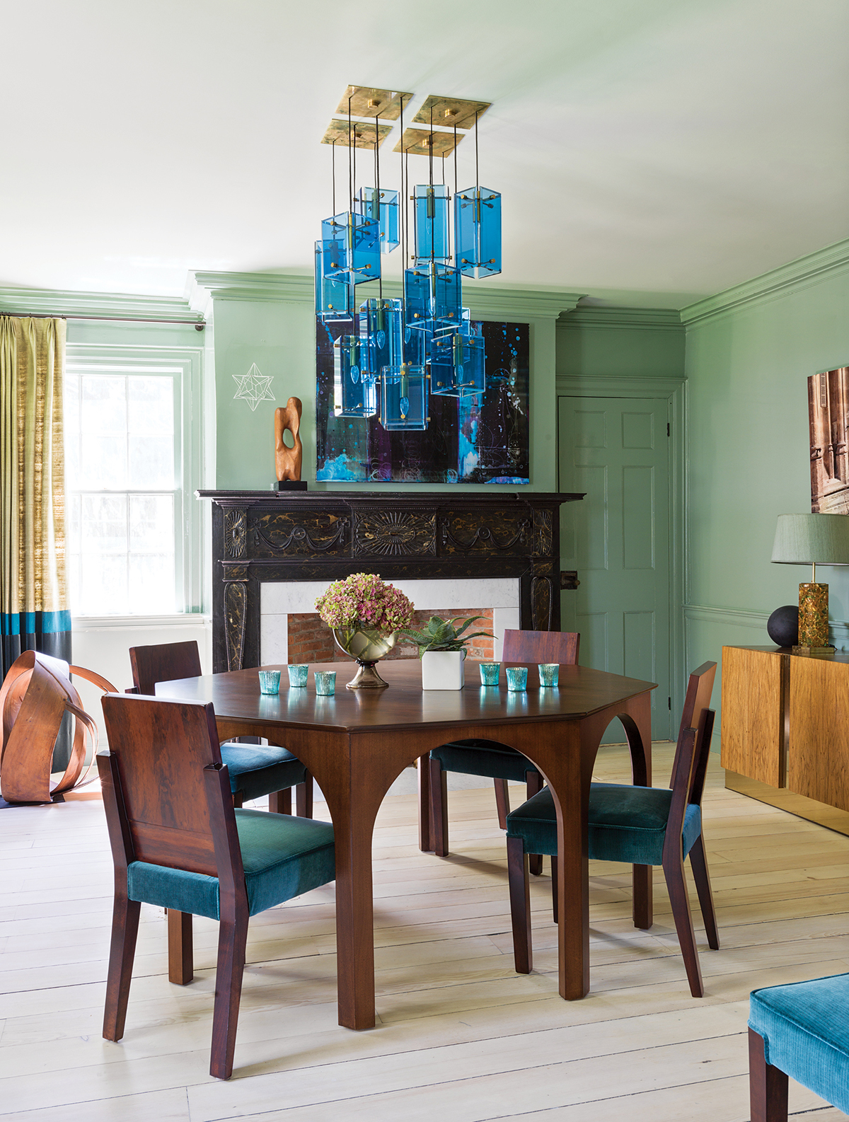
To create the dining room’s one-of-a-kind light fixture, Roop deconstructed two 1950s-era Italian glass chandeliers and hung them at different heights. / Photograph by Stephan Julliard
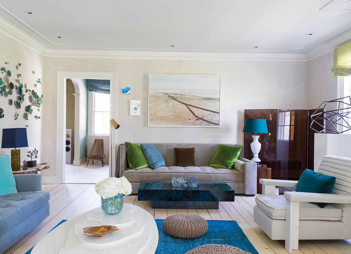
Roop collected Brazilian geodes to create the installation above the low-slung blue couch in the living room. / Photograph by Stephan Julliard
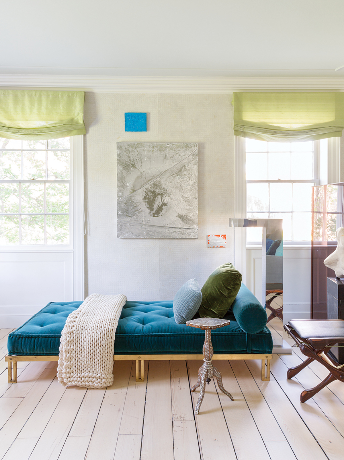
A mix of colors, textures, and fabrics adds character to the living room. “I want each piece of furniture to have its own identity and separation,” Roop says. / Photograph by Stephan Julliard
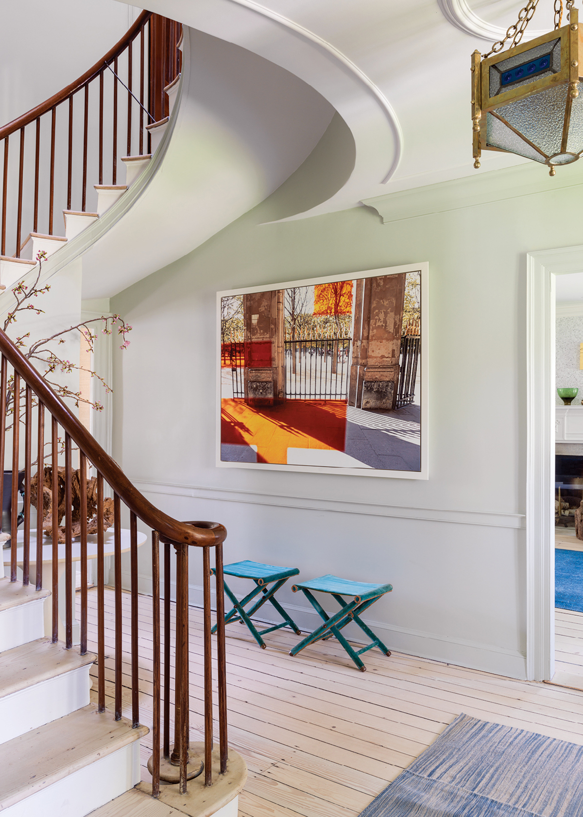
A flying staircase, built more than 200 years ago, anchors the house. / Photograph by Stephan Julliard
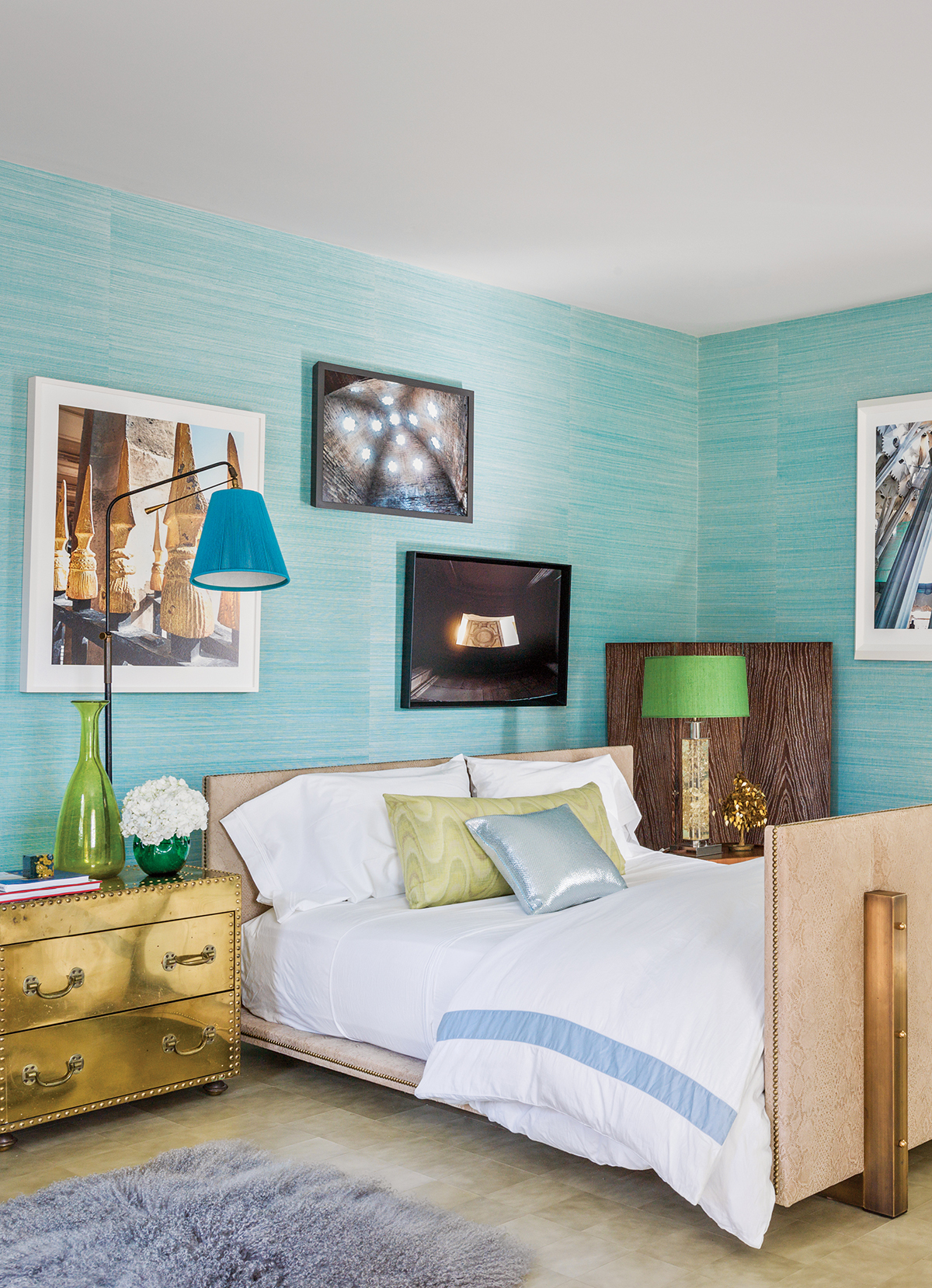
A vintage brass chest serves as a night table in the master bedroom. / Photograph by Stephan Julliard
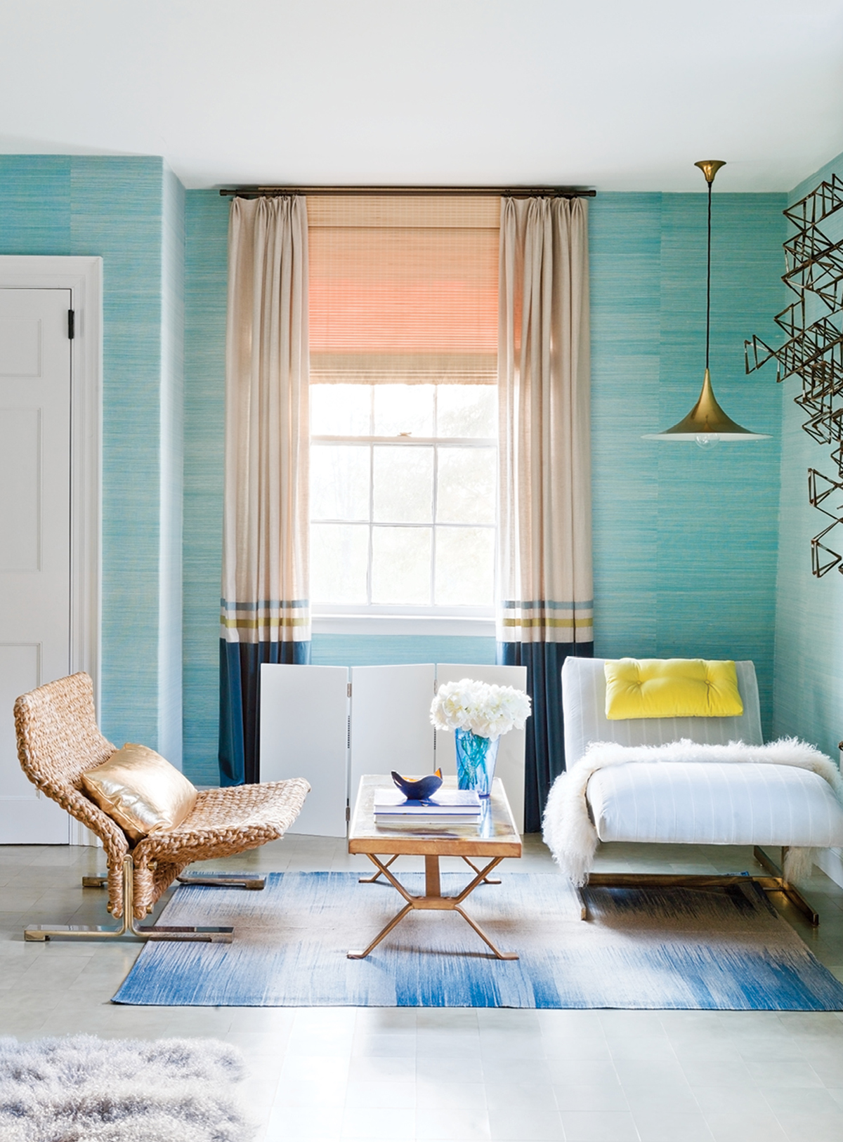
Woven with yarn, a vintage Italian chair graces the master bedroom. / Photograph by Stephan Julliard
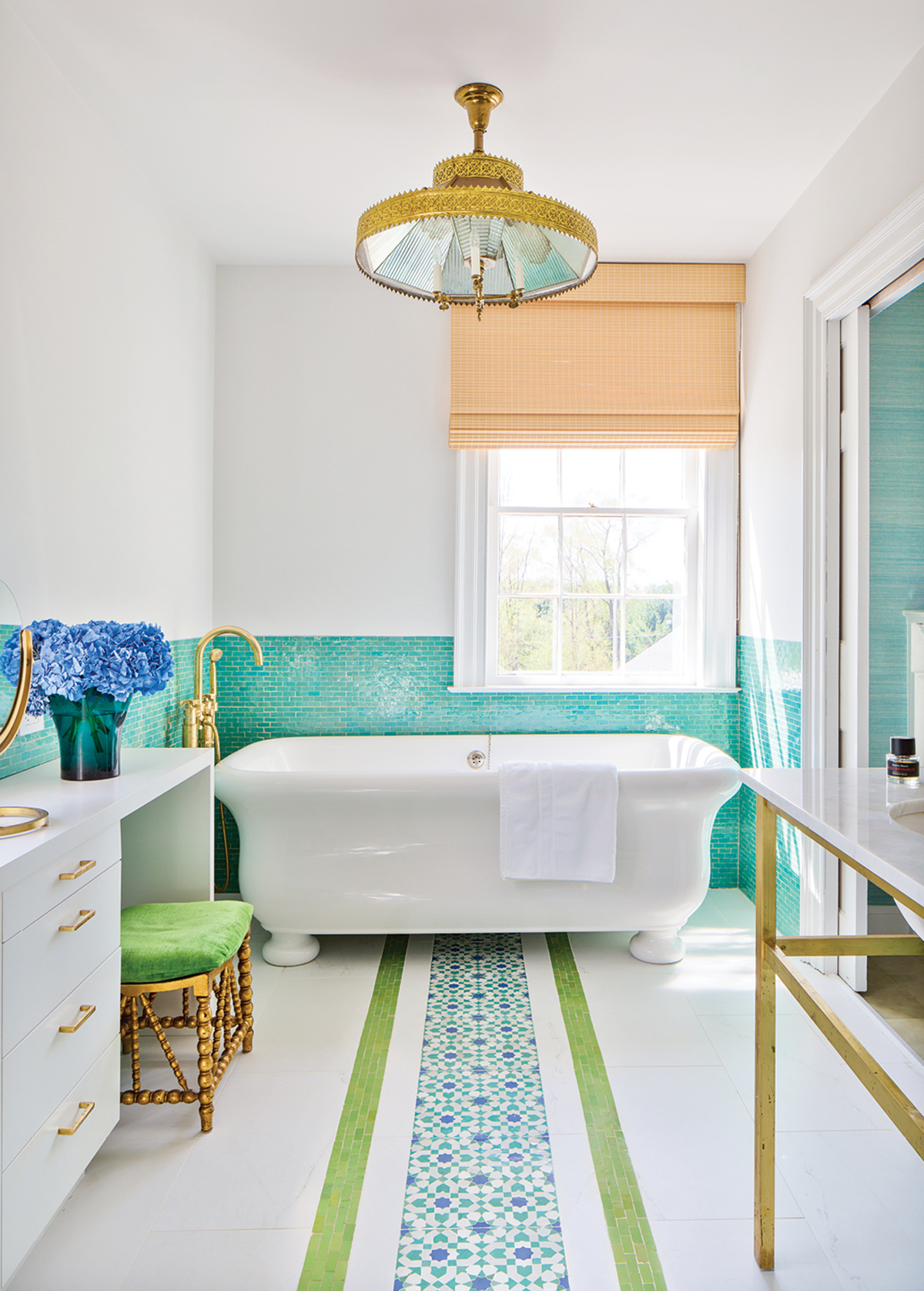
Roop designed an inlaid ceramic Moroccan tile pattern for the master-bathroom floor. / Photograph by Stephan Julliard
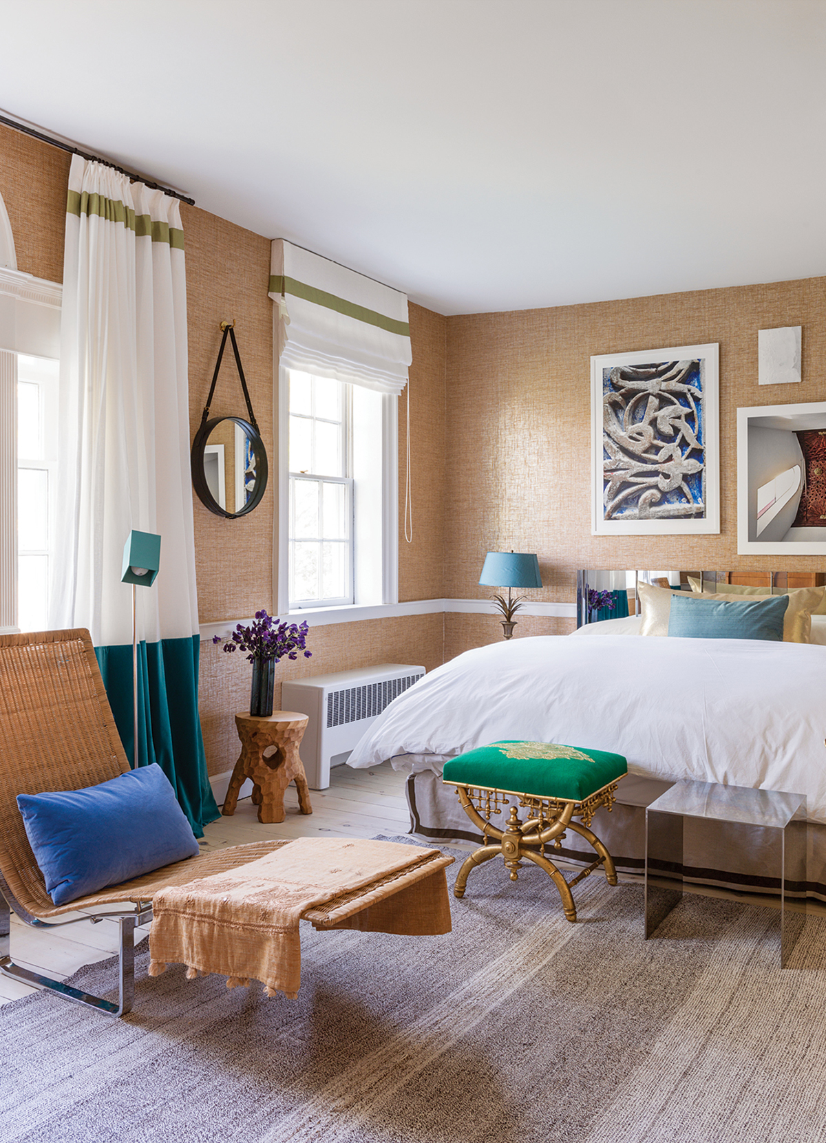
The raffia wall treatment in a guest room boasts a subtle shimmer, thanks to the silver leaf behind it. / Photograph by Stephan Julliard
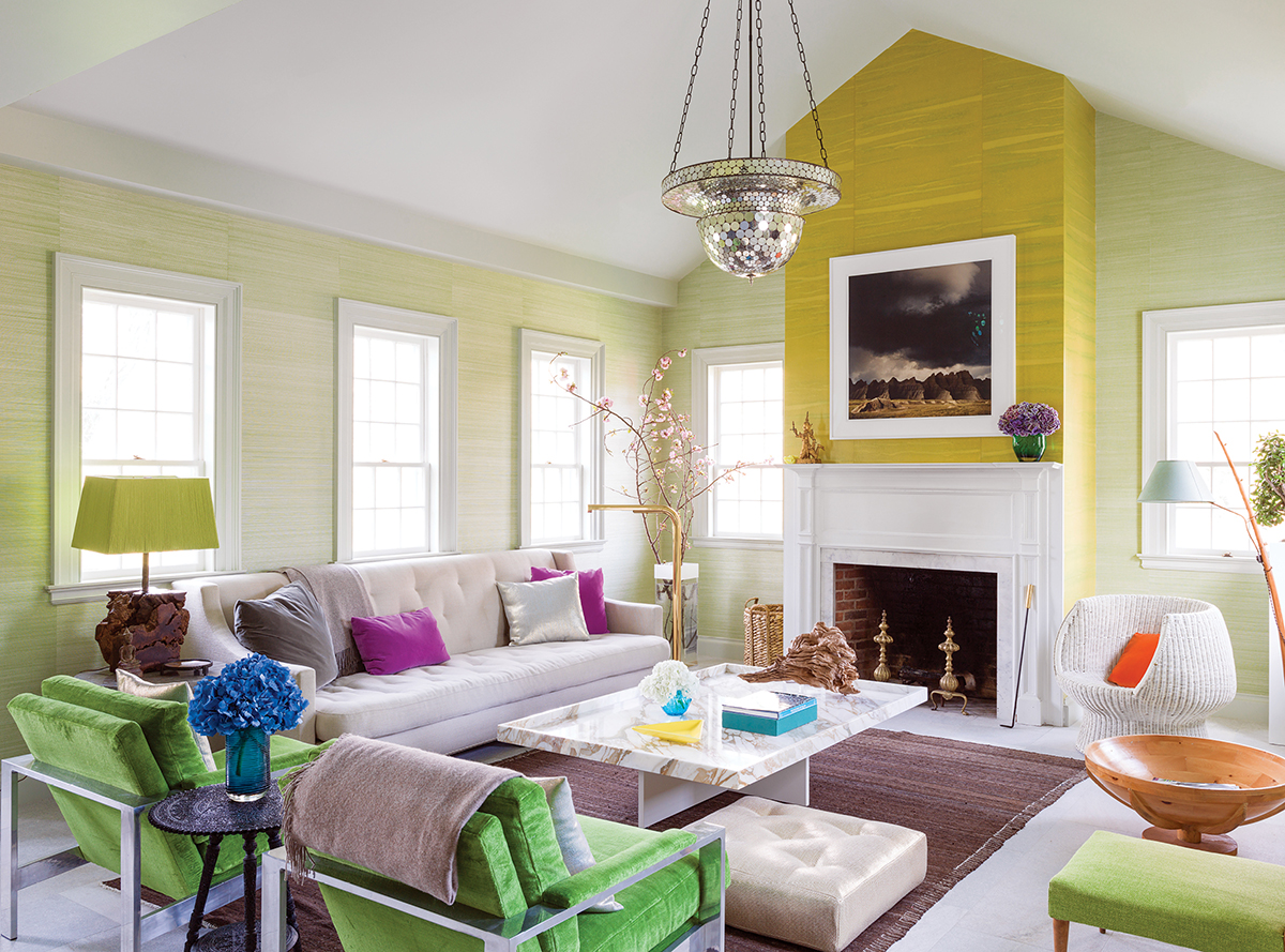
Dating to the 1920s, a disco-ball-like pendant brings sparkle to the garden room. / Photograph by Stephan Julliard
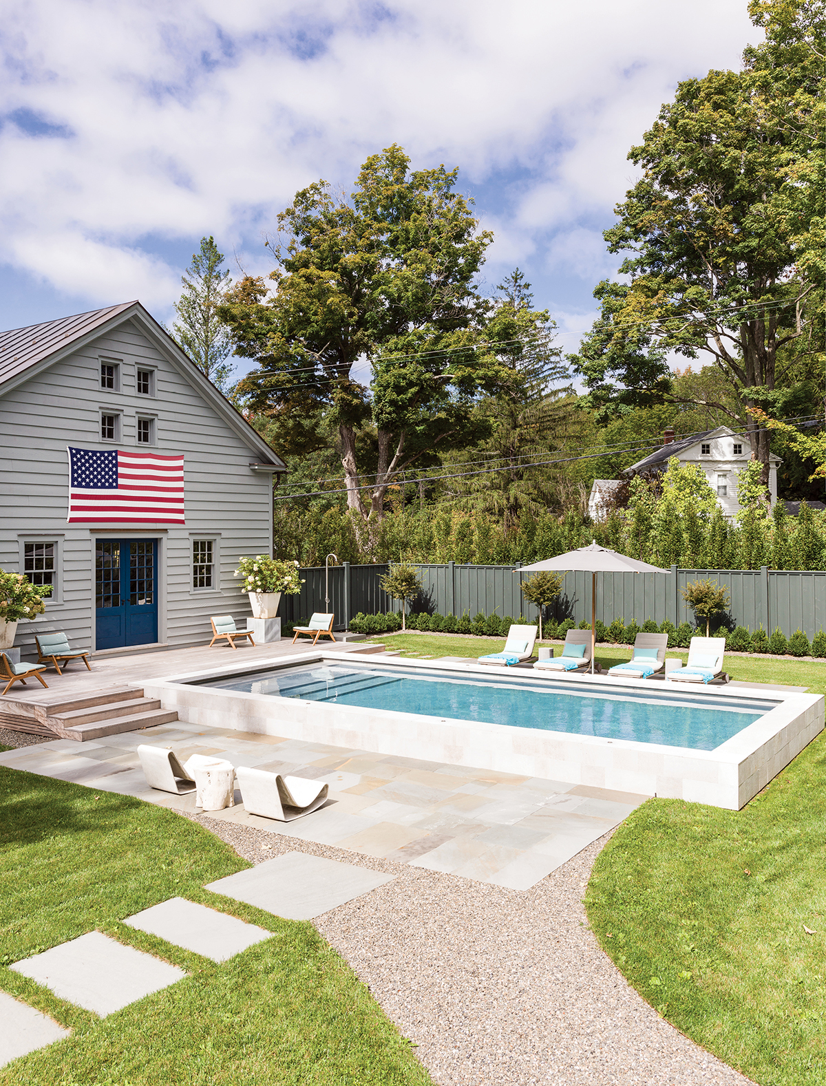
The barn, once painted a traditional red, is now a cool, calming gray, and functions as a pool house. / Photograph by Stephan Julliard

