A Fresh Start
When a botched facelift left a Wellesley Colonial with an identity crisis, a crack team of designers, builders, and architects smoothed out the wrinkles and restored the light. —By Julie Suratt
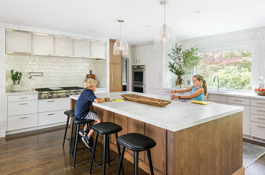
The family congregates around the kitchen’s custom walnut-and-marble island, fabricated by Venegas and Company. / Photograph by Nat Rea
The realtor’s blurb for the 1925 Colonial in Wellesley promised “sophistication and style”—a complete renovation that maintained “the charm of a bygone era.” But when California transplants Megan Dyer and her husband, John, walked into the seven-bedroom, six-bathroom home, it was anything but charming: “The finishes were cheap, the flow was off, and the rooms dark and dreary,” says Megan, who deemed the house “completely unmemorable.”
The home had been in one family for more than 40 years when a builder bought it in 2008 and tried to flip it after tacking an awkward two-story addition onto the rear. The new section had scant natural light and a disjointed layout. “It was obvious why it didn’t sell,” Megan says. But the neighborhood—with its towering oak trees, sprawling lawns, and kid-friendly sidewalks—was idyllic, and at 5,000 square feet, the house had ample space to work with. So the couple, who’d relocated for John’s job and were renting nearby, made an offer and soon moved in with their three children, now ages 14, 11, and eight, in March 2014.
They planned to renovate in phases—until Mother Nature threw them a curve ball the following winter: Water started pouring into the kitchen, the family room, and two of the kids’ bedrooms due to ice dams, and suddenly the Dyers found themselves tackling all of their projects at once. They hired architect Kent Duckham, of Duckham Architecture & Interiors in Needham, and general contractor Steven Overstreet, of S.J. Overstreet Construction Co. in Stoughton, and got to work. The general aesthetic of the exterior would remain the same—a traditional façade that fit into the neighborhood—but the inside would be “more modern and eclectic,” Megan says. To that end, Megan hired interior designer Lindsay Bentis, with whom she shares a passion for blending contemporary and vintage décor—and a West Coast upbringing.

Designer Lindsay Bentis sourced much of the furniture and décor, including the living room rugs, from vintage stores and West Coast flea markets. / Photograph by Nat Rea

In the kitchen, backlit walnut cabinets display treasured serving pieces. / Photograph by Nat Rea
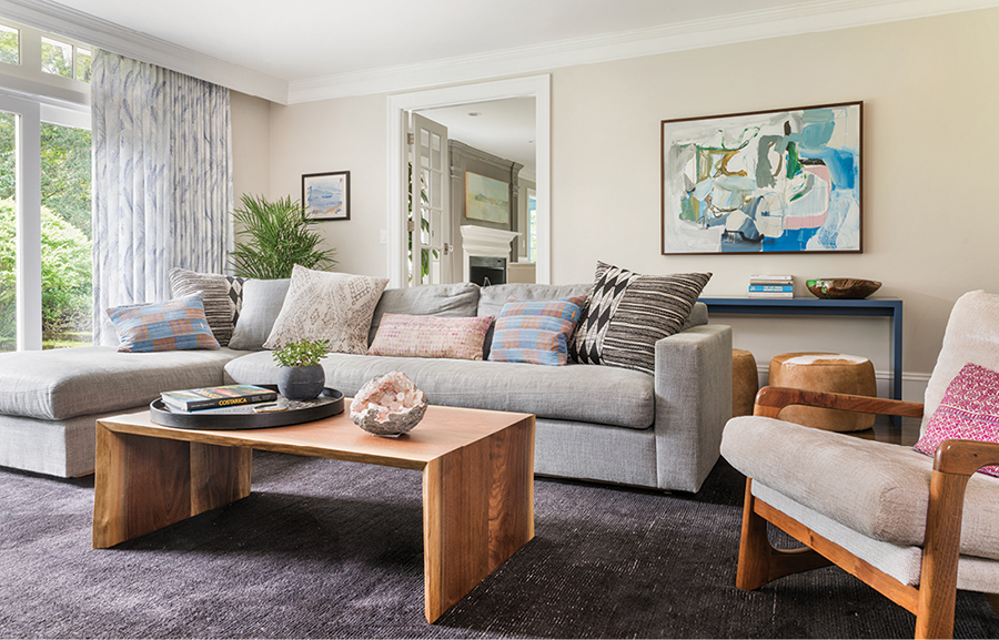
Accented with an eclectic mix of throw pillows, a plush Verellen sofa forms the perfect perch for watching movies in the family room. / Photograph by Nat Rea

A felt Muuto pendant light illuminates the Tom Dixon dining table in the breakfast nook. / Photograph by Nat Rea
Bentis and Megan’s goal was to add more light to the house, Bentis says, while Duckham and Overstreet focused on making the space function better. The old Colonial “had a lot of cool character,” Overstreet says, “but the prior renovations were piecemealed together to gain square footage—and didn’t match the details of the original house.” To fix what he calls “the layout challenges”—the three-car garage, for example, opened directly into the middle of the family room—they bumped out the back of the house four feet and reconfigured the garage’s third bay to include a tiny office, a powder room, and a mudroom with cement tiles and built-ins for storage. Now there’s a more natural entry from the garage into the house—and a place to stash backpacks and boots.
Next, they tackled the kitchen. Although brand-new when the Dyers purchased the house, it felt generic and uninspired. It featured just one small window and a skinny, multilevel island that served little purpose. Megan and Bentis pored over potential layouts, landing on an eat-in kitchen with a “giant” island for friends and family to gather around and a large butler’s pantry for storage. From there, they selected a stainless steel oven hood with marble framing that helped inspire the rest of the design. Notably, there are no upper cabinets, which allowed Overstreet to install a big picture window over the sink. And with the added square footage from the bump-out, he fashioned a bright and cozy breakfast nook in the corner with a built-in banquette and windows on both sides.
Renovations continued in the family room, located just off the kitchen. There, a wood-burning fireplace flanked by two small glass-paned doors obstructed the family’s view to the yard. “It was depressing,” Megan says of the dimly lit space, and it had “no connection to the outdoors.” To remedy this, the team demolished the existing hearth and built a new one on an adjacent wall, surrounding it with Bentis-designed built-ins to display books, wooden bowls, and vintage pottery. In its stead, a wall of floor-to-ceiling windows now floods the space with natural light.
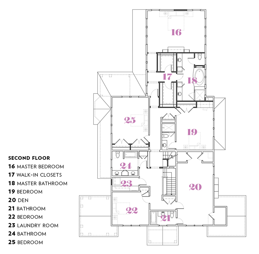
Lighting was also an issue upstairs in the master suite, due to poorly planned closets and a dearth of windows. The suite also lacked privacy, tucked up right next to the children’s rooms on the second floor, with a standard-issue bathroom placed awkwardly in the back. To create a buffer zone, Duckham moved the bathroom to the front of the room. A new hallway connects the bathroom to the bedroom, which Bentis designed around two walnut-and-brass side tables she found in Los Angeles. New windows and a patterned wallcovering by Eskayel complete the room. “Megan isn’t afraid to be bold with wallpaper,” Bentis says appreciatively.
In fact, bold patterns abound on accent walls throughout the house (most strikingly, the black Ellie Cashman wallcovering in the butler’s pantry off the kitchen), as do organic materials, vintage furniture and textiles, and eclectic artwork. “This isn’t a fussy house,” Bentis says. “It’s laid-back and lived-in, but well-considered.”


A Sputnik-like chandelier by Arteriors shines in the dining room, finished in a dark, textured wallcovering by Phillip Jeffries. / Photograph by Nat Rea
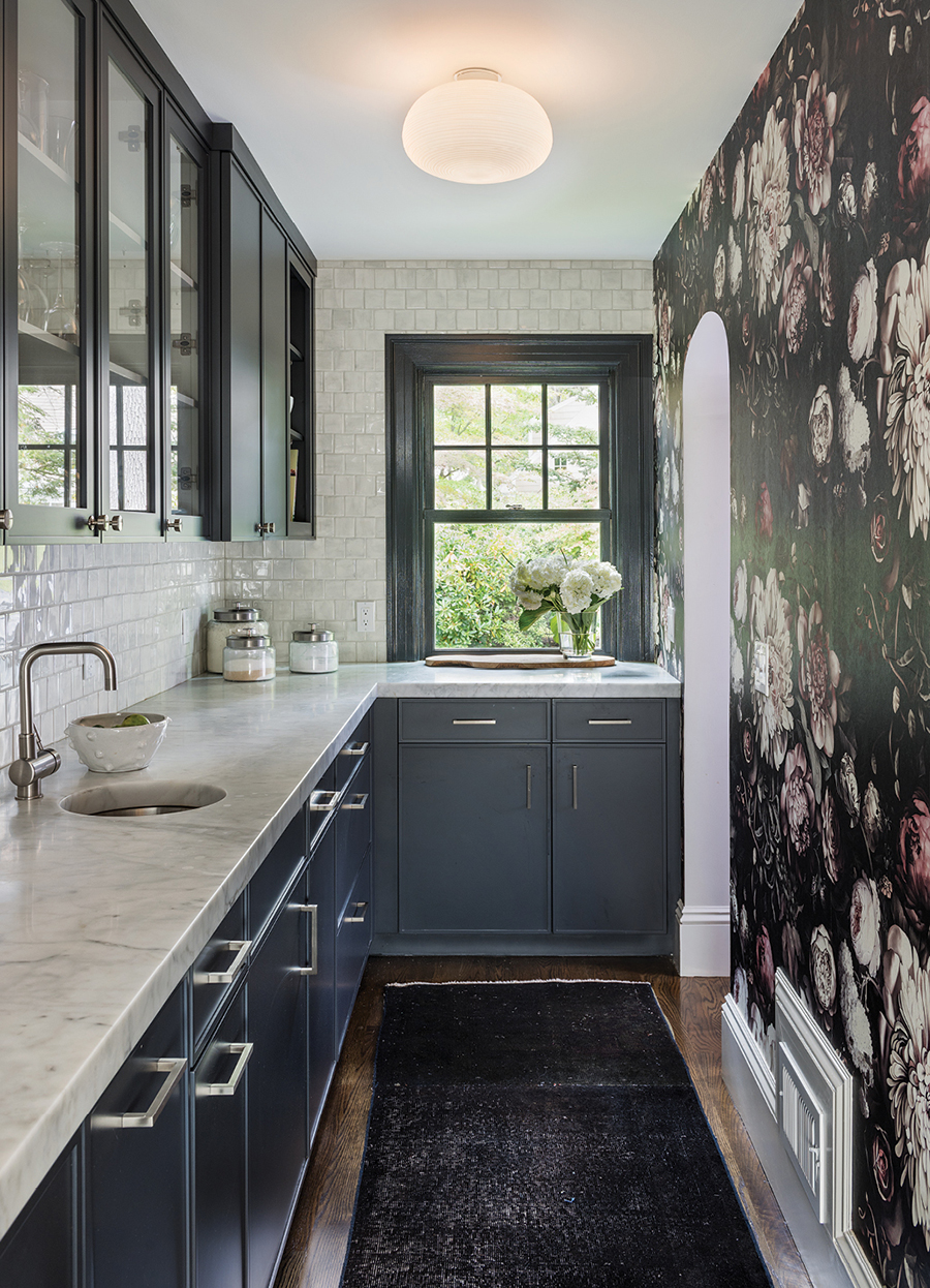
The floral Ellie Cashman wallcovering and the painted cabinets in the butler’s pantry offer a striking contrast to the white and walnut details of the kitchen. / Photograph by Nat Rea
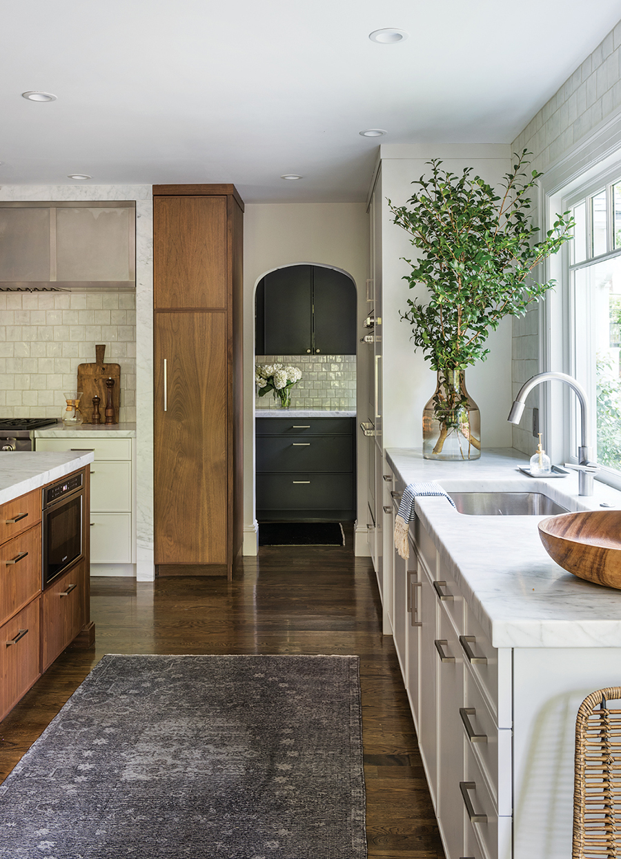
Bentis and builder Steven Overstreet designed the archway to the butler’s pantry to match the original entry on the other side. / Photograph by Nat Rea
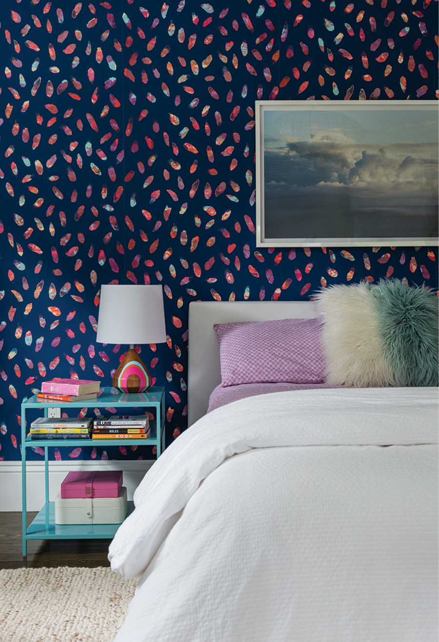
A colorful pattern by Flat Vernacular livens up the walls in a child’s bedroom. / Photograph by Nat Rea
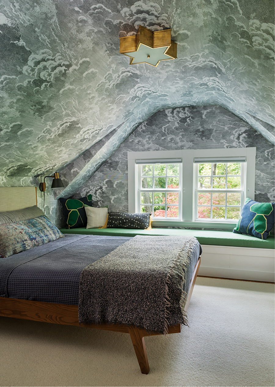
Cole & Son’s “Nuvolette” wallcovering adorns the third-floor guest room. / Photograph by Nat Rea
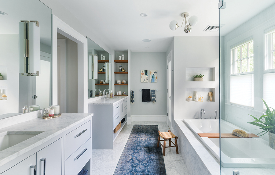
Completely redone (and relocated), the master bathroom includes custom-designed his-and-hers vanities. / Photograph by Nat Rea
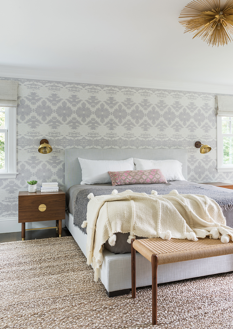
The master bedroom features an Eskayel wallcovering and a textured rug. “We wanted to introduce patterns in a soft way,” Bentis explains. / Photograph by Nat Rea

Megan and Callie (the family’s golden retriever) relax in the sunroom, which doubles as an office. / Photograph by Nat Rea
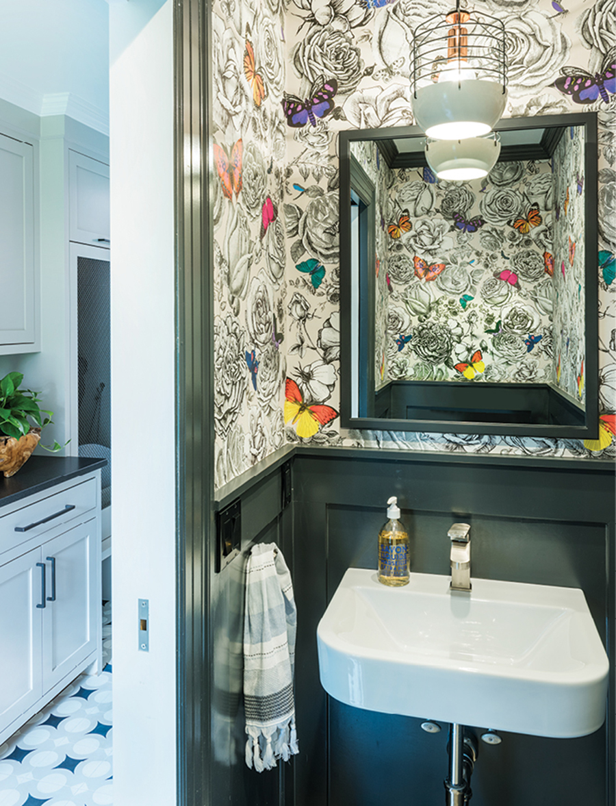
The new powder room off the mudroom feels cozy with Osborne & Little’s playful “Butterfly Garden” wallcovering and a “Bluff City” pendant light by Roll & Hill. / Photograph by Nat Rea

A swinging chair hangs from the porch that leads to the mudroom. / Photograph by Nat Rea
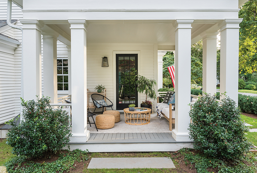
Overstreet restored the original columns on the front porch and added decorative railings and lighting. / Photograph by Nat Rea

