Why Boston’s Brutalism Is Back in a Big Way
Ugly? Hardly. The concrete buildings every Bostonian loves to hate are are once again in vogue.
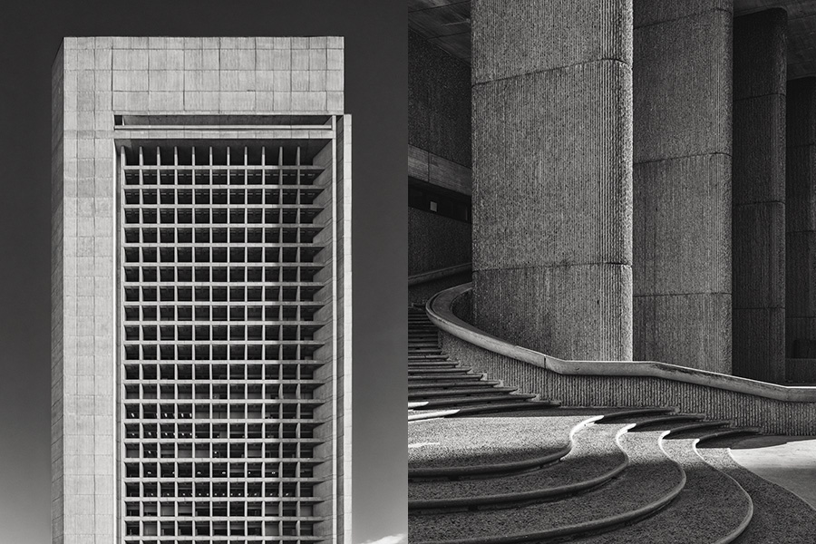
The Christian Science Center’s tallest tower commands attention with a mesmerizing grid pattern of windows. / The sinuous, bush-hammered beauty of the Erich Lindemann Mental Health Center is the work of Paul Rudolph, one of the 20th century’s most renowned modernist architects. / Photos by Bob O’Connor
As gray as a cold, rainy Boston day, City Hall stands imposingly on Government Center’s brick-lined plaza amid a bevy of skyscrapers, practically begging you to judge it. Is it remarkable? Hideous? Grand? Or utterly monstrous?
This debate is at the very heart of Brutalist architecture, pioneered by the French architect Le Corbusier during the mid-20th century. With its blocky utilitarian form, the style was meant to convey permanence and strength, but it’s long been an acquired taste. Mayor Tom Menino even once suggested selling City Hall, calling the 1968 construction “unfriendly” and “cold,” likely because the style’s signature stamp is raw concrete—piles and piles of raw concrete. (Brutalism’s name itself is derived from béton brut, the French term for the stuff.)
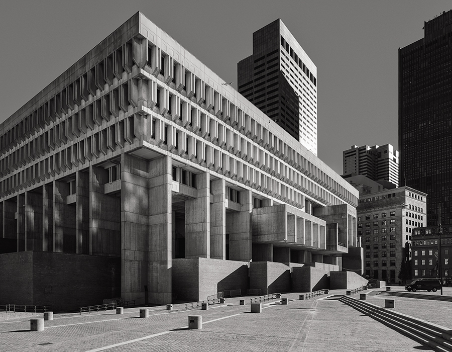
City Hall shines in the black-and-white spotlight. / Photo by Bob O’Connor
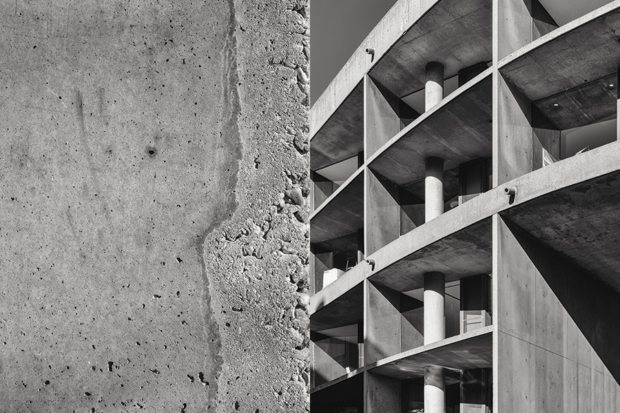
Behold the only Le Corbusier creation in North America: Harvard’s Carpenter Center for the Visual Arts. / Photos by Bob O’Connor
But lately, thanks in part to an Instagram community set on capturing their bold shadows and lines (not to mention scores of astute think pieces singing the praises of their deliberate forms), Brutalist buildings are once again in vogue. In a way, that means Boston—which boasts one of the highest concentrations of such structures in North America—is, too. Here, the style can be traced to 1960, when city planners started wiping out Scollay Square to build a civic center for what they called the “New Boston.” Mayor John Collins and then–Boston Redevelopment Authority director Ed Logue sought to make a bold, forward-looking statement by using a single building material to unify their vision: concrete. At the time, pairing government buildings and out-of-the-box architectural expression was new—and progressive. So the monolithic stone structures multiplied over the next two decades, leaving Boston with a staggering Brutalist exhibition. Cambridge, for example, claims this continent’s only Le Corbusier building, Harvard’s Carpenter Center for the Visual Arts, built in 1963. Modernist master Paul Rudolph, meanwhile, completed the striking Erich Lindemann Mental Health Center in 1971. Brutalism, explains Chris Grimley, coauthor of Heroic: Concrete Architecture and the New Boston, “reinvented the city at a time when the city needed reinvention.”
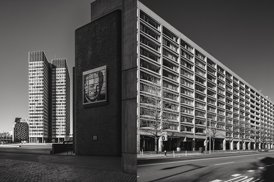
A portrait of Mayor John Collins is displayed on City Hall’s façade in the foreground of the JFK Federal Building, a product of architect Walter Gropius and the Architects Collaborative. / Another project of the Architects Collaborative, the Church Park Apartments were completed in 1973. / Photos by Bob O’Connor
Of course, Menino hasn’t been the only hater over the years. Many of Boston’s Brutalist behemoths—including the Government Service Center—still rank high on lists of ugly buildings circulating the Internet. Then again, critics once applied unsavory adjectives to the city’s Victorian buildings at the height of their unpopularity—that is, until they became beloved again. Grimley believes the same thing is happening with Brutalism today. “That kind of language that has been thrown at concrete architecture in Boston is definitely starting to wane,” he says.
That’s not just thanks to Instagram hashtags. Generally speaking, the public’s perception of architecture often follows a timeline: Thirty years after a building is created, it’s too old to be considered new, yet too new to be considered old. In other words, it’s out of fashion. But the 50-year mark is the sweet spot when people come around to a style and look at it through a more-nuanced lens. Turns out many Bostonian’s don’t think Brutalism is ugly at all, so it makes sense, then, that City Hall celebrated its 50th anniversary last year with an aura of renewed dignity. “There’s a lot more appreciation for the kind of robust architectural language that concrete allowed,” Grimley says. #brutalism proves it.
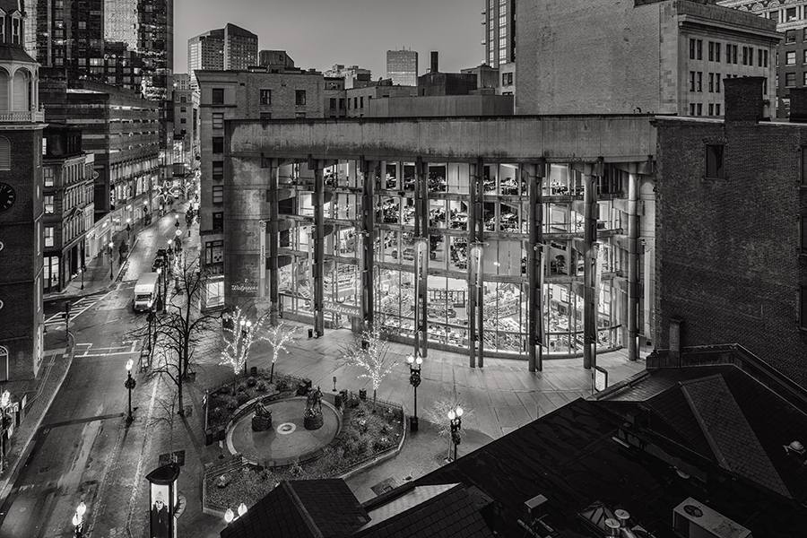
Two of City Hall’s architects, Gerhard Kallmann and N. Michael McKinnell, also designed Boston Five Cents Savings Bank in 1972. It’s now a Walgreens. / Photo by Bob O’Connor


