House Tour: A Modern Needham Home with Farmhouse Details
Sleek fixtures and shiplap walls collide in this sunny abode.
Welcome to House Tours, where we peek inside creatively designed dwellings around town. Want to invite us into your home or one you’ve designed? Tell us about it here.
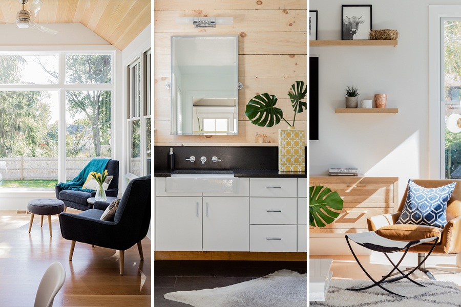
Photo by Michael J Lee
The Snapshot
Neighborhood: Needham
Type of home: Modern Farmhouse
Bedrooms: 5
Bathrooms: 4.5
Size: 4,963 square feet
• • •
When a Needham couple with three young children spotted the perfect plot of land right in their neighborhood, they called upon Hawthorn Builders to build their forever home. The family had a “very specific set of wants and needs,” says vice president of business development & design Jessica Chabot, who took on the project. “The wife grew up on a farm, and was attached to that feel, but she also wanted a very modern aesthetic.”
To create the open, midcentury-inspired look the couple wanted, the team designed a home with high ceilings, light-colored walls, and simple trim. Chabot also focused on maximizing natural light within the space. For example, just as the team was getting ready to order windows for a small sitting area located off of the kitchen, Chabot saw an untapped opportunity. “I was standing in the house and the view was so great off the back, so I called up [the homeowners] and said, ‘Hey, why don’t we do floor-to-ceiling windows?’” she says. “It became a really nice feature in the space and makes it feel like you’re almost outside.”
Once the sun-filled structure was complete, Chabot set out to fill the space with a mix of modern pieces and farmhouse touches. In the living room, for instance, blue-velvet and leather sofas from West Elm pair with a reclaimed-wood mantle above the fireplace and the client’s own black-and-white farm animal photographs above the television. In the kitchen, white shiplap runs from the antique marble countertops up to the ceiling, while a neighboring bar area features a retro Walker Zanger backsplash comprised of colorful circles. For the minimalist master bathroom, Chabot added rustic flair by installing farmhouse sinks and incorporating natural common-pine shiplap. The end result of these marriages of opposites? A chic and cozy home with undeniable ease.
Ahead, Chabot dishes on her approach to design.
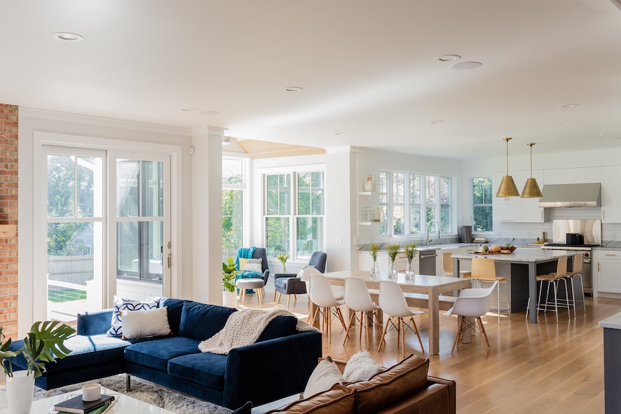
Photo by Michael J Lee
Describe your design style in three words.
I’d say “client-driven style.” Our job is to interpret our clients wants and needs into something aesthetically pleasing, and that could range from super modern to super traditional. They have to live there, after all.
Where do you find your design inspiration?
I like Pinterest a lot. I think it’s a great organizational tool. Right now, we have a lot of clients who are into what I would call “California style:” light walls, high-contrast windows, texture. I tend to save things, so I have a whole board that’s just stuff I want to use in the future and sometimes I’ll refer back to that. I’m a nerd as well, so I find inspiration in weird places like the view from our office. It’s a really cool old brick building in the middle of Needham, and sometimes I’ll just look at that and something pops in my head. Inspiration can come from anywhere, it’s just a matter of how you apply it.
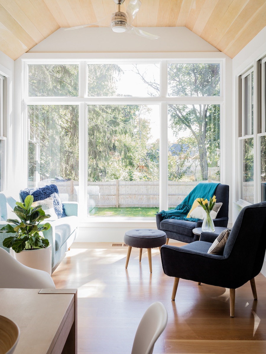
Photo by Michael J Lee
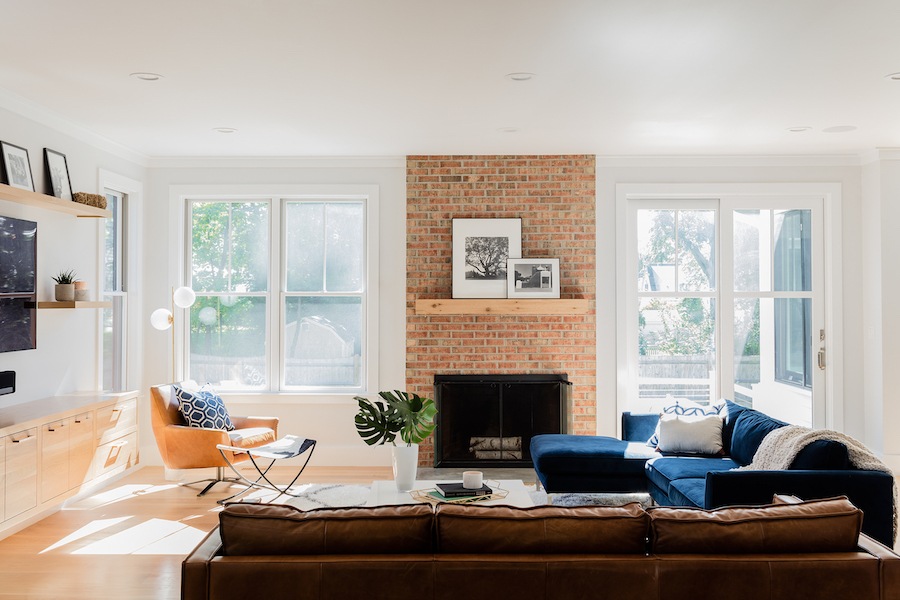
Photo by Michael J Lee
Name your top three favorite places to shop.
I like Arhaus in Natick a lot. We also buy a lot of stuff from Restoration Hardware. I think they have good-quality pieces, and it’s really accessible for most people, especially with fixtures like hardware and lighting. I also love architectural salvage places. There’s one in the South End called Restoration Resources, and they have a great collection of stuff. You can find things like church pews and cool old architectural relics there.
What was your favorite room to work on within this project?
I had a lot of favorites in this house, but if I had to choose I’d say the master bath. It’s kind of located around a corner, and every time I’d go in that room I’d get so excited. I liked the farmhouse sinks, the wall-mounted faucets, and the natural wood. If you were going to take one snapshot of that house, I think that’s a good overall representation of it. I can also say that one of the best parts about this job is having an idea and then having the homeowners maybe not entirely get it, but say, “I think that sounds like a nice idea,” and then be able to execute on it.
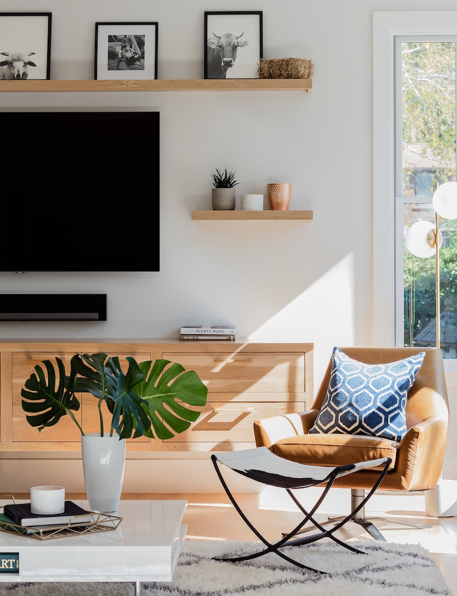
Photo by Michael J Lee
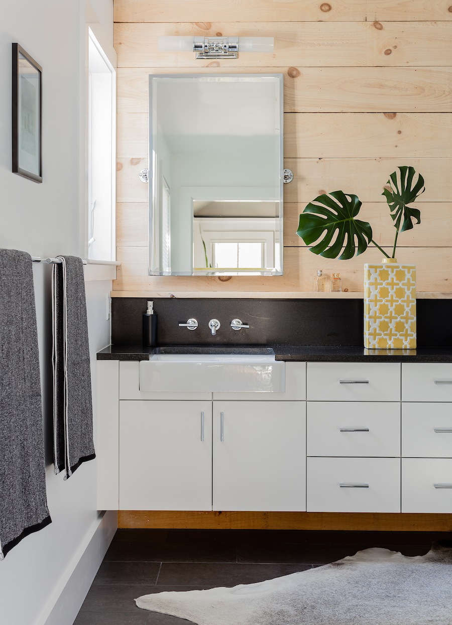
Photo by Michael J Lee
What was one challenge you faced on this project?
It was the first time I’d had a client concerned with having furniture in front of windows. The architects had put in full-height windows in all the upstairs bedrooms, and there was really only one wall you could put furniture on that wouldn’t cover a window. We had to work through that with the client and ended up swapping out some of the full-height windows with awning windows so that beds could be placed under them. That was unexpected, but it worked out fine.
What’s the best piece of design advice you’ve ever been given?
It’s advice that applies to other avenues of life, but the best advice that I’ve been given is “Being right is not a bullet-proof vest.” That advice was given to me by [our co-founder and owner] Ryan [McDonnell], and it’s true. Just because you think you’re right about something doesn’t mean it makes the client happy, and I think it’s really important to remember that. At the end of the day, it’s about what they want.
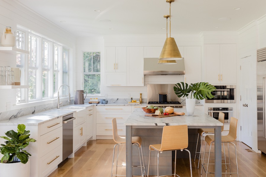
Photo by Michael J Lee
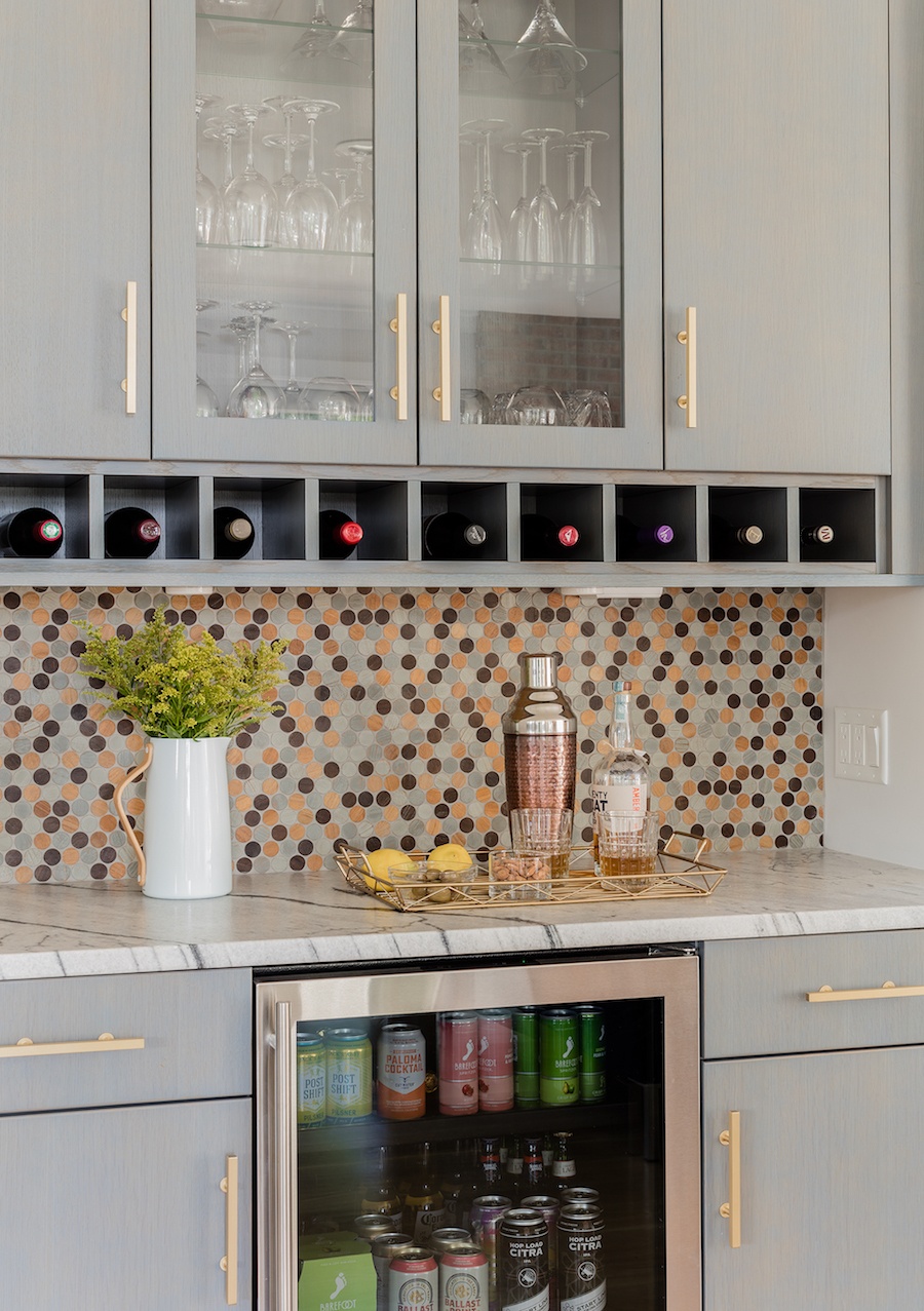
Photo by Michael J Lee
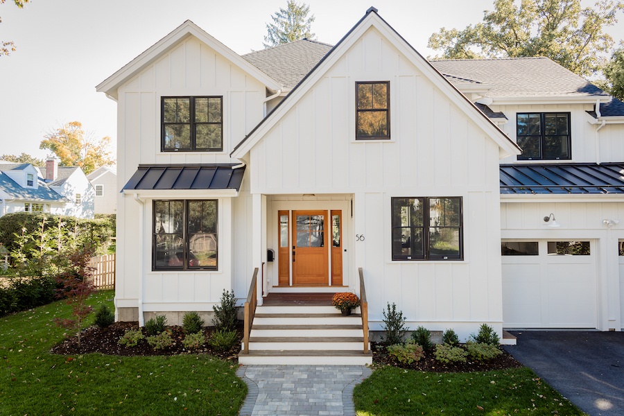
Photo by Michael J Lee

