Transformation Tuesday: Easy Updates Turned This Somerville Kitchen into a Bright and Cheerful Space
Squarehouse Studios brought in a fresh color palette and an eye-catching patterned backsplash.
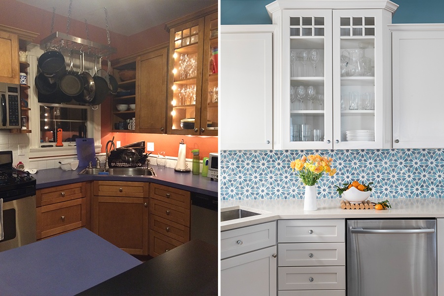
“Before” photo courtesy of Squarehouse Studios, “After” photo by Joyelle West
Before
Alicia Kersten and Nathan Wicks were at a friend’s newly renovated home for a holiday party when they met Mary Flo Ouellette and Steven Santosuosso, of Squarehouse Studios. As luck would have it, the Somerville-based design duo was the brains behind the revamped space. Captivated by the home’s transformation, the couple reached out to Ouellette and Santosuosso with a project of their own: their 1900 Colonial near Davis Square. The kitchen, a dark and mismatched room last updated in the ’80s by previous owners, was of particular concern. Rust-colored walls framed dark wood cabinets, and blue laminate countertops sat below a backsplash comprised of square white tiles, as well as some that featured a red and white checkerboard pattern. Overall, “The mix of materials was a bit confusing,” Ouellette says. So Kersten and Wicks tasked the team with designing a brighter, more streamlined look for the 150-square-foot space while also incorporating plenty of color, pattern, and texture. The couple loves to travel with their two children, so they wanted to include pieces that would remind them of their adventures, too.
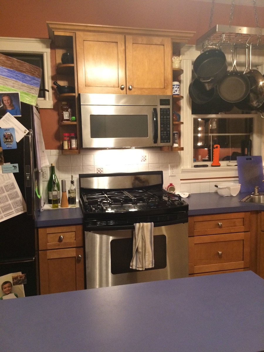
Photo courtesy of Squarehouse Studios
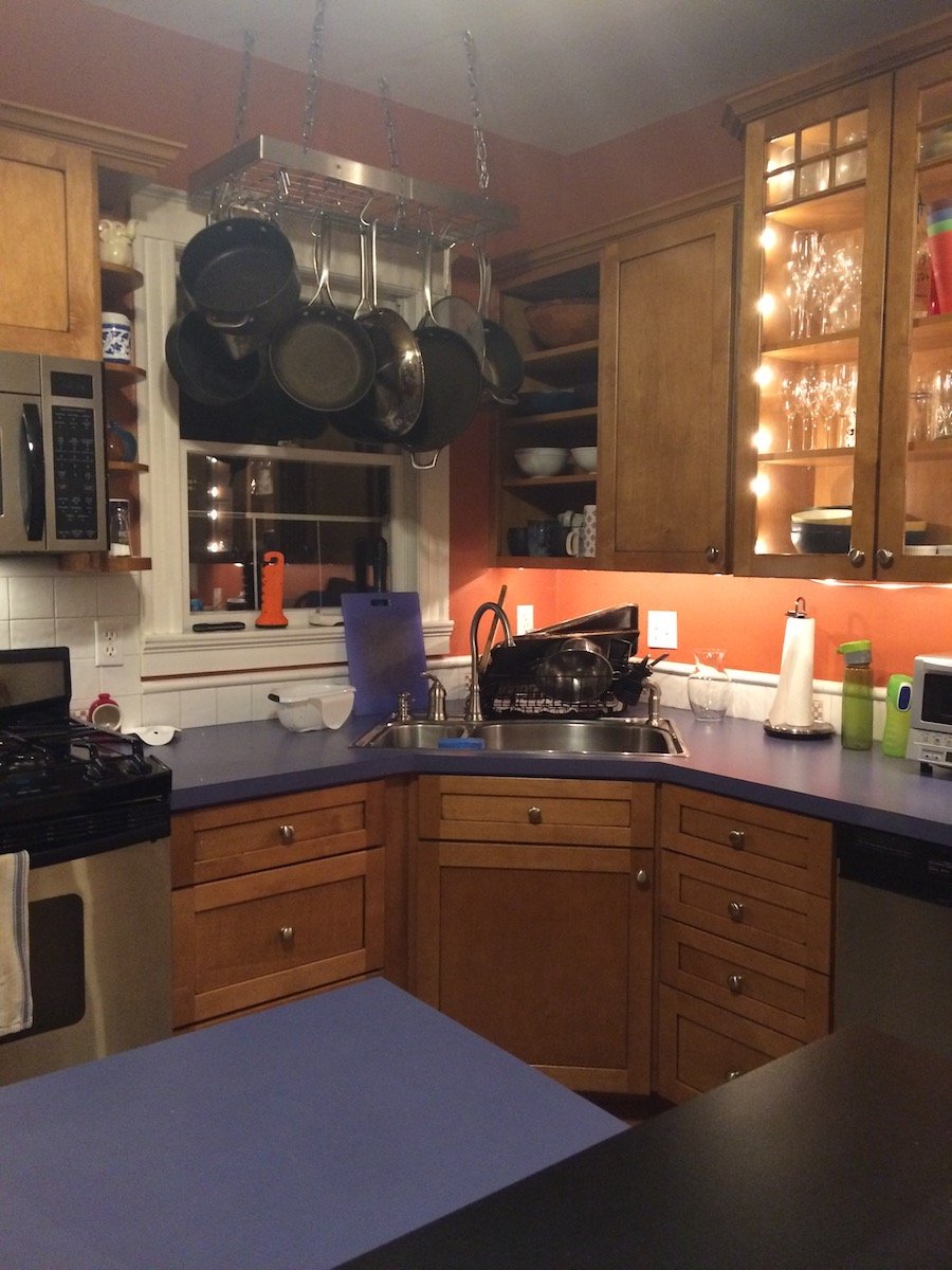
Photo courtesy of Squarehouse Studios
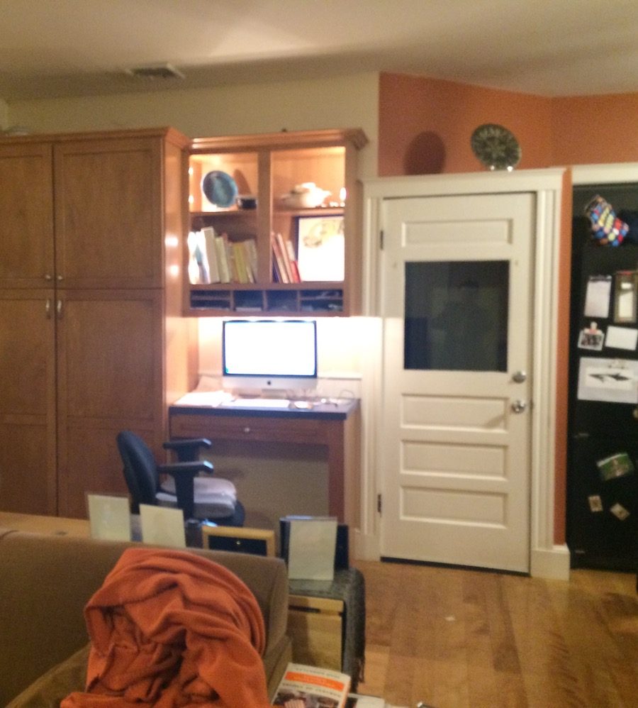
Photo courtesy of Squarehouse Studios
After
To achieve their clients’ goals, Ouellette and Santosuosso decided to preserve the kitchen’s existing layout and zero in on cosmetic changes. Kersten wanted to include cooler hues and “really loves blues,” Ouellette says, so the team chose Benjamin Moore’s “Franklin Lakes” as the backdrop for the space. A handpainted hexagonal tile by Tabarka Studio from Ann Sacks, meanwhile, adds a pop of pattern to the backsplash. To ensure that the room would still feel clean and open, the pair countered the bold tile with sleek appliances and a new white finish—“Alaskan Skies” by Benjamin Moore—for the cabinetry. These understated elements “provided a contrast to the ‘moment’ of the backsplash,” Santosuosso says, and “let that be the star of the show.” The designers also removed the cabinets’ stainless steel hardware and instead incorporated glass knobs by Lewis Dolin Hardware, which add visual interest. “It’s a small detail, but the knob [appears to] change colors as you walk around it,” Santosuosso explains. Lastly, the pair peppered the space with items the couple purchased while traveling: A framed blue print opposite the kitchen island and the ceramics showcased on the open shelving, for example, hail from Cuba. “They have a lot of really great pieces from around the world,” Santosuosso says. “[Including those] felt unique and personal to them.”
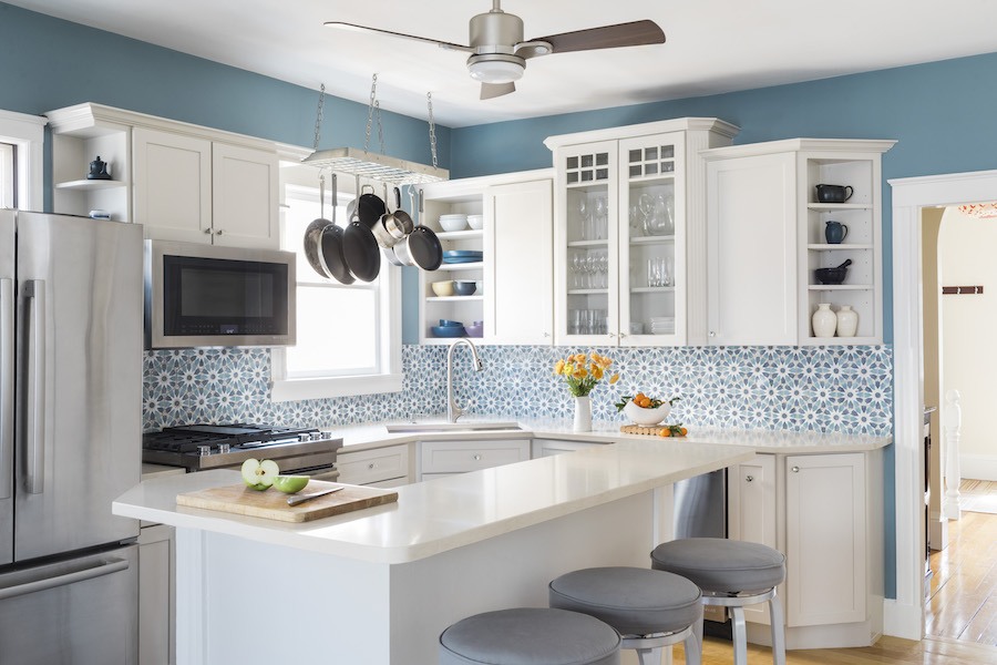
Photo by Joyelle West
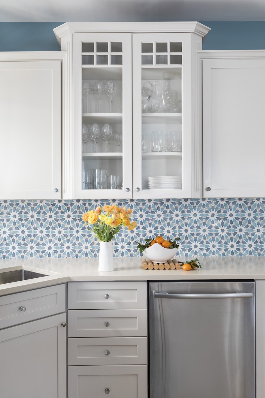
Photo by Joyelle West
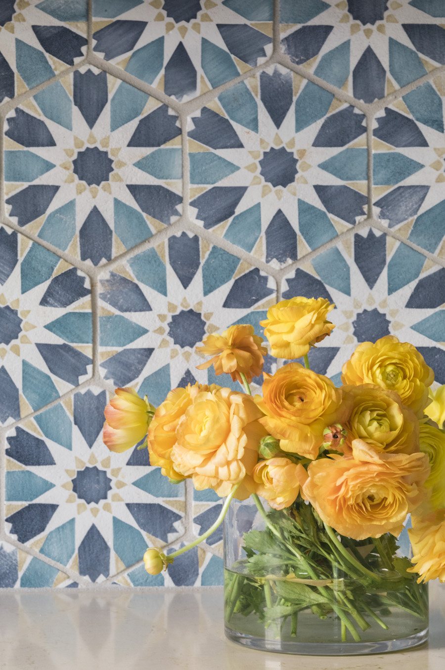
Photo by Joyelle West
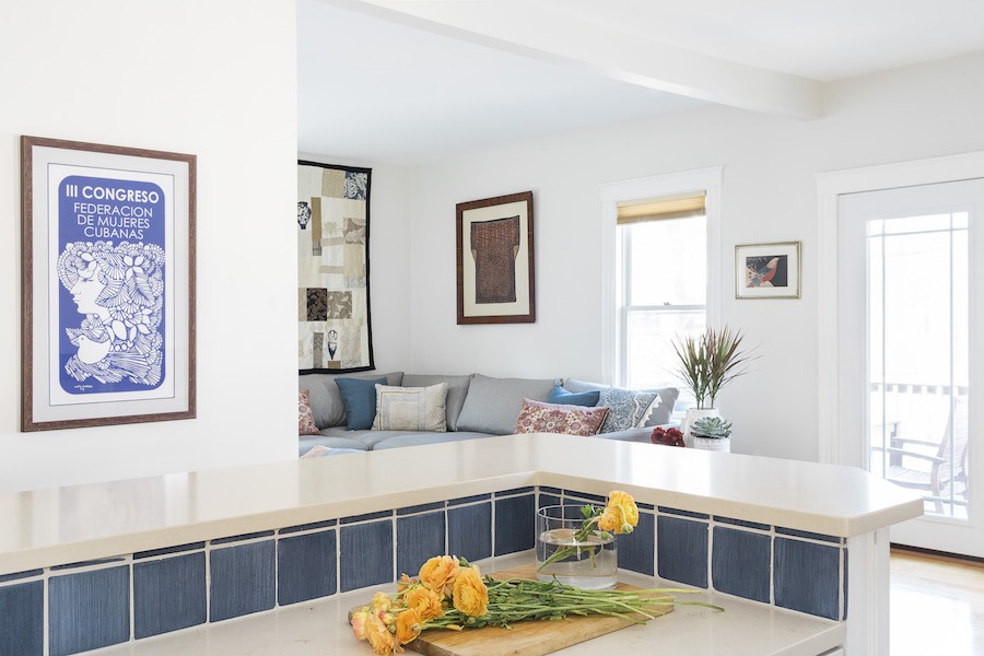
Photo by Joyelle West
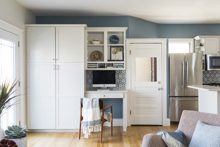
Photo by Joyelle West


