Bold Wallcoverings Transformed This Couple’s Historical Cambridge Home
Bright splashes of color add a touch of whimsy to a well-considered renovation of a 1908 abode.
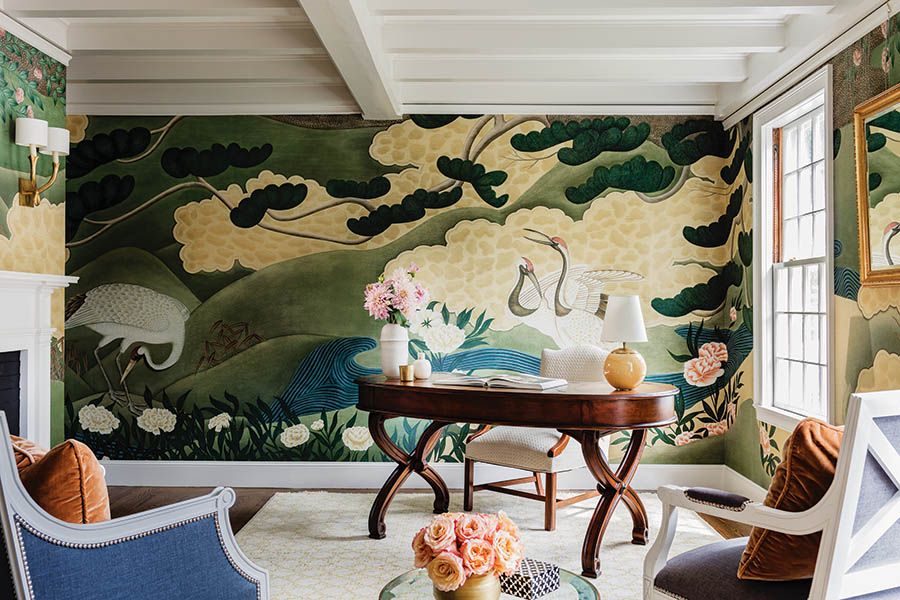
Going into this project, “We knew we wanted funky patterns,” says the wife, who’d amassed a huge collection of wallcovering samples over the years. For the home’s study, she fell in love with Iksel’s “Japanese Cranes,” which is inspired by traditional Japanese folding screens. / Photo by Michael J. Lee
It was a case of love at first sight.…on Zillow. A Lexington couple looking to move closer to the city had been scouring Cambridge listings for months, but had struggled to find the right house amid low inventory. On a spring morning in 2016, a Zillow notification alerted the wife to a new listing for a 6,000-square-foot Colonial on more than a half-acre in West Cambridge. It was a “crazy price,” she recalls, but it met most of their criteria, particularly walkability to shops and restaurants. She asked her husband excitedly, “Can we make this house work?”
The answer was “yes,” but after touring the 1908 residence—which had only two prior owners—the couple knew they were in for a long haul. What had once been an elegant, upper-class home was “seriously dilapidated,” the wife says. The ceilings slumped, the windows had broken panes, and squirrels were living on the third floor. But it had great bones, beautiful light, and a desirable location.
So they bought it, deciding to divide the ensuing renovation into two phases. First, they replaced the roof, updated the HVAC system, and replaced the old knob-and-tube electrical wiring—“just enough to make it livable, nothing cosmetic,” the wife says. Then, for the next year and a half, the couple and their two young children lived in the house, observing how they used the space, until they were ready for a full-fledged renovation in July 2018. They promptly dismissed proposals to blow out the back and put on an addition: They didn’t need the house—with its seven bedrooms and three and a half baths—any bigger than it already was. Instead, working with architect Sam Kachmar and his team, the couple sought to preserve the scale and scope of the home while modernizing it for the way they lived. Their goal was to “restore and enhance the architecture,” says interior designer Amanda Reid, of Mandarina Studio, who worked with the couple and Kachmar over the course of a year and a half. “They loved its character, but wanted to make it functional for a family.”
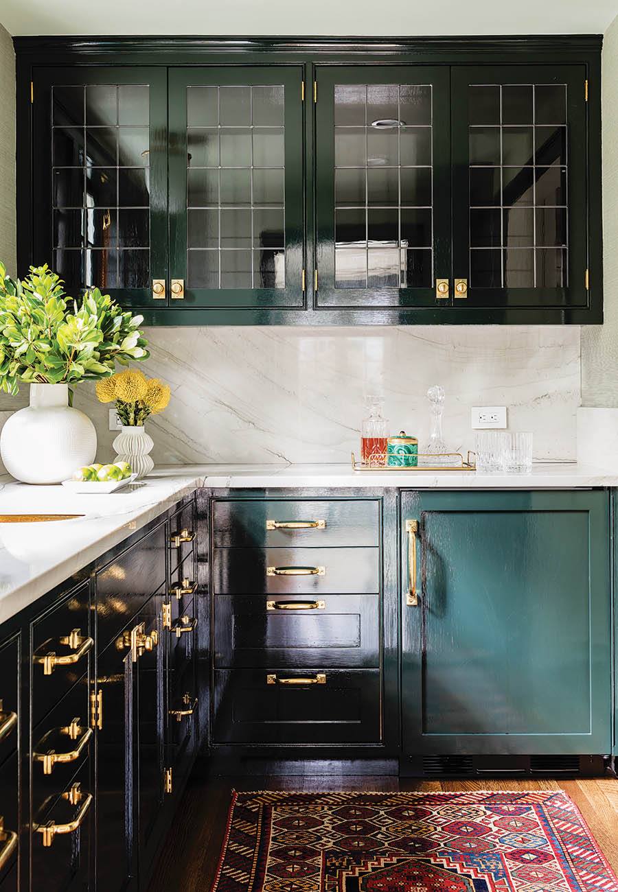
The coffee bar off the kitchen features an antique runner from Landry & Arcari, as well as cabinets in Farrow & Ball’s “Studio Green” with unlacquered brass hardware. / Photo by Michael J. Lee
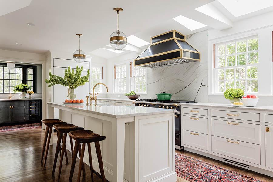
Along with a custom hood and matching brass accents, “We wanted the French range to be the focal point of the kitchen,” designer Amanda Reid says. Fixtures from Arteriors are “visually light” above a quartzite island with tapered legs that give it “more of an open feel,” Reid adds. / Photo by Michael J. Lee
At the heart of the renovation was the kitchen, a utilitarian space with Formica counters, simple finishes, and low ceilings. After contractors opened the walls of the adjoining dining room, butler’s pantry, and powder room to reapportion the space and bring in more light, the couple debated whether to keep the fireplace, which separated the kitchen from the dining room, intact. The wife recalls their former home in Lexington as “loud” with “the mess always in our faces,” so the couple bucked the open-concept trend, opting to keep the two rooms distinct with a set of convenient double doors between them instead. Now, she genuinely enjoys preparing meals in her new, brightly lit kitchen, which features what Kachmar calls a “showstopping” black French range and hood, quartzite countertops, and white inset cabinetry.
Of course, there was plenty of work to do on the second floor, too. Here, the wife happily converted a tiny bedroom next to the master suite into her “dream” dressing room, which holds both her and her husband’s clothing, a vanity, and a built-in island dresser. Near a stairwell leading to a third-floor playroom and a photography studio, the team discovered a sewing room with an abundance of shallow drawers and oddly shaped built-ins. Since there “isn’t much sewing done on the premises anymore,” the wife says, they turned it into a convenient, second-floor laundry room.
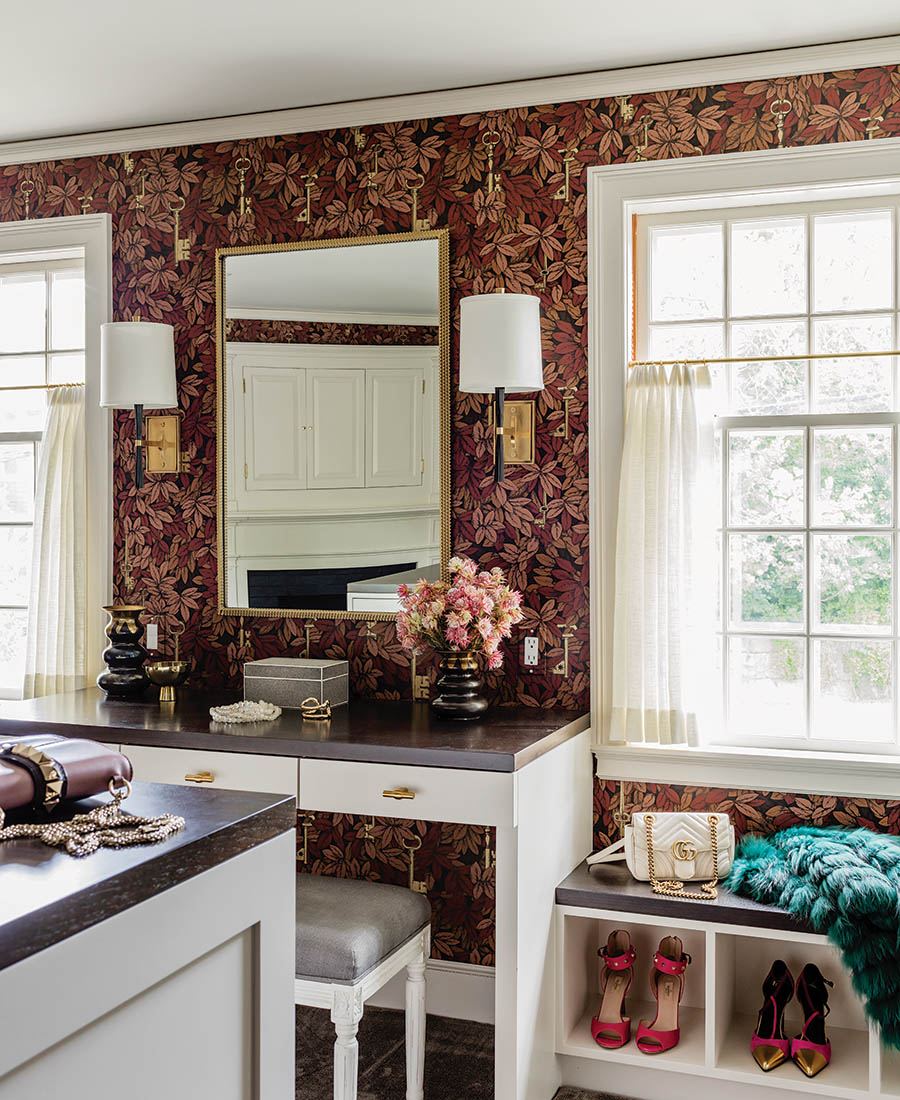
The his-and-hers dressing room “feels both feminine and masculine” Reid says, with its burgundy-and-blush Cole & Son wallcovering and the ebonized-walnut tops on the island and the vanity. / Photo by Michael J. Lee
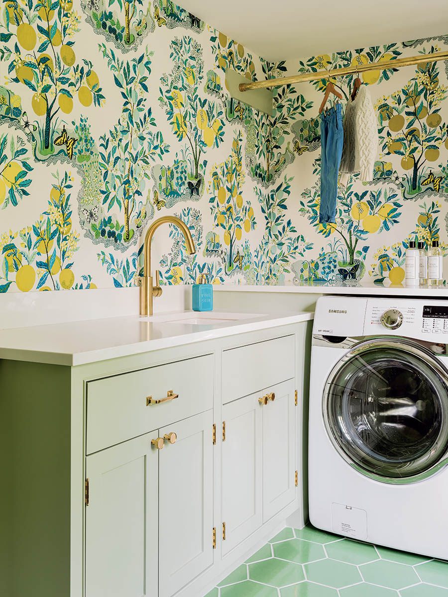
“I love using cheerful wallpaper in a laundry room because it makes doing laundry more fun,” Reid notes. Patterned with lemons, “Citrus Garden” by Schumacher “feels so fresh,” she says. / Photo by Michael J. Lee
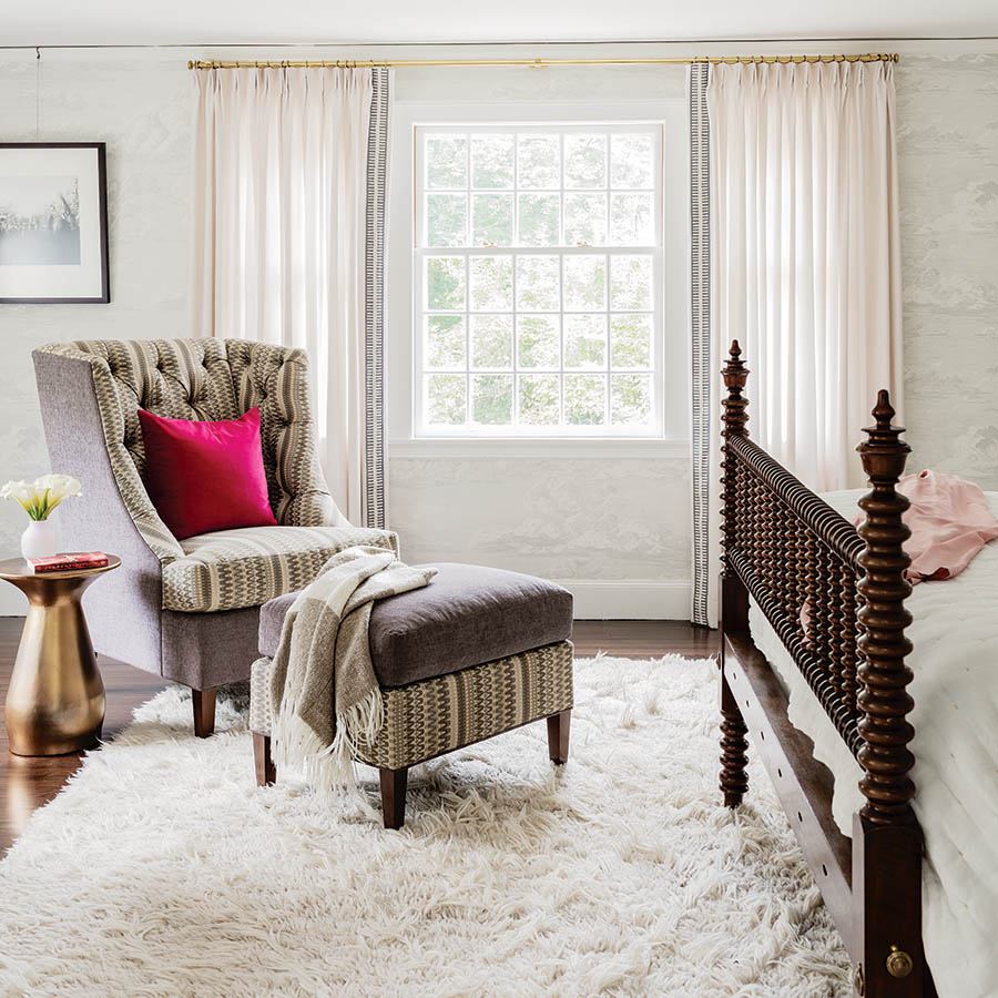
The master bedroom, outfitted with drapery by Mark Alexander, provides a quiet retreat for the couple. / Photo by Michael J. Lee
The wife confesses that, “Somewhere along the road, my husband became even more obsessed with keeping the character and charm than myself”—even down to details such as the brass door handles and newel posts. Still, the couple found themselves conflicted about the windows. Although updating them would make the house warmer and quieter—and the Cambridge Historical Commission eventually gave its approval to replace them—the pair had second thoughts after they saw how passionately some of the CHC members felt about the issue. “I would argue that your house is all about the windows,” one member asserted. His words struck a chord; they ultimately had the windows restored off-site by Cleary and Son, stripping them of their lead paint and salvaging most of the panes. The wife is thrilled with how they turned out: The wavy glass “makes me feel like I’m looking out at an impressionist painting,” she says.
As the lengthy architectural work came to a close, Reid helped the couple execute their vision for the furnishings and finishes. “I told her that I like wallpaper a lot,” the wife says. That’s an understatement: The house is awash in bold prints. “We have an eclectic sense of style,” she adds. Reid calls it “updated traditional [with] a funky mix.”
The result is a warm, livable space full of historical personality and modern accents. And despite its relatively grand size, “We use every single room every day,” the wife says. “I feel so lucky to have this house.”
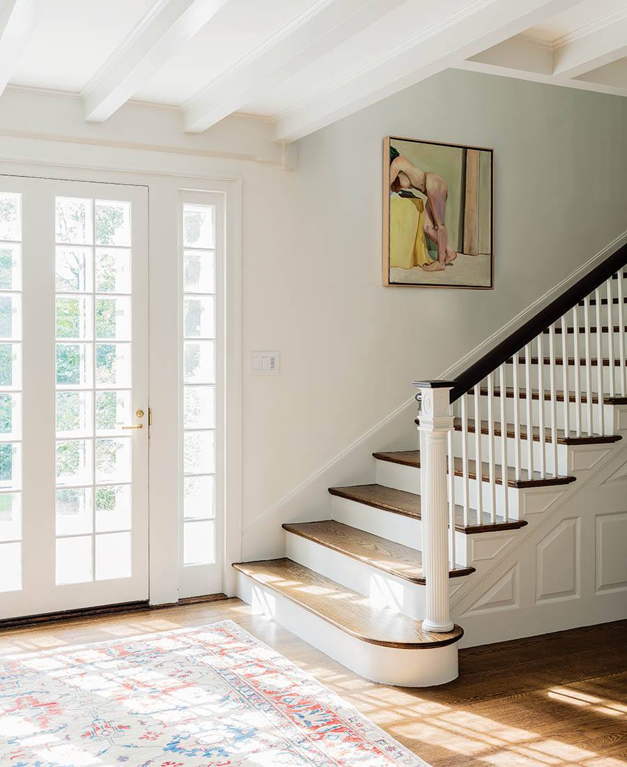
The owners were intent on restoring the home’s original features, including a newel post on the stairs. / Photo by Michael J. Lee

Paired with handmade black-and-white ceramic tile by Fireclay, Farrow & Ball’s gold “Bumble Bee” wallcovering lends a classic look to the mudroom. / Photo by Michael J. Lee
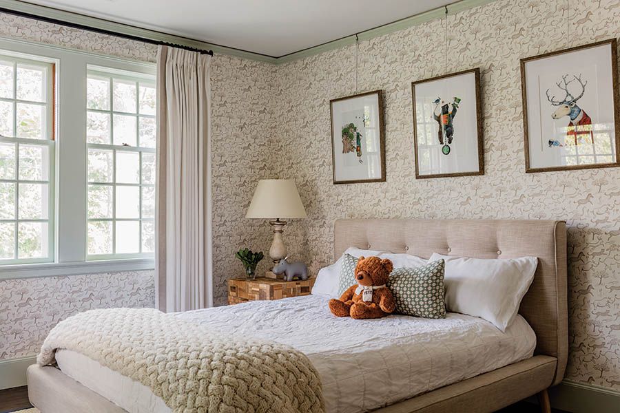
In his bedroom, the couple’s youngest son enjoys a safari-themed wallcovering by Rifle Paper Co. / Photo by Michael J. Lee

A dark-gray cantilevered vanity in the first-floor powder room sports a thick marble top and an unlacquered-brass cross-handle faucet. / Photo by Michael J. Lee

Architect
Sam Kachmar Architects
Cabinetmaker/Millworker
Kidder Blaisdell Woodworks
Contractor
Landmark Services
Interior Designer
Mandarina Studio
Window Restorer/Installer
Cleary and Son


