A Weston Couple Trades Suburbia for a Peaceful Seaport Condo
Designed by Patrick Planeta, the spacious 10th-floor unit showcases stunning harbor views.
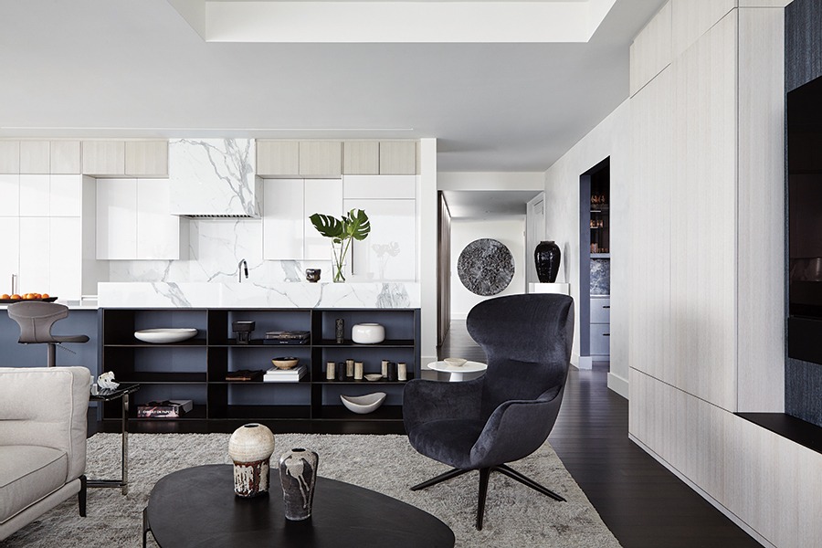
Steel shelves line the back of the kitchen’s oversize island. / Photo by Joshua McHugh
In anticipation of their empty-nester status, Patrick Planeta’s future clients, a Weston couple who had lived in the same Colonial for 20 years with three kids, started searching for their dream home. In Weston. They looked at a few houses “and then thought, What are we doing? Our kids are all leaving,” the wife recalls. Realizing that downsizing made more sense, they decided to change course.
In late 2018, the couple purchased a glassy 2,788-square-foot condo in the Seaport, where they planned to move with their teenage son. Sunlight saturates the roomy 10th-floor unit, which was the very first place they saw in the city. It also boasts a 180-degree view of Boston Harbor that was too good to pass up. But while they felt ready for a change, the couple quickly realized they needed a designer to create more storage and infuse the space with some much-needed personality.
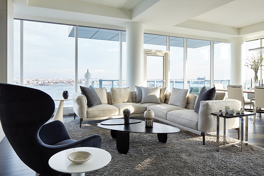
Planeta reworked the architecture of the ceiling to create soffits that delineate the living and dining areas. The organic form of the custom coffee table, fabricated by artisan J.M. Szymanski, eases the flow around the sectional and swivel chair, both from Showroom. / Photo by Joshua McHugh
And so Planeta—drawing on the view, along with the pair’s attraction to the bright, airy feel of a neighboring unit he designed—set out to create an environment suffused with calm, but not without drama. “The architecture is neutral, in colors reminiscent of the water and surroundings, but we [wanted to] play with texture and reflections [to give] it an undertone of energy,” the designer says.
The transformation begins in the entry, where Planeta had a black-and-white marble slab leathered for softness, cut into 8-inch strips, and arranged in a piano-key pattern underfoot. A ruler-like strip of bronze cuts through the stone, inscribed with a lyric from a Bob Marley song that the couple loves: “None but ourselves can free our minds.” Planeta credits contemporary artist Jenny Holzer, who is known for incorporating evocative text into the works she dreams up for public spaces, with the idea. “[Her phrases] slap you in the face and make you ponder,” he says.

In the entry, a Zieta mirror hangs over a waxed-steel console, also made by Szymanski. / Photo by Joshua McHugh

The engraved bronze strip on the entry floor will patina over time. “It’s living and moving with the family,” designer Patrick Planeta says. / Photo by Joshua McHugh
This initial meditative moment in the entry is intentional. Planeta acknowledges that the spectacular views are the condo’s key selling point, but he didn’t want the cityscape to immediately steal the thunder. “I like to hit you with something beautiful [so] you can catch your breath. Then, [when you] turn the corner, the vista unfolds,” he says.
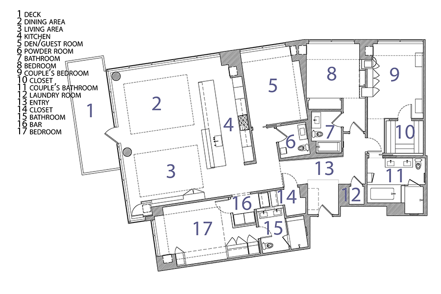
And so it does. Beyond the entry, past a hallway that leads to a marble-clad powder room and a versatile den/guest room, the extraordinary landscape visible from the main living space finally reveals itself. The open-concept room, which encompasses the kitchen, living, and dining areas, is just as impressive: Clean-lined furnishings, reflective polished-metal details, and transparent pieces, including a glass credenza and a Roll & Hill chandelier, play up the spaciousness of the floor plan, while shades of gray with underlying blue tones echo the scene outside the windows. “It’s very calming to be in a space where the colors meld together,” the wife says of the scheme.
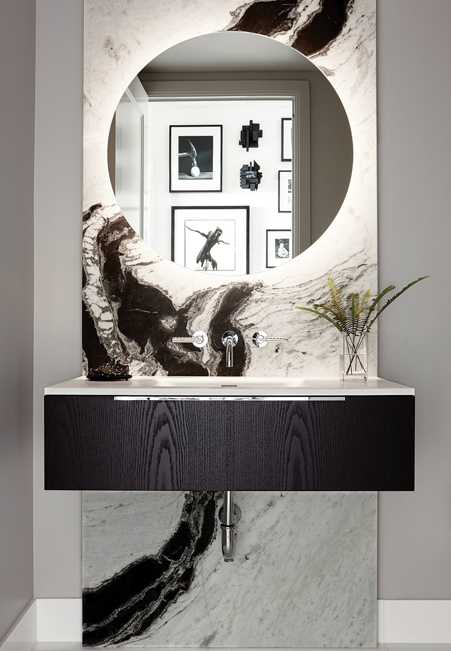
A leathered-marble slab wows guests upon entering the powder room. / Photo by Joshua McHugh
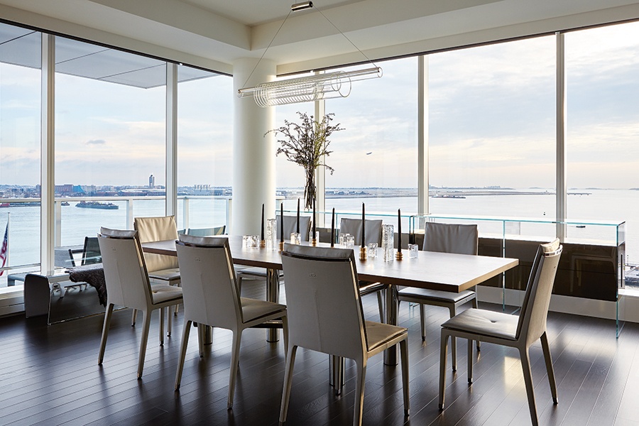
Poltrona Frau chairs surround the walnut-topped table by Egg Collective in the dining area. “Furniture legs are slender so as not to block the view when you’re on the sofa,” Planeta says. / Photo by Joshua McHugh
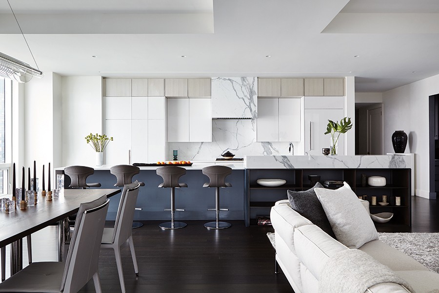
In the kitchen, marble slabs box in the range hood, line the backsplash, and provide a barrier for the sink so it isn’t visible from the living area. / Photo by Joshua McHugh

Planeta tucked a built-in bar with an onyx backsplash into a nook across from the kitchen that he created by relocating a bedroom doorway. / Photo by Joshua McHugh
The new storage in the room works well, too. Conscious that the family was moving from the suburbs, Planeta maximized hiding spots throughout the unit, designing sleek white-oak cabinetry for the living area and adding steel shelves to the back of the extra-long kitchen island. The designer also inserted a row of white-oak cabinets atop the kitchen’s existing white-lacquered ones, which failed to reach the ceiling. Finally, he tucked a sleek built-in bar and a pair of full-size wine refrigerators into a nook across from the kitchen, which he created by relocating the entrance to their son’s bedroom.
The work continued in the couple’s plush suite, which sits on the other side of the unit—away from the son’s bedroom and the action of the main living area. The space feels tailored, with extra pops of color that the wife loves, including a magenta-upholstered Poltrona Frau chair and a vibrant Polaroid by photographer Ellen Carey. The bed, meanwhile, rests against a Venetian plaster-framed inset that adds dimension and “gives the bed a sense of place,” the designer says.
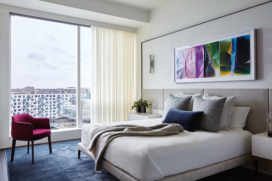
In the couple’s bedroom, gauzy de Le Cuona drapery softens the floor-to-ceiling windows that boast a view of the ICA. / Photo by Joshua McHugh
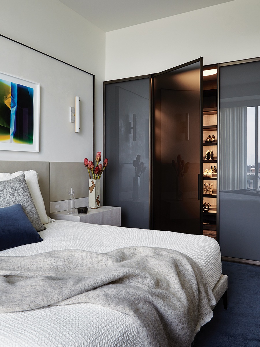
Planeta called on smoked glass and a Poliform shelving system to create the wife’s walk-in closet. / Photo by Joshua McHugh
Planeta also used smoked glass and a Poliform shelving system to create an envy-inducing walk-in closet for the wife. Unlike her closet in Weston, it’s not large enough for her to roll out a mat to practice yoga, but the backlit shoe shelves more than make up for it.
With the renovation complete, the family find themselves happily navigating urban living. The husband walks to work, the younger son has become a city kid before going to college, and the wife joined the ICA, where she hopes to volunteer. They feel energized—and a little bit in awe of their new place. “Everything is so beautiful that at first it felt like we were just visiting,” the wife says. “But the kids have been around to properly break it in, so now it feels like home.”

A sculpture by artist Catherine Latson adorns the daughter’s room. / Photo by Joshua McHugh
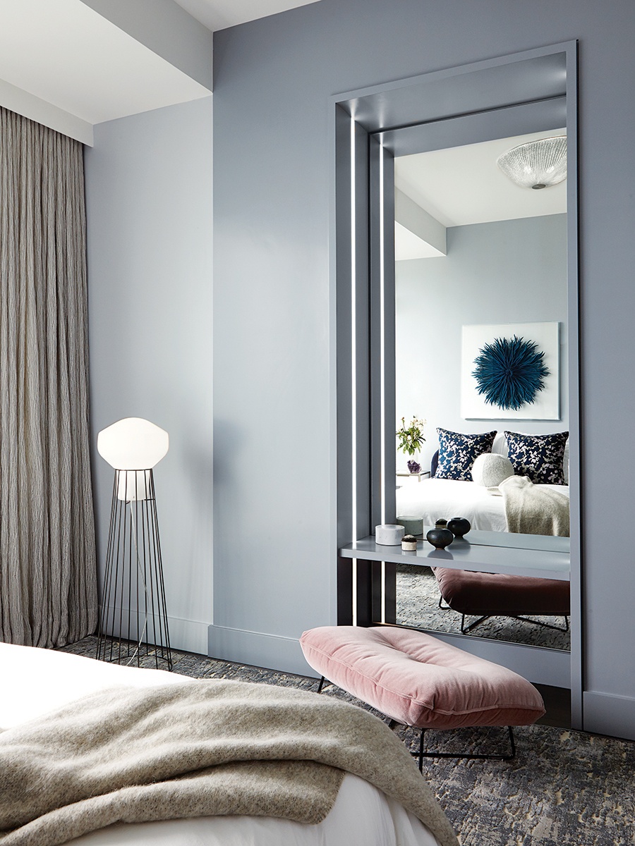
Nestled into a niche in the bedroom the couple’s daughter uses when she visits from college, a makeup table is edged with an LED light strip. / Photo by Joshua McHugh
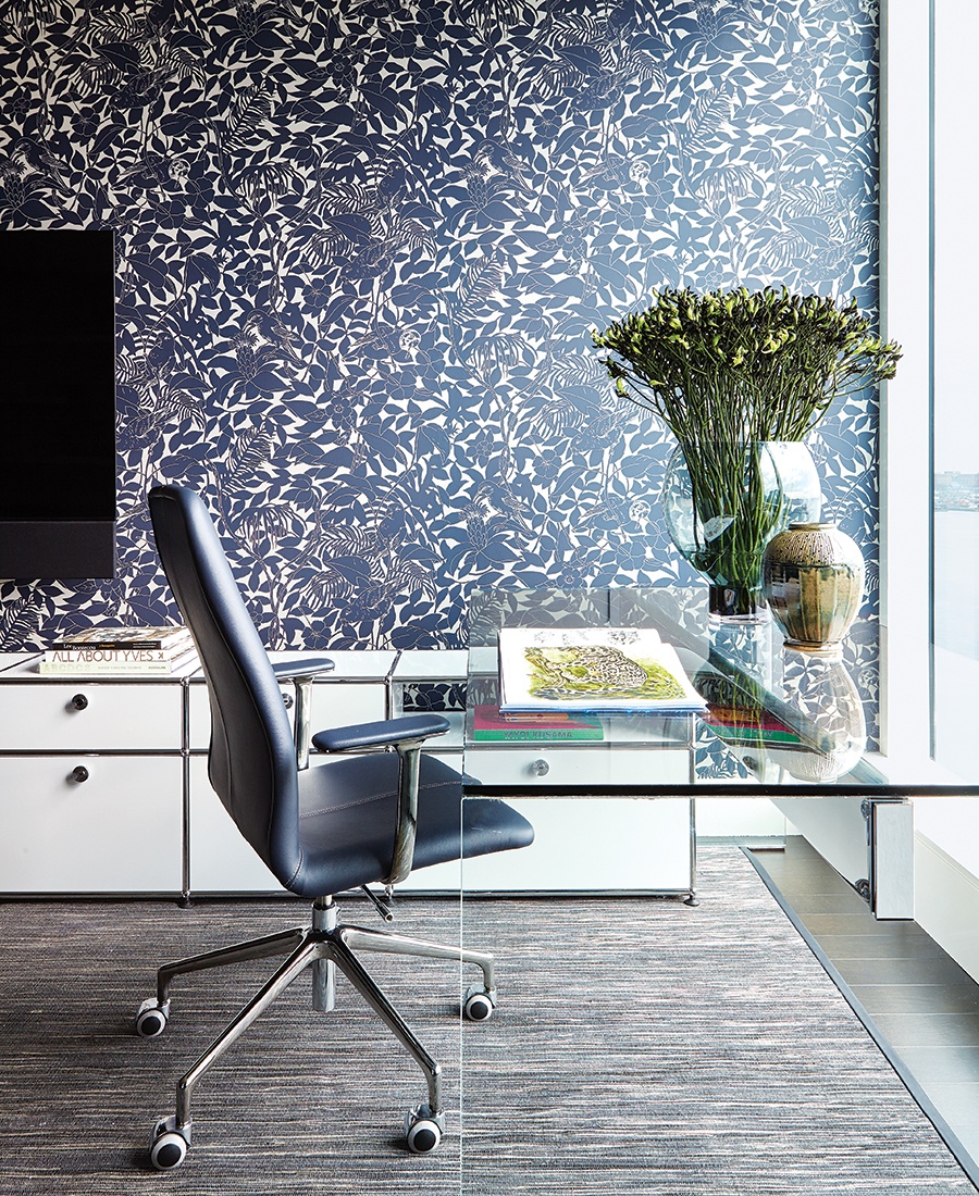
Aubergine-colored wallpaper by Hermès envelops the den. / Photo by Joshua McHugh
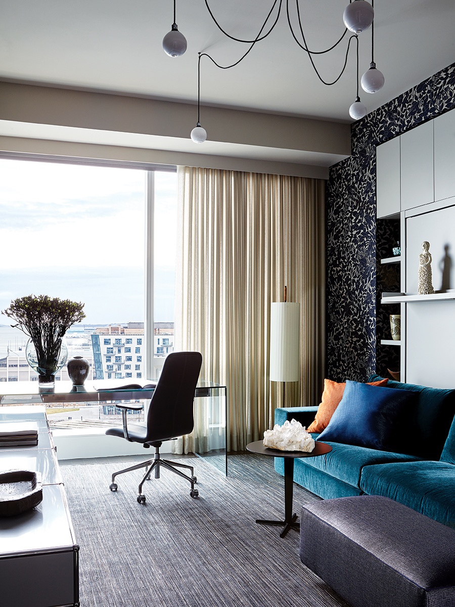
Dressed up with a SkLO pendant light, the den doubles as a guest room thanks to a Murphy bed with an integrated velvet sofa from Resource Furniture. “You remove the back cushions, and the bed folds out on top of it,” Planeta explains. / Photo by Joshua McHugh
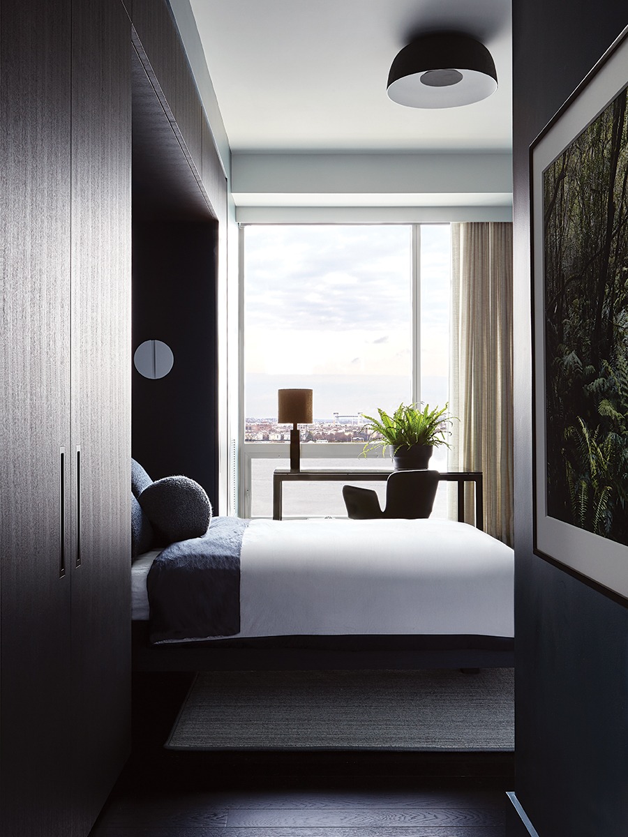
A photograph of a dense African forest by Cory Gans hangs in the teenage son’s bedroom, which has a moody feel per his request. / Photo by Joshua McHugh
Contractor
Adams + Beasley Associates
Interior Designer
Planeta Design Group
Lighting Designer
Sladen Feinstein Integrated Lighting
