Four Renovations To Inspire Your Post-Pandemic Dream Dwelling
Forget buying a new home in Vermont—the hottest trend is taking what you have and making it bigger, smarter, and more beautiful than ever. From the mudroom to the barroom, draw inspiration from these renovations as you plan your perfect pandemic and post-pandemic dream pad.
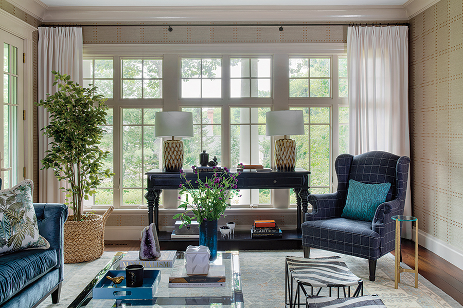
A formal living room in Wellesley gets a second life as a hip hotel-inspired “lounge” connected to a fully equipped home bar. / Photo by Sarah M. Winchester
The Kick-Ass Bar
Consummate entertainers, a Wellesley couple longed for a space where they could unwind with family and friends in their new home. The solution? Transforming a tired wood-paneled office and formal living room into a bar/lounge area that rivals the hippest hotel lobby. —BJ
Bar/Wine Fridge
Trottier Fine Woodworking
Contractor
The Wiese Co.
Interior Designer
Gather Home
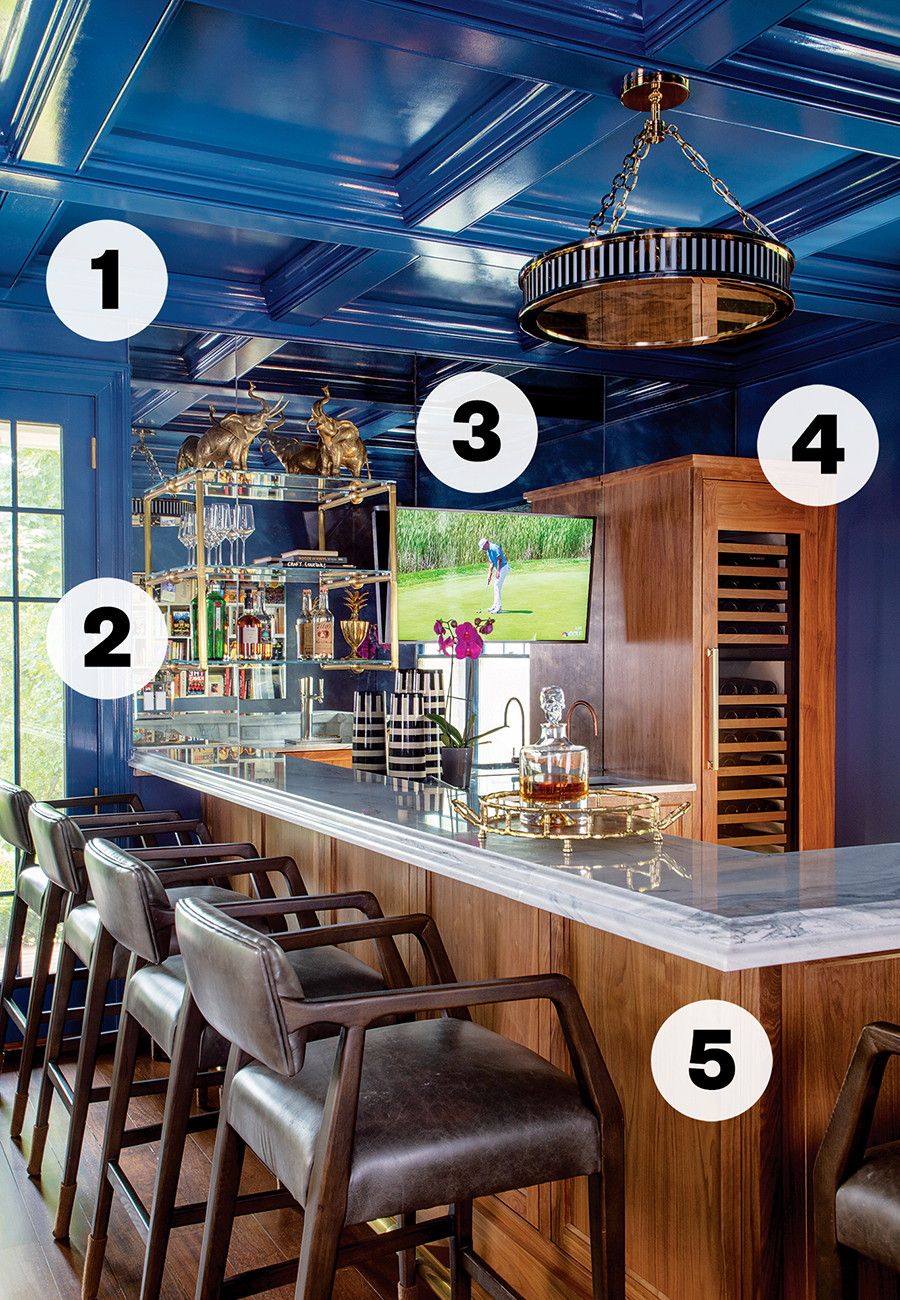
Photo by Sarah M. Winchester
1. “We wanted to create a space that had kind of a wow factor,” says designer Kim Tosi, principal of Gather Home. A fresh coat of Farrow & Ball’s high-gloss “Stiffkey Blue” paint on the cherry-wood coffered ceiling—inspired by a boutique hotel in Charlottesville, Virginia—helped achieve that goal.
2. Made by Framingham-based Costa Fabrications, the custom shelving showcases bar essentials like glasses and liquor bottles, plus a pair of elephant sculptures found at Brimfield.
3. “It’s become a running joke between [the homeowner] and me that he can never have too many TVs,” says Tosi, who installed this one in the antiqued mirror backsplash. There’s another one on the other side of the bar.
4. The wine fridge houses treasure from the couple’s once-a-year trip to Italy with friends.
5. The walnut bar was crafted by Nantucket-based cabinetmaker Jeremy Trottier. “We used the wood in the couple’s Nantucket house in multiple variations of finishes,” Tosi says. “We just loved the graining.”
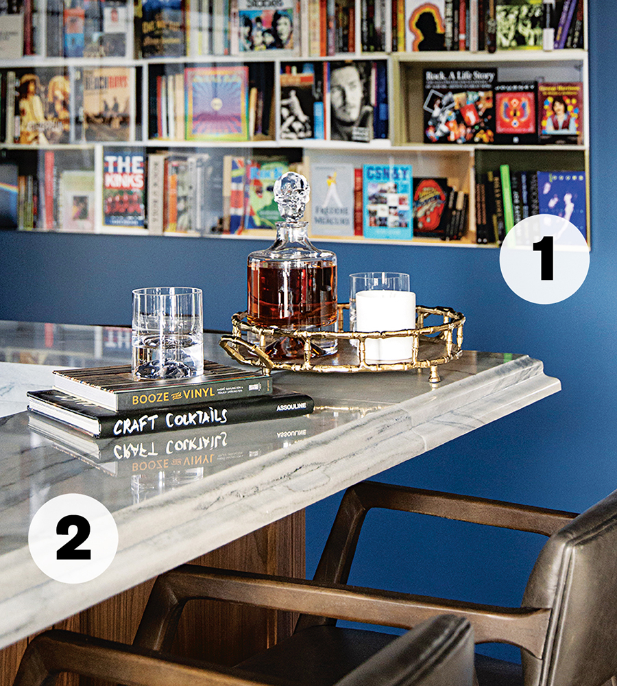
1. Purchased at the Arden Gallery in the South End, this photograph of books about rock ‘n’ roll legends by local artist Max Steven Grossman reflects the clients’ musical taste.
2. “It was all about layering texture and colors,” says Tosi, who chose a creamy gray Luce di Luna quartzite for the bar top.
HOW TO GET STARTED
1. Measure Up
“Bar height is different than kitchen counter height,” Tosi says. Typically, a home bar should be taller where guests are seated (41 to 43 inches is the standard) and lower behind the bar where drinks are served (36 inches).
2. Don’t Be Afraid of Color
A home bar is the perfect place to experiment with bold hues you wouldn’t use in other, more heavily trafficked areas of your home. And if worst comes to worst, Tosi notes, “paint can always be painted over if you don’t like it.”
3 Go Commercial
If you’re looking for an elegant, lounge-like space, don’t take your cues from traditional home bars, which tend to be “cherry wood, with someone’s framed Red Sox jersey on the wall,” Tosi says. Instead, find inspiration in your favorite boutique hotels and restaurants.
4. Anything Can Be a Bar
“A bar cart, a top of a console, a dresser—in my formal living room, we have a midcentury armoire that has all of our alcohol and cocktail glasses in it,” Tosi says. “You can use what you have. Put some fun glasses on it, grab your favorite bottles and mixers, and all of a sudden you have a party.”
The Ultimate Home Office
What do you do when you’re retired but not quite ready to give up on your career? You turn your unfinished Newton attic into a hub of productivity for working—and volunteering—at home. —BJ
Architect/Interior Designer
LDa Architecture & Interiors
AV
NEXT Electric Systems
Cabinetry
Walter Lane
Contractor
Affinity Builders
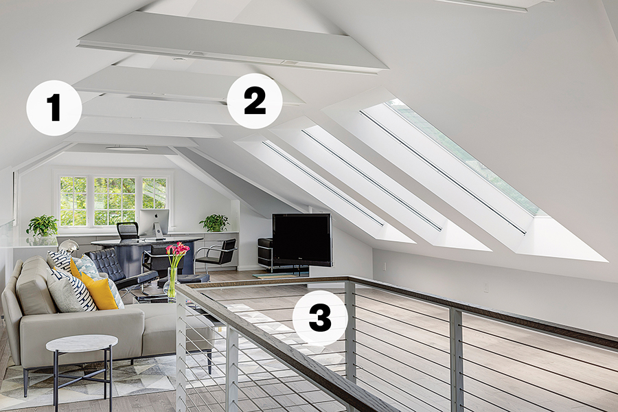
Photo by Greg Premru
1. Ricardo Bilonick, the lead architect on the project, worked closely with the husband, a lawyer, to replicate his office setup at home. That meant bringing in his old Marcel Breuer chairs and desk, the base of which was painted to better match the space.
2. The structural collar beams are outfitted with linear LED lighting that shine up into the ceiling for ambient glow, and recessed lights that shine down for reading. “It illuminates the space really nicely,” Bilonick says.
3. The cable-railing system was custom-designed and built by Weymouth-based Weld Right Iron Works.
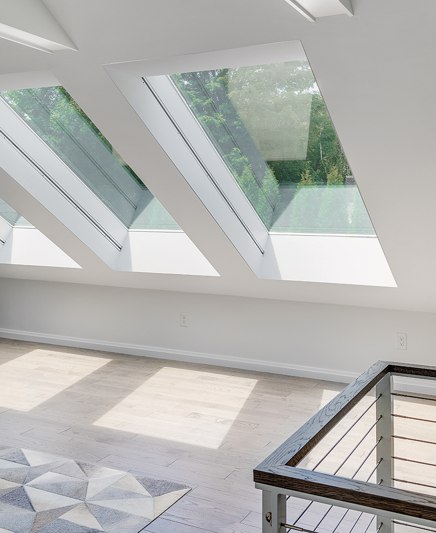
Photo by Greg Premru
Bilonick and his team chose to install “the biggest skylights we could find off the shelf” to make the attic feel “nice and open and lofty.”
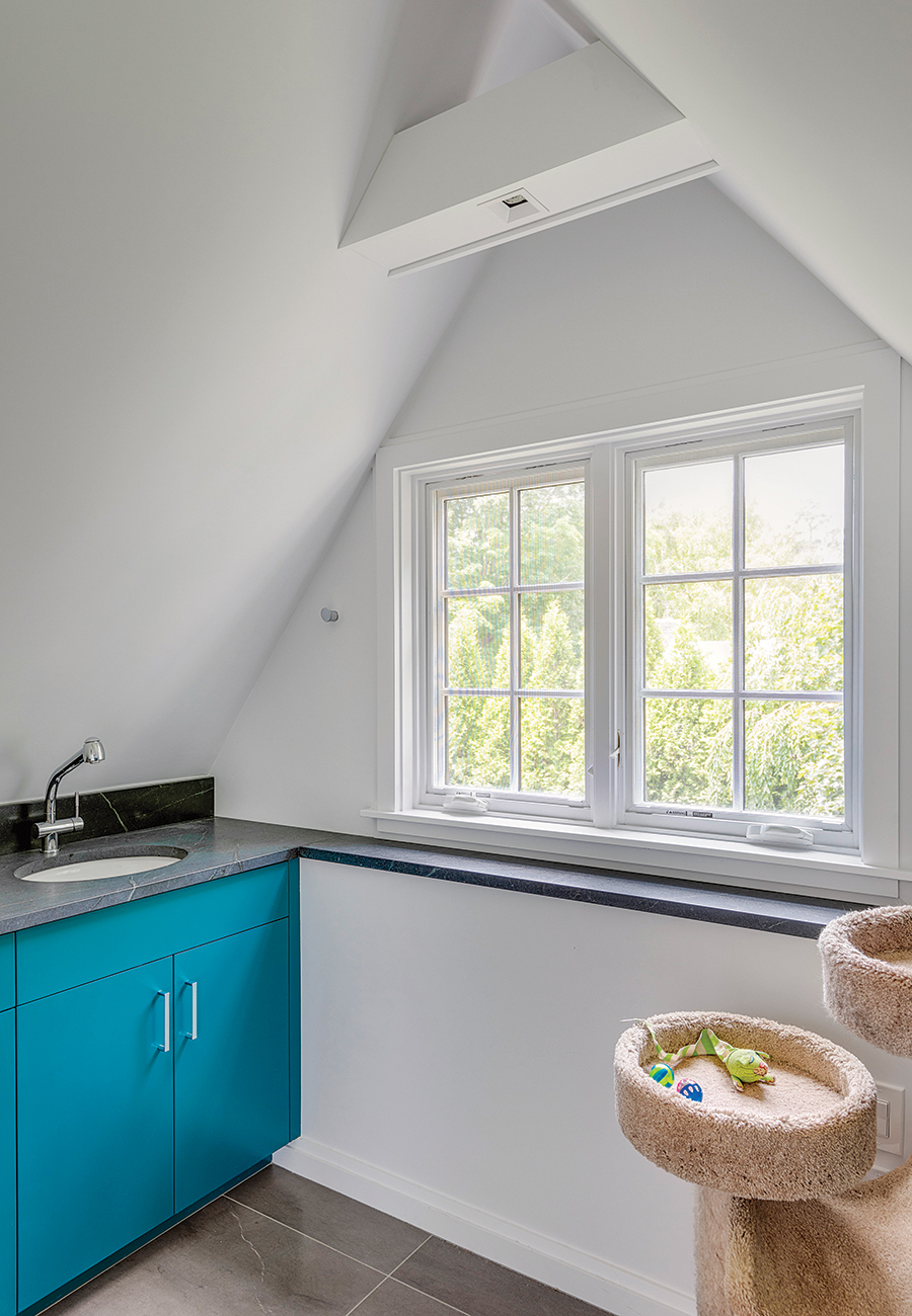
Photo by Greg Premru
A unique feature of the space is the “cat room” requested by the wife, also a lawyer who now fosters multiple pets at a time for the Animal Rescue League of Boston. “It’s their playing room and feeding room…kind of a catchall,” says Bilonick, who gave the room a splash of color by painting the cabinets with Sherwin-Williams’s “Blue Peacock.”
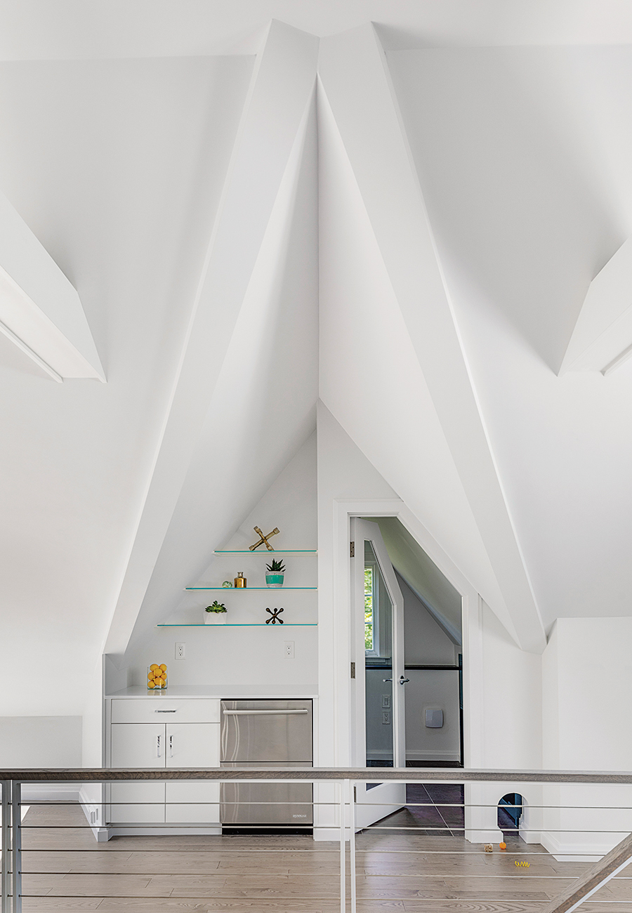
Photo by Greg Premru
Given how far away the couple are from the main kitchen, the “human hospitality center” allows them to keep cold water and ice on hand as well as food and refrigerated medicines for the animals.
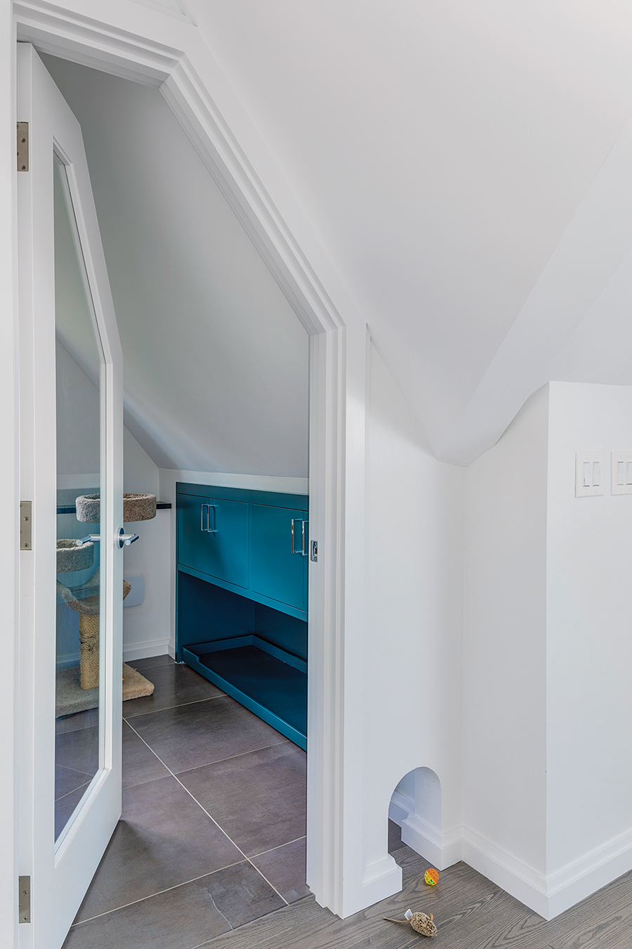
Photo by Greg Premru
A pass-through from the main area allows the cats to move in and out of their designated space even if the door is closed.
HOW TO GET STARTED
1. Be Smart About Storage
Before committing to pricey bookcases or cabinetry, take stock of what you have (and haven’t) used since you started WFH. In this case, “we edited down what [the clients] needed for storage and printers to make sure they didn’t have too much or too little,” Bilonick says.
2. Bring It to the Pros
If your new workspace is going to be in an attic or basement, it pays to bring in an AV consultant. “Not only because technology is always changing, but there may not be proper infrastructure set up and we may be too far away to make everything wireless,” Bilonick explains.
3. Avoid Clutter
Use your new home office as an opportunity to start fresh, paring down things like pens, paper clips, and, yes, even picture frames so your workspace fits in with the rest of your home. “You may not need to be reminded of your family since you’re working from home,” Bilonick says.
4. Find Your Place
Don’t have the space for a proper office setup? “If you can sacrifice a closet…
you can drop a countertop in there,” Bilonick suggests. “When you are finished work for the day, just move the chair, close the door, and hide your desk and its messes away.”
The Do-It-All Mudroom
Rain-soaked boots, cleaning supplies, bulky coats—where do they all go? If you’re lucky, in a chic catchall space like this one, created by a pair of design pros for their own family home in Bedford. —AT
Architect
Tom Wilmes
Contractor/Interior Designer
Highline Construction
Stone Fabricator
StoneTek
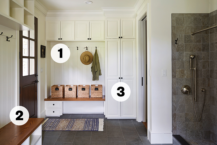
1. “We have a no-shoes house,” says Highline Construction co-owner Niki Vercollone, who created the space with her husband and business partner, Nick, as well as architect Tom Wilmes. “Having a place to dump dirty shoes [with] room for everything was important.”
2. The couple chose to stain the room’s two wooden benches rather than paint them. “When you paint the seat, it gets all scratched up,” Niki explains. “It’s better to do a stained wood. It lives a little longer.”
3. Accented with Acorn forged-iron pulls and knobs from Burlington-based Mack Hardware, a mix of cabinetry offers hiding spots for items of all shapes and sizes, from batteries and cooler bags to brooms and vacuums. There are even pull-outs for dirty and ready-to-be-folded laundry.
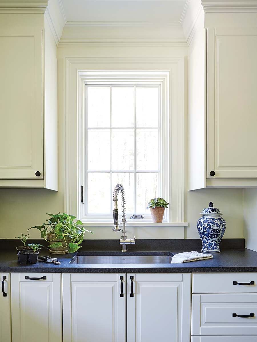
Photo by Joel Benjamin
Honed and aged black granite, which Niki describes as “indestructible,” tops the counters. “There’s no staining or scratching,” she says. “These counters get used like you wouldn’t believe and they look brand new.”
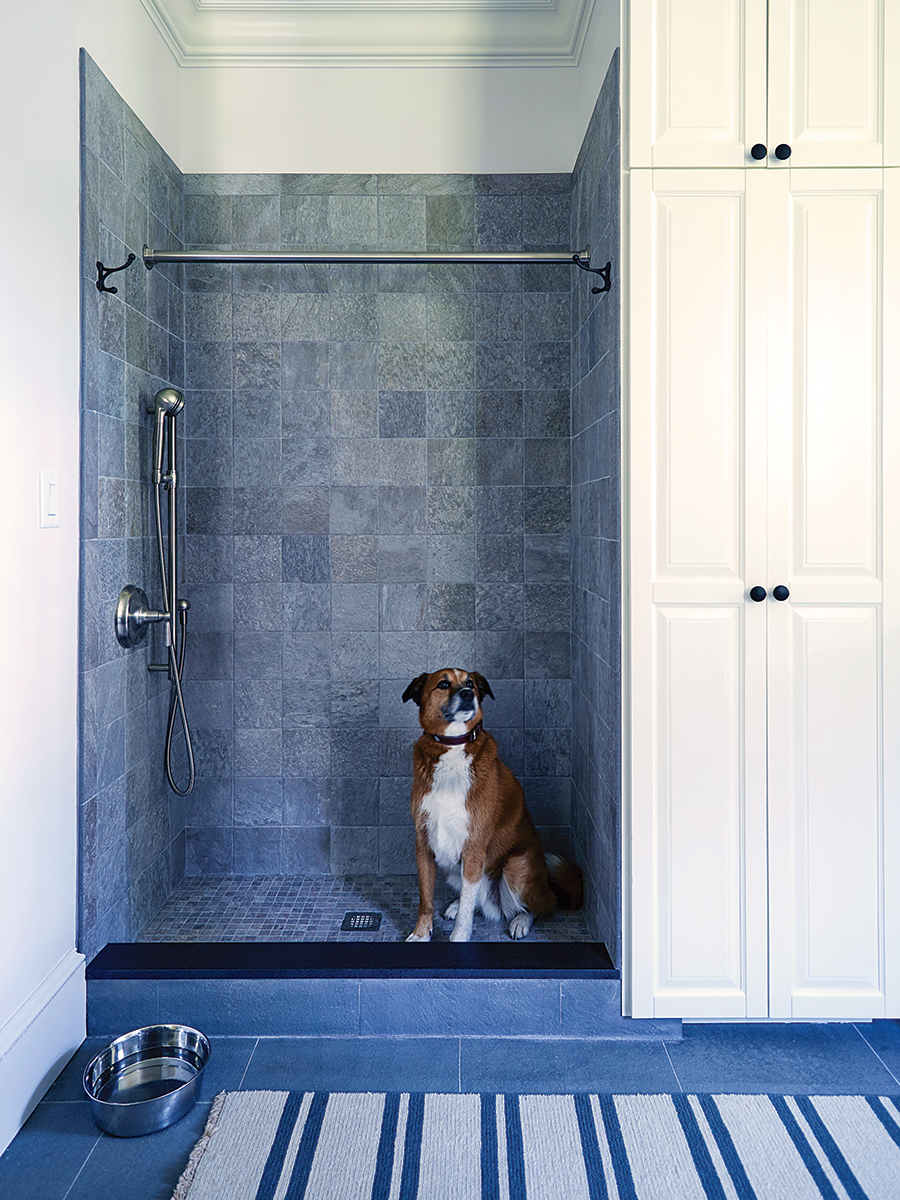
Photo by Joel Benjamin
Originally designed as a washing station for their rescue dog, Otis, the shower also offers a handy spot for hanging particularly soaked jackets or bathing the couple’s young children, ages two and four.
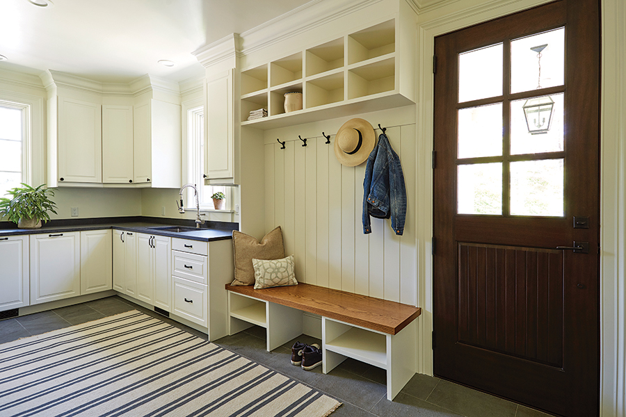
Photo by Joel Benjamin
One of the owners’ favorite features? The room’s radiant floor heating. “If you leave a pair of wet boots on the stone, it’s dry in an hour,” Niki says.
HOW TO GET STARTED
1. Begin with the Basics
“People will build a mudroom and then be searching high and low for baskets that are the right size,” Niki says. But “if you get whatever you’re going to use to store your stuff in the cubbies first, the contractor can do the carpentry to match the size perfectly.”
2. Focus on Depth
A bench is a useful mudroom addition, but the size of the seat matters—a lot. “We won’t do anything less than 18 inches,” Niki notes. “Twenty is better—that way, you’ve got some space so you’re not smushed into a bunch of coats” or whatever is hanging behind you.
3.. Aim for Durability
High-traffic areas call for high-performance materials. For flooring, Niki recommends natural stone or brick instead of hardwood, which is prone to scuffing and water damage. Stainless steel, meanwhile, is ideal for a sink. “It doesn’t scratch,” she explains.
4. Go High…and Low
“I always encourage clients to consider high and low shoe storage,” Niki says. “If you look at the benches, I’ve divided the space underneath into small cubbies and larger ones. Small cubbies hold tennis shoes and sandals, and then rain boots fit in the taller ones.”
The Sensational Backyard
More is more: That was the unspoken motto behind this MetroWest backyard transformation. Equipped with separate areas for cooking, lounging, and eating, the formerly stark green space now bears all the trappings of the ultimate entertainment zone. —AT
Furnishings
Beige and Bleu Design Studio
Landscape Designer/Contractor
A Blade of Grass
Pavilion Contractor
Design Essentials
Sound System/TV
Sounds Good Corporation
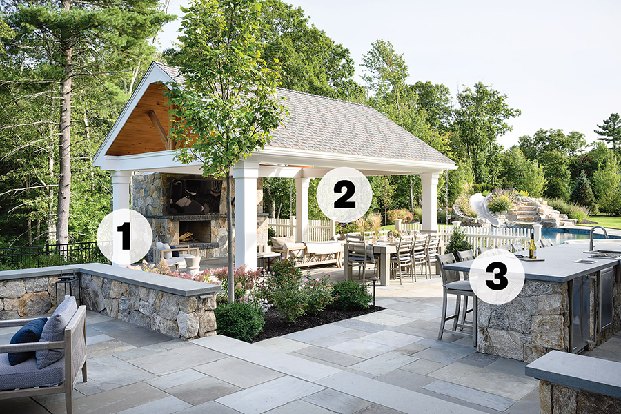
Photo by Tamara Flanagan
1. The project evolved from a request for pool decking, dual patios, and an outdoor kitchen to include a heated pavilion with a wood-burning fireplace and a flat-screen TV. “[The clients] kept telling us how having that space saved their summer [last year],” says Kate Notman, senior landscape architect at A Blade of Grass, who adds that the site’s generous size enabled the owners to host socially distanced visits.
2. Curated by Boston-based Beige and Bleu Design Studio, hardy teak furnishings, outdoor-friendly upholstery, and sculptural accent pieces (see: the reconstituted-stone side tables from Serena & Lily) add comfort and texture to the yard.
3. To soften the hardscaping and create a lush and inviting atmosphere, the team planted more than 40 types of trees, shrubs, grasses, and perennials—including daisies and peonies—throughout the site.
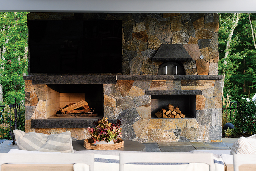
Photo by Tamara Flanagan
Enhanced with a granite mantel, the wood-burning fireplace adds an extra layer of coziness to the pavilion.
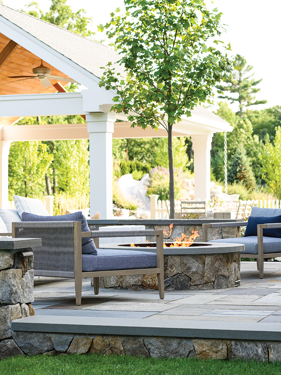
Photo by Tamara Flanagan
The yard features a pair of bluestone patios: one for dining and the other for cozying up to a gas fire pit, crafted with New England fieldstone. “It’s nice to have it not be just one large, hard surface,” A Blade of Grass owner and lead designer Jim Douthit says.
HOW TO GET STARTED
1. Love Your Layout
Before you commit to a design plan, make sure you’re satisfied with the placement of each element. “Use flags [to outline] where you think the patio should be, and then drag furniture around to see if it makes sense,” Douthit advises.
2. Think Big
When it comes to patios, bigger is better. “I don’t know if we’ve ever had a single person say, ‘This patio is too big,’” Notman says. “Plants can go in small because they will grow. But if the hardscaping isn’t right from the get-go, that’s much harder to correct.”
3. Plan for Privacy
Screening plantings, such as the spruce trees and hydrangeas used here, can help define activity areas and foster a sense of privacy between you and your neighbors. “You don’t want to be in a space that’s really yours and have anybody looking
in,” Douthit says.
4. Consider Materials
Outdoor kitchens call for hardier, more forgiving surfaces. For this project, the team chose a dark-and-leathered “Blue Mist” granite for the countertops instead of a traditional bluestone, which is more susceptible to blemishes such as grease stains.

