You Won’t Find Clutter in This Modern Newburyport Kitchen
Interior designer Holly Gagne called on a "clean palette" to create the contemporary space.
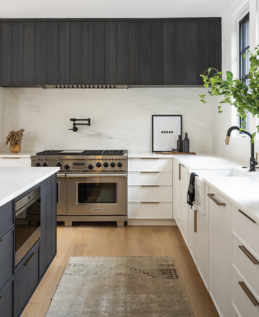
The custom wooden installation above the range not only conceals the hood, but also boasts hidden cabinets on either side, outfitted with vertical dividers to keep trays and cutting boards tidy. Photo by Tamara Flanagan
The inspiration for the 500-square-foot kitchen in this new build in Newburyport? The “crisp-white [interiors with] lots of contrast” by noted firm Ike Kligerman Barkley, spotted by the owners during a trip to Rhode Island. “That was our jumping-off point,” says interior designer Holly Gagne, who the couple hired to re-create the modern, clutter-free aesthetic in the home they share with their three children. That meant balancing a “clean palette” of white marble and dark, charcoal-stained wood with warm touches such as the oak flooring and the leather island stools. “They came with a vision, and we wanted to take that and customize it to their family and needs,” Gagne says.

Photo by Tamara Flanagan
Gagne peppered the kitchen with elements that have a slightly imperfect, handmade quality (see: the mouth-blown glass pendant lights from Schwung Home) to keep the space from feeling too sleek.
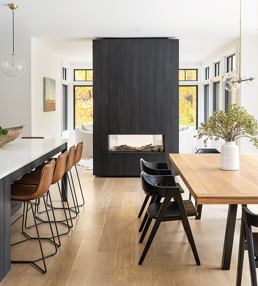
Photo by Tamara Flanagan
The double-sided glass fireplace (a must for the family, who had the same model in their previous home) “creates a subtle separation [between the kitchen and the adjacent sunroom] but still keeps the spaces feeling open,” the designer says.
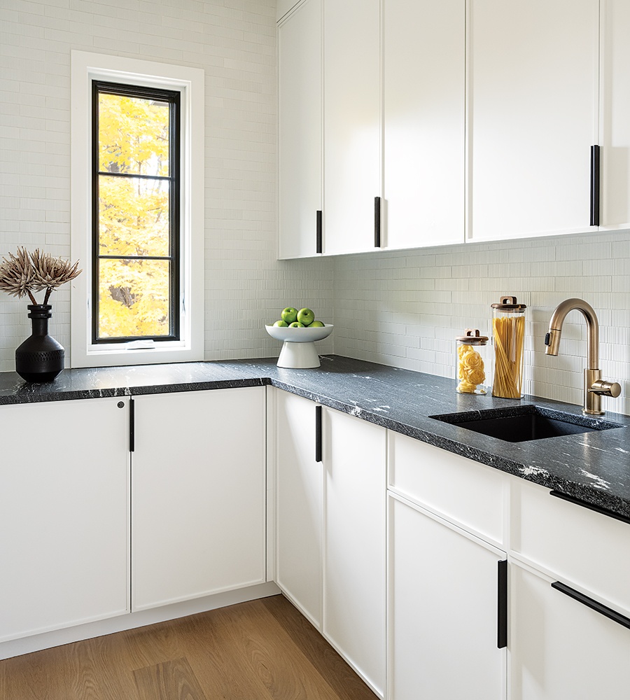
Photo by Tamara Flanagan
In the sizeable pantry that serves as the family’s breakfast station and bar area, the darker granite countertops are key. “It allows you to contain the busier daily things,” Gagne says. “It can kind of be the messier space.”
Architect
Scott Brown
Cabinetmaker
Newbury Cabinetry
Contractor
Windward Shaw
Interior Designer
Holly Gagne Interior Design
Stone Fabricator
Ripano Stoneworks
Designer Tricks
Layouts to Love
Thinking about how to organize your new space? Designer Jennifer Stuart, of Metropolitan Cabinets & Countertops, breaks down four common configurations.
Island
The most desirable layout, a kitchen with an island is especially handy for “busy families of three or more, since [an island] helps direct traffic” and “enables you to designate cooking zones and public areas,” Stuart says. Plus, she adds, islands offer an ancillary prep, work, and hangout space, making them truly multi-functional.
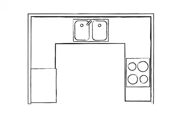
U-Shape
This three-walled layout “offers a lot of counter space and several prep areas,” Stuart says. The downside? “More than one cook in a U-shape kitchen often leads to crowding, [making it] an unlikely solution for a family,” she cautions.
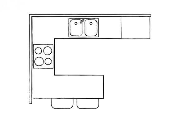
Peninsula
Kitchens with peninsula configurations, where an island juts out from one wall, are safe bets for homeowners who need seating and extra counterspace, but whose rooms are too narrow to support freestanding islands (which ideally should have a clearance of 42 inches on all sides, Stuart advises).
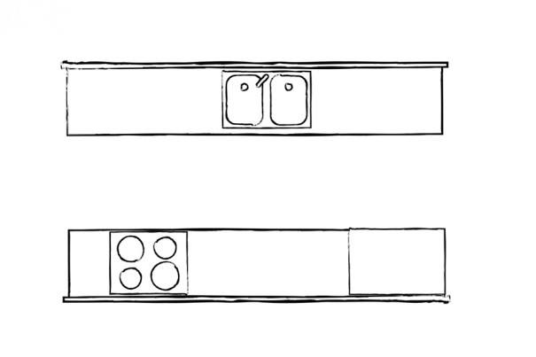
Galley
Defined by two parallel walls with a walkway between them, an apartment-friendly galley kitchen is the tiniest of the lot. “Every inch counts,” the designer notes. “The key is to select the smallest appliances you find useful. For example, Beko and Miele both make 24-inch appliances so you can maximize storage and countertop space.”
See the rest of this year’s featured kitchens here.


