A Wellesley Couple Completely Reconfigured This 1930s Georgian Revival
Armed with an ace team and plenty of patience, a young family pulls off an ambitious makeover for its traditional Wellesley home.
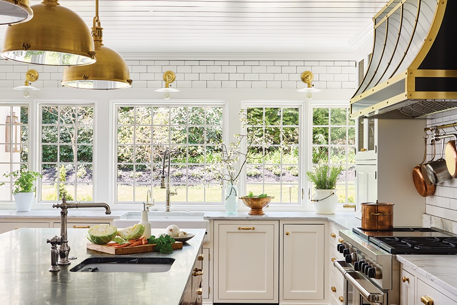
Unlacquered brass finishes and a custom hood, crafted by Medford-based Riverside Sheet Metal, add visual interest to the kitchen. / Photo by Read McKendree/JBSA
From the moment they first laid eyes on this 1930s Georgian Revival, a young Wellesley couple knew they’d found their forever home. Sure, the flow between rooms needed some finessing, as did the closed-off floor plan. But at just more than 4,100 square feet, the house—originally designed by pioneering architect Royal Barry Wills—offered the vintage vibe they craved. So the couple, who had a one-year-old at the time, bought it, knowing they’d renovate it to make it their own.
In 2018, shortly after purchasing the home, the pair was ready to get the ball rolling. They first reached out to architect Frank Shirley, who helped them devise a plan for structural changes, and then brought on contractors from the Chelsea Company and interior designer Katie Rosenfeld.
The team’s first order of business? Reconfiguring the layout. That meant constructing an addition to accommodate a new kitchen and spacious family room, creating a mudroom that includes a second entrance, and reworking the back staircase to both provide better circulation on the second floor and foster a greater connection between the rooms over the garage and the rest of the house.
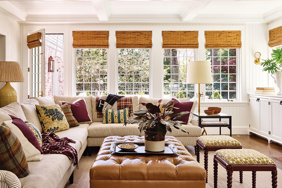
Jewel-toned pillows liven up the sectional in the new family room. / Photo by Read McKendree/JBSA
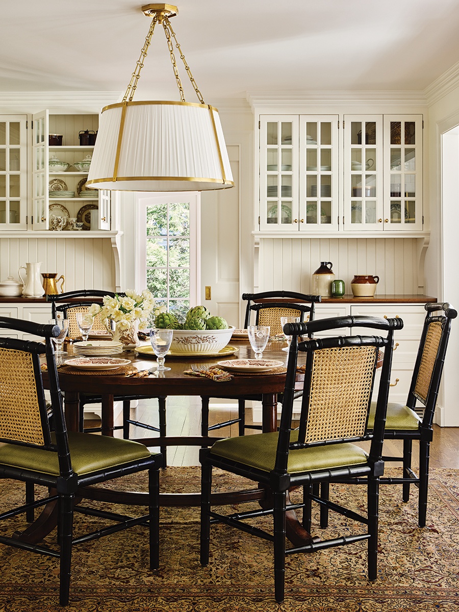
A mix of vintage and new furnishings gives the breakfast area a layered look. / Photo by Read McKendree/JBSA
Next, Rosenfeld and the wife teamed up on décor and furnishings. While she initially envisioned a more neutral palette, the homeowner says she’s glad the pro encouraged her to explore color and pattern. “Katie told me to think about the way I dress,” the wife says. “For me, it’s formal and then also a little bit wrinkled. I realized it’s all about the mix.” That ethos served the duo well when outfitting the new family room, for instance, where a throng of jewel-toned pillows mingle with textural bamboo window treatments and beadboard walls. The approach also produced stunning results in the dining room; here, Michael S. Smith’s leafy “Grace” pattern—evident on both the walls and the drapes—offers a striking backdrop for vintage dining chairs and a modern light fixture. “The house needed to be eclectic and varied but not trendy or frumpy,” Rosenfeld explains. “[We were aiming for] classic with an edge, which is a very fine line.”
All told, between planning and building, the house took more than two years to complete, with the couple—who had welcomed a second child and were expecting a third—moving in right at the start of the pandemic. The installation stage happened piecemeal during that time. “We expedited our move because I was more than 30 weeks pregnant,” the wife says.
Still, despite the lengthy renovation timeline and the added challenges of finishing the project during the early days of COVID (and with a newborn in tow), the family couldn’t be happier with the results. “We slowly started moving things from one room to another,” says the wife, who’s been layering in details to further personalize their new space. “You know you have a well-designed home when you can move things around like that.”
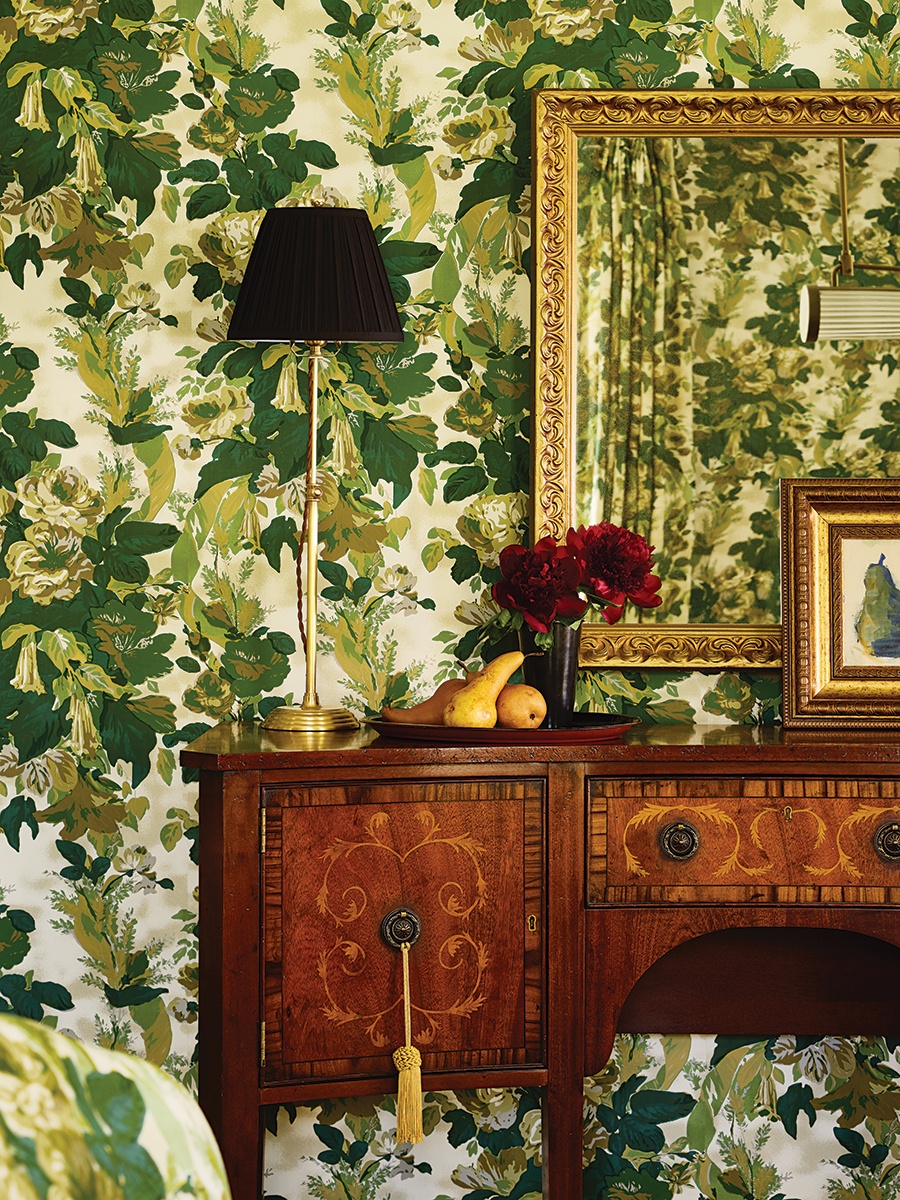
The “antique-y floral” pattern on the dining room’s drapes and walls lends style and cohesion to the space. / Photo by Read McKendree/JBSA
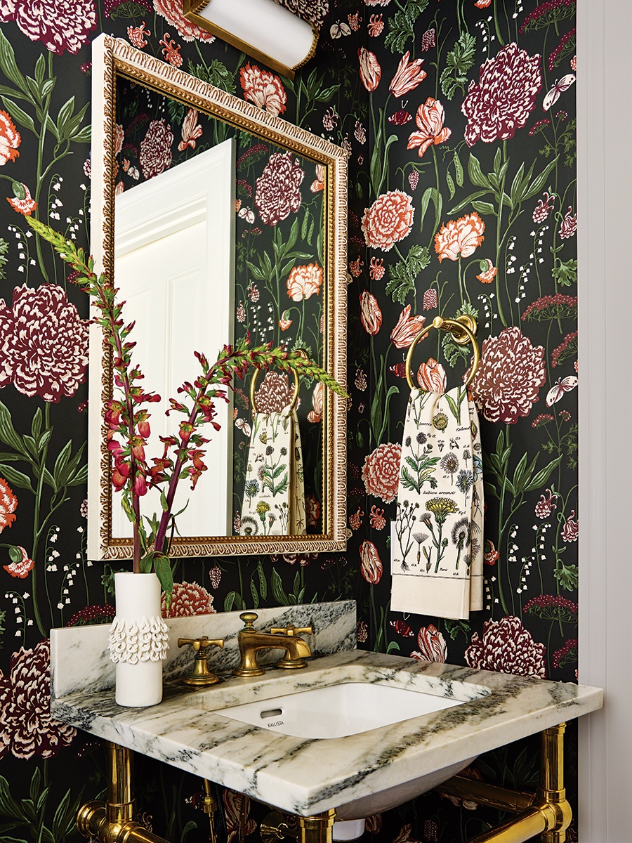
The new powder room by the back staircase pops with a Sandberg wallcovering from Scalamandré. / Photo by Read McKendree/JBSA
Architect
Frank Shirley Architects
Cabinetry
Kramer’s Custom Kitchens and Woodworking
Contractor
The Chelsea Company
Interior Designer
Katie Rosenfeld and Company
Landscape Contractor
Lynch Landscape & Tree Service
Landscape Designer
The MacDowell Company


