This Modern Home Offers a Playful Twist on Colonial-Era Homesteads
A hillside Newton home marries contemporary taste with New England tradition.
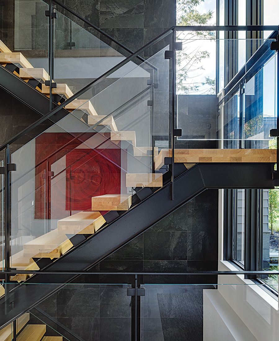
A modern glass-and-oak staircase isn’t just functional—it’s also a piece of structural art. / Photo by Greg Premru
Colleen and Mike Shafer aren’t golfers. But when the couple saw a unique West Newton Hill property overlooking Brae Burn Country Club’s sprawling golf course in 2015, they were intrigued—and hopeful that the open landscape would provide the sweeping views they’d come to love as native Midwesterners.
The house itself, however, left something to be desired. Originally built in 1942 as what was then considered “contemporary,” it was now anything but. The dated, midcentury-modern aesthetic was peppered with additions that didn’t quite mesh stylistically. So the Shafers brought in LDa Architecture & Interiors to help them make sense of their new home. “It was an amalgamation of forms over the previous 40 to 50 years,” says Treff LaFleche, principal architect with LDa. “It just didn’t address contemporary living for a family.”
And so, after a lengthy permitting process with the city of Newton (notoriously restrictive with historical architecture), the home was demolished in 2017 in favor of a clean slate. “Ultimately, their goal was that it would stand out as contemporary but still contribute to the wider New England vernacular,” LaFleche says.

Two reflecting pools flank a passageway from the main house to the primary suite, giving the illusion of levitation. “I don’t know [Colleen’s] astrological sign, but I know she responds to water. So this was an extra bit of magic,” LDa’s Carter Williams says. / Photo by Greg Premru
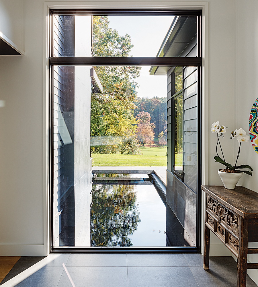
The depth of the home is relatively shallow, so floor-to-ceiling windows were used to bring in natural light that fully permeates the house. “You have moments where you can actually see through the home,” LaFleche says. / Photo by Greg Premru
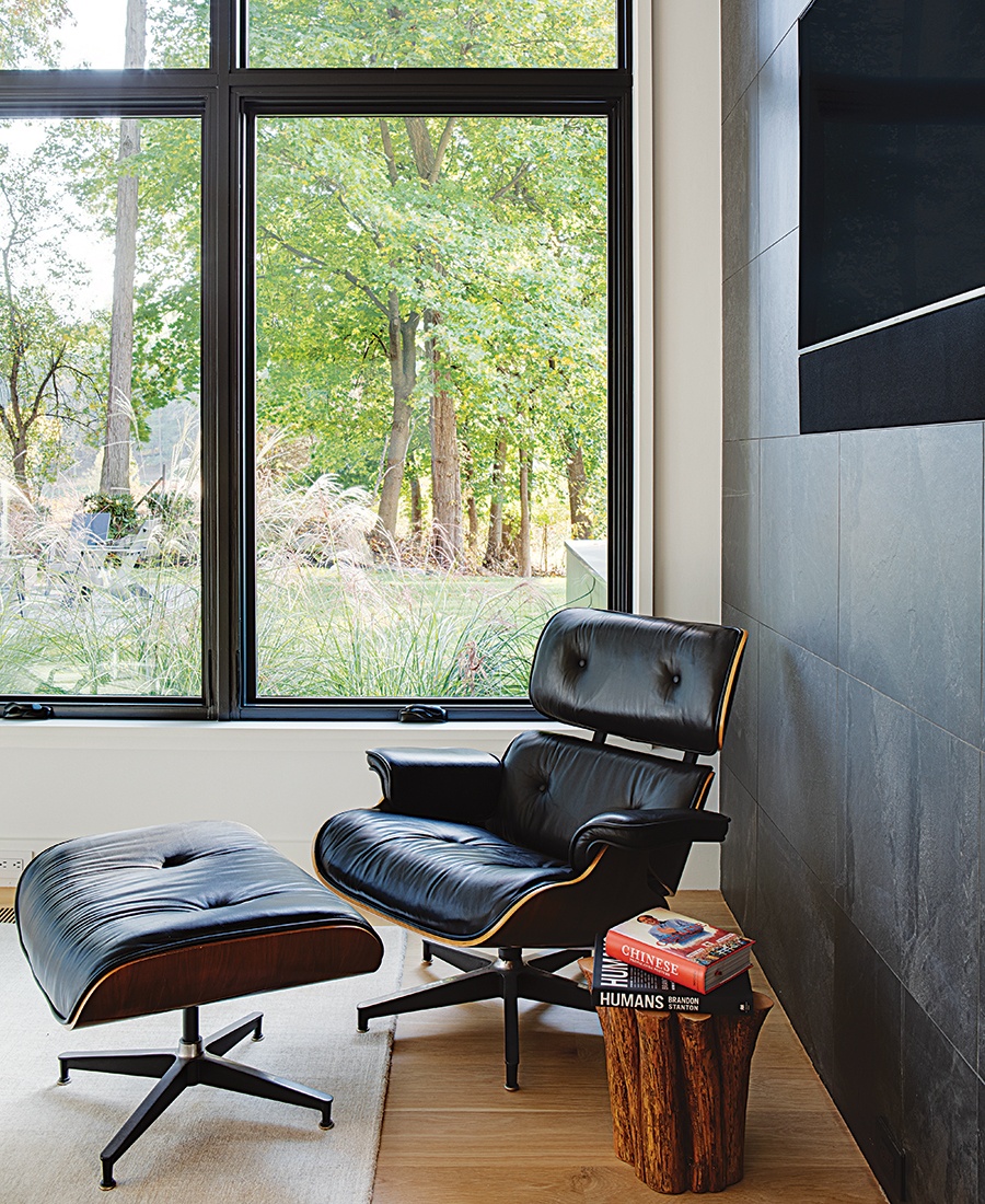
The office space is set in the back corner of the home. [It’s] much closer to the woods,” Williams says. “So you get a more close-range, quiet, contemplative view.” / Photo by Greg Premru
Back in the Colonial era, he explains, a homestead was often made up of a series of “pieces”—built over a period of time as the family grew and prospered, and connected for function and facility. “So scale tends to stay lower, rather than larger—more horizontal than vertical,” he adds. He envisions it as an “explosion of pieces” and deems it “a very 17th-century New England thing.” Unlike early settlers, however, who prioritized keeping warm over panoramas, the Shafers desired floor-to-ceiling windows across the back of the main house, letting in copious natural light and creating uninterrupted views of the pastoral golf course.

The living room windows look out onto the sprawling golf course. / Photo by Greg Premru
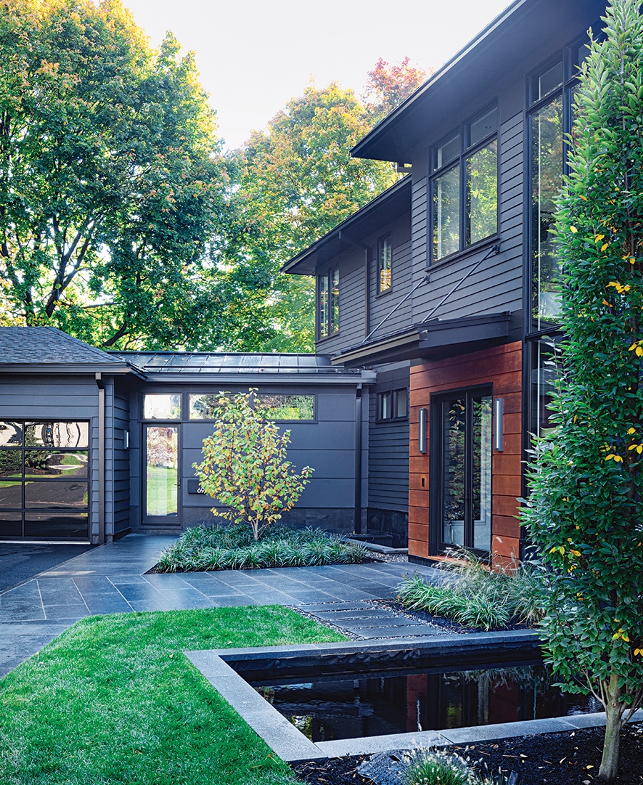
The exterior of the home is finished in natural colors and materials, including charcoal tile and stained red cedar, to blend with the landscape. / Photo by Greg Premru
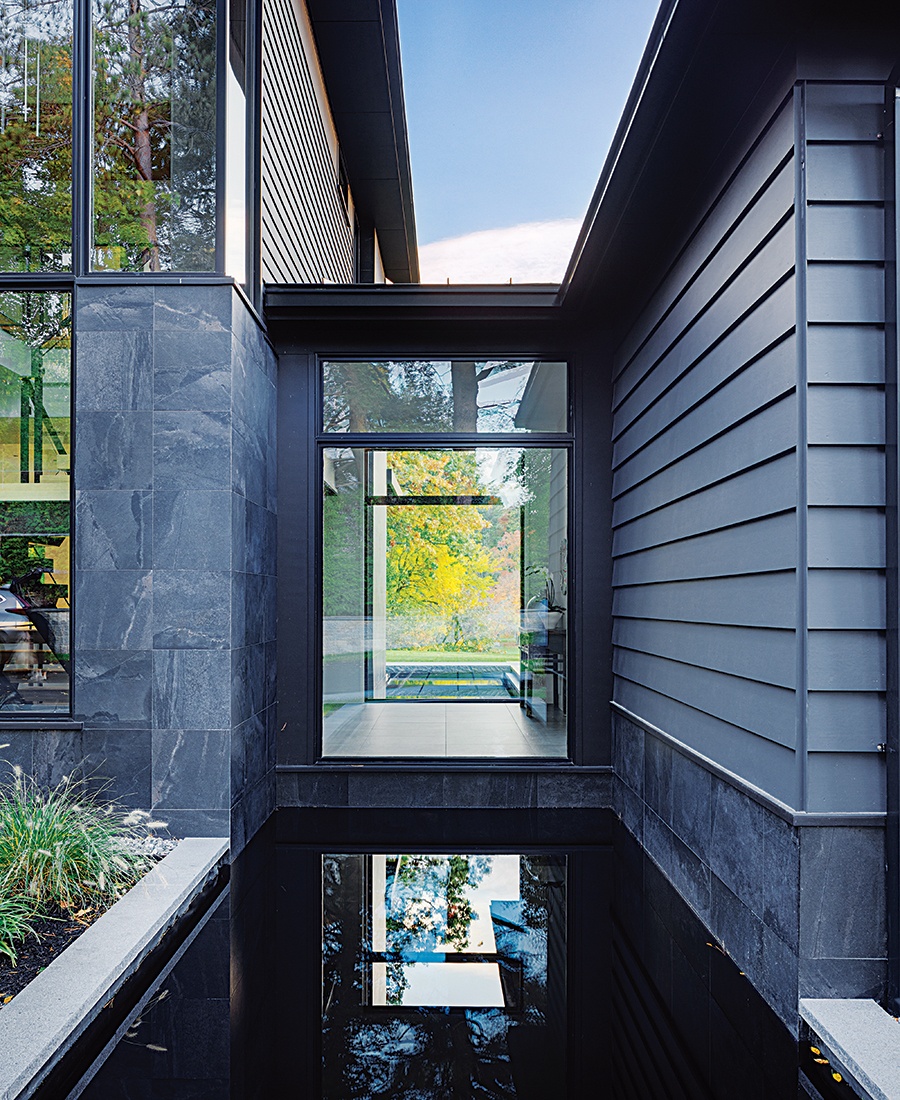
“Treff [LaFleche] and I talked about a sense of sanctuary,” Williams says. “This connector feels like a significant passage into a new place.” / Photo by Greg Premru
Because the views would arguably be the main event, it was important that the materials not compete with nature but rather enhance and amplify it. Landscape architect Stephanie Hubbard of SiteCreative suggested the connective glass passageways between structures be flanked by reflecting pools, giving the sense that water flows beneath the house. The water is also dyed black, creating a mirror reflection of the sky.
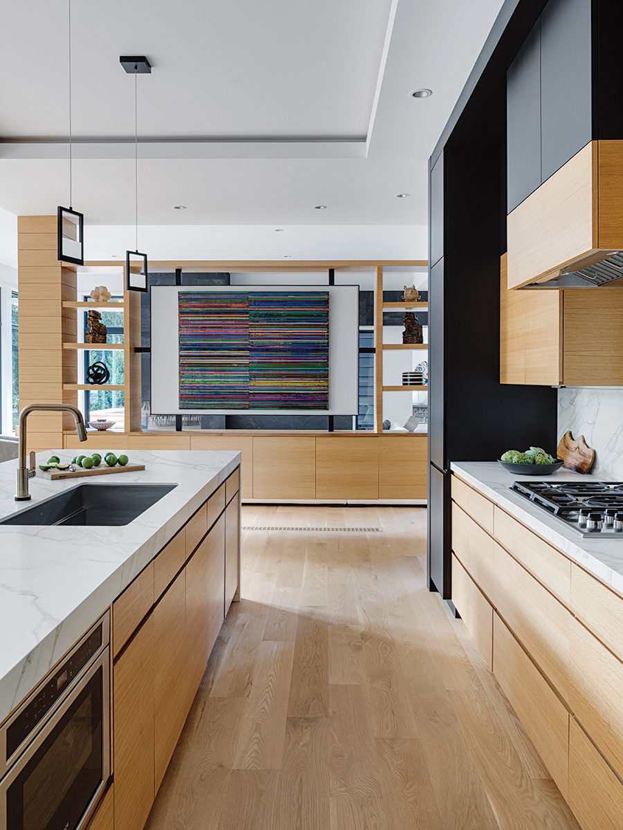
Colleen’s own art decorates the home. “The neutral palette of the house is the perfect background,” she says. / Photo by Greg Premru
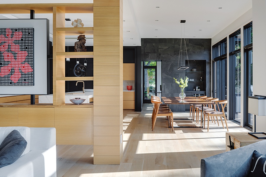
A white oak wall provides loose separation throughout the spaces in the main living area, and hides two structural beams running through the center of the house. / Photo by Greg Premru
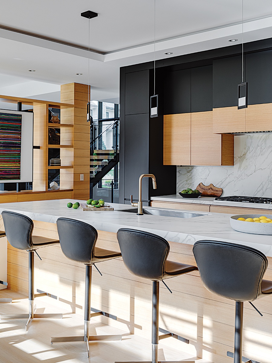
Black cabinetry is an elegant touch in the kitchen and connects the space with the color and aesthetic of the rest of the house. / Photo by Greg Premru
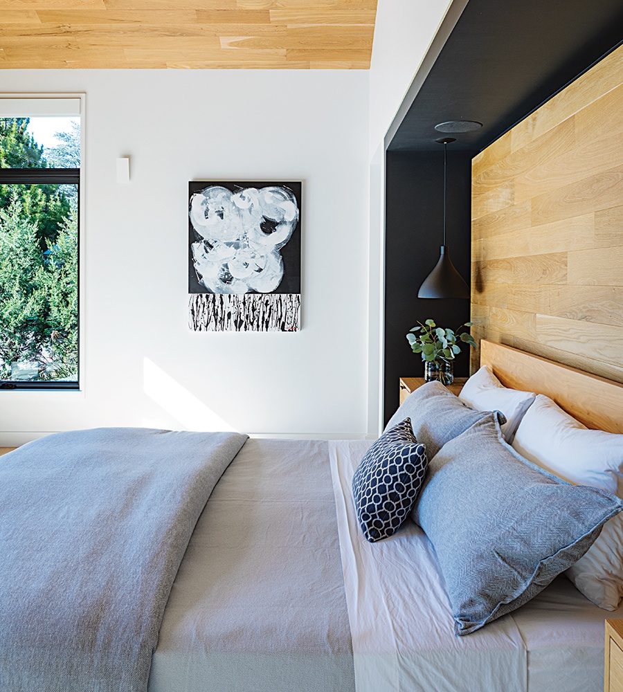
On the far west side of the home, the primary suite resides in its own first-floor wing, offering privacy from the communal living and outdoor spaces. / Photo by Greg Premru
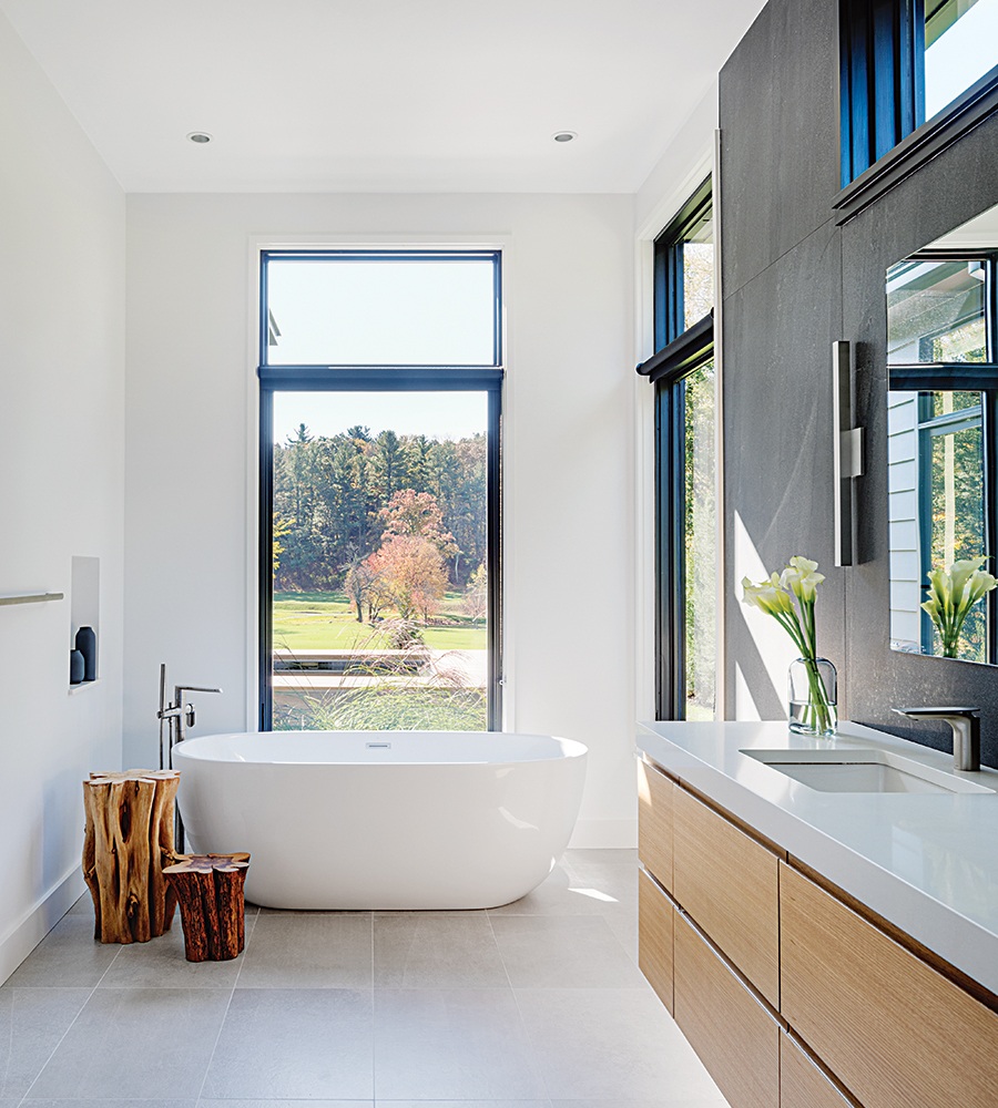
In the primary bathroom, Caesarstone counters in “Blizzard” offer a sleek contrast to the charcoal tile that runs throughout the home. / Photo by Greg Premru
The interior finishes would play an equal role in blending with the hillside, so as not to distract from the vista. Owner Colleen, a mixed-media artist by trade, selected these herself—leaning into natural materials such as white oak and a warm palette of tan and black. “When an object is black, the eye tends to look past it, rather than looking at it,” explains Carter Williams, project manager for the build—so features like the black window frames appear neutral against the backdrop of the golf course. And thanks to the abundance of natural light, sleek black kitchen cabinetry doesn’t overpower the home and make it feel dark or oppressive.
Black was also incorporated into the exterior of the home via painted clapboard siding accented with stained red cedar panels—with some unexpected drawbacks. “I don’t know if I would recommend [black exteriors] because it’s very difficult to keep clean. We have the house washed every year after pollen season. But I love it—it’s so different and unexpected,” Colleen says.
Colleen was also instrumental in the design of the sculptural glass, steel, and oak staircase—piecing together reference photos of other staircases alongside the LDa team. “The best projects are the ones where the homeowner participates, because it’s not our house—it’s theirs,” LaFleche says. “We just help them realize that dream. [Colleen] has the confidence of her creativity, and the house is definitely better because of her.”
Certainly, the settlers of yore would agree.

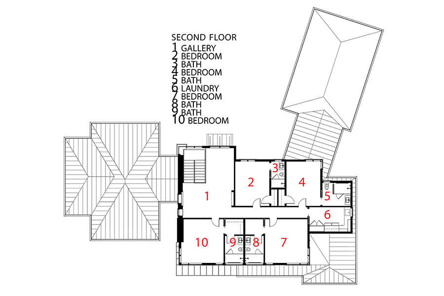
Architect
LDa Architecture & Interiors
Contractor
Denali Construction
Landscape Architect
SiteCreative
Landscape Contractor
Catoia Construction

“You try to make everything feel understated,” LaFleche says. “The role of the house should be to provide a neutral background for the fantastic views.” / Photo by Greg Premru


