This Couple Preserved the Character of Their 20th-Century Victorian
Kate Maloney Albiani fashions a fresh look steeped in tradition for a Somerville couple with competing tastes.
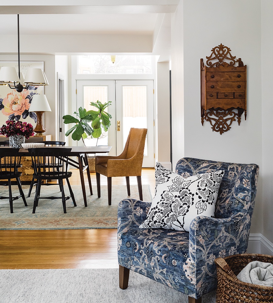
Photo by Joyelle West
Kate Maloney Albiani’s clients, a young, recently engaged couple who have since married and welcomed a baby boy, wanted a fresh feel for their 2,580-square-foot Victorian in Somerville. Built in 1900, as with many older homes, there were some oddities to resolve. For example, the third-floor ceiling slants in about a dozen different ways. That said, the homeowners also wanted to preserve the home’s rich architectural details, such as the spindled archways in the entry and the multiple moments of stained glass.
As first-time homeowners, it was the couple’s initial, joint foray into design. Reconciling their competing aesthetic preferences—the husband prefers modern while the wife favors traditional—was a significant part of the venture. Maloney Albiani and designer Elizabeth Stone devised an approachable, nuanced scheme that injects a bit of each of them into the historical framework. “We’re creating their personal vibe as a couple, which means blending two tastes into one sensibility,” Maloney Albiani says. “The layers of furnishings, finishes, and fixtures we use tell the story of the family who lives here.”
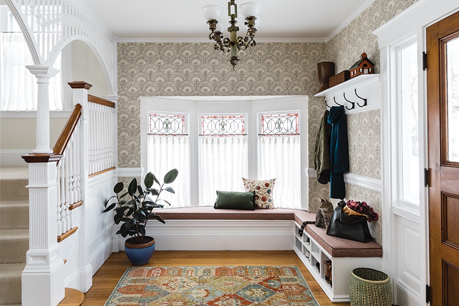
Photo by Joyelle West
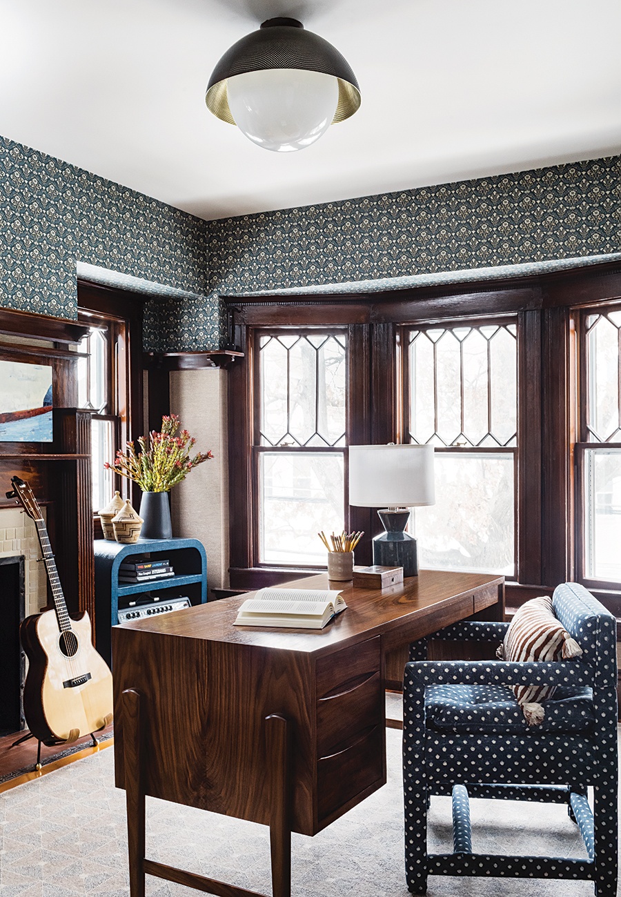
Photo by Joyelle West
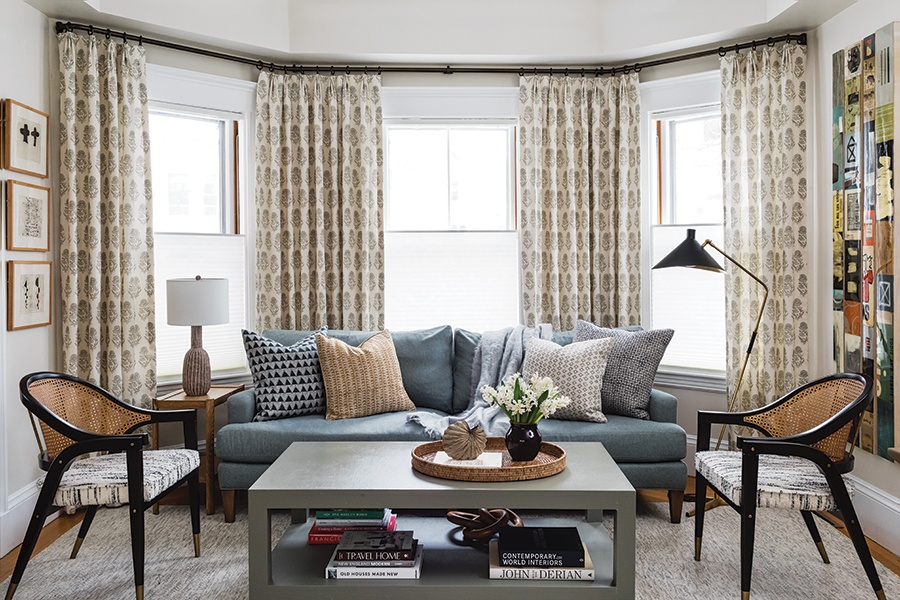
Photo by Joyelle West
Pair Patterns with Sleek Solids
To meld the homeowners’ styles in the first-floor living spaces, the designers started by creating a backdrop of traditional patterns. Wallcoverings from heritage brands, including a Sister Parish fan print in the entry and an Arts & Crafts floral by William Morris & Co. in the office, speak to looks the wife loves and pay homage to the Victorian architecture. Block-printed drapery and Oushak rugs supplement the scheme. Next came solid-color mainstays and accent pieces with sleek silhouettes that appeal to the husband’s midcentury taste without seeming out of place. Case in point: O&G Studio’s updated Windsor chairs in the dining room and the swooping lounge chairs with brass-capped feet and caned backs in the family room. Lastly, moments of patterned textiles, both global and mod, are layered in.
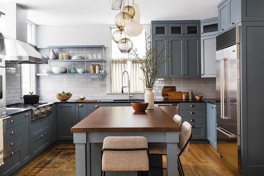
Photo by Joyelle West
Make Materials Matter
The cabinetry color—Benjamin Moore’s “Gray Pinstripe”—establishes a modern but moody atmosphere in the kitchen. “Deep blue is traditional, but slate undertones push it more modern,” Maloney Albiani says. Other features similarly straddle aesthetic sensibilities: the earthy walnut countertop boasts crisp edges; Tracy Glover’s pendants in a mix of transparent and opaque ribbed glass in modern shapes are handblown using traditional techniques; and extra-long tiles with an imperfect glaze from Ann Sacks offer a hint of modernity to an otherwise conventional subway-style backsplash. The open shelving plays a role too. “Open shelves are a traditional concept, but the steel rods make them feel a little bit edgy,” Maloney Albiani says. “Injecting metal gets a bit of the husband into the design.”
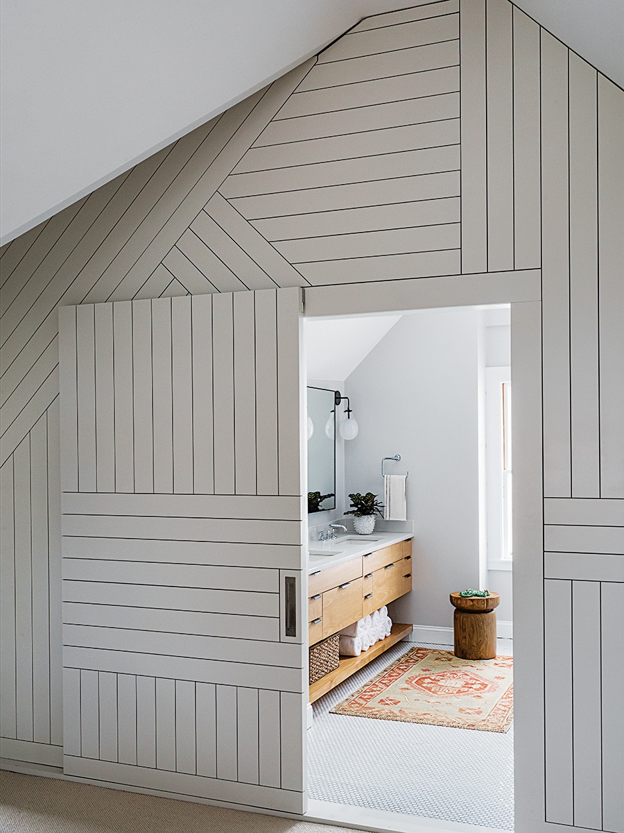
Photo by Joyelle West
Accentuate the Angles
On the third floor, the couple was less than thrilled with the lack of separation between their bed and bath. Given the riot of rooflines, simply slapping up a wall wouldn’t work. Rather than trying to make sense of the slants, the designers leaned into them. Collaborating with woodworker Erik Rueda, they created a wall covered in a playful composition of nickel gap, complete with a sliding barn door. “The lines draw attention away from all the angles,” Maloney Albiani explains. “This is a sculptural architectural element they can enjoy instead of an awkward wall.”
Contractor
Don Foote Contracting
Interior Design
Kate Maloney Interior Design


