This Boston Condo Serves as a Modern, Elevated City Escape
An elegant city pied-à-terre designed by Lisa Tharp provides a decadent respite from the daily grind.
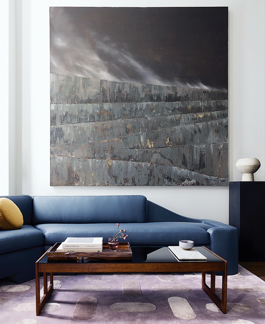
A mixed-media painting—made with oil paint and soil—by local artist Daniela Rivera explores the environmental impacts of Chilean mining and serves as a conversation piece in the living room. / Photo by Jared Kuzia
With a home in the suburbs and a bustling family life, the owners sought a space in Boston where they could escape. “They wanted a fun place to go on the weekends where they could invite friends,” says interior designer Lisa Tharp, who also worked on the couple’s full-time residence, which is neutral and classic. “This place was a chance to do something different—more modern, more contemporary. They wanted it to feel a bit more elevated.”
The roughly 1,400-square-foot unit is in a brand-new condominium in the city, so apart from a few small projects (an alcove of columns and a banquette to delineate an eating area in what was otherwise a completely open concept), no renovation was needed. What it really needed was style, mood, and atmosphere. “We strived to create something sexy—something that really encouraged luxuriating,” Tharp says.

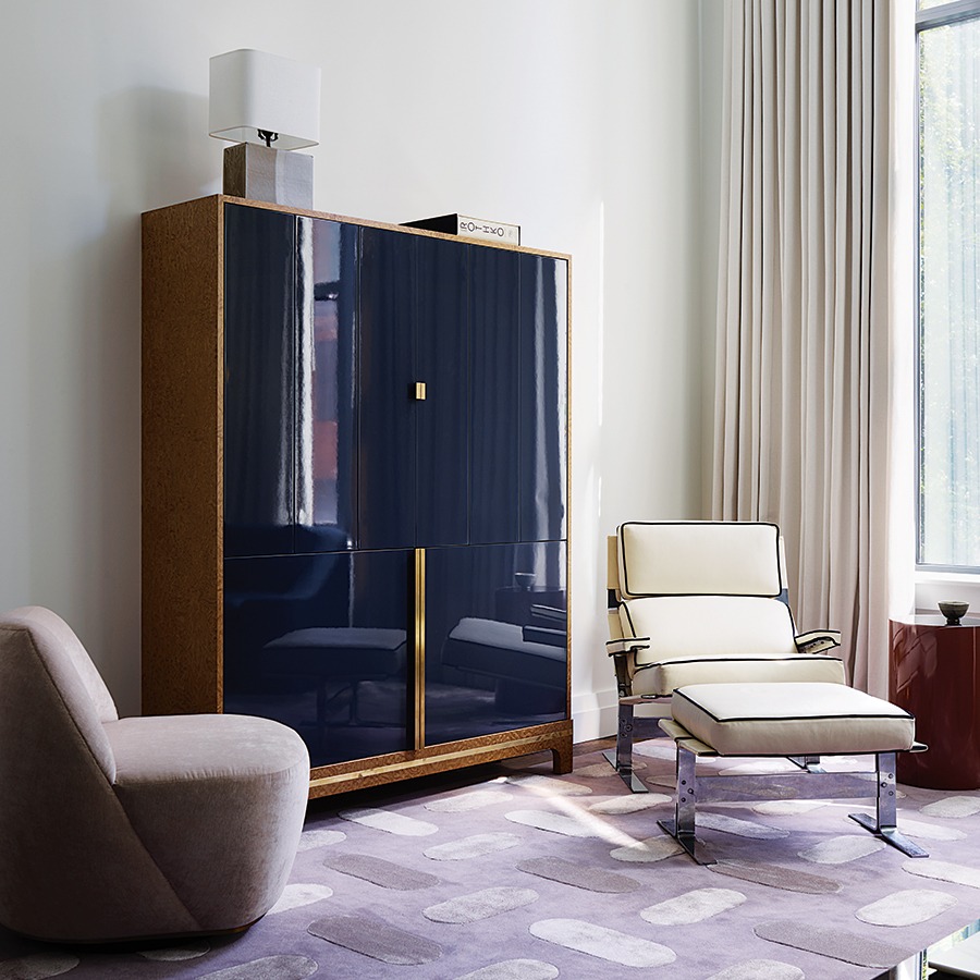
“We kept things a little more quiet in the main space,” says Tharp. By keeping the dark colors literally closer to the ground, it anchors guests in a room with such tall ceilings. “It solves for the tall, thin, narrow volume of the space. / Photo by Jared Kuzia
With that in mind, Tharp began to shape a space that would delight the senses and create a weekend enclave worthy of a younger couple—even if weekdays feel anything but. In the living area, cool jewel tones like navy blues and dusty purples create a comfortable place for gathering over cocktails and sharing stories with good friends. And while contemporary lines and silhouettes can skew cold, Tharp ensured that it remained welcoming by mixing textures and fabrics—a custom wool-upholstered sofa, a leather lounge chair, a lacquered cabinet, and floor-to-ceiling drapes.
To encourage conversation and fill the pied-à-terre with a sense of place, the walls feature pieces from local artists. Just above the sloped back of the living room sofa is an arresting mixed-media piece by Daniela Rivera, which explores the disruptive impacts of Chilean mining practices and the existential struggle between livelihood and home. This tableau is one of Tharp’s favorite parts of the pied-à-terre. “The painting has real meaning to contemplate,” she says. “It’s a built-in conversation piece.”

An open floor plan makes it difficult to carve out a dining area, so Tharp suggested tall panels to outline a banquette for more intimate meals. / Photo by Jared Kuzia
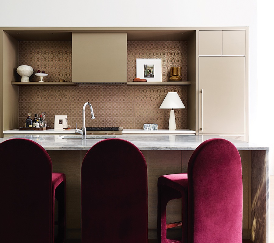
Bar stools upholstered in burgundy velvet create a bar-like atmosphere in the kitchen. / Photo by Jared Kuzia
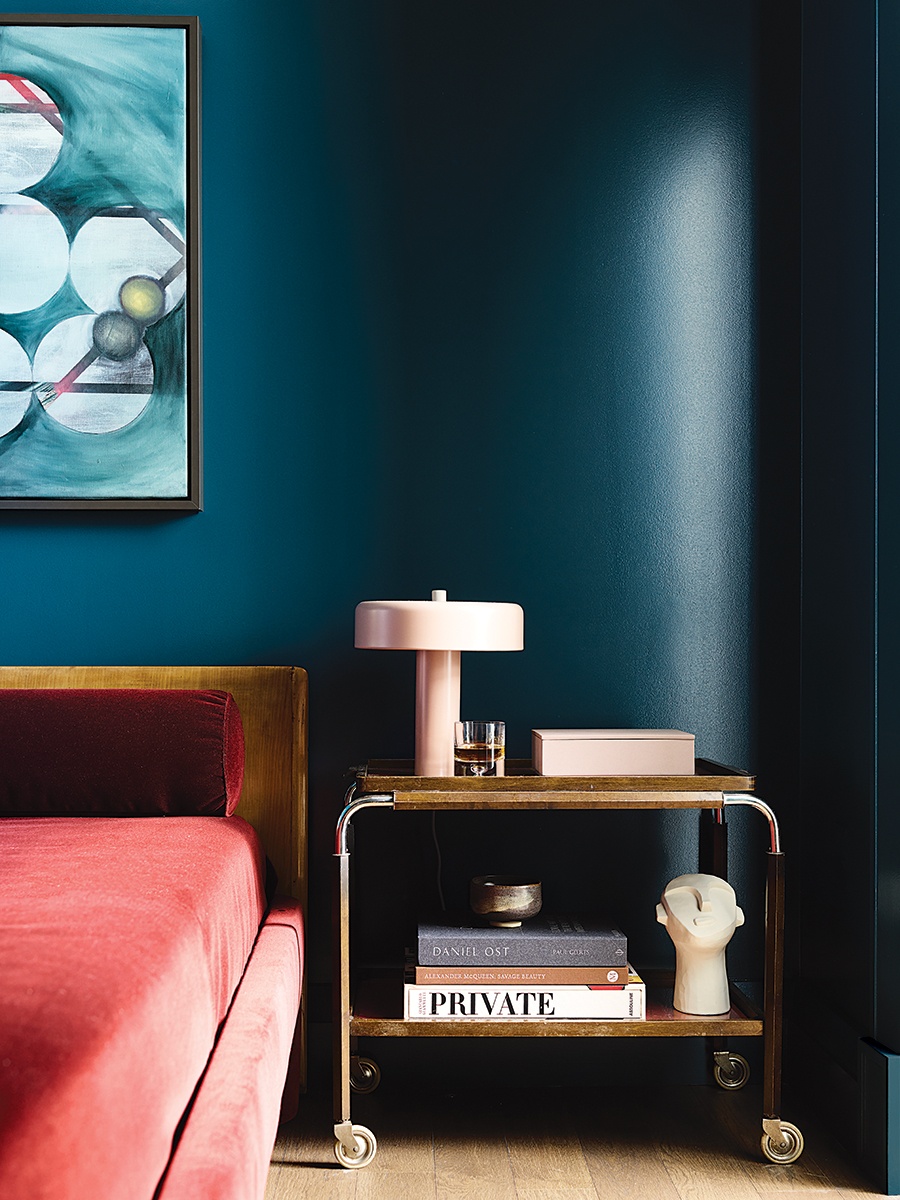
The guest room has no source of natural light, so Tharp opted for a high-gloss teal paint to reflect light. / Photo by Jared Kuzia
The kitchen, meanwhile, didn’t need all the bells and whistles that it would in a primary residence—just enough practicality to create a dinner for two, a plate of pre-theater appetizers, or to mix a batch of Negronis for guests. “We wanted it to feel more like a cozy restaurant or bar at night,” says Tharp, who nixed classic kitchen cabinetry in favor of a full backsplash of handmade Venetian tile. “Those tiles really glow in the evening.” A row of burgundy velvet bar stools; a curved, custom banquette in the dining area; and a sculptural Ingo Maurer lighting fixture give the space the vibe of a chic private dinner club.
Tharp gave the guest bedroom a rich, sensuous palette—glossy “Archer Teal” on the walls from her own collection with Ecos paints, a custom midcentury-modern bed upholstered in a seductive red velvet, and a vintage gold-and-walnut bar cart for a touch of style. The contemporary art is courtesy of Tharp’s daughter, RISD graduate Fia Tharp, whose oil painting hangs above the bed.

Tharp relied on varying shades of dusty rose to create a monochromatic look in the primary bedroom. / Photo by Jared Kuzia
The primary bedroom is dressed head-to-toe in a dusty rose. “Monochrome has an extremely calming effect,” Tharp says. “There’s very little contrast in the value of the colors—so your eyes can just rest. They can travel freely around the room without any high-contrast disruption to your gaze.”
And while the pied-à-terre is meant for brief overnight stays and entertaining (though the couple’s kids and even the dog are invited on occasion), it’s a place where one begs to linger. “Comfort was first and foremost,” says Tharp, “but it also has a lot of flavor and personality. It whispers for you to come in and put your feet up.”
Builder
FBN Construction
Interior Design
Lisa Tharp Design
/ Photo by Jared Kuzia


