Designer Cecilia Casagrande Brings Color to a Blank-Slate Brookline Victorian
A single lawyer with two sons (and no furniture) gets a completely fresh—and vibrant—start.

A framed image from photographer Max Steven Grossman’s “Bookscapes” series adds to the library vibe of the homeowner’s office. / Photo by Jared Kuzia
When interior designer Cecilia Casagrande stepped foot into this newly renovated Victorian in the Fisher Hill neighborhood of Brookline, it was—top to bottom—entirely devoid of color. Built in 1900, the home was recently redone by a developer who had it painted white and installed cheap light fixtures. It was then purchased by a single man with two sons (and no furniture) looking for a completely fresh start. Their blank slate, however, was a bit too blank.
That’s where Casagrande came in. “Life is short, and we live in a colorful world,” says Casagrande, who was tapped to design the entire home. “Color makes a healthier home. It’s not natural to live in all white, or cream, or beige.” But it took some convincing to get the owner—a practical Boston-based lawyer—to dabble in a more diverse palette.
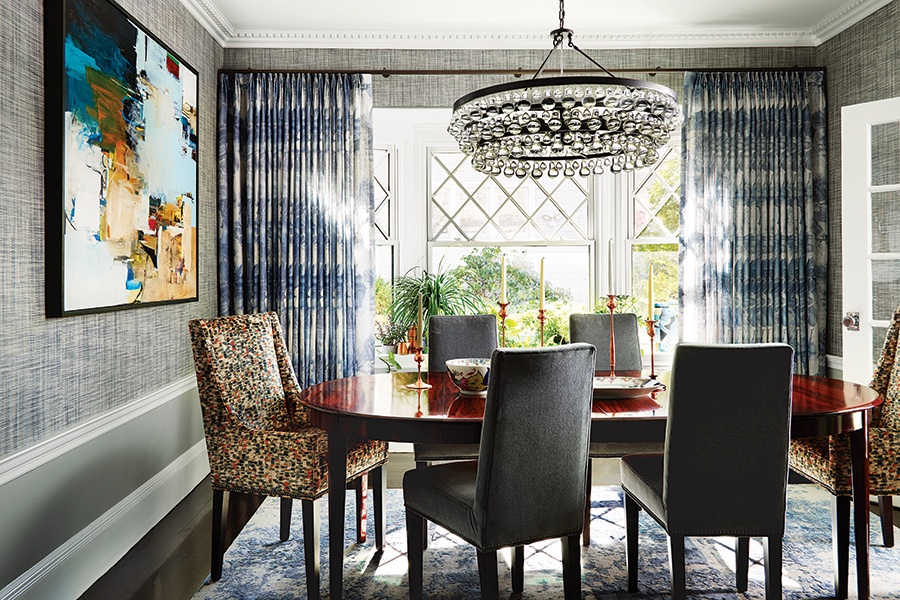
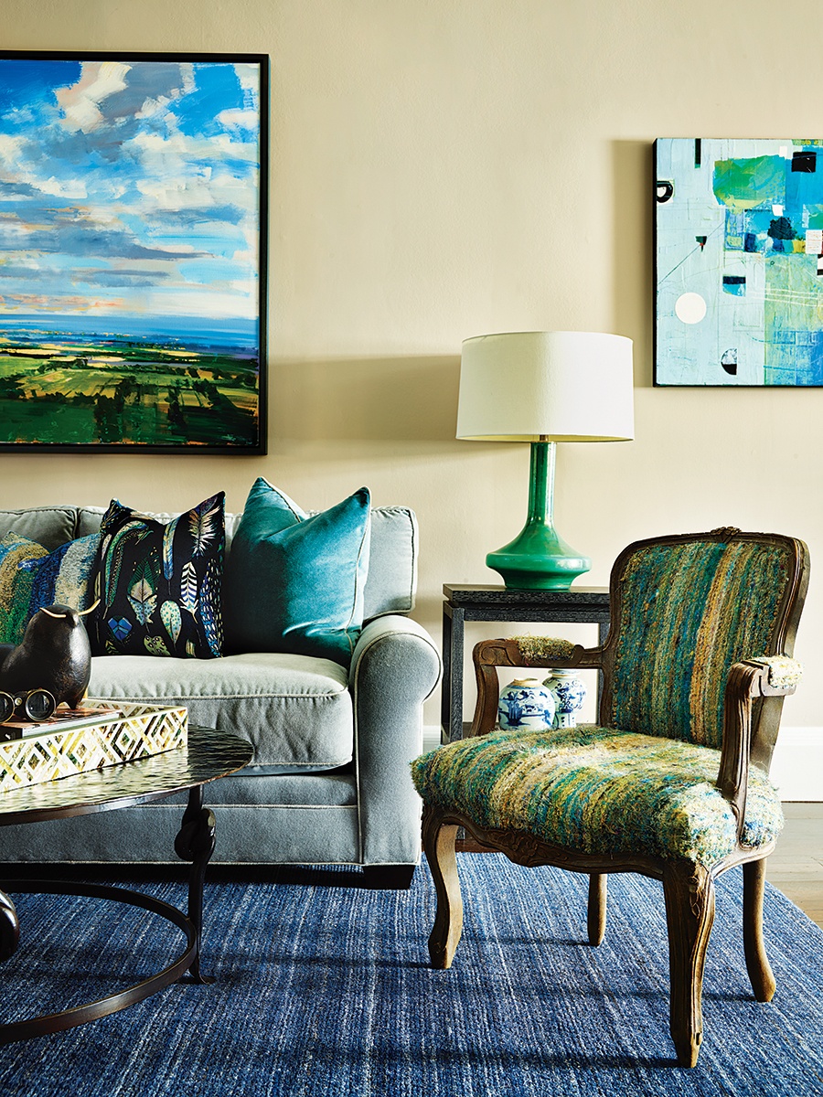
“When we started, he didn’t really know what his style was,” Casagrande says. To whet his appetite, Casagrande introduced a slightly more reserved design in the living room. She acquiesced to beige—Farrow and Ball’s “Elephant’s Breath”—on the walls in exchange for pops of blue in the upholstery, rugs, and artwork. In the dining room, Casagrande brought in texture via crosshatch-printed wallcovering and brightly patterned host chairs.

Casagrande was in San Francisco at an art show when she saw coppery-colored candlesticks she thought would be perfect for the dining room. “I knew the color with that orange in the fabric of the host chairs would look so good,” says Casagrande, who contacted the artist who crafted the candlesticks to make a few different sizes for the space. / Photo by Jared Kuzia

In the living room, a plush sectional fulfilled the owner’s request for space to stretch out with his kids while watching games on TV. / Photo by Jared Kuzia

In the kitchen, Casagrande strove for a look that exemplifies “classic New England with a modern twist” by adding a bold yellow ceiling and pendant and red stools to the all-white room. / Photo by Jared Kuzia
The adventurous design choices were a hit, and Casagrande’s plan to sell the homeowner on a more vibrant vibe worked. “He never knew he had this love of art and color. As we progressed from one room to the next, he got more and more daring,” she says. The true “aha” moment came in the kitchen, where Casagrande pitched a curvy yellow LZF light fixture alongside window treatments featuring multihued fruits and vegetables. “That was the moment he said ‘Okay. I get this,’” she recalls.
From there, agreeing to a bright-yellow ceiling and red counter stools was a natural progression. It seemed that once color was on the menu, the rest of the home followed suit. To ensure that each room had a distinct feel and purpose, Casagrande ensured nothing was repetitive, and everything had the right touch of personality.

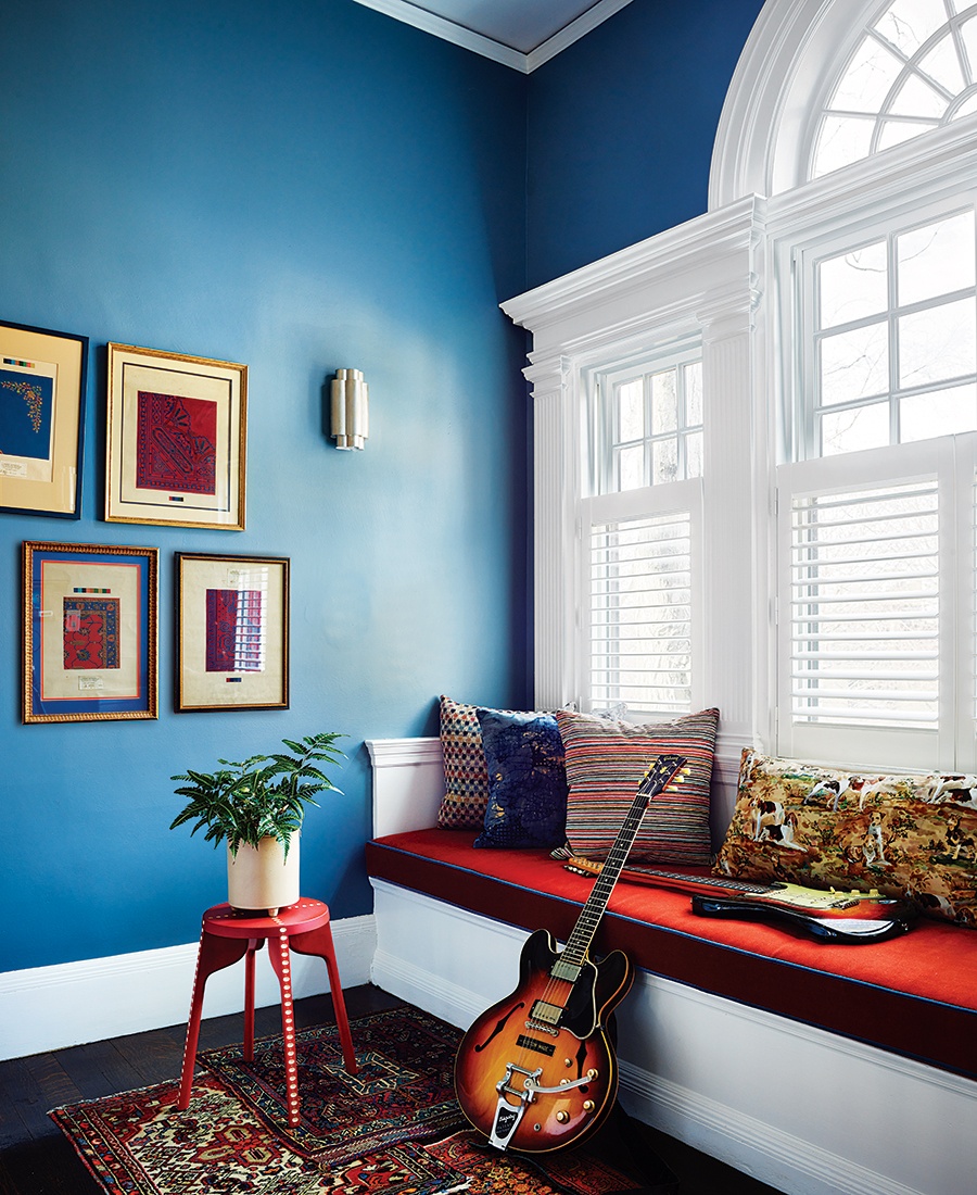
“Too many palettes in one room is not relaxing,” says Casagrande, who opted to have the banquette of window seat in this hallway reading nook upholstered with red fabric with blue piping that matches the wall color. / Photo by Jared Kuzia
The upstairs halls and reading nook are painted in a vibrant blue with red accents—a combo that can easily veer into circus territory when you consider the banana-yellow kitchen and the blue and green upholstery downstairs. Casagrande credits her ability to balance all these colors with having a set palette for each room. “I stick to one palette,” she says. “You can mix patterns within that palette, but having too many palettes is just not relaxing.” The layout also helped—with very few open-concept spaces across the home, each room could have its own style and color without creating chaos and clashing tones.
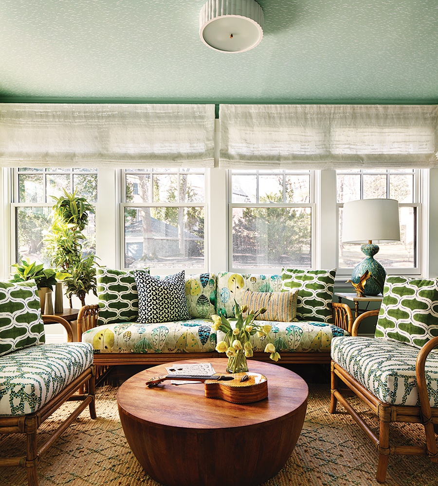
Psychology also played a big part in Casagrande’s palette selection. The yellow in the kitchen is meant to inspire new and exciting flavor experimentation while the homeowner makes meals with the boys. The pale lime-green in the primary bedroom was chosen to create a restful atmosphere. The office is a studious green to inspire focus (on work or on playing his guitar collection), while the sunroom boasts a Martha’s Vineyard beach palette—with natural sisals, sea-glass greens, and blues—to inspire a coastal mindset.
Casagrande may have been the homeowner’s color spirit guide, but she trusts that he’ll continue to add more vibrancy to his life in the future. “He doesn’t need me. He had it in him all the time.”

Casagrande used Farrow and Ball “Yukutori” wallcovering—a sage-green design featuring seagull-like birds in flight—on the ceiling of the sunroom. / Photo by Jared Kuzia

Photo by Jared Kuzia
Happy Hour
A whiskey connoisseur, the owner needed a home bar to stash his collection and mix drinks for guests. In there, a cheeky on-the-nose wallcovering from Cole & Son peppers the previously whitewashed walls. “I told him, ‘I know just the wallpaper,'” says Casagrande, who also added floating wooden shelves to warm up the space and make it feel more like a real bar.
Interior Designer
Casagrande Studio
First published in the print edition of Boston Home’s Spring 2023 issue, with the headline, “New Outlook.”


