How a Suburban Colonial Got the Modern Vibe of a Boston Condo
Interior designer Dee Elms transformed a traditional house into a sophisticated abode with a contemporary apartment's feel.

A custom Porter Teleo wallcovering is understated and elegant, making for a perfect accompaniment to the dramatic curved stairway Elms designed. / Photo by Michael J. Lee
A young family dreamed of a backyard with a swing set, garage, and all the benefits of suburban living without giving up the contemporary vibe of their Boston high-rise apartment. After purchasing a classic 2000s Colonial, they tasked Elms Interior Design with bringing the 6,500-square-foot home in line with their style. The one challenge was that they didn’t have time to take on any major construction projects.
Dee Elms, the studio’s founder, remembers, “When I walked through the house for the first time, it felt a little too open. Every room opened to the next, so there was no spatial separation. That’s where the interior architecture came in. The steel-and-glass panels solved this issue.” Elms opted to retain the grand, sweeping mood of the first floor but added industrial transom windows between spaces to allow each area its own mood.

The homeowners’ existing table was incorporated into the new space, along with the chairs, which were reupholstered. The Phillip Jeffries hemp wallcovering and the Stark area rug exude moody charcoal tones. / Photo by Michael J. Lee
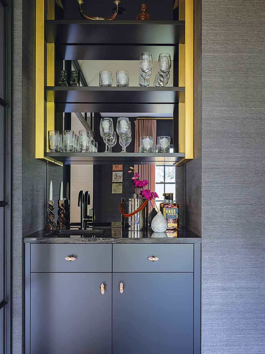
Elms conceived a sleek black-and-gold bar with a mirrored background to the dining room, infusing an air of urban sophistication into the space. / Photo by Michael J. Lee
To the right of the glossy-black front door is the dining room, where a languid portrait in blush pinks with Arabic calligraphy by Boston-educated photographer Lalla Essaydi anchors the space’s palette. A fierce Lindsey Adelman chandelier balances the softness with sculptural edges. It’s this unexpected tension between delicate and industrial—dove gray and rustic wood floors, wispy ostrich feathers atop a plaster-and-steel table—that adds layered interest to a home that still checks all the boxes for an active family.
The clients are avid art collectors, and Elms designed the living room around their existing artwork. Although most designers stipulate an empty space as a starting point, Elms prefers when clients come with treasures. “It helps me understand the aesthetic they have lived with,” she explains. From there, she can design the most comfortable environment to fit their lifestyle.
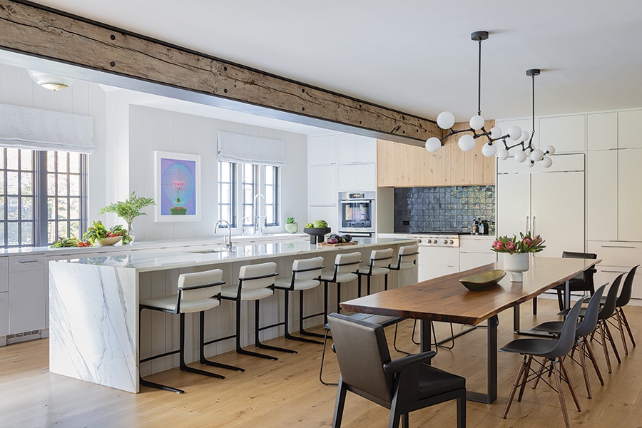
With an extra-long island and adjacent dining table, the kitchen can seat 30 people. Lindsey Adelman’s Branching Bubble chandelier was customized to accommodate the elongated table. / Photo by Michael J. Lee
In the kitchen, Elms optimized for big-time entertaining and dining at both the table and massive island. The rough-hewn beam wrapped in steel and the vintage streetlight fixture from Paris add a coolness that makes the space as ideal for a grownup cocktail party as it is for homework duty.
An indoor-outdoor Holly Hunt carpet in the adjoining family room makes no area off limits to the children. Elms says, “The Vladimir Kagan sofa is beautifully asymmetrical. I wanted something round for lounging. It’s not a huge room—but it’s the perfect room for entertaining.”
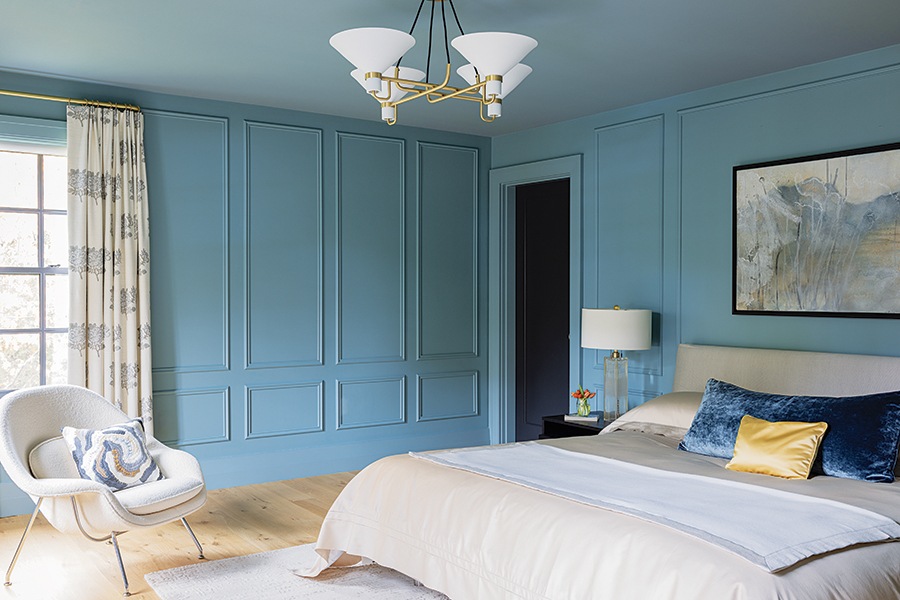
A shade of blue by Farrow & Ball evokes a sense of calm in the guest bedroom, where a circular chandelier by Jonathan Browning creates a modest focal point. / Photo by Michael J. Lee
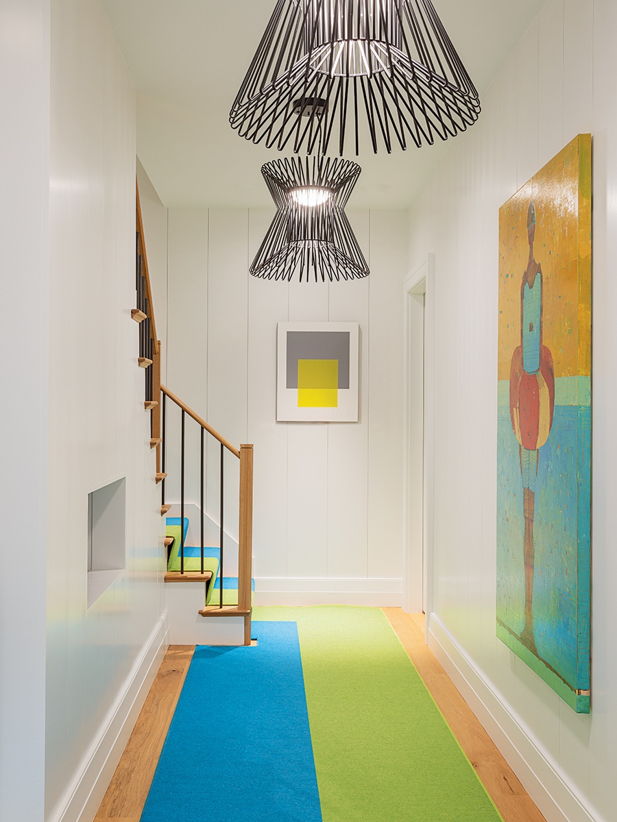
Lighting was a key focus throughout the home. In the lower-level hallway, black Tech Lighting pendants—produced from Circa Lighting—are composed of metal rods formed in a geometric shape. / Photo by Michael J. Lee
Back in the central foyer, the existing curved stairwell is made memorable with the addition of a Porter Teleo wallcovering hand-designed by Elms. “I wanted it to feel very organic, so we chose colors based on the environment downstairs so that it really flows up the stairs,” she says.
The chandelier at the top of the stairs—a showstopper of interlocking Murano glass barbells that shimmer like honeycomb—is grounded in the present day with vibrant Dana Piazza ink line drawings. It’s a glamorous segue to the luxurious primary suite, complete with a soaking tub worthy of tranquil self-care.
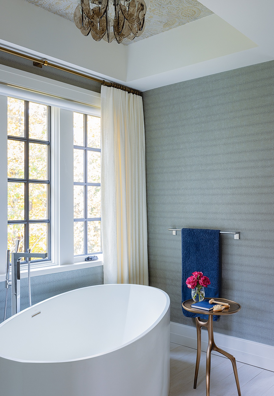
The primary bathroom features a mod soaking tub situated by a window for prime views of the foliage. Two similar but distinct Holly Hunt designs sheath the walls and ceiling. / Photo by Michael J. Lee
A previously nondescript guest room gains hygge personality with the addition of paneling painted a dreamy blue, while the daughter gets a room to grow in with cheerful blossom curtains and a sentimental mirror that once belonged to her mother. Pops of color and teenage sparkle can easily be added over the years without requiring a pricey redesign.
The basement, with its proximity to the swimming pool, posed a puzzle when the clients requested that the entrance bring the “wow” factor. Elms found a solution in flamboyant palm tree fronds painted by hand onto the walls by Pauline Curtiss of Patina Designs. The mural is a nod to New York City hotspot Indochine, Elms says. “Guests are transported to a tropical place when they come in through the pool.”

A lush hand-painted mural by Patina Designs transforms a simple basement pool entrance into a glamorous tropical cabana. / Photo by Michael J. Lee
Paint it Black
In the basement, low suspended ceilings were already in place for structural reasons, working against the clients’ wish for a fun statement when guests enter the poolside vestibule to grab a towel or access the changing room. Elms opted to camouflage the functionality by painting the ceilings a rich black. The color also lends the ceilings an illusion of height.
Builder
FBN Construction
Interior Architecture & Design
Elms Interior Design
First published in the print edition of Boston Home’s Spring 2023 issue, with the headline, “Modern Meld.”


