Designer Meghan Shadrick Infuses Old with Hue in Wellesley Hills
In this 7,300-square-foot Colonial, color and pattern create an approachable vibe that suits a family with four sons.
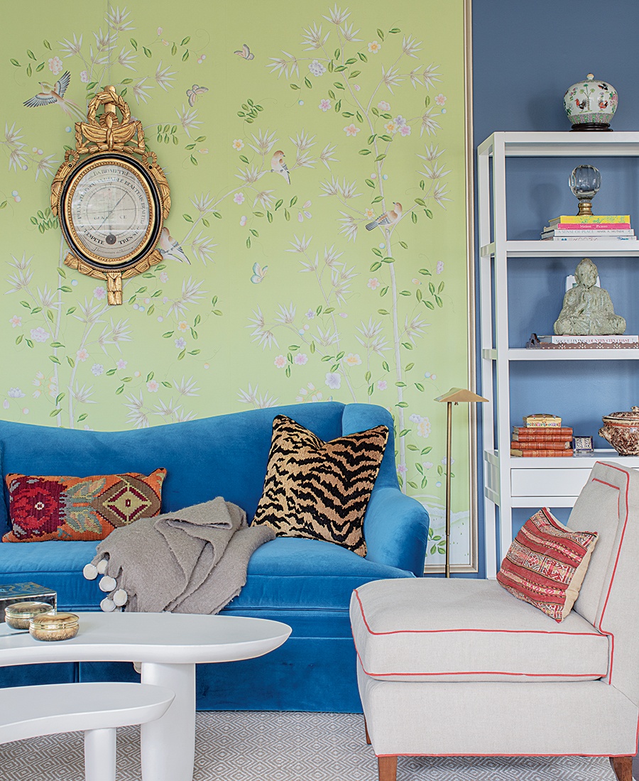
An antique European clock serves as a focal point on a feature wall of chinoiserie wall-covering in the living room, where the Wellesley Hills homeowner’s collectibles are displayed. / Photo by Michael J. Lee
The COVID-19 pandemic hit just as interior designer Meghan Shadrick was wrapping up a project for a couple in Wellesley Hills in the spring of 2020. The timing was fortunate, Shadrick says: Instead of sheltering in place in the “stale, vanilla, builder-grade” Colonial they’d purchased two years before, the couple and their four sons retreated to a stunning space designed for entertaining—yet cozy enough for relaxing, reading, and playing games together while they hunkered down.
The homeowner had enlisted Shadrick’s help to infuse her home with a more vibrant and youthful feel a couple of years prior. Recognizing her passion for European art and furniture didn’t jibe with her young family’s lifestyle, she sought a fresh approach that would hold up to active teenagers, telling Shadrick, “I don’t want them to feel uncomfortable in the house; I want a place where they can bring their friends.” That translated to hardy fabrics but also “layering in a decent dose of color,” Shadrick says, which lends a “laidback feel to older furnishings.”
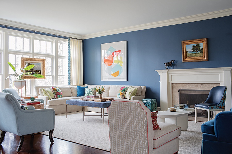
The homeowner wanted her four boys to feel comfortable in the living room, curling up on the couch with a book or doing homework. A whimsical piece by local artist Liz Roache hangs above the sectional, giving the formal space a more “lighthearted” feel, Shadrick says. / Photo by Michael J. Lee
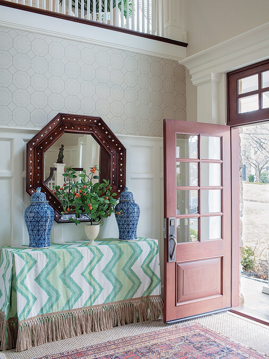
A fringed chevron tablecloth—changed seasonally—provides the neutral two-story foyer with a subtle hint of color. / Photo by Michael J. Lee
The ample open-concept home opens into a two-story foyer that Shadrick purposefully kept neutral with linen wallcovering and a sisal rug: “I wanted the eye to rest,” she says, before proceeding into the rest of the home, which is awash in color. A wall of bright-green grasscloth, for example, draws you into the dining room, where an antique table—chosen by the owner to fit as many people as possible for the couple’s frequent gatherings—presides. Navy dining chairs are leather for durability and “wipe-ability,” says Shadrick, who refers to the vibrant pattern on the back as “a little surprise” amidst a sea of solids. The custom-woven hide rug, too, offers an easy cleanup for the occasional splash of red wine.
Off the dining room, the expansive living room presented a challenge to Shadrick: “How do we make this vast space cozy?” Knowing the homeowner would entertain often in this room, she divided the area into multiple seating groups and created a feature wall of chinoiserie wallcovering, which pops against the dark blue.
Comparatively, the entertaining space in the kitchen is relatively small, so a built-in banquette provides a little more “breathing room,” Shadrick says. The boys, ages 10 to 16, argue over who gets to sit here during meals—and because the Schumacher fabric has been vinylized, Mom doesn’t have to worry about spills. The adjoining pantry is a hidden gem: “We could use exquisite materials because we didn’t have to cover a lot of square footage,” the designer says. Artist Pauline Curtiss painted the cabinets with a custom green glaze with gold inset on the beaded edge profile. “The use of color makes a typically mundane area really special,” she adds.
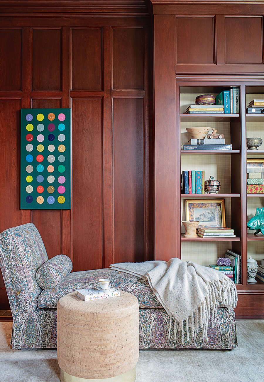
Instead of painting the dark mahogany panels of her study, the homeowner chose vividly colored fabrics and accessories to brighten the space. / Photo by Michael J. Lee
The homeowner’s office, a dark-mahogany-paneled room, has become a peaceful retreat from the hustle and bustle of the busy household. Rather than painting the wood, Shadrick added fun, feminine touches of chartreuse and mulberry, which brighten the room. “With something as heavy as mahogany, any other color would disappear,” she says. The paisley on the chaise lounge is a curvy motif that feels feminine, and the drapes, hand block-printed fabric by Galbraith & Paul, pick up on the pink accents. “The owner loves the pattern so much, she wishes she could keep the curtains closed all the time,” Shadrick adds with a laugh.
The final design is “the perfect balance of welcoming comfort and sophistication,” the homeowner declares, adding it’s “exactly what I was hoping for.” That’s a win for Shadrick, the family of six—and all their friends and guests.
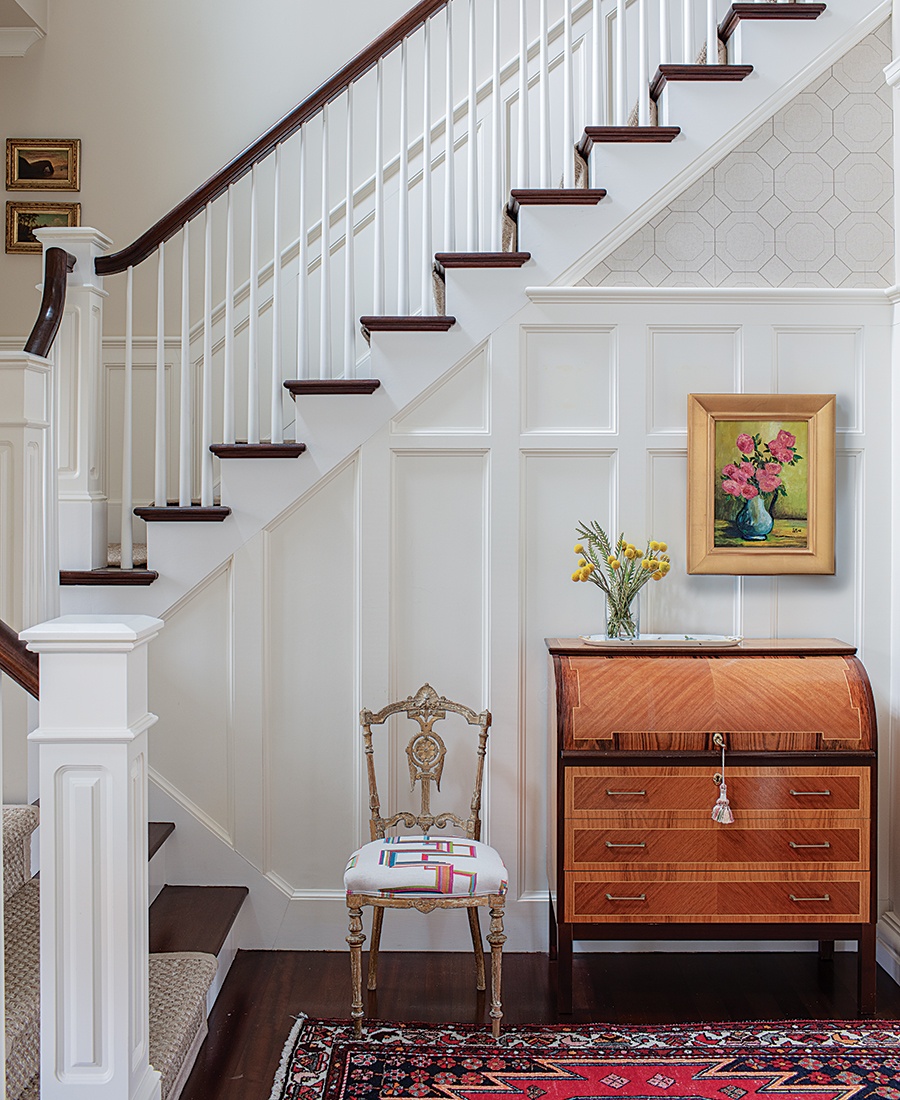
The detail of the antique roll-top desk and chair take center stage in the front hall, where crisp white-painted paneling exudes a fresh, clean vibe. / Photo by Michael J. Lee
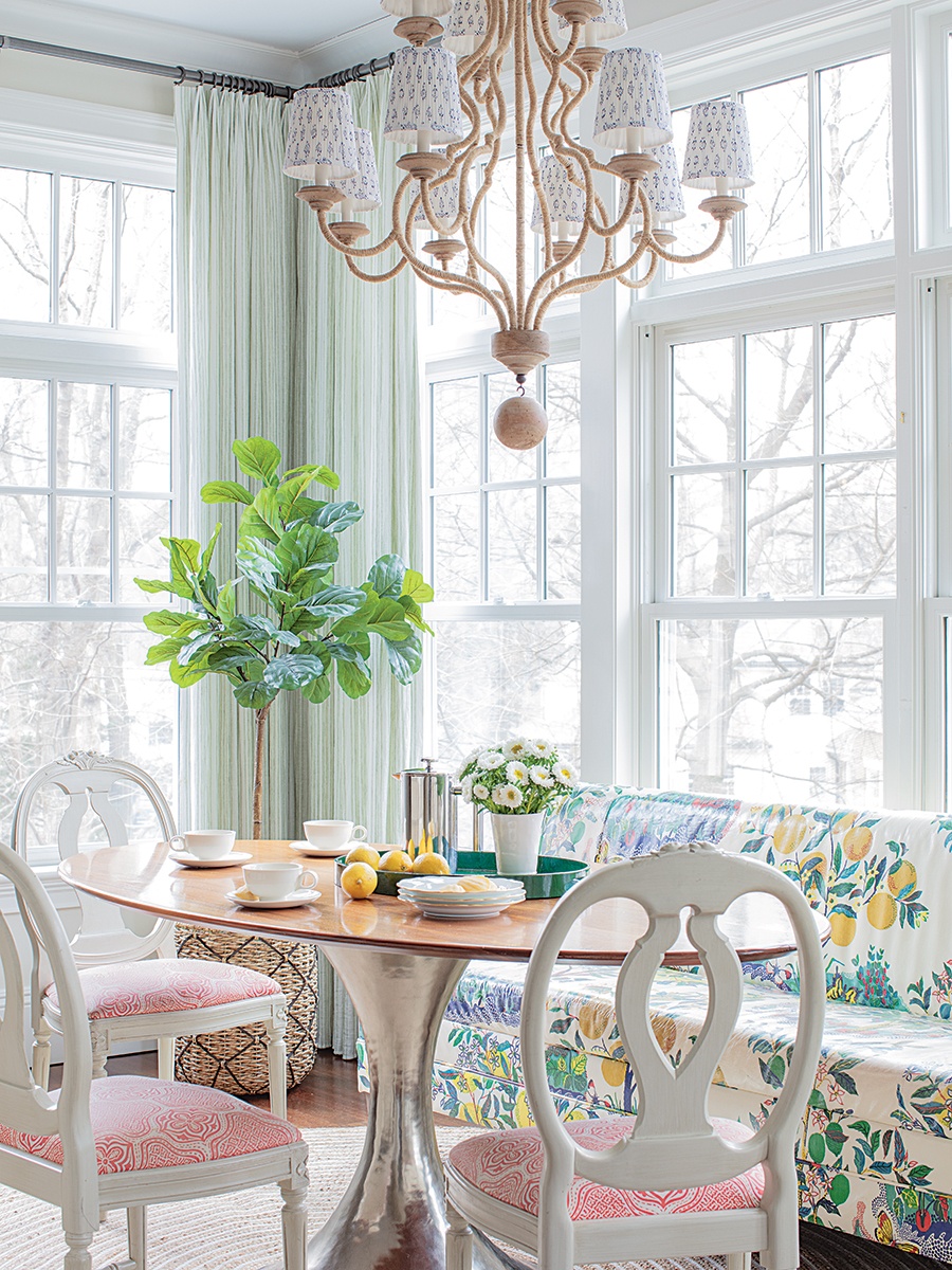
Shadrick commissioned Huston & Company in Kennebunkport, Maine, to create a wooden top for the kitchen’s tulip table to add warmth to the iconic midcentury design. The built-in banquette is covered with a vinylized Schumacher fabric. / Photo by Michael J. Lee
Setting Boundaries
How do you deliver more color into an open-concept home where every room leads to another? It’s a dilemma designer Meghan Shadrick faced with this 7,300-square-foot Colonial: determining where one room ends and the other begins and how the colors would work together. Shadrick’s solution was to add an extra beam between the dining and living rooms, painted white to match the rest of the trim. “It creates a natural division between the two rooms,” she says.
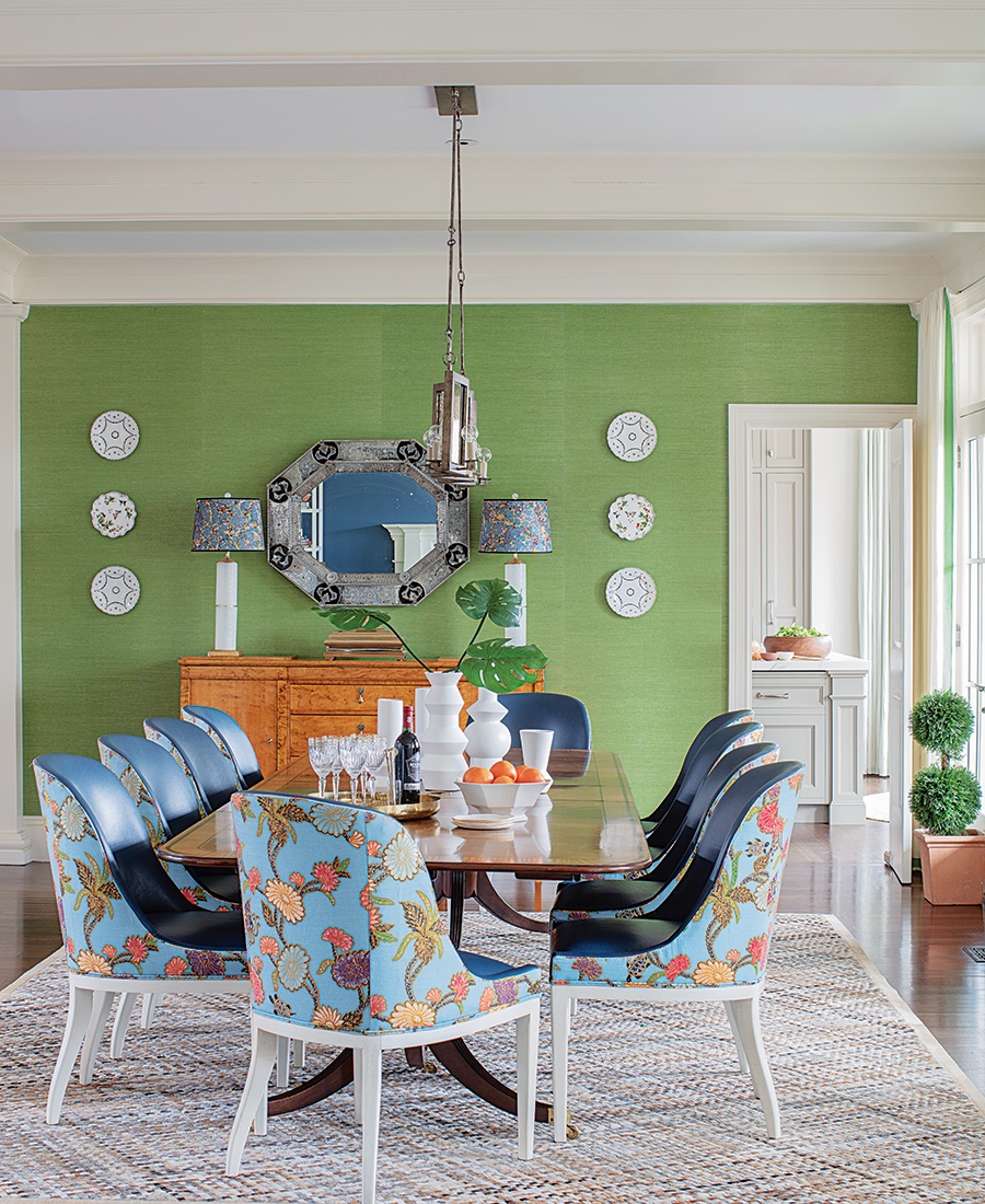
Bright-green grasscloth adds depth and dimension to the family’s dining room. “You see a slight color variation, depending on how the sun hits it,” Shadrick says. The antique dining table seats as many as 16 for the family’s frequent gatherings. / Photo by Michael J. Lee
First published in the print edition of Boston Home’s Spring 2023 issue, with the headline “Old Meets Hue.”


