Inside a Gorgeously Contemporary South End Unit in a Former Baptist Church
Interior designer Michael Ferzoco introduces a contemporary vibe into a city residence renovated from a gothic-style house of worship.

Among the South End homeowners’ collection of art is a piece from the estate of Sol LeWitt, courtesy of Krakow Witkin Gallery, © 2022, atop the sideboard. / Photo by Michael J. Lee
Interior Designer
Eleven Interiors
For the homeowners, purchasing one of six units in the newly transformed church in the South End was a fresh start. Comprised of 5,000 square feet on two levels, the home is airy, light-filled, and open-plan, with stone walls and arched windows that stretch floor-to-ceiling—relics of the building’s former incarnation.
The developers, says interior designer Michael Ferzoco, who helms the firm Eleven Interiors, took a contemporary approach to the build-out. “There were no cased openings on the walls, no paneling or moldings—they wanted the language of the original architecture to be the more dominant aspect.” Ferzoco took cues from this and veered toward creating a modern aesthetic that juxtaposes with the history of the building.
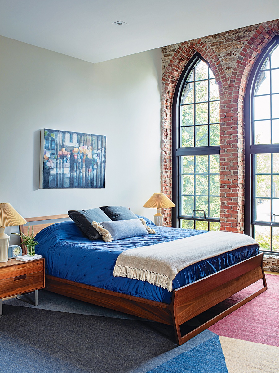
In the primary bedroom, a Danish modern-style bed is in keeping with the home’s clean, contemporary aesthetic. The geometric Rug Company rug introduces another dimension of color to the room. / Photo by Michael J. Lee
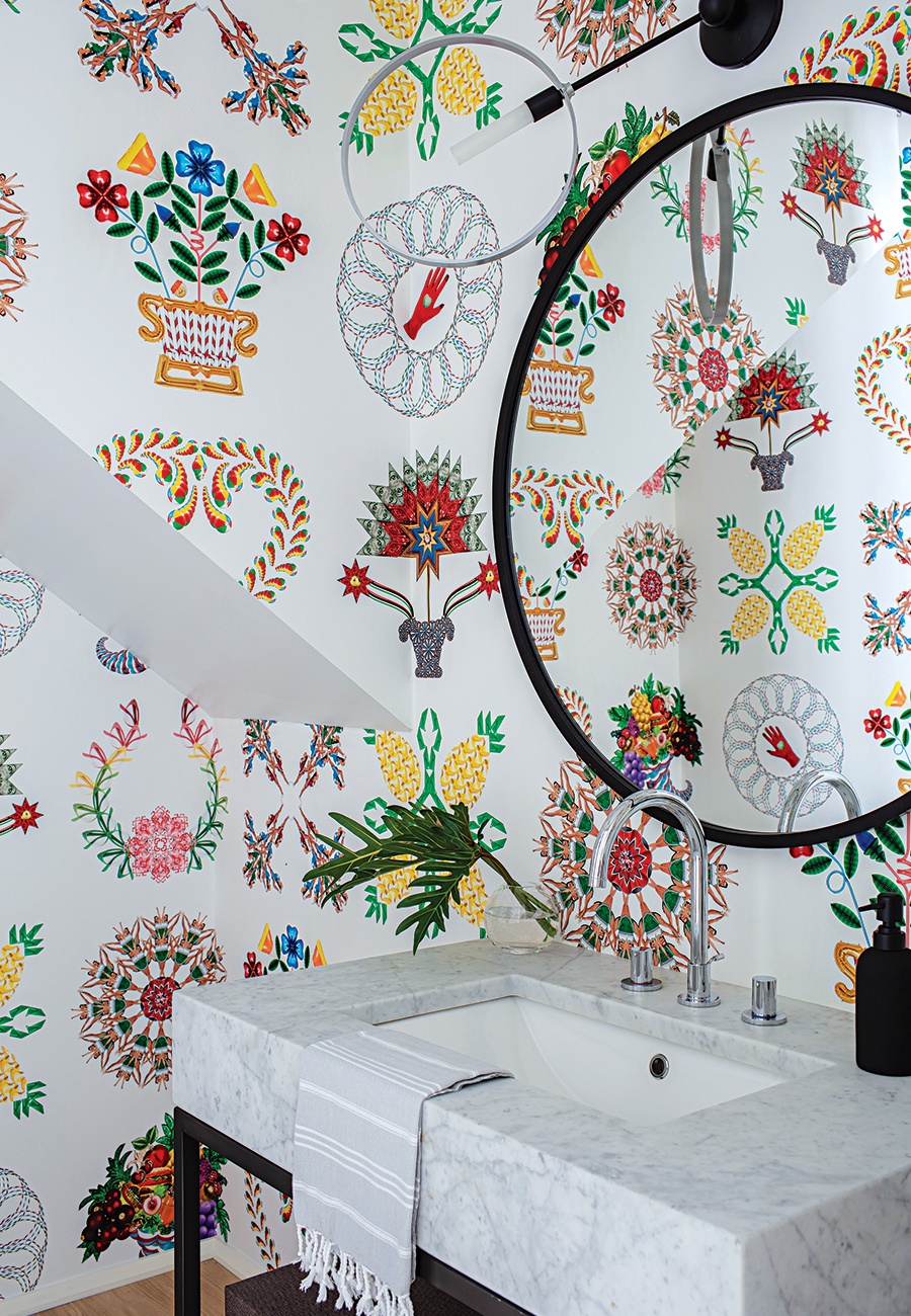
The powder room wallcovering is an installation by artist Cassandra C. Jones (via the Abigail Ogilvy Gallery) inspired by the Baltimore Album Quilts, circa 1840. / Photo by Michael J. Lee
“The homeowners have a great eye for design and art,” says Ferzoco, who worked closely with the couple to make selections for the space, which was essentially a blank canvas when the designer came on board. In the main living area, the existing fireplace was a Sheetrocked four-by-five white box. To make it a focal point, the fireplace surround was extended up to the ceiling and replaced with a steel-treated material finished to look like copper and arranged as separate panels that, says Ferzoco, are an ode to Mondrian-style art, an abstract form recognized for its arrangement of cubes or squares.
A linear steel-and-glass chandelier made by Hubbardton Forge extends from the ceiling above the dining table, one of several statement light fixtures in the home. “Once the essentials of a space are right, then you start adding the jewelry,” Ferzoco says. “And that involves several different types of lighting: up lighting, down lighting, sconces, pendants—it all needs to be layered.”

A bent wood sculpture by Jeremy Holmes takes center stage in the family room. / Photo by Michael J. Lee
While the homeowners favored a more spare, modern feel and selected muted and neutral tones for some furnishings, they aren’t afraid of using color, says Ferzoco, who infused blues and oranges throughout the home with textiles, rugs, and art. “They already had a really nice collection of art, and they added to it beautifully,” he says. “Art is part of a project that can fall flat. Often, you need to guide homeowners on this aspect, to turn them on to galleries in the city.” Though Ferzoco is quick to point out that wasn’t the case here, noting a massive steamed, bent wood sculpture by artist Jeremy Holmes on the family room wall that the homeowners purchased from the nearby Lanoue Gallery.
The home’s front entry is the original main entrance of the church; tall, solid, wood Gothic-style doors open into a long hallway that Ferzoco fitted with built-in benches, drawers, and cabinets to store shoes, coats, and other items. A few steps above, a casual room overlooks the ingress and arched doors through a glass railing. “It’s a great area with a game table that serves as a library and family workspace,” Ferzoco says. The room, where a rug featuring various irregular shapes in alternating shades of blue is paired with a chandelier comprised of several light sources pointed in different directions to invoke a sense of organized chaos, is also one of the best vantage points in the home to take in the way modern design is beautifully juxtaposed within a historic shell.
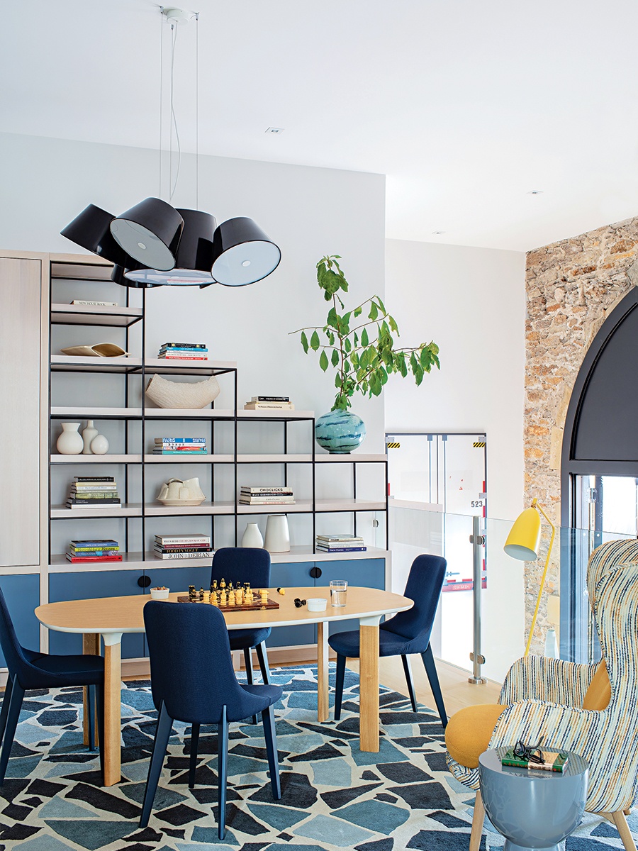
In the library/game room, Ferzoco designed custom shelves and cabinetry to display the couple’s collectibles, books, and other essentials. / Photo by Michael J. Lee
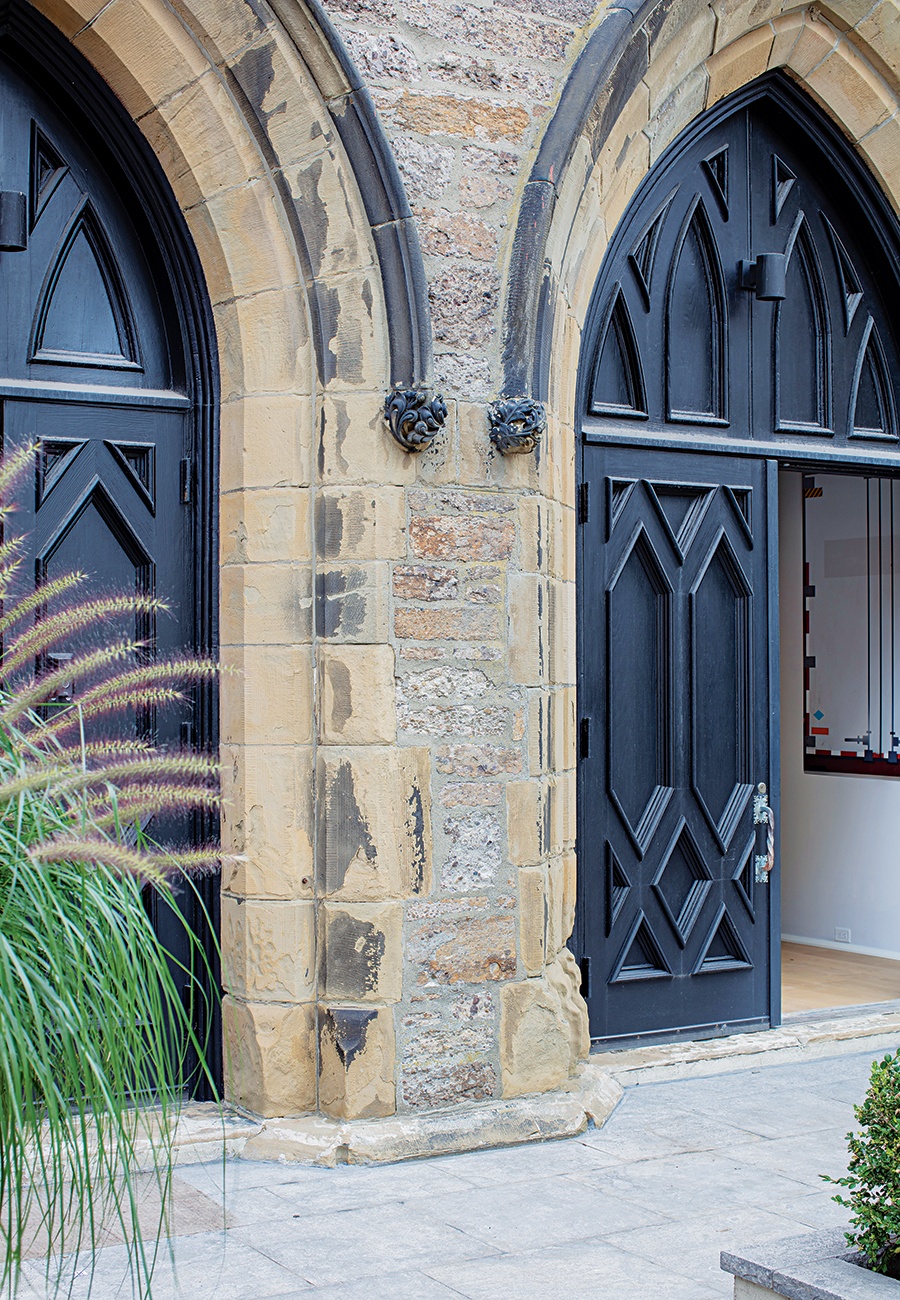
The three sets of Gothic-style doors, original to the church, open directly into the home, one of six units in the building. / Photo by Michael J. Lee
First published in the print edition of Boston Home’s Spring 2023 issue, with the headline, “Keeping the Faith.”
