Transforming a 1920s Cambridge Home into a Modern Sanctuary
Considered space planning and contemporary accents that sync with the homeowners’ sensibilities bring new energy to a century-old house.
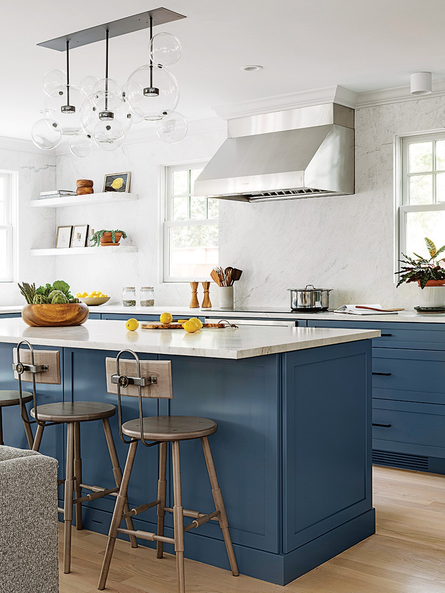
Contemporary and traditional touches meet in the kitchen, where the handblown glass spheres of a Giopato & Coombes chandelier hang above Shaker-style cabinets. / Photo by Greg Premru
A move of just a few miles meant a big change for a Somerville couple and their young child. Though they had loved their industrial-chic loft and its top-floor views, all of those stairs weren’t exactly stroller-friendly, and they wanted more elbow room as their family grew. They found a 1920s single-family home in Cambridge with a great backyard and plenty of space—but the interior wasn’t their style. “It was very house-y, very much the opposite of a contemporary industrial loft,” the homeowner recalls. “Our preference is for things to be a little more modern.”
Enter Michael Ferzoco and his team at Eleven Interiors, who helped the family find a balance between old and new. “We wanted to honor the setting and the house but figure out ways to do it that felt youthful and cool,” says senior designer Michael Forman, the lead on the project.
Step one: a striking new look for the stair banisters, where the smooth curves of a white-oak handrail meet the strong lines of black-steel balusters. The aim was to make the railing look like a continuous ribbon flowing from one floor to the next. “It was probably the most challenging part of the project,” notes Tom Heffernan of Heffernan Build & Remodel. The work paid off. “It carries from the basement to the third floor, so you’ve got this consistent modern element throughout the entire home,” Forman says. “It really set the whole tone of the house.”
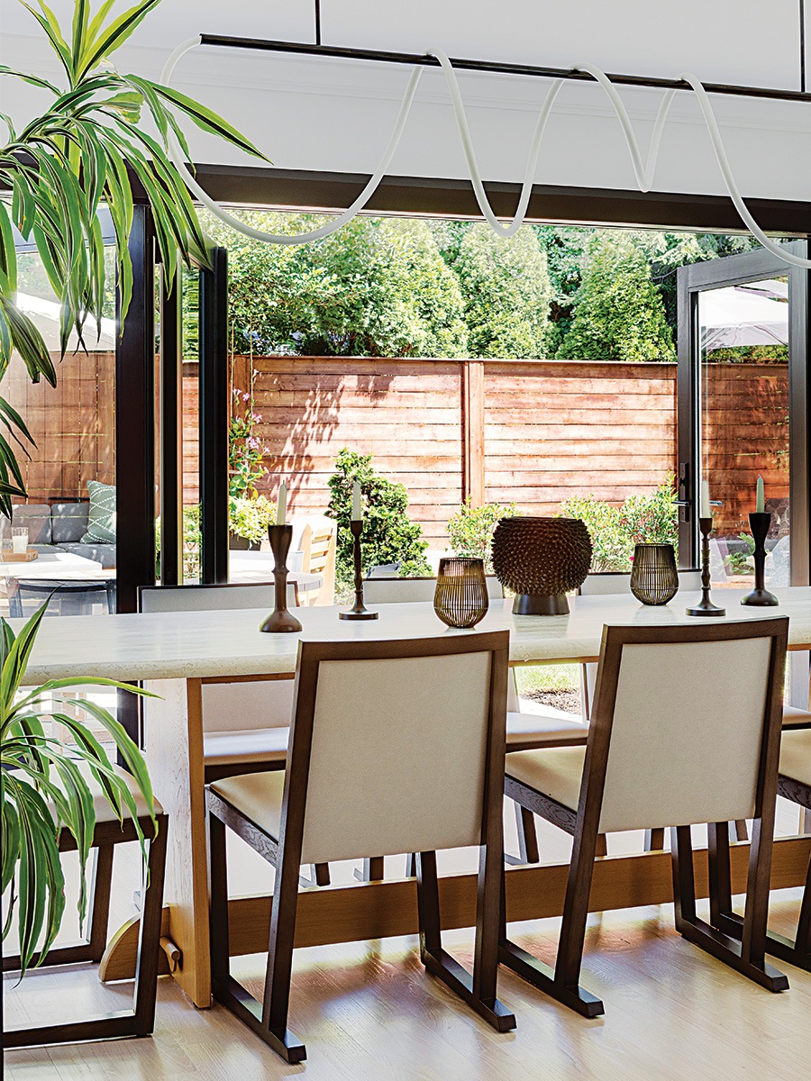
Using accordion doors to open the dining room to the backyard had a transformative effect. “We had these small, sad-looking French door there before,” the homeowner recalls. “We just wanted to open up the entire thing and again bring in a more modern, slightly industrial style into the house.” / Photo by Greg Premru
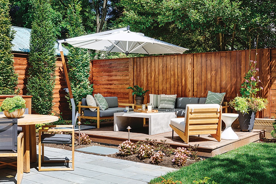
The home’s backyard was a big draw for the family, who love using the patio and shaded lounge area for entertaining during the warmer months. / Photo by Greg Premru
Natural light and new lighting went a long way, too, especially in the dining room. The homeowners wanted to bring the outdoors in, so the team opened up a wall and replaced mullioned French doors with single-pane accordion doors that offer easy access to the backyard. “Now the house has this excellent indoor-outdoor connection,” Forman says. The family also loves what they call “the worm light,” a Morghen Studio rope light that does loop-the-loops above the dining table. “We have a lot of very contemporary—some would say edgy—light fixtures that felt very much like them,” Forman observes.
In the kitchen, the upper cabinets were removed in favor of floating stone shelves and a full-height stone backsplash that wraps the windows. “The dramatic stone element helps balance out the traditional cabinetry [below] as a more modern touch,” Forman says. But for the homeowner, who loves to cook and entertain, function was as important as form, and the team took time to fine-tune the practical features, from the integrated drain board by the sink to the detailed specifications for the pantry. “I was able to give them very explicit instructions: ‘OK, I need the spice drawer to be this depth; I want the left-hand door to kind of fold into the pantry,’” she says. “They were very thoughtful about trying to understand how I need to use the space.”
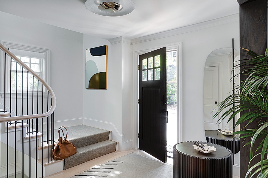
Elements of blackened oak and steel appear throughout the first floor, including the entryway, where a closet was removed to give the space some breathing room. / Photo by Greg Premru
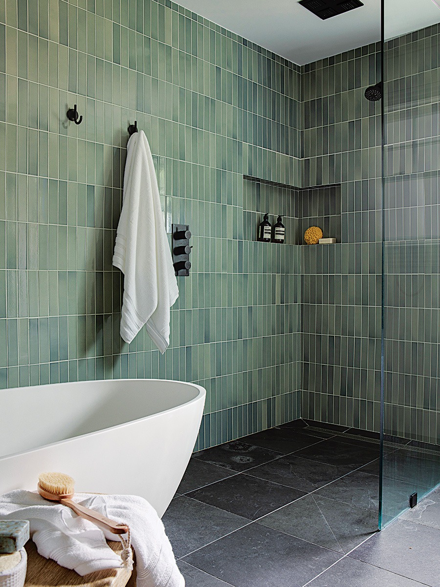
Reminiscent of spas the couple has visited in their travels together, the primary bath features heated floors, a sculptural tub, and a curbless shower lined with Heath Ceramics tile in soothing shades of green. / Photo by Greg Premru
One crucial update hadn’t occurred to the homeowners at all. A renovation by previous owners had created a very open concept on the first floor that felt at odds with the rest of the house, left a bathroom exposed, and made a single load-bearing column stick out like a sore thumb. So the team suggested building some walls to delineate different living areas. “Adding wing walls and freestanding walls here and there helped define each space,” Forman explains. “We were trying to bring the house back to the original architecture but also complement the clients’ contemporary style,” Heffernan adds. Both pros took care to maintain the sightlines and sense of openness, which the clients really appreciated.
“Our kid can be playing with Legos on the floor, my husband is on the couch, I’m cooking something, and it feels like we are still very together as a family. Michael and his team recognized that’s the kind of thing we were looking for coming from a completely open-plan loft,” the homeowner says. She and her family love living in the house now. “It’s a lot warmer and more inviting than our previous place. And that’s because of the work that Michael and his team did.”
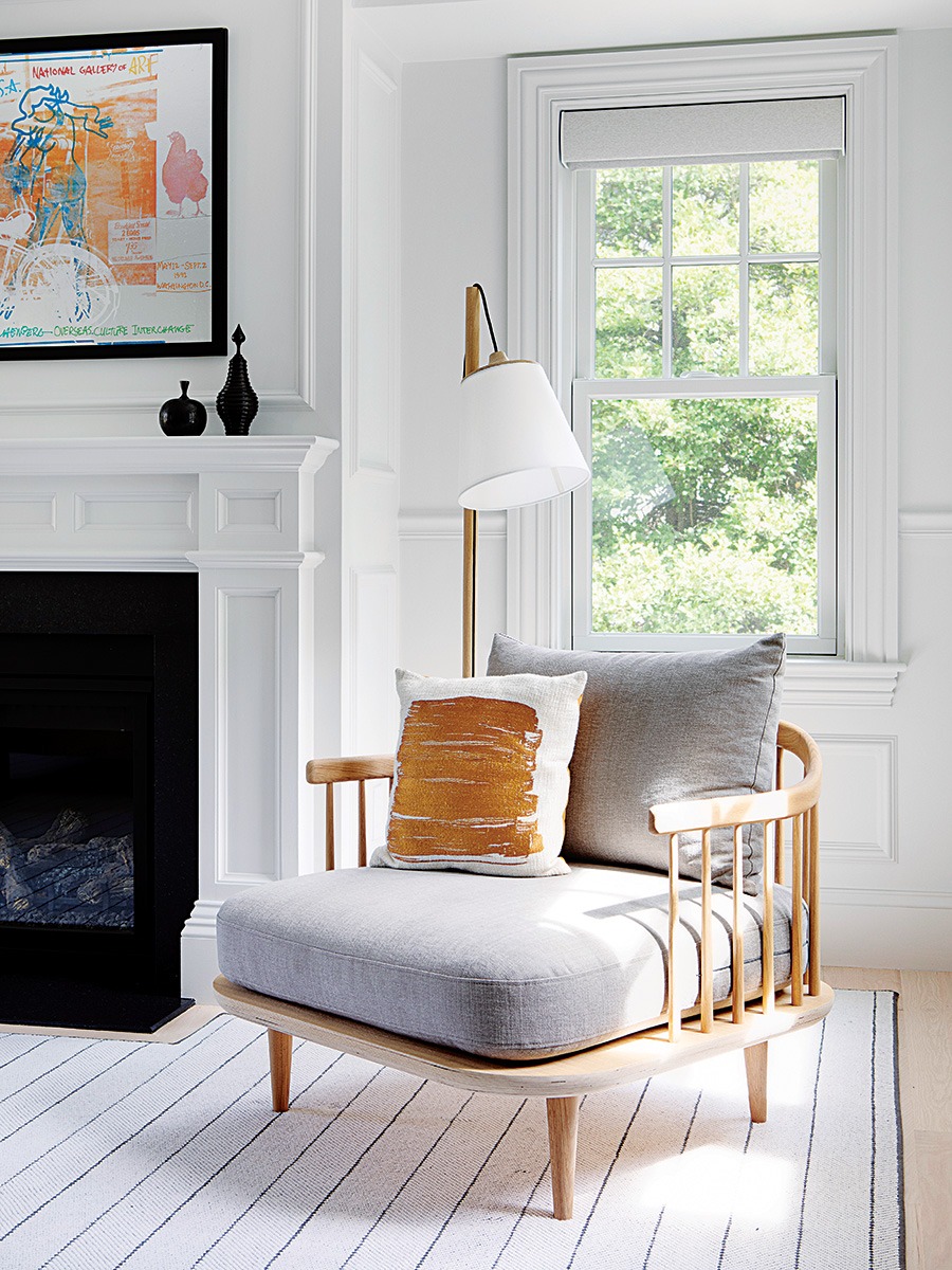
“We threw some elements at them that they weren’t expecting, like the picture molding,” Forman says of the primary bedroom. “Pair that with a very contemporary bed and a very contemporary Scandinavian armchair, and it suddenly feels modern. / Photo by Greg Premru
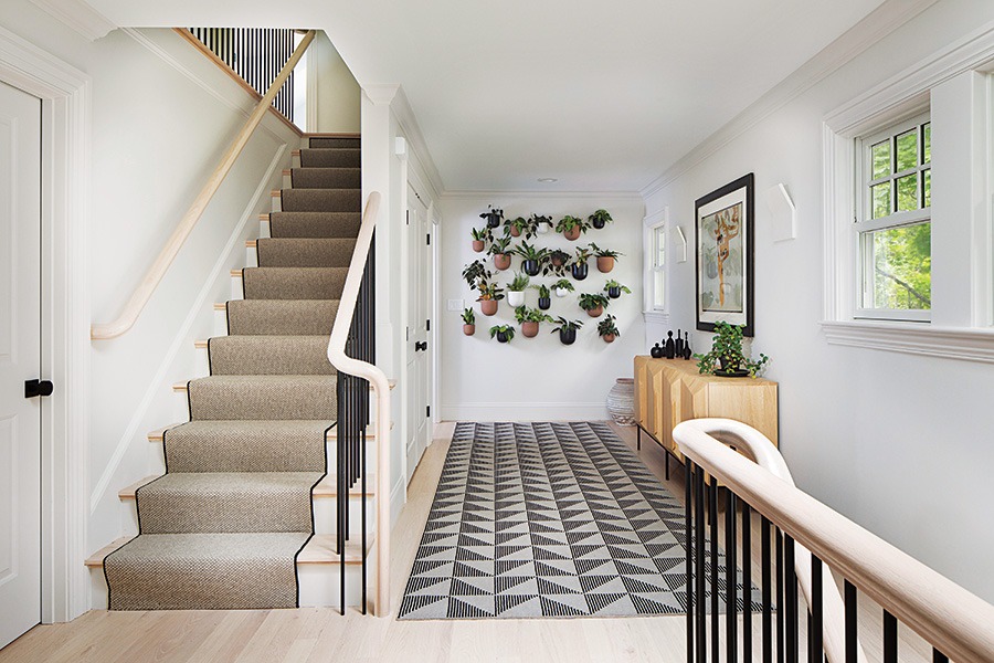
The revamped stairway runs through the entire house. “The handrail is a perfect example of something that you can add to a home like this—a modern element that speaks volumes,” Forman says. / Photo by Greg Premru
Room to Grow
Next to the primary bedroom, a plant wall with vessels in different sizes and colors lets the homeowners flex their green thumbs. “That was an interesting way of displaying a variety of plants and sort of showcasing their plants as artwork. From a function standpoint, it’s a very easy design for installation and maintenance,” Forman says. “And it has a small footprint—it doesn’t take up any space.”
Builder Heffernan Build & Remodel
Interior Designer Eleven Interiors
First published in the print edition of the Boston Home Summer 2024 issue, with the headline “Modern Family.”


