A Spacious Cape Cod Vacation Home for Large Family Gatherings
Geared for guests, a new summer house exudes a timeless appeal.
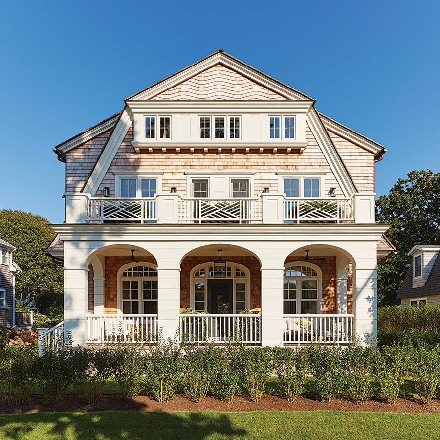
Photo by Tim Williams
While there were a few things on the client’s wish list for their new house, they were very clear on one point: They wanted as many bedrooms as possible. Indeed, the intent for this retreat on Cape Cod was for it to be a gathering place, a spot for the couple and their three children to unwind together, along with a steady stream of guests. A bunkroom on the home’s basement level has three queen-size bunk beds, and the third floor has two guest rooms, while the family uses the second floor’s four bedrooms. But the layout doesn’t feel cramped, not by a long shot; rather, the home—though refined—feels airy, laid-back, and welcoming, a dreamy spot for a summer stay.
“We designed this house to fit into its neighborhood of early-20th-century cottages. The design uses traditional architectural elements and materials in an effort to respect its context and appear as if it had been there all along,” says architect Tom Catalano, noting that the neighborhood includes a range of homes—some historic, some built more recently. With an exterior clad with cedar shingles and white trim, the design nods to classic Cape Cod summer cottages. Designer Liz Caan strove to create a time-honored appeal inside, infusing spaces with vintage items, playful patterns, and light fixtures featuring a mix of materials and finishes. Caan, who’d worked with Catalano on the homeowners’ year-round residence in Wellesley, says that they were more willing to add a bit of adventure here. “They wanted to have more fun with the design, to have the house feel casual, like a flip-flop version of themselves.”
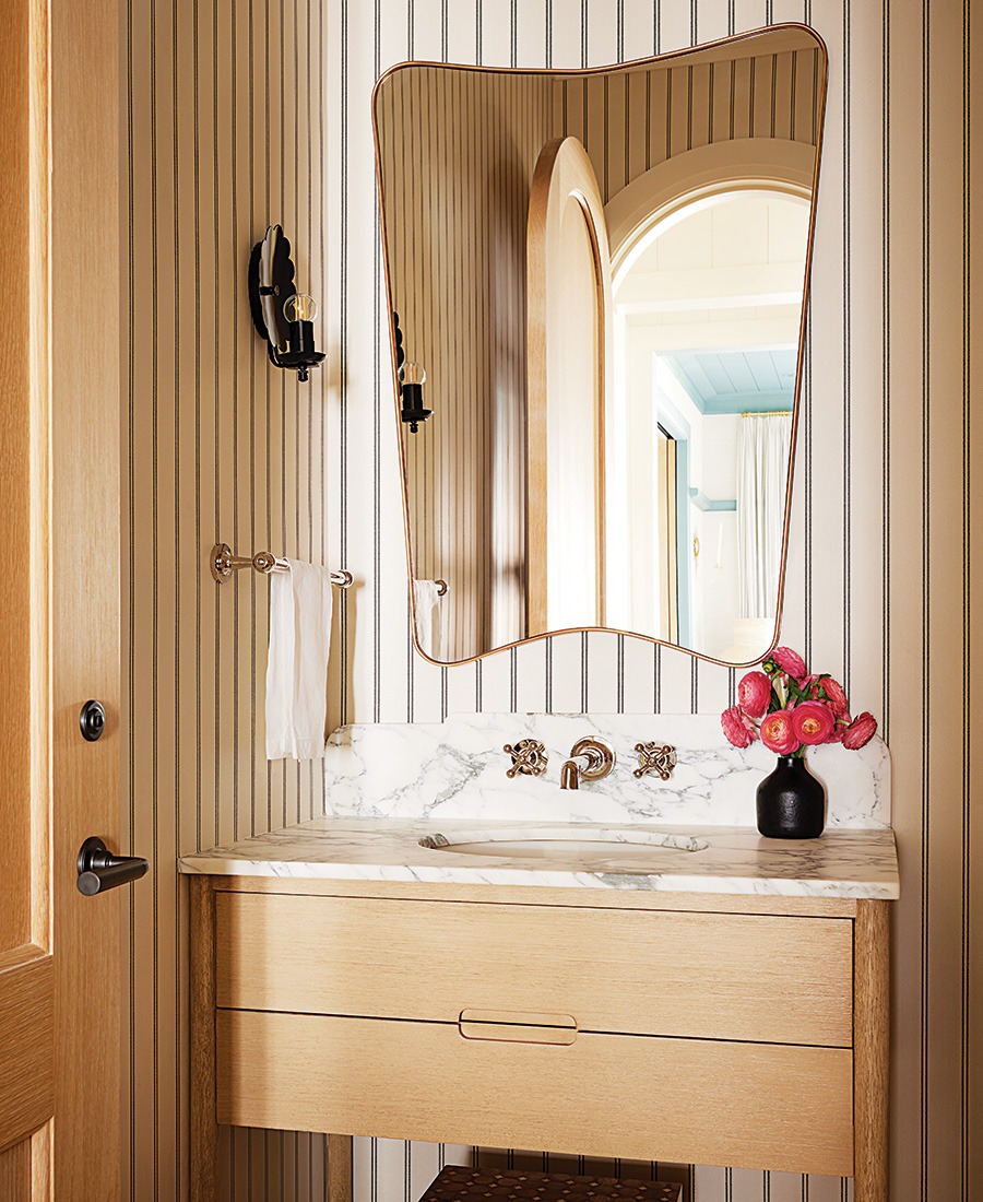
A nod to early cottage architecture, the powder room is clad with beadboard. Rather than paint it white, the team kept the wood in its natural state for a more sophisticated look. / Photo by Tim Williams
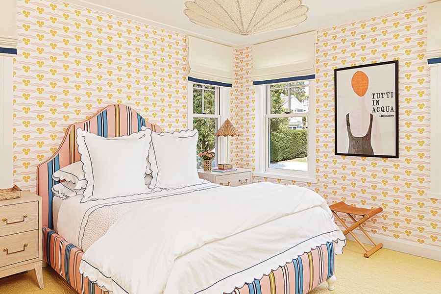
The walls of the daughter’s bedroom are sheathed with a pink and-golden-rod orange Ottoline covering that coordinates with the upholstered bed. A scalloped Madegoods light fixture makes a dramatic impact. / Photo by Tim Williams

In one of the third-floor bedrooms, the gables were transformed into a design element by adding trim and the wall’s grasscloth to them. The black ceiling pendant is from CB2, and Caan scored the vintage trunk from the Brimfield Antique Flea Market. / Photo by Tim Williams
Taking subtle cues from the coast, Caan says that she and her team played with “off-blues. Not hydrangea blue, but deep-sea blues that are kind of moody with greens in them.” The base of the kitchen island is painted Farrow & Ball’s “Inchyra,” a moody shade that can appear gray, blue, or green depending on the light.
The kitchen design was inspired by English kitchens with varying-width oak-paneled walls and cabinetry. “It’s rendered in a driftwood finish to look like it’s aged a little bit,” Catalano says. A modern spin on the beadboard cladding of early summer cottages, the ceilings are sheathed with painted, grooved 8-inch boards, which have a cleaner look than beadboard.
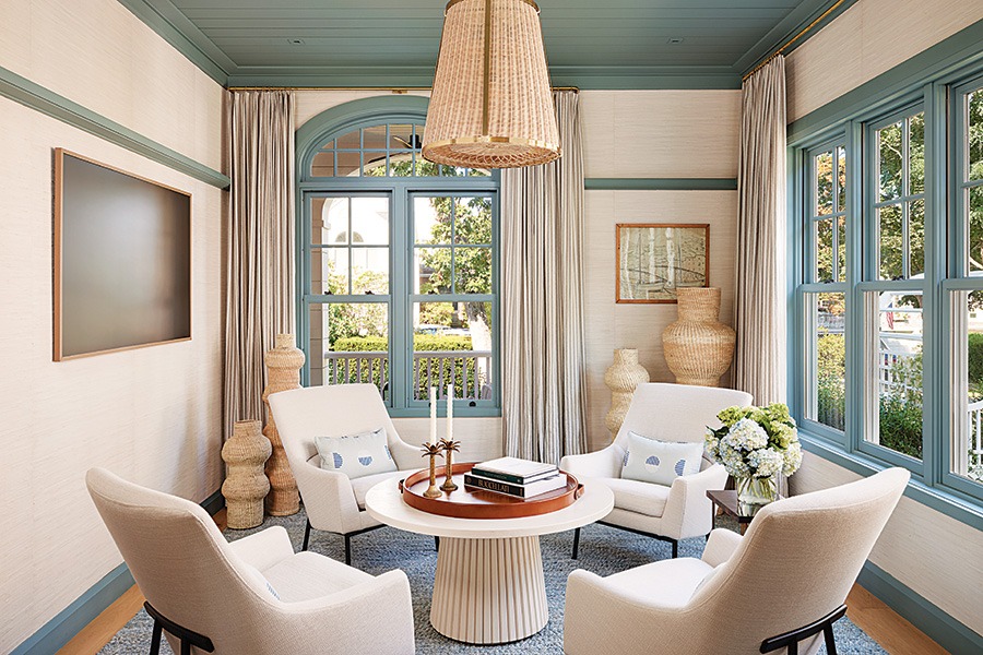
Instead of a traditional dining room, a lounge was created with a higher cocktail table surrounded by four chairs that are appropriate for light bites and cocktails. The walls and ceiling are painted Farrow & Ball’s “Oval Room Blue.” / Photo by Tim Williams
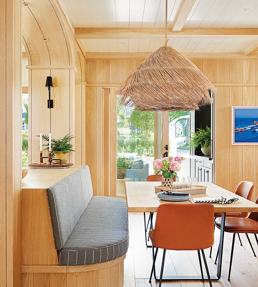
A built-in banquette fits several kids around the kitchen table. The Arteriors light fixture has movement to it, says Caan. “It’s made of a straw-like material; it’s fun and a little messy—it reminds me of someone shaking their head. / Photo by Tim Williams
An archway defines the family room from the kitchen, and beyond that, a lounge takes the place of a dining room. “They don’t have big, formal meals inside here,” says Caan, who procured a high cocktail table and comfortable chairs where the adults can have hors d’oeuvre with their guests.
The homeowners have several family members who live nearby, adds Caan. “This is an area where you know all your neighbors and friends are always stopping by.” After a day out on the ocean, a group might gather in the outdoor living room, which was designed to blur the boundaries of indoors and outdoors. With a wet bar and TV, it’s a three-season space with expansive windows that remain open to the elements in the summer but can be fitted with screens to avoid mosquitos. Come fall, glass panels are installed. There’s radiant heat under the slate tile floor, which keeps the room toasty when the
temperature drops.
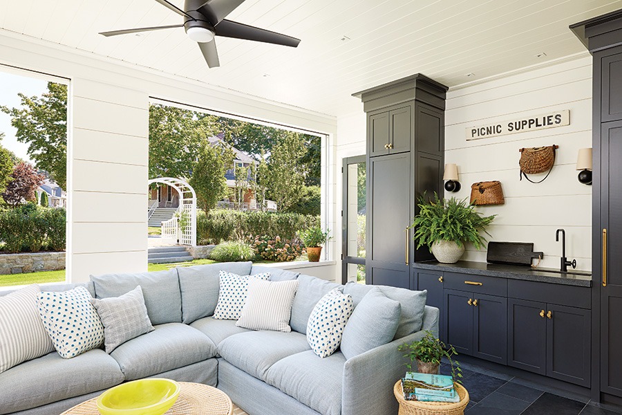
An ample Skaargarden sectional provides seating for a crew in the outdoor living room, where the built-ins are painted Benjamin Moore’s “Midnight Oil.” / Photo by Tim Williams
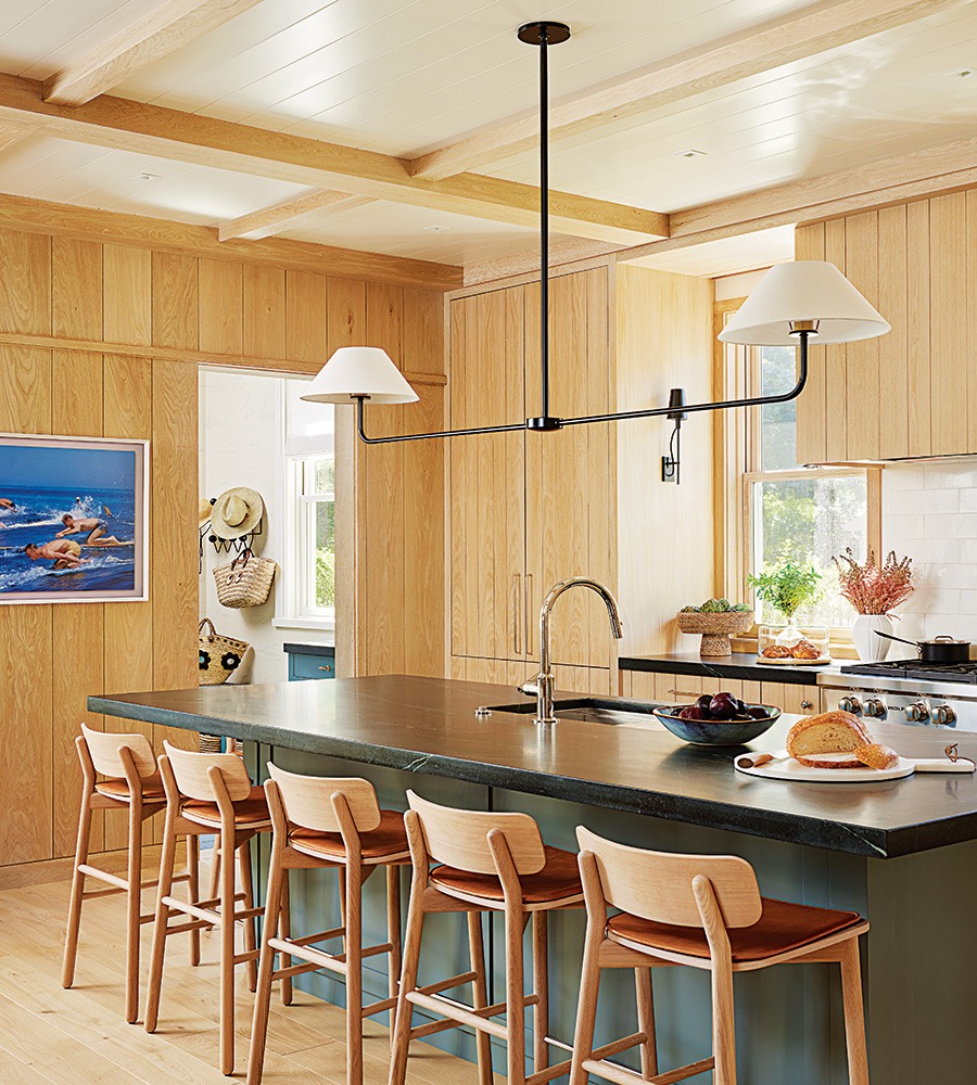
Like an original period summer cottage, the home features a lot of unpainted wood. The varying widths creates interest without detracting from the natural beauty of the grain. The linear Urban Electric pendant above the island is both unfussy and sculptural. / Photo by Tim Williams
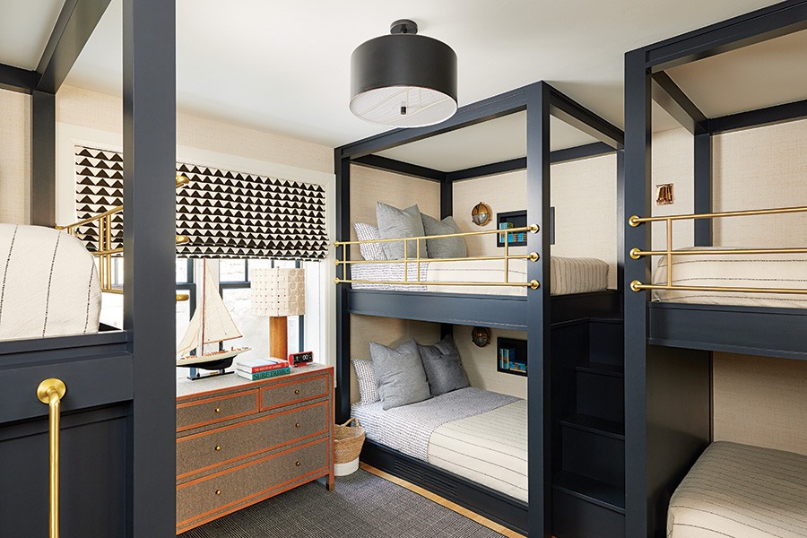
The basement was dug out to accommodate a fullsize window that fills the bunkroom with natural light. Leather, brass, and black accents nod to a modern nautical fl air. / Photo by Tim Williams
While the home has three levels plus a large, finished basement, Catalano was intent on making the house look like an original period building. “To respect the streetscape and fit appropriately within its context, we brought the home’s gambrel and dormer eave lines down to the first floor,” he says, noting that from the street-facing front of the house, it appears to be a one-story home with dormers.
A classic hallmark of summer house vernacular, the front porch is one of the home’s cherished spots. “We furnished it with Skargaarden furniture that is a little sportier and more contemporary than classic wicker rocking chairs,” Caan says. “The couple loves to sit there and talk to their neighbors going by; everyone always stops to say hi.”
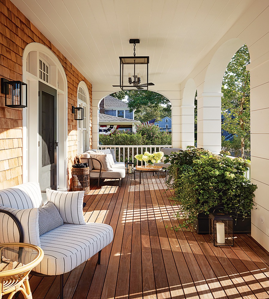
Photo by Tim Williams
Architect Catalano Architects
Builder Halliday Builders
Interior Designer Liz Caan & Co.
First published in the print edition of the Boston Home Summer 2024 issue, with the headline “The More the Merrier.”


